article thumbnail

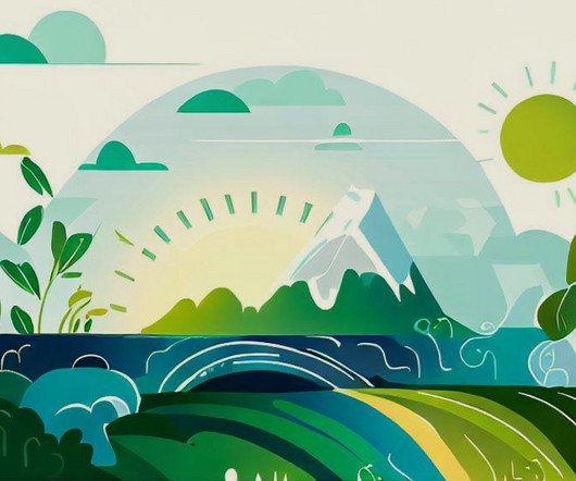
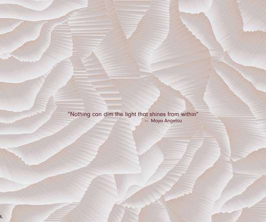
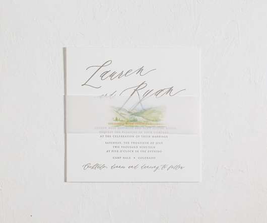
COLORFUL + MODERN WELCOME PARTY INVITATIONS

Press'd

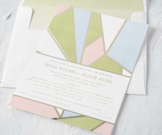
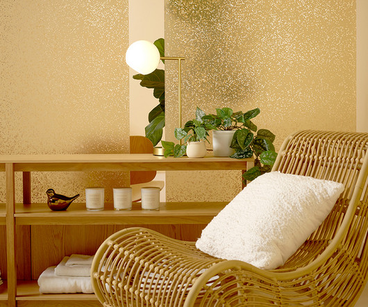
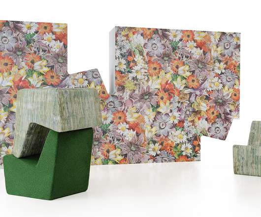
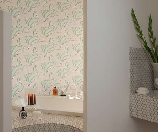
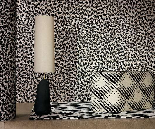
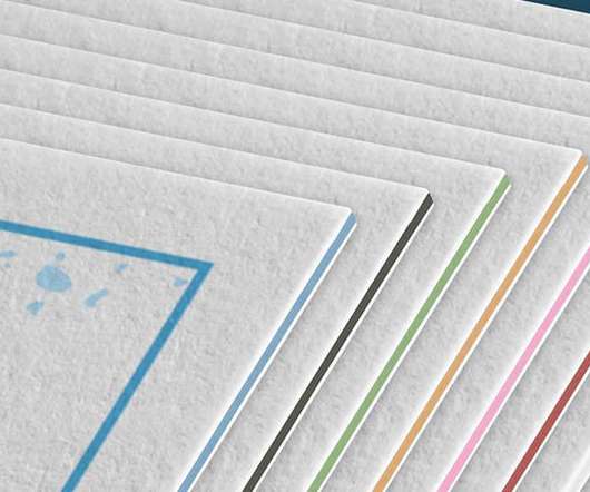
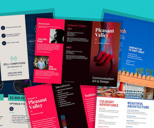
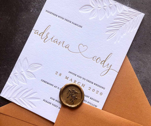
We worked with our friends at Prickly Pear Press to create these colorful and modern welcome party invitations. We updated the colors to Tawny Shine, Clover, Pastel Blue, and Whisper for a summery pop. Our Briolette sample set the stage for the design inspiration.

Color 52
article thumbnail

Illustration inspired by travels, books and people, who can make our life amazing and colorful

Abduzeedo

Illustration inspired by travels, books and people, who can make our life amazing and colorful abduzeedo 0202—23 Irene Neyman is a self-taught illustrator & graphic designer from Ukraine, who creates a strong visual and emotional connection between brand, design, and audience.

Travel 70
Insiders

Sign Up for our Newsletter

This site is protected by reCAPTCHA and the Google Privacy Policy and Terms of Service apply.

Trending Sources

article thumbnail

A Collection That Reimagines Frank Lloyd Wright’s Organic Architecture as Materials

Design Milk

If you look, nature has more color and geometry at work than one might initially think. Additionally, there are two digitally printed wallcovering designs, a series of Digital Studio patterns, and a fully customizable digital asset that reissues Wright’s Design for Hillside Theater Curtain.

article thumbnail

colorful cortes inspired letterpress invitations made for a Mexico wedding

Press'd

Geena and Zackary worked with our team and Union Street Papery to create these colorful cortes inspired letterpress invitations. The digitally printed envelope liner tied all the colors of the suite together. The digitally printed envelope liner tied all the colors of the suite together.

Color 52
article thumbnail

Floral Motifs Are Digitally Printed onto Blonde Hair in a New Baroque-Inspired Collection

Colossal

As a way to extend the floral designs woven into garments, Barcelona-based stylist Alexis Ferrer has developed a printing method that embellishes blunt bobs and Marcel waves with rich, colorful patterns inspired by the “best fabrics for the French bourgeoisie during the XVIII century.”

article thumbnail

Why Do Colors Look Different on Screens vs Print?

Six Leaf Design

Color is one of those tricky things that can look different depending on so many factors. It gets even more complex when you're comparing the colors on a digital screen, which uses a 3-color process (RGB), to printed colors, which uses a 4-color process (CMYK). That’s thanks to backlighting.

Color 130
article thumbnail

How To Prepare Artwork for T-Shirt Printing (6 Pro Tips)

Just Creative

Preparing artwork for t-shirt printing involves ensuring the design is in the correct format, resolution, and color space. This ensures you can print it on a t-shirt with your desired printing area. Also, exporting the design in a specific file format compatible with the t-shirt printing process.

Print 130