This site uses cookies to improve your experience. To help us insure we adhere to various privacy regulations, please select your country/region of residence. If you do not select a country, we will assume you are from the United States. Select your Cookie Settings or view our Privacy Policy and Terms of Use.
Cookie Settings
Cookies and similar technologies are used on this website for proper function of the website, for tracking performance analytics and for marketing purposes. We and some of our third-party providers may use cookie data for various purposes. Please review the cookie settings below and choose your preference.
Used for the proper function of the website
Used for monitoring website traffic and interactions
Cookie Settings
Cookies and similar technologies are used on this website for proper function of the website, for tracking performance analytics and for marketing purposes. We and some of our third-party providers may use cookie data for various purposes. Please review the cookie settings below and choose your preference.
Strictly Necessary: Used for the proper function of the website
Performance/Analytics: Used for monitoring website traffic and interactions
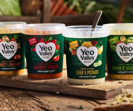
London-based B&B studio has revamped Yeo Valley Organic's entire visual identity and product range architecture through a combination of small tweaks and more dramatic overhauls. Veltman says: "This is part of the overarching architecture that empowers Yeo Valley Organic to future-proof its portfolio. "We
Jose's 3D journey Based in Málaga, Spain, Jose's journey into 3D animation began unexpectedly through his work in interior design and architectural visualisation. "My My dream had always been to tell animated stories beyond infographics and architectural video presentations," he explains. "I These broadly fell into two categories.
The rebrand draws heavily on the museum's iconic modernist architecture by Lina Bo Bardi, using a red-and-black colour palette and strong typography to reflect the building's striking visual presence. Their goal was to elevate Hip Pop from an indie challenger to a mainstream category leader, moving away from typical health drink aesthetics.
Reading "Andrés Higueros avoids coffee." Sign up to our newsletters and we'll keep you in the loop with everything good going on in the creative world.
This guide explores 70+ Japanese-style fonts , categorized by their design styles, and provides insights into how each category can enhance modern design and branding. Itedory Osaka Japanese Style Font Itedory Osaka is a Japanese-style font inspired by the culture and architecture of Osaka. Download 22.
Reading "Sergey Isakov’s illustrations." Sign up to our newsletters and we'll keep you in the loop with everything good going on in the creative world.
POV Forward Thinking Review of the Year Editorial Team Jenny Brewer Olivia Hingley Ellis Tree Elizabeth Goodspeed Liz Gorny Extra nice Extra Search Account Social Photos as a living organism: Riya Panwar reinvents the photographic canvas Can photography grow roots?
Instead of endlessly scrolling through random images, imagine having a carefully curated feed of graphic design, interior design, architecture, and much more. Dive into a Sea of Design Categories on Pinterest The WE AND THE COLOR Pinterest account is organized into distinct boards. Each board focuses on a specific design category.
The brand evolves the fun, frivolous and weird curation found in the Be(Attitude) shop and narrows in on a single product category. Reading "How small studios stay." " More from The View From. James Chae Nupip is a brand that produces and sells accessories for Crocs and other small products.
Beyond the Binary: Its About Intentionality Here’s the thing: these aren’t rigid categories. Don’t hesitate to browse WE AND THE COLOR’s Architecture and Design sections for more inspiring content. We see how others use these approaches. It influences how we want to present ourselves to the world.
That’s the charm of Alan’s beautifully coloured illustrations that champion the architecture and roadside signage of Austin, Texas – where he is a resident artist at Sage Studio. Reading "Alan Rivera paints a." Who else sees a Dollar Tree or a Mongolian restaurant and rushes to create a felt tip tribute to it?
This versatility ensures that whether you are creating a graphic design portfolio , an architecture portfolio , or a photography portfolio , the template provides the right tools to present your work effectively. Feel free to find other professional graphic design assets in the Templates category here at WE AND THE COLOR.
He finds inspiration for this kind of design work in “1950s and 1970s design, architectural photography, and Parisian libraries and archives”. Reading "Skate culture and street art." To create visuals that are “strong, clear and timeless” for identities, illustrations and graphic assets, both on the page and on screen.
Tune in to this episode and others to stay updated on the latest trends, insights, and advice in the world of art, design, photography, and architecture. Feel free to browse WE AND THE COLOR’s Graphic Design category for more. Header image by Pixel-Shot (via Adobe Stock).
These new fonts come from all popular categories, including serif, sans-serif, script, display, and more, ensuring that you always have the perfect typography for any project. Designed from a strict square grid, each Kubeon character reflects a carefully calibrated architecture.
📖 Reading Time: 5 minutes 🏷️ Categories: Design, Branding, Marketing 📅 Published: [DATE] 50 Simple Logos That Prove Less is More Okay, let's get one thing straight. Originally part of their restaurant architecture, simplified into an ‘M'. The world of design, especially logo design, is drowning in complexity. Chew on that.
But that doesnt mean that brand strategy isnt important, and the best creative work often has a team of talented strategists behind it, as we see with the dedicated Brand Strategy category at the Brand Impact Awards (BIAs). Whats the dynamics of the category? Whos leading the category? Why are they their competitors?
Nestled within the pristine beauty of the Šumava National Park in the Czech Republic, this cottage by Markéta Cajthamlová Studio is an architectural triumph. The use of dark-stained wood for the facade, and locally sourced recycled stone for the plinth and retaining walls further connect the design to its regional architectural heritage.
The Nothina Mount typeface , a masterwork from Alit Design, belongs firmly in that second category. Unlike a standard italic, which is often a slanted version of a roman font, the entire architecture of Nothina Mount is built on this angle. Feel free to find other trending typefaces in the Fonts category here at WE AND THE COLOR.
We organize all of the trending information in your field so you don't have to. Join 66,000+ users and stay up to date on the latest articles your peers are reading.
You know about us, now we want to get to know you!
Let's personalize your content
Let's get even more personalized
We recognize your account from another site in our network, please click 'Send Email' below to continue with verifying your account and setting a password.


Let's personalize your content