Remove basis-grotesque
article thumbnail

14 fonts to fall in love with: trending typefaces that designers adore

Creative Boom

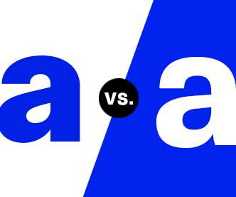
As Nolan developed the typeface, it quickly became more personal and evolved into the designer's own take on the grotesque genre. Pastiche Grotesque by Order Pastiche Grotesque is a sans-serif typeface designed by Order, a design studio based in San Francisco (see our exclusive interview with founder Jesse Reed to learn more).

Fonts 545
article thumbnail

DesignStudio rebrands Habyt, a new type of housing company

Creative Boom

This bespoke logo is supported by Basis Grotesque , a clean, straightforward and highly legible typeface from Colophon Foundry. Design elements At the centre of the system, the new logo builds on the idea of 'unlocking opportunities' through the symbol for opening doors, which is located in the negative space of the 'H'.

Portfolio 297
Insiders

Sign Up for our Newsletter

This site is protected by reCAPTCHA and the Google Privacy Policy and Terms of Service apply.

article thumbnail

Top 20 Fonts That Will Be Popular With Designers in 2021

Shillington

Basis Grotesque. Basis Grotesque was originally drawn in a regular weight for the redesign of photography magazine Hotshoe. Inspired by the quirky grotesques of nineteenth-century Britain, and influenced by American Gothic, the family is available in six weights with matching italics. FS Meridian.

Fonts 145
article thumbnail

Farm&Roll – an alternative flour identity

Mindsparkle Mag

The Farm & Roll logo involves geometric, grotesque letterforms in which the letter “O” depicts a stylized millstone for grinding flour. In combination, they form a pattern that is the basis of a design system. They have created a brand for new premium and organic alternative flour products.

Brand 52
article thumbnail

Gerstner-Programm

Typographica

The 1963 essay “The Old Akzidenz-Grotesk on a New Basis” recounts his analysis of several grotesque typefaces and his decision to reassess Akzidenz-Grotesk: “We prefer the original Grotesque. In attempting a systematic Grotesque in the vein of Univers or Helvetica, Gerstner created an interesting tension.

article thumbnail

10 Fresh Font Pairings for Editorial Design in 2020

Shillington

Another dependable and hard-working typeface, Maple is a sans-serif grotesque with exaggerated lowercase incisions, irregular stroke terminations, and an overflowing black weight. The resulting grotesque sans-serif provides real dramatic impact and is most famously in use by MOMA, De Wiels, Zeit Magazine and the Walker Art Centre.

Fonts 69
article thumbnail

Reviewed: New Logo and Identity for Sing King by Nomad

Under Consideration / Brand

We used the basis of musical notes to create the negative space of the crown, creating a simple yet striking symbol. We've supported this with a word mark and palette of accompanying weights of Sharp Grotesque by Sharp Type. Nomad provided text. Your browser does not support the video tag.