This site uses cookies to improve your experience. To help us insure we adhere to various privacy regulations, please select your country/region of residence. If you do not select a country, we will assume you are from the United States. Select your Cookie Settings or view our Privacy Policy and Terms of Use.
Cookie Settings
Cookies and similar technologies are used on this website for proper function of the website, for tracking performance analytics and for marketing purposes. We and some of our third-party providers may use cookie data for various purposes. Please review the cookie settings below and choose your preference.
Used for the proper function of the website
Used for monitoring website traffic and interactions
Cookie Settings
Cookies and similar technologies are used on this website for proper function of the website, for tracking performance analytics and for marketing purposes. We and some of our third-party providers may use cookie data for various purposes. Please review the cookie settings below and choose your preference.
Strictly Necessary: Used for the proper function of the website
Performance/Analytics: Used for monitoring website traffic and interactions
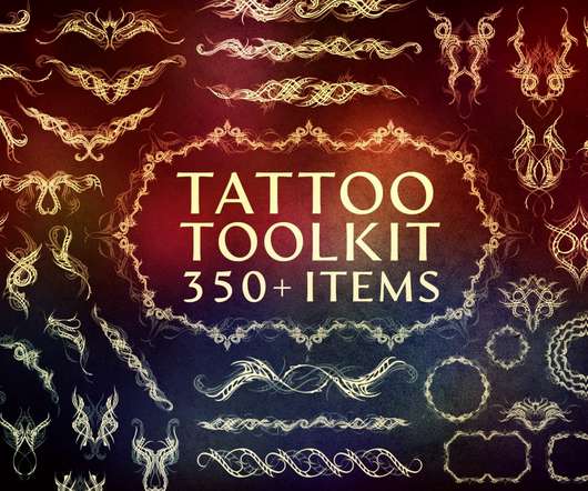
So much so, that, although tattoos are designed to be permanent body art, brands and designers are incorporating tattoo elements into their work. If you’re a digital designer yourself, looking for tattoo design brushes, vector art & toolkits , we’ve got you covered! Tattoo Art – Affinity Brushes. Download Now. Download Now.
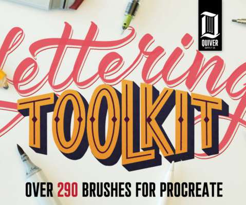
The Procreate app is quickly becoming one of the most popular programs for creating art that the iPad offers. When patterns are used the right way, they are almost unnoticeable as they can add texture to give the image a grittier feel or shading to give the drawing depth. Learn More. Procreate Ink Brushes – $10. Learn More.
With more than 475 glyphs, 150+ alternates, 12 ligatures and multilingual support, you can easily use this flexible font for any project from magazine covers to art posters. $8 Thanks to this collection of 1600 Infographics Templates, you can easily put together a colorful story through professional pictures and charts.
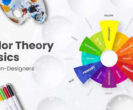
As a continuation of our inspirational examples and palette ideas for great color combinations, today we will have a look at the basics of colortheory and go beyond that. You can also review the colortheory article overview below and fast-travel to the specific sections you need. What are Colors?
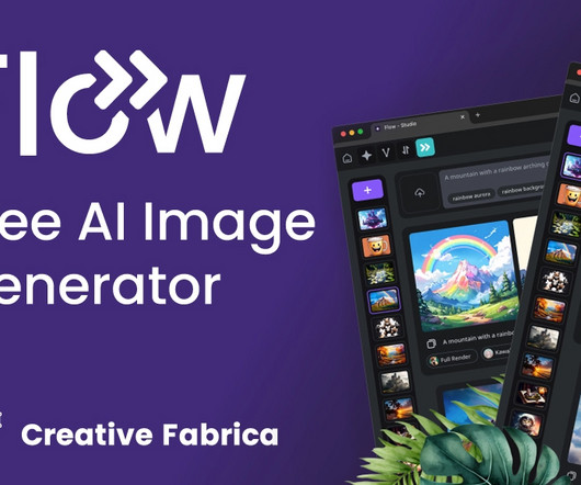
Introducing Flux: The Brain Behind Flow At the heart of Flow’s innovation is Flux , a state-of-the-art AI model that drives the generation process. Flux is designed to understand and replicate complex patterns, textures, and styles, making it ideal for creating diverse visual content.
Her distinct point of view embodies an authentic, purpose-driven design philosophy, and she brings knowledge of art and colortheory to each thoughtfully curated project. and the quality and color of her work helped the team select the design, color palette, and finishes.
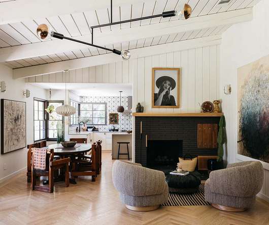
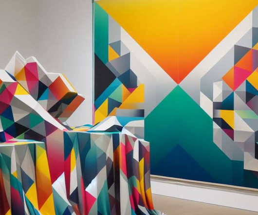
In the world of creativity and expression, art and design have long been intertwined, forming a powerful union that shapes our surroundings and influences our emotions. In this blog post, we delve deep into the mesmerizing fusion of art and design, exploring the harmonious symphony that emerges when these two worlds collide.
With elements and textures that allow you to create standard or typography logos. The kit provides you with full editable files for Illustrator and if you use Photoshop, files are included for both shapes and textures. Deriving inspiration from early 20th-century travel posters, the fonts have an art-deco style to them.
These details might include repeating patterns, textures, logos, icons, and compositional techniques. In the first few chapters, you’ll learn the most important techniques like rendering out backgrounds and creating textures. Creating Custom Maps and Textures in Photoshop CC 2014.
Elements of design are the parts of your work of art that you arrange and craft to create visually pleasing designs. Depending on the type or shade, you can use colors to emphasize elements or evoke certain feelings. Choosing the right colors is crucial when you’re trying to tell a story with your design. Edit in Design Wizard.
Graphic design is defined as the art and skill of combining elements such as text, pictures, visuals, shapes, and textures to catch the attention of the desired audience and deliver specific communication. Textures: Textures There are designs that work very well when they have certain textures added to them.
Throw hue and tone into the mix, too, and you’re left with four, distinct color terms that everyone uses, yet not everyone understands. The mix-up among tint, shade, hue, and tone is understandable since they’re all related to colortheory and refer to similar concepts within design. Textures, frames. Free Design Poster.
It can be achieved through color, size, shape, texture, or any other visual attribute. How to use Contrast: Color Contrast: Pairing light colors with dark colors is a classic way to create contrast. Understanding colortheory and how different colors interact with each other is essential for effective design.
Under his eye, they became pieces of art, statements on the tone, and texture of what was to come. Well, a little more than ‘use bright colors,’ I’m afraid. Study colortheory then apply it to your projects in tasteful, audacious ways. A Simple Web Developer’s Color Guide by Laura Elizabeth. Large preview ).
Kaizen Technolog Brand Identity Design The Inspiration Factor: How Powerful Logos Spark New Businesses Great logos are like tiny works of art, carrying a wealth of meaning within a simple design. They understand design principles, colortheory, and typography, ensuring that the logo is not only aesthetically pleasing but also functional.
Led by Michael Worthington, a member of the faculty at the California Institute of Arts, the course will teach you how to implement visual, rhythm, and pattern in design, techniques of image making and how to create your own series of images as well as how to use scale, direction, texture, weight, and space in your project.
Retro or vintage design refers to a broad range of graphic design styles which lift influences and inspiration from different historical eras and retro style design, from mid-century modern graphic design and 50s art styles to vintage 70s graphic design. Pack of vintage textures which replicate the ageing process.
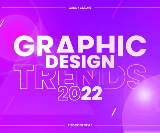
Candy colors. Vibrant eye-candy color schemes. Skillful designers and digital artists who know their colortheory already roll their sleeves to create bold and striking graphic design creations with beautiful candy colors. So, what exactly is Art Deco? Top Graphic Design Trends 2022 Overview: 1. Psychedelic.
The world of vector art is indeed captivating. Imagine acquiring the skills to transform your initial sketches into polished, professional-grade vector art. This software allows him to translate creative concepts into breathtaking digital art, particularly his signaturevector illustrations. Good news is on the horizon.
Colors help us take better decisions. In this article, we will have a glimpse of what Color Design , ColorTheory is, see a few tips for choosing a color scheme, and apply colors to a Widget. Red pigment Our conscience already developed awareness about colors. In the end, how well do we use them?
It’s not just math—it’s art! The thickness, the texture, the finish. Being a design nerd means you have a unique perspective on the world, one where alignment, colortheory, and typography reign supreme. You might even carry around a Fibonacci spiral diagram—just in case. “Did they really choose Papyrus for this?
50 Totally Free Lessons in Graphic Design Theory. Color, Texture, and Imagery. It's important to understand the basics of colortheory and get a feel for how to work with colors. Color can make areas of a design pop off the page or recede into the background. Laura Keung. 29 May 2022. Danny Outlaw.
You’ll learn how to manipulate visual elements in a digital collage, experimenting with colors, shapes, and textures to produce dynamic and engaging artwork. You’ll explore techniques for creating depth and dimension, using colortheory and composition to captivate your audience. Why Join This Course?
Read more tips on using alignments for all elements here: The art of alignment. Color is a powerful tool for designers, so it makes sense that a carefully arranged and consistent palette would be an important step in all design endeavors. Remember the joy of Word Art? Use this template. Always use a grid. Use this template.
It is perfect for office, school, travel, art, gaming, music, and so much more. Color Wheel Earrings These are 1/2" locking leverback dangle earrings with professionally printed art prints handset under glass domes. The discs are brushed to give them a subtle texture. The glass nicely magnifies the artwork underneath.
To know how to accurately combine colors is a critical skill that artists, designers, marketers, and brand owners spend years learning and mastering. Science and art aside, a big part of the process is finding the right inspirations. Both colors give a huge contract on a light grey background. STONE ART by Multiple Owners.
Introduction to the Course Watch video lesson (1 min) ↗ Arranging elements on a page, whether in graphic design, photography, or art, to create successfully harmonious designs is essential. A useful question when designing or composing a photograph or art is: Where do I want my audience to look first? Key Principles of Composition 3.1
Photocopy dry toner texture bundle. 300+ Best Black & Dark Textured Backgrounds Looking for luxury black textures to complement your latest creation? Check out this collection of black and dark textured backgrounds from Envato Elements. Let's take a look at some famous 90s art styles that made this decade so popular.
When you look at a design in grayscale it forces you to only see tone but not actual colors. This way you can get an idea for why certain areas of an icon are colored darker than others. Unfortunately colortheory is a very detailed subject which can’t be learned in a day.
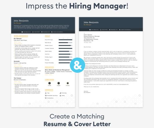
Icons, lines, shapes and textures can enhance your resume without overdoing it. Feature your best design work prominently. Showcase at least one stunning portfolio image on the first half of page one. Use subtle graphic elements. Mix up your layout. Back up claims by referencing projects in the work experience section.
It’s the perfect size, comes in a selection of nice colors, and has the perfect amount of texture to its surface. The umbrella’s vibrant colors were chosen based on research into colortheory, making a rainy day a little brighter for whoever is taking shelter under it.
Designers are now at the crossroads of art and technology, where they can harness powerful tools to produce engaging, personalized, and memorable visual experiences. This trend embodies the best of both worlds, combining the striking realism of fine textures and lifelike details with the clarity and elegance of minimalist layouts.
Its flexible approach combining sketching and precision drawing makes it suitable for everything from quick concept art to detailed technical illustrations. ArtRage ArtRage focuses on simulating traditional art materials with its highly realistic brushes and tools.
Producing more than 1,800 unique colors from high-quality pigments still mixed and rolled by hand, the material has been used by artists for hundreds of years, including art history heavyweights like Edgar Degas and Claude Monet. Become a Colossal Member today and support independent arts publishing for as little as $5 per month.
There are different textures and color scripts that will create something unique every time. This action creates an effect that blends both watercolor paintings and sketch line art drawings into its final result. Create a realistic rubber stamp effect using Photoshop brushes and textures. Visit Tutorial. Visit Tutorial.
In fact, they’re so singular that while readers today may not remember the particulars of the series’ flagship entries, they can instantly recall the art that branded them. In high school, fate would see him attending a commercial art class at a nearby vocational program. Jacobus graduated in 1981, when all art was tangible.
And a huge part of that history, maybe the most crucial part, leads back to one specific place: a revolutionary German art school that existed for only 14 years but punched far, far above its weight in terms of lasting impact. Walter Gropius and his colleagues saw industry not as the enemy of art, but as a powerful partner.
We organize all of the trending information in your field so you don't have to. Join 66,000+ users and stay up to date on the latest articles your peers are reading.
You know about us, now we want to get to know you!
Let's personalize your content
Let's get even more personalized
We recognize your account from another site in our network, please click 'Send Email' below to continue with verifying your account and setting a password.


Let's personalize your content