This site uses cookies to improve your experience. To help us insure we adhere to various privacy regulations, please select your country/region of residence. If you do not select a country, we will assume you are from the United States. Select your Cookie Settings or view our Privacy Policy and Terms of Use.
Cookie Settings
Cookies and similar technologies are used on this website for proper function of the website, for tracking performance analytics and for marketing purposes. We and some of our third-party providers may use cookie data for various purposes. Please review the cookie settings below and choose your preference.
Used for the proper function of the website
Used for monitoring website traffic and interactions
Cookie Settings
Cookies and similar technologies are used on this website for proper function of the website, for tracking performance analytics and for marketing purposes. We and some of our third-party providers may use cookie data for various purposes. Please review the cookie settings below and choose your preference.
Strictly Necessary: Used for the proper function of the website
Performance/Analytics: Used for monitoring website traffic and interactions
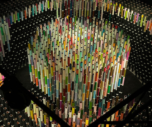
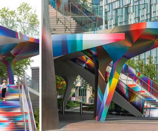
Renowned architect and artist Suchi Reddy and historic Indian brand Asian Paints recently presented Chromacosm , the largest and most comprehensive architecturalcolor system with over 5,300 unique shades. Like a creature among grass, the viewer walks among tall stalks of colored cylinders, all adorned with a myriad of color.
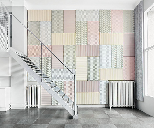
BAUX joins the likes of ABBA, IKEA, and Volvo as an iconic Swedish export cementing itself in the zeitgeist with their inaugural launch into the American market upon the Bio Colors unveiling – six new pastel hues across the Origami Acoustic Pulp range made solely from natural ingredients.
Think about saving hours searching for the perfect image or color palette. More specifically, this is where following WE AND THE COLOR’s Pinterest account can transform your creative process. WE AND THE COLOR understands the needs of creative professionals. Find us on Pinterest Why Follow WE AND THE COLOR on Pinterest?
Browse our color combinations to step up your creative game and reap the rewards. Knowing what colors go together is a skill in itself and it can have a positive impact on all areas of your life. Once you gain an understanding of what different colors mean and the theory of color , you’ll see how they can influence perceptions.
Architecturer WordPress For Interior Designer 13. Download Avas Elementor WordPress Theme Download Architecturer WordPress For Interior Designer Architecturer WordPress Theme is a responsive WordPress theme created especially for professional architect, interior designer and landscape designer to showcase their works.
The Art of Color. Johannes Itten The Art of Color. Image Credits: Amazon When our parents and teachers started teaching us how to read and write as children, color was first presented to us. You soon discover colortheory is a whole science and field of study when you start researching it. Interaction of Color.
Her distinct point of view embodies an authentic, purpose-driven design philosophy, and she brings knowledge of art and colortheory to each thoughtfully curated project. The firm’s work has been featured in California Home + Design , Architectural Digest , Domino , Dwell , Emily Henderson, House Beautiful , Martha Stewart, and more.
The WE AND THE COLOR subreddit, r/Design_WATC , was created to fill that void for designers, artists, and creative thinkers. This community offers a unique platform for those passionate about design—whether it be graphic design, architecture, photography, or visual art—to come together and share their knowledge, projects, and perspectives.
You can change the colors, fonts, and layout of your theme, and you can even add your own custom content. This theme has a slider for featured posts, a hidden sidebar for widgets, and the ability to switch between fonts and color styles. Get ad posting WordPress theme with different color options and with awesome WP functionality.
Visit Website Look 795 Blade RS Website Design Webflow landing page for the new Look 785 Blade RS racing bike Visit Website MAKHNO Website Design MAKHNO — Ukrainian studio of architecture and design. Visit Website Scheele’s Green Website Design A project about the dangerous love of the color green in the Victorian era.
Neural Aesthetics explores the collaborative synergy between human creativity and artificial intelligence, while the Quantum Color Palette takes us beyond the conventional spectrum. Its influence can be seen in product design, architecture, and even digital interfaces.
Nappy Nappy provides free stock images that showcase diversity and representation, with a focus on people of color. Free Color Tools: 24. Coolors Coolors is a color scheme generator that allows users to create and customize color palettes for various design projects. Free Mockup Tools: 30. Free Graphic Design Courses: 35.
Let’s start with the most basic aspect — color. We process the colors and arrangement of a website before we have time to process its content. For Bass is typically translated into simple, vivid color palettes with no more than three of four colors. Well, a little more than ‘use bright colors,’ I’m afraid.
Exploring Bauhaus Influence in 3D Illustration abduzeedo 1108—23 Discover how Leonardoworx LWX merges Bauhaus principles with modern 3D illustration, crafting artworks that celebrate simplicity and color. This section nods to the Bauhaus’s architectural angle, where function dictated form, and every line served a purpose.
In 1928, The Saturday Evening Post , then the US’s most popular illustrated weekly, heralded “The New Age of Color.” Richly-tinted branding became all the rage as forecasters realized color spelled cash. . But the idea that color exerted influence was not “new,” although we could say there is something New Age about it.
Abstract illustration using shade colors A brief start about color We consume red strawberries and wait for the white ones to mature. Colors give meaning to our context. Colors help us take better decisions. Red pigment Our conscience already developed awareness about colors. A rollback in (pre)-history Figure 2.
At its core, design is the conscious arrangement of elements, be it colors, shapes, or materials, to create a functional and aesthetically pleasing composition. The use of design principles in art is evident in the careful selection of colors, composition, and perspective.
The Bauhaus movement, celebrated for its groundbreaking contributions to art, architecture, and design, is often synonymous with clean lines, minimalism, and functionality. The tables combine bold primary colors with a practical design, exemplifying the movements blend of art and utility. Subscribe to our newsletter!
This layer encompasses both information architecture (how content and features are organized) and interaction design (how users move between and within those organized spaces). Tools Information architecture diagrams including site maps and navigation models. Tools Visual frameworks like PARC, gestalt principles, and colortheory.
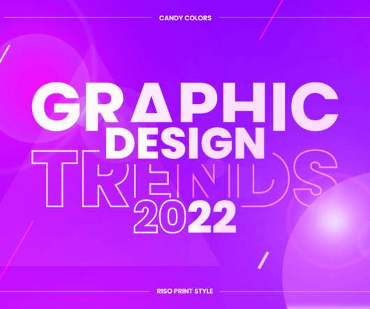
Candy colors. CANDY COLORS. Vibrant eye-candy color schemes. Skillful designers and digital artists who know their colortheory already roll their sleeves to create bold and striking graphic design creations with beautiful candy colors. Top Graphic Design Trends 2022 Overview: 1. 2D/3D Mashup. Paper Cutout.
Ziza is the second digital font release to emerge from Mark van Wageningen’s ongoing experiments in constructing, deconstructing, and reconstructing type, exploring the connections between various type technologies and materials, and — most flamboyantly — revisiting and exploring the possibilities of color type.
You might guess the age of a print with slightly more pixelation and a duller color as being of the 1950s or 1960s. Letterpress is one of the oldest printing techniques, using a method of relief printing to create an engraved color effect. Cogs, metallic textures, and rich colors help to bring a touch of steampunk to any design.
color palettes. We all want to design better and inclusive experiences, but sometimes we might be forgetting about just the right color contrast, or a proper tab order. For accessible color palettes, Geenes.app is a reliable and sophisticated tool that allows you to create, maintain, sync and test color palettes and their variations.
Graphic Designer Gift - CMKY Badge This set of three badges makes a perfect gift for your favorite graphic designer, photographer, artist or anyone who appreciates super fun and colorful badges. Color Wheel Earrings These are 1/2" locking leverback dangle earrings with professionally printed art prints handset under glass domes.
By using typography, color, form, imagery, and organization, we can achieve clear and effective communication. Many of these graphic design genres overlap each other, as well as other fields like architecture, landscape design, industrial design, and even psychology. . It encompasses much more than just a logo. Grace Fussell.
The focal point is also brought in through the use of color, the bright red being a stronger color against the washed-out green background. Contrast can be shown through color differences, size, or volume between elements. In this painting by Rothko, contrast is shown through the different color values of blue, orange, and red.
Eclecticism in architecture, The Basilica of the Sagrada Família in Barcelona, Spain. As a concept, it can be most easily understood by looking at examples in architecture. Whenever I interview candidates, a portfolio quickly sets the bar for hard skills (colortheory, typography, layout, accessibility).
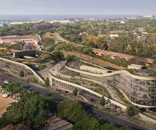
Over the years I thought about going into medicine or psychology, but something always brought me back to architecture. “For me, architecture isn’t just work, it really is my life. It was my destiny.” ” Eran’s also quite musical, and jokes that his mom must not have seen a career as a rockstar in his future!
It’s the perfect size, comes in a selection of nice colors, and has the perfect amount of texture to its surface. Available in two colorful coasters per set, the mesmerizing design makes the colorway a difficult choice to narrow down. The reBoard by Material $35. Set of 2 Resin Coasters by Gaetano Pesce $30.
These tutorials encompass a diverse array of subjects such as responsive design, typography, colortheory, and frontend development among others. Tutorials To aid designers and developers in augmenting their abilities and broadening their information resources, Webdesign Ledger not only offers articles but also tutorials.
Its expansion into web-based tools and improved rendering capabilities have broadened its appeal beyond its architectural roots. Its Grasshopper plugin for parametric design has revolutionized computational design workflows, particularly in architecture and product design.
Examples of content include colortheory, type, spacing, form elements and buttons. P.S. this article was adapted from a talk I gave at World Information Architecture Day 2022, Minneapolis. Styleguide Consistency is the core need behind a styleguide. Pattern library Efficiency is the core driver behind a pattern library.
Interface design includes features such as fonts, colors, graphics, buttons, and menus. User research, persona development, information architecture (IA), wireframing, prototyping and high-fidelity design, and user testing are some of the responsibilities of a UX Designer. Other concepts like colortheory will also be required.
The digital transformation is setting a new standard, with hyperrealistic graphics meeting the simplicity of minimalism, while dark mode and colorful gradients create impactful, high-contrast visuals. For instance, AI can quickly adjust layouts, select color palettes, or even generate typography variations that align with a brand’s tone.
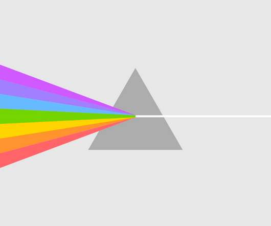
.” Whether working in kinetic sculpture or large-scale murals, Pantone investigates the vast realm of colortheory and its bottomless potential, in this instance transforming the cyan, magenta, and yellow model into a dynamic display.
Part of the School of Art and Architecture, students can expect to receive a design education that encompasses a global perspective and a multidisciplinary digital focus. This is complemented by modules in colortheory, graphic design principles , art and the latest industry software to produce full rounded designers.
If there’s a color everybody has been talking about these days, that’s sage green. So, today we want to present you a project that features a harmonious pastel color palette that includes sage green. So, today we want to present you a project that features a harmonious pastel color palette that includes sage green.
such as typography, images, symbols, and colors?—?to Dwiggins in the 1920s, who wanted to describe the emerging profession that utilizes images, colors and typography to establish visual communication (2). They use brand visual assets (colors, typefaces, icons, etc.) to convey a message to an audience.” (1) like visual designer.
The fundamentals of graphic design are about seeing (and understanding) how the qualities of visual material—shapes, images, colortheory , typography , and layout—work, and work together… and then being able to decide which qualities of each are relevant and engaging and useful for visualizing a particular idea or solving a certain problem.
The fundamentals of graphic design are about seeing (and understanding) how the qualities of visual material—shapes, images, colortheory , typography , and layout—work, and work together… and then being able to decide which qualities of each are relevant and engaging and useful for visualizing a particular idea or solving a certain problem.
The comfort of classic colors that conjure emotion concocted by Note Design Studio with Blo. Note Design Studio and Blo Present Statements Color is so much more than pigment or paint. So, it makes sense that multi-hyphenate Note Design Studio has aligned with Danish color brand Blo for the 2025 release of Statements.
Is it simply the colors they use, or is there something deeper? Well, understanding design principles like typography, colortheory, layout, balance, and hierarchy isn’t just about following rules. ColorTheory : Knowing how colors interact and evoke emotions is crucial. It is more than that.
Imagine a place trying to tear down the old walls separating fine arts (like painting and sculpture) from applied arts or crafts (like furniture making, architecture, and graphic design). Walter Gropius went on to teach at Harvard’s Graduate School of Design, profoundly shaping American architectural education.
We organize all of the trending information in your field so you don't have to. Join 66,000+ users and stay up to date on the latest articles your peers are reading.
You know about us, now we want to get to know you!
Let's personalize your content
Let's get even more personalized
We recognize your account from another site in our network, please click 'Send Email' below to continue with verifying your account and setting a password.


Let's personalize your content