This site uses cookies to improve your experience. To help us insure we adhere to various privacy regulations, please select your country/region of residence. If you do not select a country, we will assume you are from the United States. Select your Cookie Settings or view our Privacy Policy and Terms of Use.
Cookie Settings
Cookies and similar technologies are used on this website for proper function of the website, for tracking performance analytics and for marketing purposes. We and some of our third-party providers may use cookie data for various purposes. Please review the cookie settings below and choose your preference.
Used for the proper function of the website
Used for monitoring website traffic and interactions
Cookie Settings
Cookies and similar technologies are used on this website for proper function of the website, for tracking performance analytics and for marketing purposes. We and some of our third-party providers may use cookie data for various purposes. Please review the cookie settings below and choose your preference.
Strictly Necessary: Used for the proper function of the website
Performance/Analytics: Used for monitoring website traffic and interactions
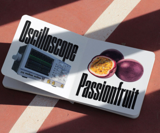
The demand for our fonts led me to start an online store." "Because I was rather exposed to graphic design trends from spending a lot of time moderating #Design Tumblr, I caught the emergence of the experimental sans-serifs trend that ruled the internet for a while during that period and made typefaces within this genre.
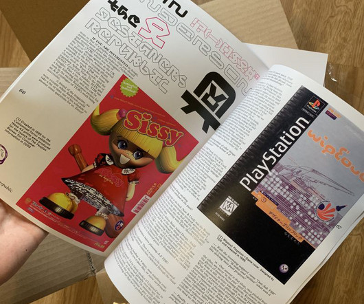
The third and most recent issue, titled Spliege, took a radical creative turn (and won the Stack awards). The third and most recent issue, titled Spliege, took a radical creative turn (and won the Stack awards). For Charles, SiegeMag's revival is more than just a personal project. I often get asked when it's coming back."
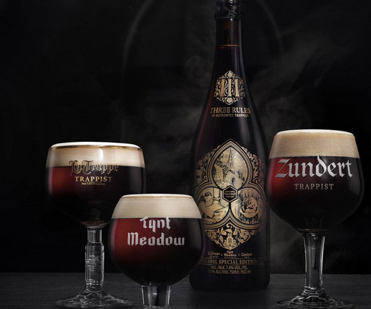
It sounds like the brief for a luxury champagne or a high-end single malt, but the Eindhoven branding agency Tte de la Course has introduced a premium-level presentation to the beer market in the form of Three Rules of Authentica special edition dubbel with a story behind it that feeds right into a narrative of quality and craftsmanship.
Many design techniques and photography rules can help you achieve the results you desire. One such principle that has stood the test of time is the renowned 'Rule of Thirds’. From a captivating portrait to the perfectly balanced design elements in a graphic or even the harmonious layout of a website—the Rule of Third.
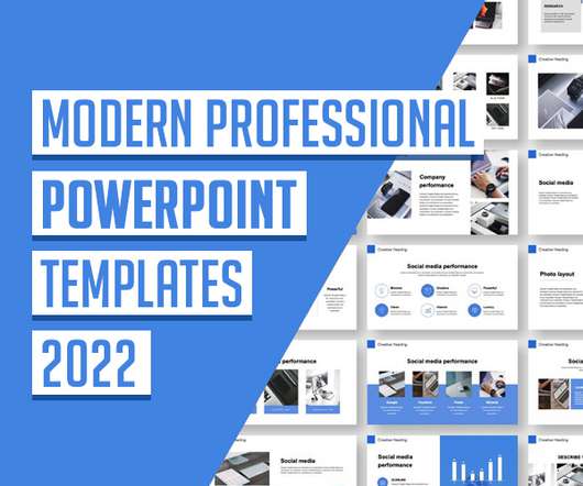
So, before choosing the best professional PowerPoint templates, it is worth studying the basic rules for compiling slides, searching for and distributing information, because this affects the degree of perception of data by listeners. How to work with information? Here are the main recommendations: State the topic clearly.
Starting with the verbal identity, Koto based it on five fundamental Kikin community rules, taking the brand's voice with a mantra-like quality through short, impactful sentences like 'Put Planet First' and 'Work Together'. Koto is behind the identity of an early-stage UK startup that supports sustainable businesses as they grow.
Royal Television Society's annual two-day event by Studio Kiln We canvas a selection of design industry experts to learn what will be big in typography over the next 12 months. Their answers may surprise you! So it's worth keeping an eye on the latest trends. That doesn't mean you have to blindly follow them, of course.
I do not rule out that it may transform in the future. Only in my third year of study, when the specialisation of book graphics began, I soon realised that illustration makes me happy. My family is in the Kharkiv region now, which borders Russia. It was hard to realise it was happening, so I had to pause work on my current project.
Image licensed via Shutterstock Your introversion isn't a barrier to making social video; it's actually an asset. Discover how to conquer the world of video content with these expert tips and strategies. For the last couple of decades, the creative profession has been broadly kind to us introverts. You don't have to make content.
If the axiom “third time is the charm” rings true, the third rug collection between Ruggable and Jonathan Adler should prove to be the partnership’s best one yet. But it’s arguably Jonathan Adler’s designs most associated with the rug brand over the years. Athens, Thebes, Santorini, and Gatsby).
Freelance illustrator Lia Liao has worked with big-name clients such as The New Yorker, The Washington Post, and Scientific American. However, a background in psychology rather than art helped to develop her distinctive editorial style. Lia, who is currently based in New York, only recently switched to a career in illustration.
First impressions matter. The first interaction a potential customer has with your brand is usually on your website. The way you design and develop your website can make or break your conversion rates. If you see an increase in your website traffic but not in sales, then it is time for you to evaluate your website design. It’s as simple as that.
We work with clients to get to the heart of who they are and then express their brand through dynamic identity systems led by principles rather than rigid rules. Dylan Mulvaney. As head of design at Gretel NY , Dylan Mulvaney is the creative force behind brand identities for Apple, Netflix and Vice. First is our approach. Second, our team.
Before we jump into the rules, let’s talk about the underlying ideas. Before we jump into the rules, let’s talk about the underlying ideas. The Golden Rules of Font Pairing: What to Do and What to Avoid Now, lets get to the nitty-gritty. Has this ever happened to you? It’s a common design pitfall.
Implement the Rule of Thirds. You might think The Rule of Thirds is only applicable to photography, but it’s actually one of the core principles in web design. Here are 12 tips that can help boost your site’s conversion without sacrificing good web design. Make Your Call-to-Action Easily Distinguishable.
In recent years, PR companies have come up with two unofficial days on which people are most likely to ditch them: namely Quitter's Day on 12 January and Blue Monday, the third Monday in January, which one travel company dubbed as the most depressing day of the year. How are you doing with your New Year's resolutions?
We loved the visual identity for this year's Green Man so much that we had to interview the artist behind it. Murugiah explains how he got the gig, developed his branding ideas, and what it's like to be surrounded by your own work at a festival. The summer of 2023 has been an amazing year for UK festivals. They said yes, and the rest is history.
Whether you’re a seasoned or aspiring web developer, a business owner or are just someone’s nephew who’s been dumped with doing the website designing; there’s a web design builder software option out there that will cater to your needs and abilities so you’ll be able to create the perfect website. Should I be using web design builder software?
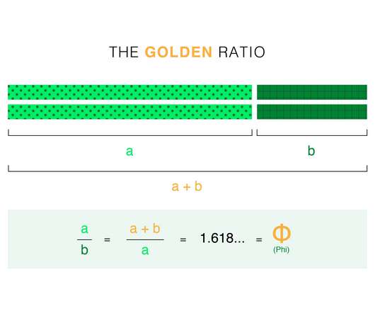
What do the Pyramids of Giza and Da Vinci’s Mona Lisa have in common with Twitter and Pepsi? Quick answer: They are all designed using the Golden Ratio. The Golden Ratio is a mathematical ratio. It is commonly found in nature, and when used in a design, it fosters organic and natural-looking compositions that are aesthetically pleasing to the eye.
By removing distracting items and sharpening the main topic, cropping helps images follow the rule of thirds. Everyone enjoys taking pictures of kids. It’s challenging to capture a joyful youngster satisfactorily when the child is always on the run. You can learn more about the best camera settings for child photography.
Lessons from nature and technology Imagine a design system that evolves organically, free from the constraints of centralized control. A system where updates and patterns emerge naturally from its users, where collaboration isnt just encouraged but woven into its fundamental architecture.
Worm Rules Free Font 26. In the cutting-edge realm of digital design, staying updated with the latest trends is crucial. Whether you’re a graphic designer, brand strategist, or a business owner looking to elevate your brand’s visual identity, choosing the right font can make all the difference. Super Bakery Free Font 18.
When building exposure for your business, you need to get the word out to drive traffic to your website. And you need to use some sort of marketing strategy to do it. One of the most commonly used strategies to drive traffic to a website is SEO. Unfortunately, that means that these types of baseline SEO tactics aren’t enough anymore.
This article has been contributed by Ashley Lipman. In the 1800s, playwright Henrik Ibsen coined the phrase that would evolve into the adage, “a picture is worth a thousand words”. While the way we consume imagery has evolved dramatically over the past two hundred years, that phrase still rings true — especially in social media and marketing.
This rule of thumb works the same for big corporations and individual bloggers. As creating a website becomes simpler and more affordable, both individual bloggers and businesses must struggle with ever-growing competition for eyeballs on their content. As a result, promoting a new blog can become a challenging undertaking.
In the very Italian setting of the main cloister of the San Simpliciano – a church in central Milan, parts of which date back to the third century AD and now home to Padiglione Brera – was a very British affair. Very Good & Proper (could you find a more quintessentially English name?!),
Are you captivated by the world of graphic design or need some basic design advice for your marketing, but unsure where to start? Do you find yourself drawn to creating logos , brand identities , social graphics , and packaging , but feel overwhelmed by the complexity of it all? SPECIAL OFFER! How to Graphic Design: The Course of Fundamentals 5.0
This article has been contributed by Ashley Lipman. In the 1800s, playwright Henrik Ibsen coined the phrase that would evolve into the adage, “a picture is worth a thousand words”. While the way we consume imagery has evolved dramatically over the past two hundred years, that phrase still rings true — especially in social media and marketing.
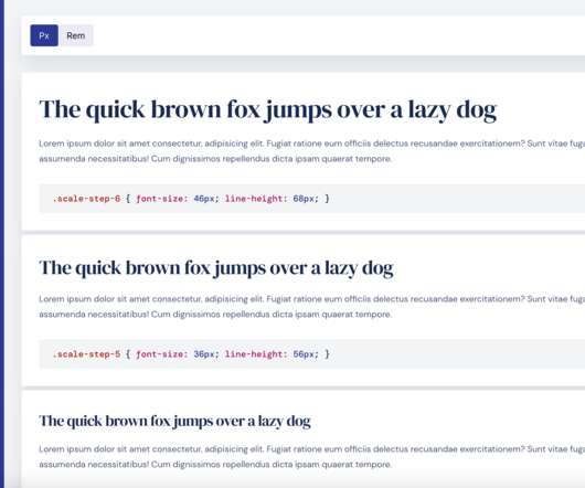
Common Typographic Scale Ratios: 1.200 — Minor Third 1.067 — Minor Second 1.125 — Major Second 1.200 — Minor Third 1.250 — Major Third 1.333 — Perfect Fourth 1.414 — Augmented Fourth 1.500 — Perfect Fifth 1.618 — The Golden Ratio. What is a Typographic Scale? What Ratios Are Used? Why are these ratios in particular used?
CSS (Cascading Style Sheets) is a crucial component of modern web design. It’s the language that gives your website its look and feel. But to truly master CSS, you need to understand the units it uses to measure things like length, angle, time, and resolution. Absolute Lengths px (Pixels) This is the most commonly used unit in web design.
Since there are no rules to collage design, you can take advantage of a variety of tools and integrate different styles and elements into your design. You can practice the rule of thirds and frame elements in the middle, create movement, or show fluidity in your design. Creating Collage Art Through Graphic Design.
Confusing and misleading graphics are all around us, but we can change this by following these simple rules. As the main goal for a line chart is to represent the trend, it's important to adapt the scale based on the data set for a given period and keep the line occupying two-thirds of the y-axis range. a time series.
They show a different version of themselves on the third wipe and revert to the original for the fourth and fifth. Fashion brands could leverage this challenge by partnering with an appropriate influencer who wears their clothing during the third wipe. TikTok is not only on the rise, it’s here to stay. Wipe It Down Challenge.
Ultimately these innovations will evolve the way brand systems are traditionally delivered, in the form of static brand guidelines, to a new suite of bespoke creative tools that empower designers and non-creatives alike to translate brand rules into real-time communication artifacts and multi-channel creative. Photo courtesy of Eric Li.
Since the arrival of covid-19, every business has been trying to become digital. They tend to sell their products or services by developing a website. For this purpose, they tend to do digital marketing for their companies. It is impossible without the incorporation of exceptional SEO practices. Download Now. Top SEO Trends 2022. Just cheers!
As such, you can utilize a third-party service to print them into a Google photo book , which can be filled with images of your choosing, with customizable covers and layouts. One of the hallmarks of uploading digital pictures is sharing, and the tool isn’t an exception to the rule. At a monthly fee of just $1.99
When it doesn’t, we experience an interruption to our state of flow (more about this later) that throws us into cognitive strain, and the design has failed. This can easily happen when basic design principles have been ignored, resulting in a design that doesn’t “hang together.” The design is striking in its simplicity and elegance.
Foreword: I worked now 6+ years with Design Systems (DS). I was there when it started ( Check this ), and now I am here writing about what it has become. A buzzword, with a lot of noise around, that has made it very difficult to find reliable sources. Some of them became real icons. Some of them became real icons. Adoption once again is key.
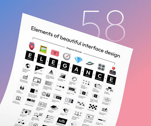
Simple rules guide you towards appropriate design decisions and help you make a more compelling case for decision-makers. Design Principles are an assortment of considerations that form the foundation of any good product design. Here are ten principles that can help you create more usable, effective, and immersive designs.
When it comes to corporate video, there are A LOT of terms that get thrown around. And let’s be honest, if you don’t work in video then this might seem like a whole load of gibberish. Have you got your bokeh right? Have you considered three point lighting? Have you set your camera’s shutter speed to 60? Download now. The Video Brief Template.
This archaic statement may seem like hyperbole, but saying that images speak louder than words is no exaggeration. We are an inherently visual species. Vision is the sense we rely on most, a fact reflected by how complex our eyes are in relation to other creatures, including our canine best friends. Let’s hark back to history again, shall we?
When was the last time you were blown away by a stunning creative poster design? “Wow, how amazing is that?” ” you must have thought. Maybe you also asked yourself a few questions: “Who made this poster?” ” “How did they get the creative poster design idea or inspiration?” I have your back.
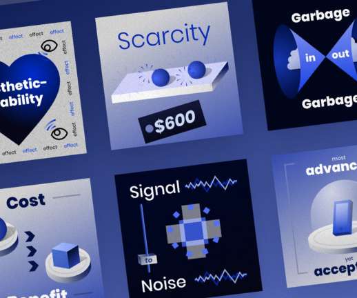
Whether you are a seasoned designer looking to refresh your approach or a novice eager to learn the ropes, these rules are tailored to help you create interfaces that are not just visually appealing but also intuitively functional. Crafted to be your ultimate roadmap in the journey of UI design.
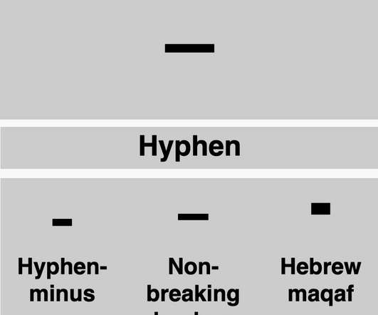
Instead of just ignoring them, as many readers perhaps do, we want to explore these characters to help you make sense of them. Understanding what you’re reading and its purpose in the written word will increase your enjoyment and comprehension of the text. This applies both to readability and legibility. It is also known as the and sign.
We organize all of the trending information in your field so you don't have to. Join 66,000+ users and stay up to date on the latest articles your peers are reading.
You know about us, now we want to get to know you!
Let's personalize your content
Let's get even more personalized
We recognize your account from another site in our network, please click 'Send Email' below to continue with verifying your account and setting a password.


Let's personalize your content