This site uses cookies to improve your experience. To help us insure we adhere to various privacy regulations, please select your country/region of residence. If you do not select a country, we will assume you are from the United States. Select your Cookie Settings or view our Privacy Policy and Terms of Use.
Cookie Settings
Cookies and similar technologies are used on this website for proper function of the website, for tracking performance analytics and for marketing purposes. We and some of our third-party providers may use cookie data for various purposes. Please review the cookie settings below and choose your preference.
Used for the proper function of the website
Used for monitoring website traffic and interactions
Cookie Settings
Cookies and similar technologies are used on this website for proper function of the website, for tracking performance analytics and for marketing purposes. We and some of our third-party providers may use cookie data for various purposes. Please review the cookie settings below and choose your preference.
Strictly Necessary: Used for the proper function of the website
Performance/Analytics: Used for monitoring website traffic and interactions
As part of a two-year collaboration with How&How, the conservation charity reinvents itself with a new logo, custom typeface and migration-inspired patterns. The result of this process was a brand idea that How&How called 'Force for Nature'. How&How also incorporated expressive pattern overlays into the designs.
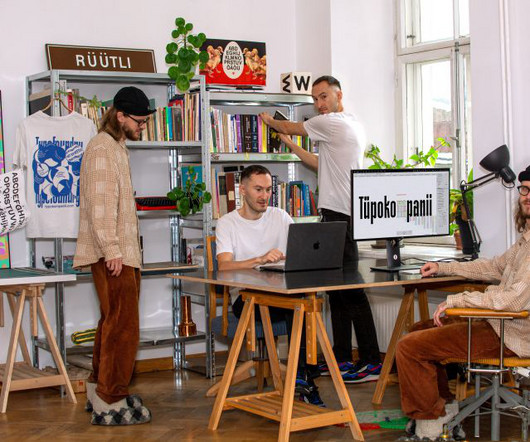
Blending local heritage with experimental design, the duo creates unique typefaces that push the boundaries of traditional type design. Based in Tallinn, Estonia, type design studio Tüpokompanii prides itself on a "mistake-driven" approach, thrives on seeking out letterforms' "unexpected qualities", and is a "design-driven" studio.
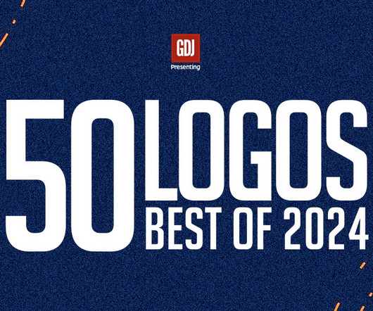
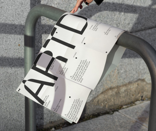
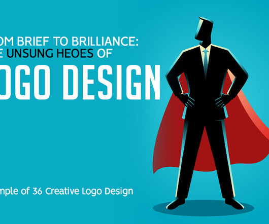
The collection of 50 best logos of 2024 you need to see and spark your creativity showcases innovative designs that are redefining logo concepts and visual branding. From startups to established brands, these logos set the bar for creativity and professionalism. These logos reflect innovation, elegance, and adaptability.
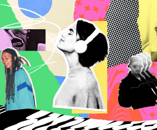
While brands might have once limited this to an audio logo alone, they're increasingly developing a full sonic identity, covering everything from UI audio elements to background music. Logodesign to musical motifs Elements of your logodesign can inspire musical motifs.
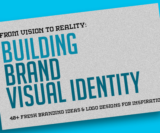
Creating a powerful brand with a unique visual identity requires more than just logodesigns; it’s about building an emotional connection, crafting an impactful message, and visually representing values. Through strategic logodesigns, which become symbols of the company’s voice, mission, and goals.
The world of visual design is constantly evolving, and 2025 promises to deliver some of the most exciting transformations yet. With rapid advancements in technology, the rise of artificial intelligence, and a renewed focus on sustainability, design is becoming more dynamic and inclusive.
The Huion Kamvas 16 is a versatile drawing tablet that has garnered attention in the graphic design community for its impressive features and performance. Design and Build Quality The Kamvas 16 boasts a sleek and modern design, featuring a 15.6-inch inch full HD display with a resolution of 1920 x 1080 pixels.
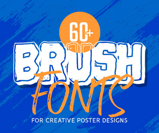
The ultimate collection of creative Brush Fonts for posters is here to inspire and elevate your designs. Designed to stand out, brush fonts are perfect for professional and personal projects alike. These fonts not only save time but also enhance the visual appeal of your designs, making them impactful and memorable.
Unlimited Downloads Over 1,500,000+ Fonts, Mockups, Freebies & Design Assets Mockups 6,131 items Fonts 5,191 items Download Now His portfolio showcases a diverse range of projects that highlight his mastery in creating visually captivating designs.
From the midcentury script typography to the playful supporting illustrations and colour palette to the custom plaid and argyle patterns, everything is designed with tongue-in-cheek. The final designs also incorporated influences from the 1980 American sports comedy Caddyshack and Wes Anderson's more recent movies.
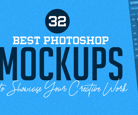
In the graphic design world, presenting your work effectively is crucial. These digital tools allow designers to showcase their creations in a realistic setting, making it easier for clients and stakeholders to visualize the final product. When selecting Photoshop mockups, consider the relevance of the mockup to your design.
Reflecting its commitment to social change, the Hague-based design agency has crafted a colourful and impactful new identity for itself. Located in The Hague, Netherlands, JUST is a design agency deeply committed to making a societal impact. Wonder, in turn, is the feeling experienced when interacting with a product they've designed.
Global environmental action NGO WRAP has a new informative yet striking identity, designed by the London-based studio Among Equals. To find this sweet spot, Among Equals went through several design iterations of the logo - which informs everything else in the identity - to find the right balance of 'brokenness'.
Whether you’re a budding graphic designer, a digital illustrator trying to keep up with client orders, or a UX designer organizing prototypes, there are plenty of tools that can help manage your creative workflow. Its search functionality alone makes finding “that one logo file from two months ago” a breeze.
And rather than being a mere "add-on" to brand identity, it needs to be integrated into the brand identity process from the very start. Traditionally, brand identity focused on static elements: logos, colour palettes, typography and tone of voice. Circular movements and fluid transitions weren't just designed for visual appeal.
Every creative should know about these 25 design studios and learn from their inspiring work. In a world overflowing with creativity and design innovation, there are thousands of outstanding design studios to be inspired by. The studio fuses strategy with design to create dynamic and culturally relevant work.
Image licensed via Adobe Stock Many clients don't fully appreciate what graphic designers can offer them. There are many good things about graphic design, including the potential to earn a decent salary, engage in hybrid or remote working, and do fulfilling, interesting work. There's more to a brand's identity than a logo.
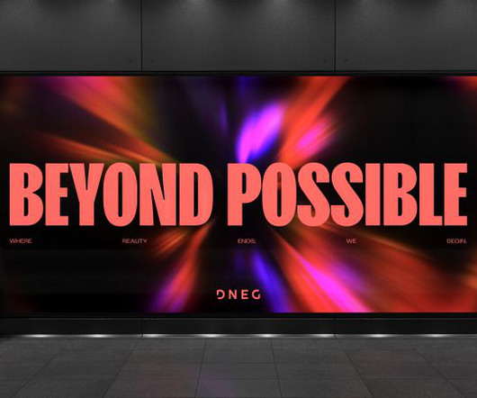
We wanted to bring the right energy to the brand experience by defining the unique DNEG perspective, attitude, and mindset - their 'Who'," explains DesignStudio design director Lorenzo Di Cola. At the heart of the new identity is a dynamic Vision animation, representing the transformative process that defines DNEG's work.
The new design tackles challenges unique to India's retail environments, including low lighting and visibility. Taxi Studio has revealed its work on Carlsberg Elephant, which was designed to communicate its new premium position in India's evolving drinks market.
Studio Curious Circle Location: Seoul, South Korea Put Simply is a Korean skincare brand that caters to sensitive skin, and is designed to strip away the complexities of skincare routines. The design uses clear, easy-to-read labels and minimal jargon, making it easy for consumers to know exactly what they're getting.
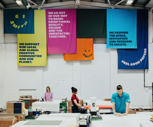
A deep dive into how design studio TEMPLO reimagined GF Smith's brand identity, balancing heritage with a bold, dynamic vision that embraces colour, movement, and a global creative community. Breaking Away from the Past GF Smith's previous identity, designed in 2014, was widely respected in the design world.
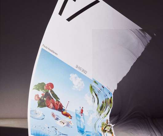
The independent creative director, designer and illustrator is a branding specialist with her work winning multiple awards since she graduated in graphic design from the Lahti Institute of Design. At the beginning of the designprocess, I started immersing myself in technical and scientific details of photography.
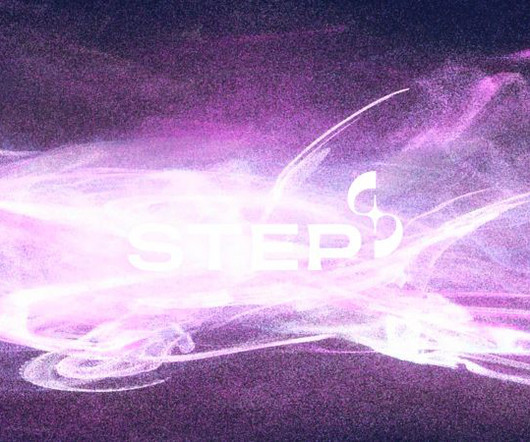
Among Equals is behind the identity for new UK energy programme STEP, designed to position the brand as ambitious as NASA's Apollo missions. He also notes how many fusion brands rely heavily on sun-related visuals - think sun-based emblems and orange and yellow colour palettes - because fusion is a process happening at the heart of the sun.
The design industry is charging forward into 2025 with excitement and renewed purpose. From sustainability strategies and AI-driven creative processes to fostering new talent and redefining brand simplicity, these thought leaders have shared their visions and strategies for 2025 with us. Feeling uninspired? Take heart!
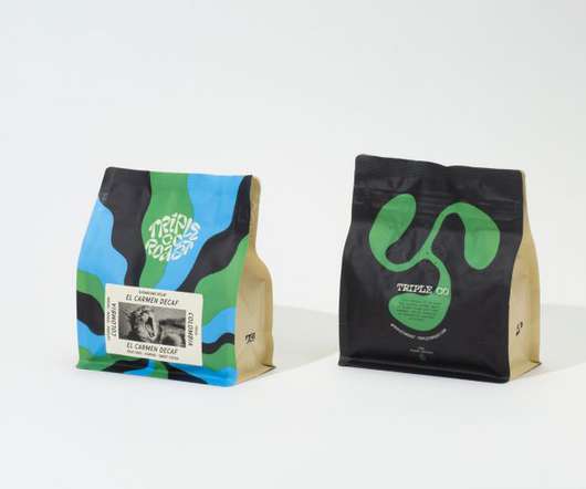
We're big fans of Belfast branding studio Angel & Anchor ; back in March, we reported on their VHS-inspired identity for speciality coffee roaster Process. Fundamentally, it was a collection of design elements that lacked connection with each other. Design elements. Bristol-based speciality coffee roaster Triple Co.
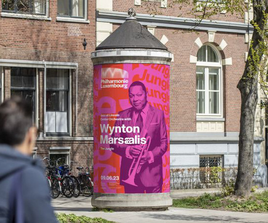
Designed by architect Christian de Portzamparc, it's a stunning building boasting excellent acoustics and an iconic frontage, instantly drawing the eye with its 823 facade columns made of white steel. The logo NB's logodesign takes its cue from Philharmonie's iconic building, an architectural landmark in Luxembourg.
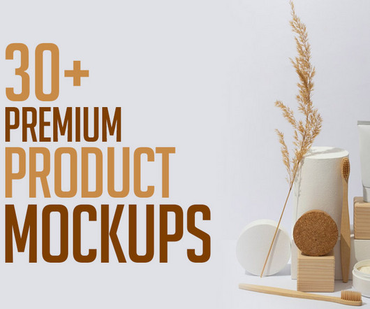
When it comes to showcasing your designs, nothing beats the power of high-quality mockups. Whether you’re working on packaging mockups , branding, or product designs, premium product mockups can make your work stand out and elevate its appeal. Using premium mockups allows you to visualize your designs in real-life scenarios.
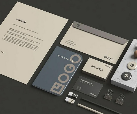
When presenting a brand to clients or stakeholders, one of the most powerful tools is a well-designed stationery mockup. Stationery mockups provide a realistic, cohesive look at how a brand’s design elements will appear on everyday office items, helping to communicate a company’s visual identity clearly and effectively.
"A strong relationship is mutually collaborative, never dictatorial, where solutions come with strategic rationales, thinking is shared, and curious questions are asked," says Wedge founder and chief design officer Justin Lortie. Achieving the equivalent vibrancy of a full CMYK process required meticulous colour separation," says Lortie.
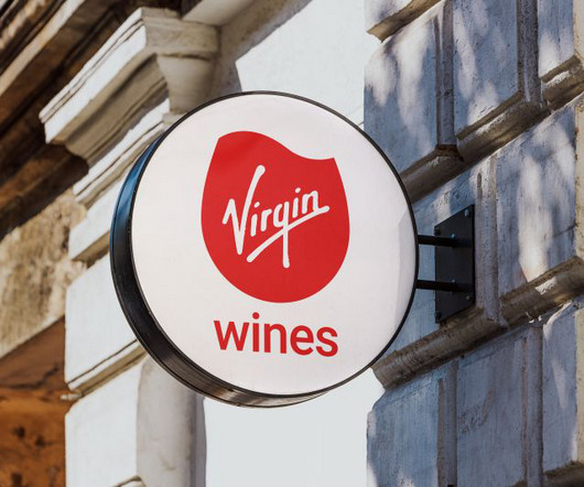
Virgin Wines has introduced its first major rebrand in two decades, including a fresh logo, colour palette, and typography. Crafted by Norwich agency Borne , it's designed to breathe new life into the range and emphasise the "joy of wine from grape to glass". This new logo replaces the previous static wine glass mark.
Specifically, it matches talent in design, product, engineering, and marketing with startups, agencies, and corporations across Europe. And so they turned to Hyperfocus , a young and eager boutique agency based in Hamburg that sits at the intersection between brand and product design. Naming process So, how did they go about naming? "We
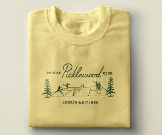
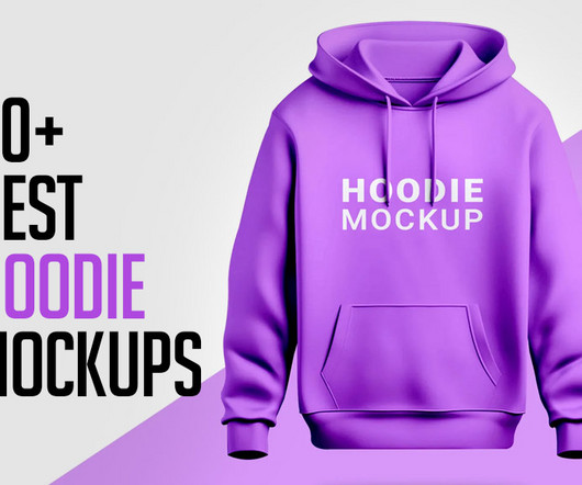
Design like a pro, 50+ Best Hoodie Mockups to download for your apparel showcase branding. Whether you’re launching a clothing line or designing hoodies for personal use, high-quality mockups ensure your creations stand out. Using professional hoodie mockups elevates your design presentation. Need extra help?
Tips for getting your graphic design project featured (one being, send us lots of visual assets/mockups) Mockup via Art Directed Want to see your graphic design work featured in this online magazine? Explain the problem or challenge they were facing and how your design solution addressed it. All context is useful.
Elevate your logodesign skills with our curated selection of the best logodesign tutorials of Adobe Illustrator. In the dynamic world of graphic design, logos stand as the visual embodiment of a brand’s identity. The Modern T LogoDesign In Adobe Illustrator Tutorials 5.
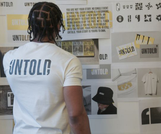
Here Design recently worked with a group of young offenders in prison to design a new identity for Untold, a charity that offers vocational training for young men in UK prisons. Headed up by UAL professor Lorraine Gamman, the DAC provides graphic support on initiatives designed to support effective rehabilitation.
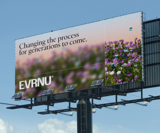
We were massively inspired by Evrnu's mission and ethos, which serendipitously aligns with our design vision: great design connects hearts and minds and, in this case, science and nature," says Coralie Carré, Creative Director at DEPT. "We As for the NuCycl logo, this contains a nod to the brand's circular mission in its letter shapes.
Image licensed via Adobe Stock Whether you're a pro designer or an entrepreneur without design skills, Adobe Express can revolutionise your content creation. Designer/founder Aseil Amgheib and 'small biz babe' Angel White explain why it's an essential tool in their workflow. I just design on the go."
The vector logo templates are pre-designedlogo graphics that are created using vector graphics software Adobe Illustrator and Photoshop. Vector logo templates are widely used by businesses and individuals to create professional-looking logos quickly and affordably. When Is The Perfect Time For A Logo Redesign?
Designing modern, creative logos is a blend of art, psychology, and strategy. A well-crafted creative logodesigns communicates a brand’s identity, captures the essence of its business, and leaves a lasting impression on its audience. An effective logo can leave a positive and memorable first impression.
Creating a company logo is something that’s part of this process, and a fair amount of time needs to be dedicated to this because, for the most part, your logo is often the very first glimpse of your company to those looking from the outside. Iconic brands can be recognized by their logo.
Before we delve into the distinctive world of Studio n.io.s – an independent graphic design studio based between Prague and Shanghai – it's essential to understand the roots from which this creative powerhouse emerged. Founded by Ki Yang, a visionary designer hailing from Shanghai, Studio n.io.s is one of the 0.1% is one of the 0.1%
Logos are everywhere. The truth is, a great logo is the culmination of meticulous planning, creative exploration, and unwavering dedication – a testament to the tireless efforts of logodesigners. Hide ] Table of Content Ready to Spark Your Own Design Journey?
Instead, the design zeroes in on the institutions broader mission: to make the world of sound from alpine folk traditions to experimental music accessible to a wider, international audience. Visually, we wanted people to see the design and inevitably think of sound and resonance, he says. This gave us time to let things mature.
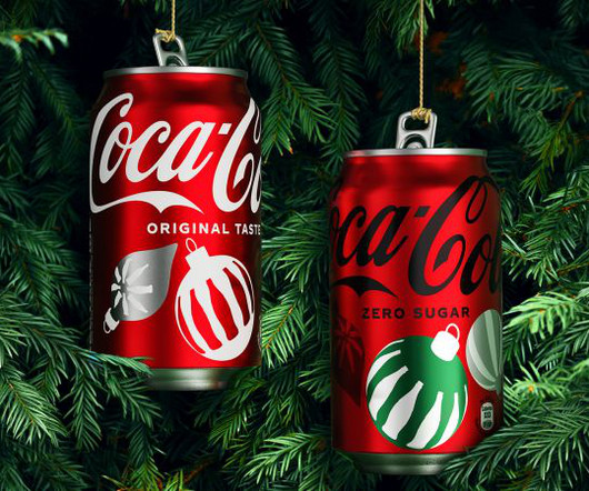
We chat with Rapha Abreu, VP of design at The Coca-Cola Company and Kristie Malivindi, creative director at John Knowles Ritchie, to learn how they collaborated on a new holiday campaign identity for the world's most popular beverage. And this new global toolkit is a stylish combination of nostalgia and modern design.
We organize all of the trending information in your field so you don't have to. Join 66,000+ users and stay up to date on the latest articles your peers are reading.
You know about us, now we want to get to know you!
Let's personalize your content
Let's get even more personalized
We recognize your account from another site in our network, please click 'Send Email' below to continue with verifying your account and setting a password.


Let's personalize your content