This site uses cookies to improve your experience. To help us insure we adhere to various privacy regulations, please select your country/region of residence. If you do not select a country, we will assume you are from the United States. Select your Cookie Settings or view our Privacy Policy and Terms of Use.
Cookie Settings
Cookies and similar technologies are used on this website for proper function of the website, for tracking performance analytics and for marketing purposes. We and some of our third-party providers may use cookie data for various purposes. Please review the cookie settings below and choose your preference.
Used for the proper function of the website
Used for monitoring website traffic and interactions
Cookie Settings
Cookies and similar technologies are used on this website for proper function of the website, for tracking performance analytics and for marketing purposes. We and some of our third-party providers may use cookie data for various purposes. Please review the cookie settings below and choose your preference.
Strictly Necessary: Used for the proper function of the website
Performance/Analytics: Used for monitoring website traffic and interactions
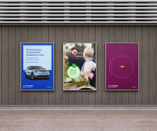
SomeOne founding partner Simon Manchipp delves into their recent project with the Motability Scheme, explaining why brands in this sector need to change. He says: "It was clear that the new branding work needed to create ways to better explain the Scheme's full offering, making it more representative, positive, and straightforward.
Colours are a fundamental part of graphic design, but even using them in a seemingly 'incorrect' way can produce striking, eye-catching results. And it's these colourschemes that rip up the rule book, which is the focus of a new book recently released by Counterprint.
Just as visual elements like logos and colourschemes create recognition, a well-crafted sonic identity can instantly trigger brand associations and emotional responses. Colour palette to tonal quality Try translating your brand's colour palette into musical tones and see what happens.
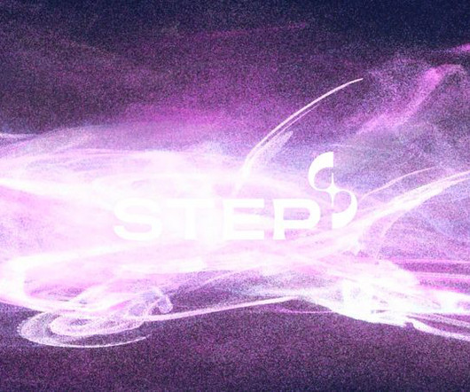
While brands in the fusion space are already falling into stereotypes, STEP is standing out from the crowd with a colour palette inspired by the synthetic image of future plasma. Among Equals is behind the identity for new UK energy programme STEP, designed to position the brand as ambitious as NASA's Apollo missions.
The work of London-based illustrator and animator Anna Broadhurst is instantly recognisable thanks to its distinctive colours and use of dynamic geometric shapes. Inspired by the strong shapes and bold colours of Petra Eriksson, Anna has channelled this influence into her work to create in-your-face yet visually pleasing images.
The National Education Nature Park is a scheme to help educate kids about nature. Design agency Out of Place Studio explains how it crafted its visual identity. It's not one single park but a scheme to link up a vast network of natural spaces connected with nurseries, schools and colleges, all working together.
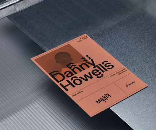
Type foundry and design studio F37 has created a mature new look for Manchester's underground trance scene, Majefa. Boasting dynamic typography and colours inspired by rave culture, the identity is a celebration of the UK's clubbing aesthetic. As it turns out, F37 had already been working on the perfect design by chance. "On
Yellow and black colourschemes. Rather than launch with typical design industry fanfare, F37 wanted something that gave back to the city that inspired it. The brief came to us with a lot of stuff of what they didn't want," recalls Ellen, who collaborated with designer Craig Oldham on the project. Worker bees.
Manchester-based designer Ben Clark explains how he went about it. For branding, they turned to Ben Clark Design , an independent design practice based in Manchester, specialising in branding and visual identity. Branding Best Workplaces in Travel required balancing several themes.
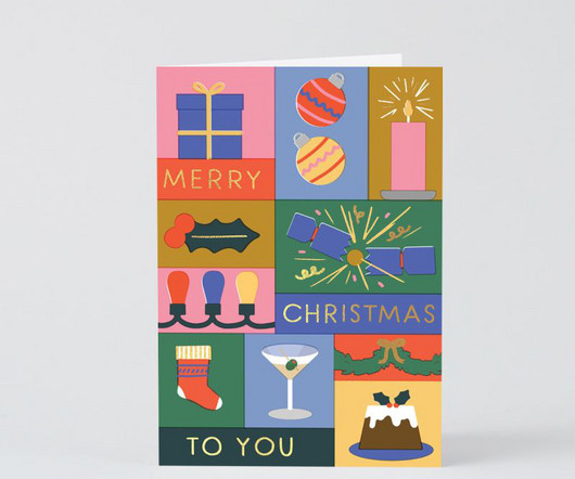
To show solidarity, we have assembled a selection of festive cards by artists and designers – perfect to send this Yuletide to your friends, colleagues, and loved ones. With not a moment to lose, here are this year's recommended festive cards for Yuletide 2023 by independent artists and designers. Where does the time go?
The Münster School of Design graduate discusses her creative journey so far and how she has developed her unique style. Julia Wand is an illustration and graphic design graduate of the Münster School of Design in Germany. In my opinion, illustration and graphic design go hand-in-hand together," she explains. "In
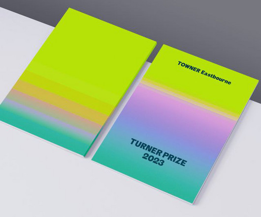
Innovative design meets coastal inspiration – we take a closer look at the Glasgow branding studio's vision for one of the world's most celebrated visual arts awards. Tangent's design cleverly integrates the existing Towner brand elements, such as typography and colour, presenting the Turner Prize as a natural extension of Towner's identity.
Illustrator, digital designer and creative artist Humberto Cruz has been making waves on Instagram thanks to his unique pop culture-inspired style. Even if you do not immediately recognise the name Humberto Cruz, chances are you will recognise his work via his studio name, I Scream Colour. And it's easy to see why. Why Everpress?
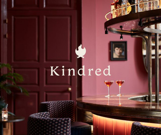
Go-to design team for edgy and cool interiors also chosen to revamp the club's brand. The design team started by re-working Kindred's logotype and campfire logomark. They also created a darker and richer colour palette, taking cues from the refreshed interior styling.
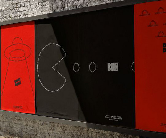
Quebec-based audio studio DOKI DOKI specialises in creating original music and sound design for video games. While characters, story and gameplay draw players in, effective sound design helps to bring these virtual worlds to life and make them feel rounded and more enjoyable. Sound is the unsung hero of video games.
To help reframe its narrative, Stereolabs turned to global design consultancy Pentagram to craft a new brand identity for them. The identity is designed to work across Stereolabs' outputs, from website, marketing, and trade shows to the product itself.
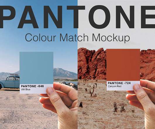
Access All Areas members have a really unique collection of Photoshop mockup templates to download this week, courtesy of New Tropical Design Studio. These Pantone Colour Swatch Mockups help you quickly and easily create trendy photographs, style guides, and cool social media content. Find out more about New Tropical Design.
James Olstein chats to us about his love of zines, how web design led to his career as a freelance illustrator, and how his love of screen printing has shaped his work as a digital artist. I really wanted to learn how to make my own, which is how I discovered graphic design." He struggled to find employment for a couple of years. "I
In today’s Adobe Illustrator video tutorial I’m going to show you how to create an outdoors themed badge design, featuring a simple mountains graphic and colourful sunset effect using a retro colourscheme. Watch my Tattooine Embroidered Patch Design Illustrator Tutorial – [link]. ?
But instead of illustration, she initially focused on interior design. However, she reveals that her background in interior design was not a waste of time; in fact, it continues to feed into her work, which is instantly recognisable by its rich tones and cheerful aesthetic, to this day.
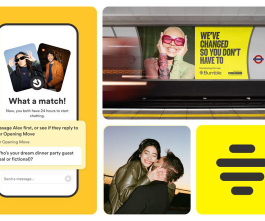
In short, the app is doubling down on its mission, with updates designed to give women even more choice and control when initiating connections. "We Alongside the product update, Bumble has unveiled a new visual identity with a refreshed logo, colour palette, typography, and custom illustrations. Hate dating apps?
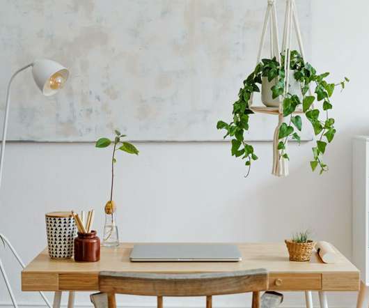
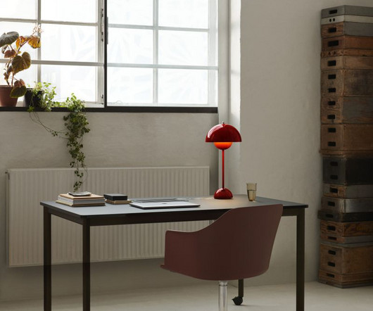
Artists, designers, makers and photographers will all require different tech and tools for their work, but we can all agree there are some things that we could all benefit from to enhance our desk space. The desk classic in a design that pops: Anglepoise & Paul Smith Type 75 Table Lamp. Via The Conran Shop. Priced from £210.
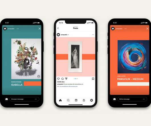
Designed to build on Art Republic's success, the new approach also aims to challenge the status quo of the art sales marketplace. Settling on the idea of a more playful and accessible approach, the new strategy and brand identity are designed to bring Art Republic to the attention of mainstream audiences.
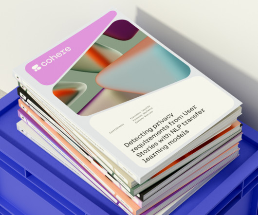
Described as a language AI platform, Cohere is designed to be used today by any software engineer at any company. Our custom-designed typeface became vastly customisable with each letterform being able to be split at any point." That's where Cohere comes in. Our Voronoi plains became textured pebble structures.
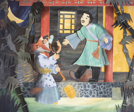
She's worked with clients throughout the US, creating children's book illustrations, editorial designs, promotional illustrations, puzzles, seed packets, and more. Shelley loves exploring different possibilities of colours, shapes, layers, and textures in pieces of paper. Asian folklore stories are among her biggest inspirations.
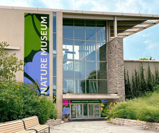
Span has designed a new identity for Chicago's Nature Museum, taking inspiration from Illinois's native prairies. Organizationally, the Nature Museum is also part of the 167-year-old Chicago Academy of Sciences, meaning there were some complexities to consider when designing its new identity. "We
And so they turned to OHMY , a digital-first design studio based in Warwickshire that "builds brands, websites and apps for ambitious businesses" to craft a new identity. Logo and typography For the logo design, the team focused on creating a strong wordmark based on Aro from Good Type Foundry. "We And who isn't interested in that?
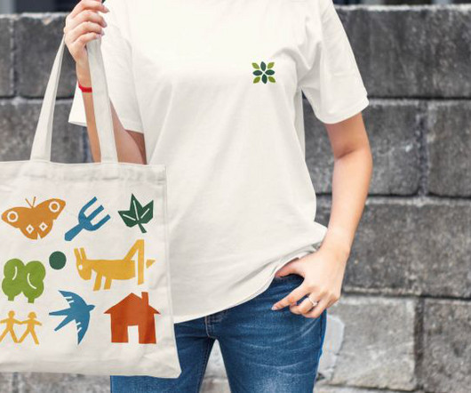
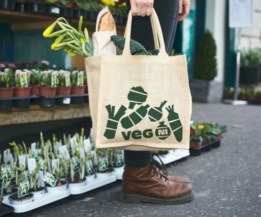
From the off, the wholesome project was based on a very tight budget, with funding awarded via a grant from the Agri-Food Co-op Scheme. The colour palette is primarily an earthy green with different veg icons in their natural colour – for instance, the vibrant orange carrot and the cheerful purple beetroot.
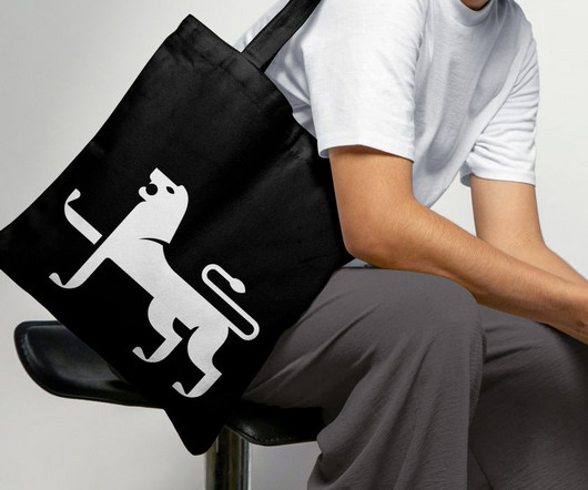
Seeking a refreshed modern identity for the store, Jarrods turned to award-winning design studio The Click , a local firm led by Bobby Burrage. Design inspiration The team got their inspiration from a pair of heraldic lions located just across the medieval marketplace from the grand facade of Jarrolds' flagship store.
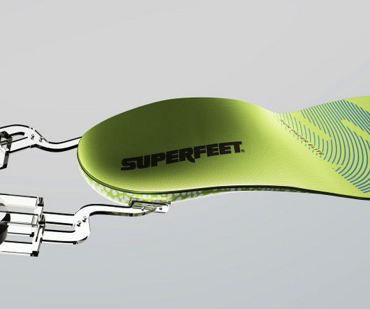
More than just a tagline, it's a strategic platform designed to celebrate and amplify the diverse ways people rely on movement – from marathoners chasing personal bests to nurses logging twelve-hour shifts. Then there's the recharged neon "Super Green", derived from Superfeet's best-selling insole, which anchors the whole colourscheme.
Follow along with today’s Adobe Illustrator tutorial to create a colourful text effect, which comprises of a stack of text elements that transition through the colour spectrum to produce a rainbow effect. Use any size to suit your final application, but ensure the RGB mode is set so the most vivid colours are available.
In today’s Photoshop tutorial I’ll show you how to easily create cool looking vintage logo designs by combining antique illustrations with some visually interesting text styles and layouts. Unless you’re a talented artist who can illustrate detailed drawings by hand, we will need some assets to make use of within our design.
After completing his training as a graphic designer, he found himself drained and unfulfilled in the world of advertising; it became apparent that he craved more autonomy. "It Jonas' journey to where he is today started with a little detour. Fueled by this desire, he embarked on a new path, studying Fine Arts in his hometown.
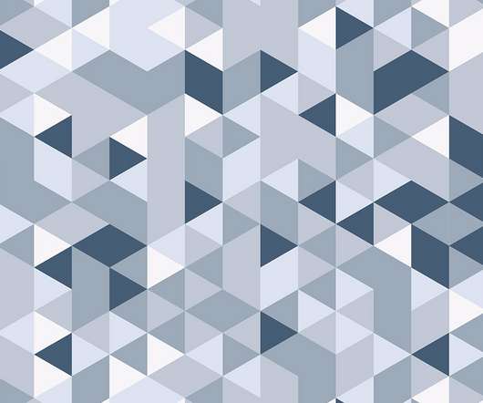
In today’s Adobe Illustrator tutorial I’m going to show you how to create a geometric pattern using tessellating triangle shapes with a randomised colourscheme. This detailed mosaic effect is ideal for adding colourful backgrounds to your designs, or even as interesting abstract poster art. Assets Used. ?
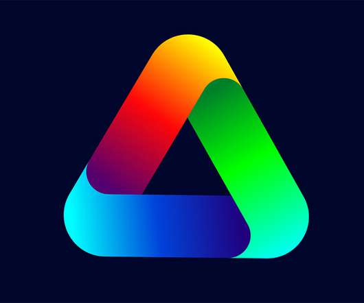
In today’s Adobe Illustrator tutorial I’m going to take you through the process of creating a colourful gradient logo icon. I’ll show you how Illustrator’s shape tools make it easy to construct the basic vector design, then we’ll apply a vibrant colourscheme using gradients.
Learning how to convey a narrative with your layouts and typography is a must if you want a career in graphic design. Understanding how to weave stories with graphics is crucial whether you’re an experienced designer or a newcomer to the profession of graphic design.
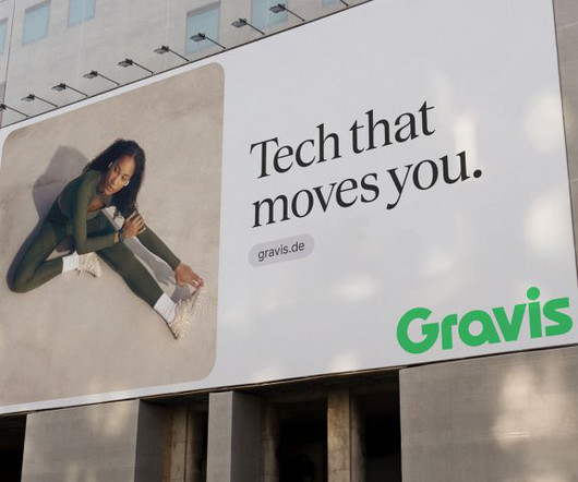
The result is a striking and iconic logo paired with a vibrant colourscheme that reflects the spirit of innovation. The colours, typography and art direction all add up to a brand refresh that feels, well, quite refreshing. Gravis is Germany's premier tech retailer and one of the nation's largest Apple resellers.
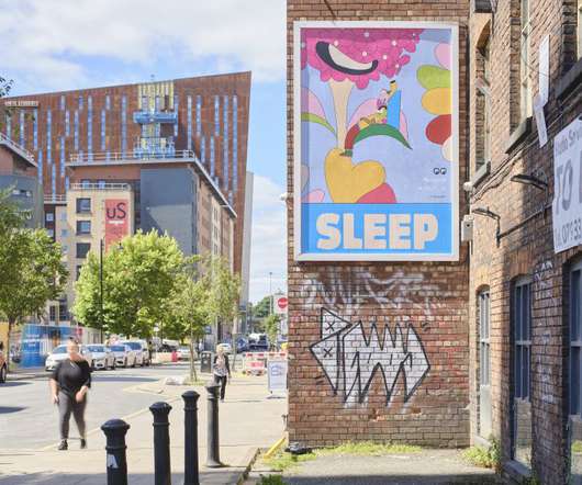
Collaborating with artist, designer and curator Micah Purnell as part of his Add-Art scheme, the giant posters feature artworks by leading illustrators Fuchsia MacAree and Murugiah. Award-winning artist and designer Murugiah is behind the second artwork. Award-winning artist and designer Murugiah is behind the second artwork.
Mastering the Art of ColourSchemes in Design Were you aware that colour can summon strong feelings and change our moods, choices and actions? This is why choosing a suitable colourscheme for any design, be it a website, logo, product package , or interior space, is necessary. That’s SATURATION.
Counting a new logo, typeface and signature colourscheme amongst the company's refresh, the overhaul is striking and upbeat, featuring visual references to classic and modern pop art and culture. Alongside the rebrand, Yellowpop launches its latest collection of original neon designs.
In today’s Photoshop tutorial I’m going to show you 5 ways to create the trendy Duotone look, the colourful photo effect where the shadows and highlights of an image are replaced with vibrant contrasting hues. Check out Envato Elements for Unlimited Design Asset Downloads and Get 50% off Annual Membership – [link].
Midlands-based illustrator Katie Louise Thomas specialises in creating colourful, vector-design-based artwork across packaging, cartography and editorial. To learn more about her work, we sat down with Katie to discover why she likes vector design, how she tackles creative briefs, and what exciting project she's currently focused on.
Flowerpot VP3 Vermillion Red I Collect Glass SC60 Amber Illuminate your workspace with designer flair with our curated selection of iconic table lamps and budget-friendly alternatives. So why settle for mundane lighting when you can elevate your surroundings with iconic designer table lamps that double as functional art?
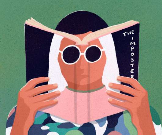
Illustration by Mia Angioy for Creative Boom Today, we kick off a special six-part series focused on the use of music in modern design. We've partnered with Epidemic Sound to bring you a six-part series of articles focused on the use of music in modern design. Yet there's just one problem.
We organize all of the trending information in your field so you don't have to. Join 66,000+ users and stay up to date on the latest articles your peers are reading.
You know about us, now we want to get to know you!
Let's personalize your content
Let's get even more personalized
We recognize your account from another site in our network, please click 'Send Email' below to continue with verifying your account and setting a password.


Let's personalize your content