This site uses cookies to improve your experience. To help us insure we adhere to various privacy regulations, please select your country/region of residence. If you do not select a country, we will assume you are from the United States. Select your Cookie Settings or view our Privacy Policy and Terms of Use.
Cookie Settings
Cookies and similar technologies are used on this website for proper function of the website, for tracking performance analytics and for marketing purposes. We and some of our third-party providers may use cookie data for various purposes. Please review the cookie settings below and choose your preference.
Used for the proper function of the website
Used for monitoring website traffic and interactions
Cookie Settings
Cookies and similar technologies are used on this website for proper function of the website, for tracking performance analytics and for marketing purposes. We and some of our third-party providers may use cookie data for various purposes. Please review the cookie settings below and choose your preference.
Strictly Necessary: Used for the proper function of the website
Performance/Analytics: Used for monitoring website traffic and interactions
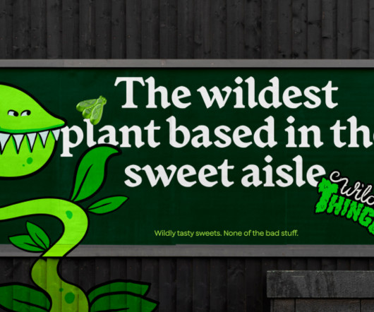
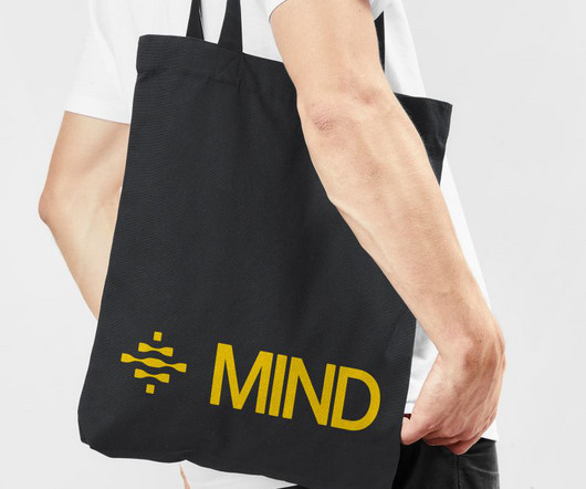
How&How helps Wild Thingz build a category-defining rebel sweetie brand from scratch – something that pleases both parents and kids. The project began by examining the existing category to see if there were any opportunities. Yet the 'bad sweets' are an explosion of bright colours, flashy logos, and exciting in-pack games."
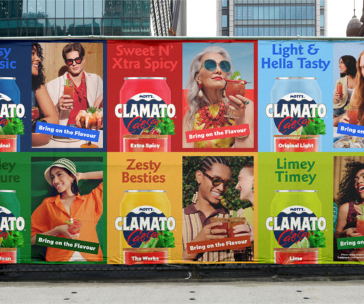
Instead, Wedge turned to the food category for inspiration, tapping into a world of flavours to express Clamato's unique portfolio of taste offerings: Spicy, Salty, Savory, Zesty, Peppery, Fiery, Umami, Limey, Tangy, Briny, etc. Achieving the equivalent vibrancy of a full CMYK process required meticulous colour separation," says Lortie.
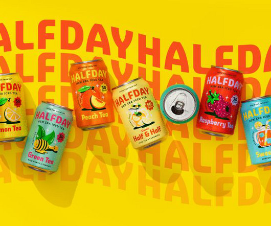
Through its new identity, HALFDAY is serving up bold colours, playful illustrations, and a healthy dose of '90s nostalgia, proving that prebiotic tea can still have a rebellious streak. At that time, brightly coloured bottles lined the shelves, brands embraced loud design, and iced tea was more about indulgence than wellness.
The rebrand draws heavily on the museum's iconic modernist architecture by Lina Bo Bardi, using a red-and-black colour palette and strong typography to reflect the building's striking visual presence. So Smith & Diction worked hard to "put weird to the test" while still developing responsible systems for logo, type and colour.
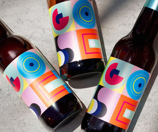
GOSE required an identity as unique as its product, which Bala delivered through semi-abstract illustrations and an acidic colour palette that reflects the beer's salty flavour. This, paired with the product's unique taste, gives meaning to the entire brand experience, which is totally disruptive in its category.
The approach reflects Eddie's understanding that clarity is a competitive advantage in complex technical categories. Swarms of letters surround, absorb and subsume forms in three-dimensional renderings animated with vibrant kaleidoscopic colours that represent data prevention and risk detection.
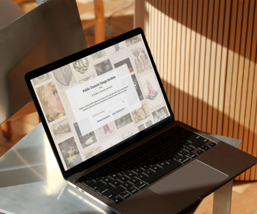
Though "small" compared to massive repositories, PDIA is still an absolute wonderland with over 10,000 images, spanning everything from medieval manuscripts and early colour photography to 16th-century illustrations of celestial phenomena and Victorian gym equipment. The unifying thread?
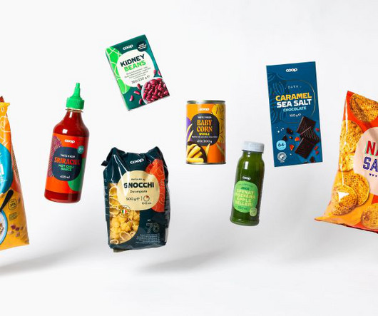
This meant that these three colours and shapes had to be avoided, and instead, a new way to apply the logo had to be presented. Flexible design system A related challenge was finding a design system that can be recognised as Coop throughout the store but allows each category to stand independently and compete with the category leader.
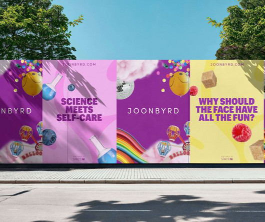
Founded by dermatologist Dr Alexis Granite, it aims to create a new category called "Affective Wellness", which combines beauty and skincare with emotional and mental wellbeing in body care products such as body wash, lotion, scrubs and serums. Their products have playful names, sweet scents, and pastel colours.
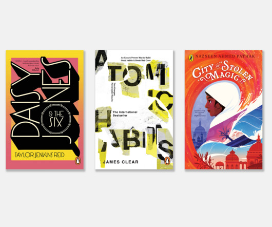
The judges went through over 1,800 submissions this year, choosing one winner for three different categories (children's, adult fiction and adult nonfiction), plus second and third-place awards. All is silhouetted by the complementary blue colour of the sea and the date palm, pointing directly at the mysterious, cooler-toned city of London.
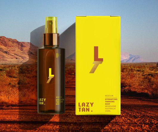
Competitor research revealed that negative perceptions, such as streaky finishes, unnatural tones, and complex routines, burdened the self-tanning category. The warm, natural colour palette reflects the product's promise of an authentic glow, while the typography balances modern sophistication with an inviting, effortless feel," says Gibbs.
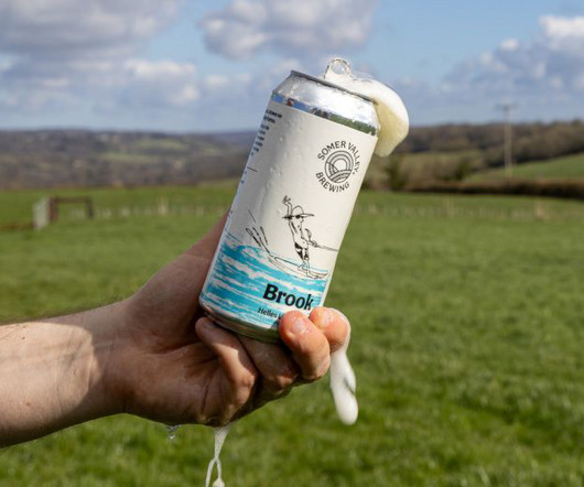
With so many almost identical packaging on the market - metal cans with blue, white and gold coloured elements - Laumann felt that "to do yet another brand with these stylistic ingredients seemed too defensive and unambitious". What more could you ask for as a branding and design agency?"
They've now unveiled playful new branding designed to reinvigorate the category appeal to a younger audience. has a strong field-to-fork family heritage, and we wanted to keep that in play while introducing a wider sense of category excitement and impact," explains Greg Taylor, chief provocation officer at Elmwood London.
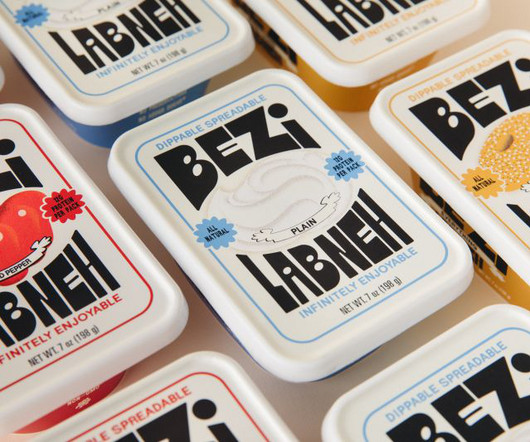
Red Antler used its expertise working with start-ups to design a category-disrupting dip for New York foodies. Luckily, Brooklyn-based studio Red Antler specialises in working with start-ups and new ventures and was excited to rewrite the rules of the dip category. The new Labneh company hit shelves across NYC this September.
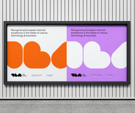
The vibrant colour palette uses shades of purple and a vivid orange that calls to mind historical graphic design greats like standards manuals. In its 13th year, categories include Apps, Film & Video, Podcasts, Social, Websites & Mobile Sites, Web3 & XR.
In an interesting twist, the renowned awards body collaborated with Pantone for the first time to create a new Special Award celebrating the best use of colour. The packaging's bold colour is mixed with red Istrian earth from the olive groves – just like the clay that was originally used to make the vessels.
This year saw a record-breaking 2,000 submissions across five categories, with the winners revealed in a special ceremony last night. Phillips, who won in the Illustration for Children category, explores themes of Jewish identity, generational divides, and gentrification in his work. Benjamin is truly a deserving winner."
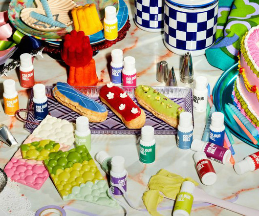
Food colouring products aren't all the same. Premium brand Colour Mill needed help to stand out from the crowd, so it turned to Universal Favourite to give it a fresh new identity. Colour Mill is a family-owned, Australian-based food colour manufacturer specialising in the 'cake and bake' industry.
Influur was already a successful enterprise, hosting a diverse community of over 30,000 creators across various categories for branded events and social media collaborations. Typography and colour palette The visual identity system uses Duplet Open, a timeless and elegant typeface that gives the brand credibility.
What has changed is the type colour, which Veltman describes as a "more sympathetic green", while the word 'Organic' has been positioned more comfortably within the mark. We see this through exciting innovations in categories such as gut health with the launch of Gut Boost drinks in their ever-growing Kefir range."
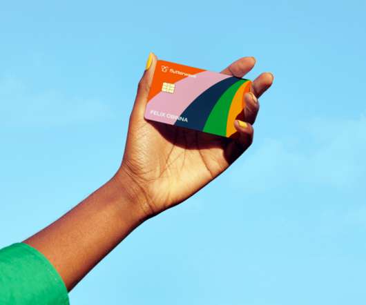
"Flutterwave is such a powerful and dynamic brand that exudes the spirit of African entrepreneurship and so our collaborative approach was critical to this, ensuring the brand remained authentically African while standing out in its category," says Roman Stikkelorum, managing director at Verve.
The Collected Works curated a colour palette that balances historical gravitas with modern boldness. The idea was to signal '"this is serious, but not that serious', "with a blend of muted and bold colours," says Fresneda. In Fresneda's view, the cover art is where everything came together as the brand's flagship piece.
The brand's colour palette was also sourced from the landscape, drawing inspiration from the farm's fields, hedgerows, and natural materials. "We even got farm owner Chris to drive his tractor over paper with inked-up wheels!"
Every year, the best-performing organisations across various categories are awarded along with a top 30 list of best employers, helping to drive best practices across the industry. Typography and colours For typography, Ben used Delvard Serif , which is professional yet modern, while Mulish complements this nicely for body copy.
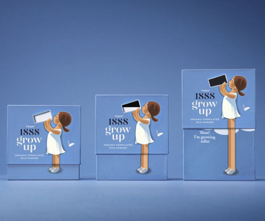
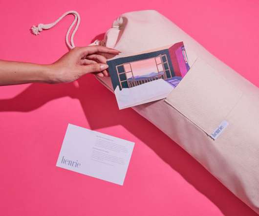
The studio's head of design, Meg Jannott, describes the brief as "exciting and ambitious" while stressing the importance of the client's category as parenting is overwhelming enough without having to sift through hundreds of brands that don't resonate with them. As the name suggests, gold is a driving factor in the colour system.
One valuable insight we gained was the opportunity for a new type of ready-made meal category: one made from high-quality ingredients without being positioned too premium. We scaled this down to a set of packages that bang with intense, delicious natural colour." Colour strategy Piëtke outlines how they determined the colour palette.
Bath-based brand and packaging design agency Sunhouse has redesigned OG orange juice brand Tropicana, using heritage in a contemporary way to position it as the category leader and aligning with its new campaign, 'THAT juice'. Tropicana's rebrand coincides with a shift in the category, likely due to the turbulent economy of recent years.
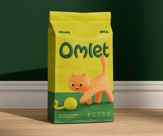
Designed to encapsulate the fun and whimsy that Omlet is known for, the new identity is a charming and colourful delight. Boasting bold colours and cute 3D-sculpted critters, Omlet's overhaul not only reflects its core values it also stands out a mile from the competition.
Illustration brief Owen says Rick's brief was clear: "Create illustrations that were 'twisted, colourful, full of fantastical, freaky exotic plants, flowers, and foliage, with surreal characters.' "We Oat Studio addressed this by developing five complementary colour palettes tailored to a specific festival location.
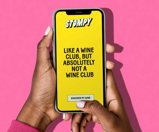
The work by Jessica Walsh and her team hopes to challenge the "stuffy" nature of the wine buying experience by championing "doing wine your way" expressed through bold type, bright colours and humorous illustrations. At its heart, Stompy's new typographic logo is inspired by the art of grape stomping.
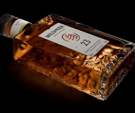
Amid the rising popularity of Japanese whiskeys, LOVE has designed a new brand that combines two cultures while staying true to the category's time-honoured codes. Decades-old visual codes, such as gold foils, bold, masculine colours, and "heather and weather" photography, flood the Scotch sector.
From bold colour palettes to eco-conscious packaging, these five standout branding projects showcase how creative design can transform food brands into visual experiences that connect with consumers on a deeper level. A key design element is the terracotta-coloured tubs, inspired by the traditional clay pots used for plant growth.
DuBois has a great sense of composition and colour. Book Cover Award category went to Kerry Hyndman for her work on The Rich House by Stella Gibbons. Meanwhile, the winner of the Book Cover Award category went to Kerry Hyndman for her work on The Rich House by Stella Gibbons. Couldn't be better.".
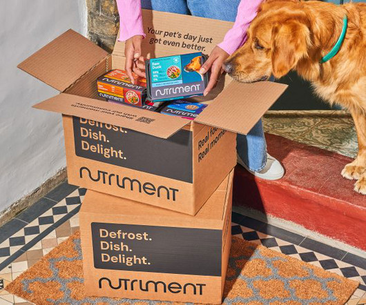
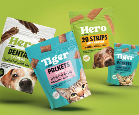
Pet food brand Nutriment was founded in 2013 when raw diets were still a small niche within the category. The studio's account director, Emma Collingswood, highlights Robot Food's work on other brands in the pet food category, such as Harringtons, NAW, Wagg, and YuMove.
Split into multiple categories, including best jacket design, best educational book and best graphic novel, the British Book Design and Production Awards have a long and illustrious history of commending landmark editions in the publishing field. Here Design was responsible for managing the illustrations," Martin adds. "We
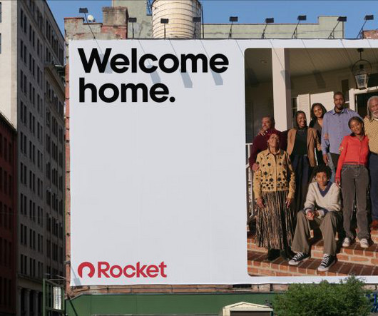
Consistency was also an issue, and Holt believed that the previous brand felt somewhat dated compared to Rocket's forward-thinking, technology and AI-driven vision, Rocket's logomark and colour palette already have a lot of equity and recognition, which is why Otherway opted to refine rather than reinvent the identity.
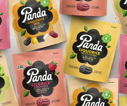
A big requirement of the brief was to ensure Panda's branding "reflects and retains its position as the category leader while helping it secure new store listings and dialling up stand out on-shelf," according to the agency. The packaging also needed to be distinctive, as some of Panda's products, such as the liquorice bars, are so small.
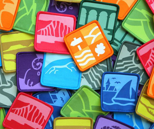
And the new designs for National Landscapes by Nice and Serious fall straight into that category. The colour system was influenced by the defining colours of UK landscapes, ranging from sandy dunes and rolling grasslands through to deep and vibrant moors and heathlands. Never heard of National Landscape?
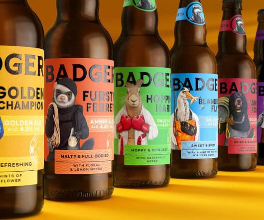
Paired with bold colours and updated typography, the new look aims to help Badger appeal to a wider demographic. Badger is strongly positioned to lead the charge within the premium ale category but to do so, we needed a bolder approach", he explains. Characters related to the brand's rich history were the way to do this.
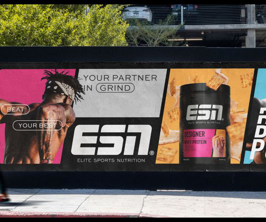
It was a conclusion that was agreed upon with ESN, with the creative director at The Quality Group, Marcel Henke, saying: "Our work with Robot Food has ensured our new visual identity better reflects our leadership position in the category. Similarly, the new typography was carefully chosen to reflect the attitudes of the ESN brand.
Designed to encapsulate the fun and whimsy that Omlet is known for, the new identity is a charming and colourful delight. Boasting bold colours and cute 3D-sculpted critters, Omlet's overhaul not only reflects its core values it also stands out a mile from the competition.
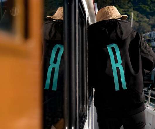
The resulting visual identity consists of a new logo, colour palette, typeface, photography and brand collateral. The broader visual language uses a vibrant palette inspired by the pop of colours found onboard their boats – we're talking hi-vis clothing, bait flashers and hooks.
Softer brand colours mirror the incumbent design but have been modernised to appeal to younger pet parents. Brand architecture The category as a whole was found to be busy and confusing, so this tension had to be resolved. The effect is subtle but immediately tugs on our heartstrings, even if we don't immediately recognise why.
It appointed Vancouver-based design agency Glasfurd & Walker to create its identity and packaging and to help it stand out in a sleep category that can often look like it's in the tech space. There are hints of Paula Lawrie, Dike Blair, Lois Dodd and David Hockney, given the vibrant colours Clara uses in these illustrations.
We organize all of the trending information in your field so you don't have to. Join 66,000+ users and stay up to date on the latest articles your peers are reading.
You know about us, now we want to get to know you!
Let's personalize your content
Let's get even more personalized
We recognize your account from another site in our network, please click 'Send Email' below to continue with verifying your account and setting a password.


Let's personalize your content