This site uses cookies to improve your experience. To help us insure we adhere to various privacy regulations, please select your country/region of residence. If you do not select a country, we will assume you are from the United States. Select your Cookie Settings or view our Privacy Policy and Terms of Use.
Cookie Settings
Cookies and similar technologies are used on this website for proper function of the website, for tracking performance analytics and for marketing purposes. We and some of our third-party providers may use cookie data for various purposes. Please review the cookie settings below and choose your preference.
Used for the proper function of the website
Used for monitoring website traffic and interactions
Cookie Settings
Cookies and similar technologies are used on this website for proper function of the website, for tracking performance analytics and for marketing purposes. We and some of our third-party providers may use cookie data for various purposes. Please review the cookie settings below and choose your preference.
Strictly Necessary: Used for the proper function of the website
Performance/Analytics: Used for monitoring website traffic and interactions
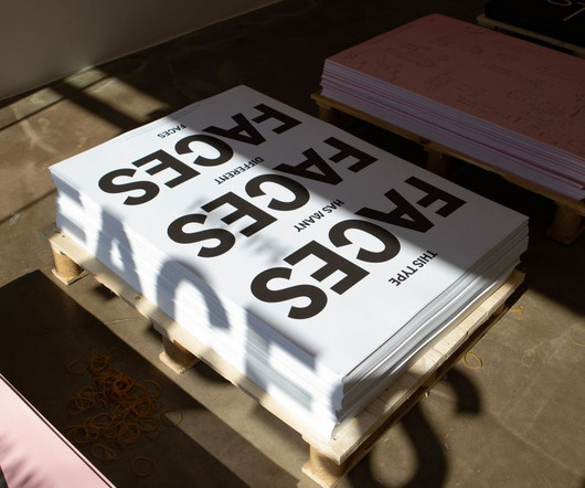
Read on to discover the best new fonts for your design projects. So in this article, we've hand-picked a delightful array of hot new fonts that aren't just functionally and technically sound but add that certain extra splash of creativity to inspire and captivate you. So read on because have we got a list for you!
And so, it's a great time to start playing around with some fresh fonts and giving your designs a new look. Then make a beeline for Bricolage Grotesque, a new font that explores the connection between typography and personal identity. It's a free and open-source variable font across three axes: weight, width and optical size.
With its master slide layout and drag-and-drop photo replacement feature, customization is effortless, allowing users to easily tailor the presentation to their specific needs. With its master slide layout and 40 unique slides, customization is effortless, allowing you to craft polished and professional presentations in minutes.
This means that websites will need to be optimized for smaller screens, with a focus on clean, minimalist layouts that prioritize content over flashy graphics. This will be accompanied by a move towards more fluid, organic shapes and asymmetrical layouts that break free from traditional grid-based designs.
Finding The Perfect Logo Fonts. Finding the best fonts for logos can be a tricky task. A font can change the entire look of the logo as the typography you use ultimately determines the personality of your branded logo. There are thousands of fonts out there, but only a select few are a cut above the rest.
Over 1,500,000+ Fonts, Mockups, Freebies & Design Assets. Icons and buttons, font and colour schemes, space, pictures, and responsive design are all things that a UI designer considers. It is in charge of transforming a product’s creation, research, content, and layout into a user-friendly, guided, and responsive experience.
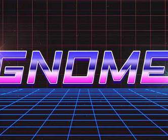
The 80s gave us some really bold fonts, futuristic styles, neon colors, and anything that screamed ‘bolder is better’. This was a whole new way for designers to experiment with layouts, move images, and set type. We saw a resurgence of the 80s styles around 2010 with the movie Drive and Tron: Legacy. Fiver Neon Style.
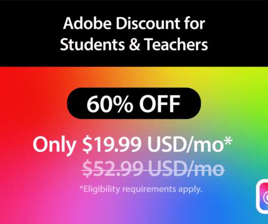
It comes with step-by-step tutorials, 100GB of cloud storage, Adobe Portfolio, Adobe Fonts, and more. per month and comes with a subscription to Adobe Illustrator for desktop and iPad, 100GB of cloud storage, Adobe Portfolio, Adobe Fonts, and Adobe Spark. It is a vector graphics editor for Mac first published in 2010 by Sketch B.V.
And one of the most important factors in all that is choosing fonts that complement each other well, both aesthetically and functionally. With millions of potential font combinations open to you, though, it can be difficult to know where to begin. Elena is a lovely font designed specifically for digital text. Elena and Maple.
The version date is 2010, so probably not safe to use these days. HTML Font and Body Tag Wizard. Lots of Fonts and Assorted Digital Assets. In the early days of web design, digital assets like fonts and artwork were sold on physical media. It was built with HTML and used table layouts. NoteTab Pro.
Display your success with a quote like: ‘From 1 garage in 2010 to 17 offices in 2019’. . Utilize Your Office Layout. Once you’ve thought about furniture and accessories, it’s time to think about how your office layout can be used as an integral part of your brand. Are you committed to being environmentally conscious?
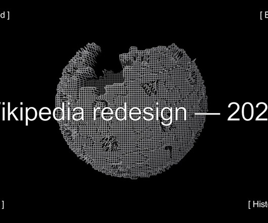
By Kieran McCann & Bárbara Martínez When I first started working at the Wikimedia Foundation, I was surprised to discover that although our projects used some basic layouts, there was no underlying layout grid system. What is a grid system and why do we need one?
Do not mix more than 2 different fonts because it can give a sense of inconsistency. Indeed, just one font can be quite enough. Stick to this hierarchy when designing your layouts. Hint: you can use type scale to test sizes and fonts before creating your final text styles. By the way, Figma now supports variable fonts!
Established in 2010 as the Print Room, The Coronet Theatre presents a risk-taking, eclectic program of theatre, film, dance, music, poetry, and visual art in London, UK. Layout template. “System of a Crown”. Season launch campaign. Your browser does not support the video tag.
One needs to adjust the layout, font sizes, and images for small screens to do this. Legible font sizes make the user experience better. Walmart's revenue shot up in 2010 after improving its loading speed by one second. The best combination of colours and fonts can make a website more engaging.
Websites without a ‘design layout' more like a wall of text can only work with less-than-stellar internet speed. Became a power duo with HTML, CSS eventually replaced the style of HTML content such as colour, typography, and layout. Website Design: The Evolution Period (2000-2010). Website Design In Mobile Era (2007-2010).
The logo sits alongside dainty serif fonts and Arial Black, giving the page a textured, almost print-like appearance. font Georgia for the body copy of the articles, while combining it with minimalism-friendly Arial or Arial Black for the headlines in the sidebars. BDG’s aesthetic combines frustration with the limits of web 2.0
The phrase is a pangram – a sentence featuring every letter of the alphabet used by designers to test out fonts – invented by Karlopoulos to check the letters on his vintage Olivettis, Olympias, and Bar-Lets; flea market finds that form a fraction of the archive collected in the designer’s basement studio. . “I and the Latin a.
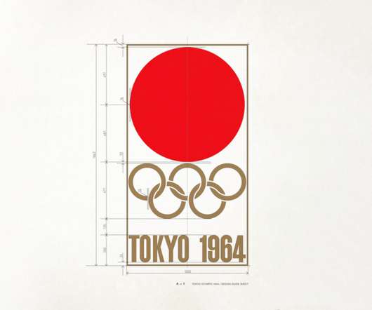
Olympic Games logos from Mexico 1968, Munich 1972, Montreal 1976, LA 1984, Barcelona 1992, Atlanta 1996, Vancouver 2010, London 2012, Rio 2016, Tokyo 2020, Paris 2024 & Milano Cortina 2026 It’s worth noting though that a logo alone is not a visual identity. Helvetica as a font has since become a ‘design classic’ loved and loathed.
They are responsible for working with content to create visual images and layouts. In addition, graphic designers must be familiar with typography, illustration, and page layout. Northlight Sherwin, David (Author) English (Publication Language) 256 Pages – 11/24/2010 (Publication Date) – HOW Books (Publisher).
Regarding organizing layout and material, grid systems are crucial for graphic designers. To do that, you must become an expert in fonts, type families, kerning, and tracking. Image Credits: Amazon The Norton Anthology of American Literature is the “bible” or foundational text for literature majors. Buy on Amazon 15.
Understanding Responsive Web Design The term ‘Responsive Web Design’ was introduced in 2010 by Ethan Marcotte. Fluid Grids and Flexible Media Fluid grids are based on a flexible, percentage-based layout. Fluid grids enable the layout to resize fluidly, ensuring that it adapts seamlessly to different screen dimensions.
Here’s the catch: It’s not 2010 anymore. Ratios instead of fixed pixel widths are employed here; it’s like having a rubber band for your layout. This way, we should switch to a column layout for smaller screens – and vice versa. Imagine your content is water, and your layout is a series of containers. When do you use it?
Your emails should automatically adjust their layout, font sizes, and image dimensions to provide a seamless experience no matter what device your subscribers use. This should include: Brand colours , fonts, and other visual elements Image and graphics styles (photography, illustrations, etc.)
Fixed layouts with absolute positioning were standard since screens were a known quantity. Column widths, font sizes, and image dimensions could all be locked in. Suddenly, fixed layouts broke on mobile screens. Marcotte called for fluid grid layouts, flexible images and CSS media queries.
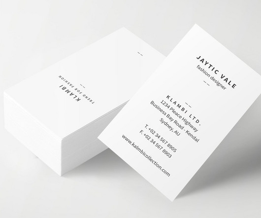
That's why this business card template's modern, simple and unique layout is a great choice. This business card template offers a visually appealing layout and is easy to edit, making it suitable for people who are not graphic designers. One of the most critical features of this business card template is its ease of use.
In 2010, the Library of Congress recognized it as being "culturally, historically, or aesthetically significant", and selected it for preservation in the National Film Registry. It’s a curious replacement, especially because the layouts seem to be nearly identical to corresponding credit screens in the original.
2010 - Function of Multisite In 2010 many contributors were developing version 3.0 Clean typography was expressed by the Open Sans font. 2014 - Google’s Noto font family December 2014 - edition 4.1 Twenty Fifteen uses Google Web Fonts Noto Sans and Noto Serif. In July 2021 , CMS was upgraded to version 5.8
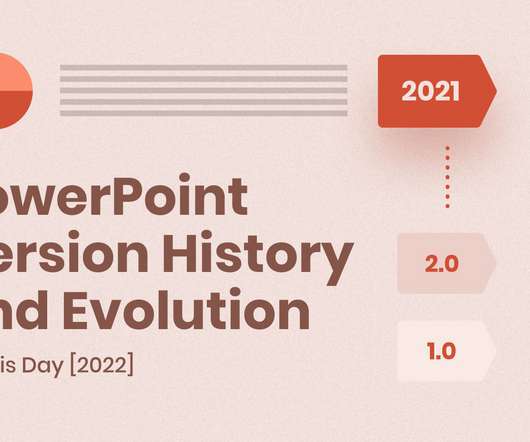
PowerPoint 2010. Fortunately, PowerPoint has been able to share some of the great fonts that were available in Word and import tables from Excel. PowerPoint 2010. PowerPoint 2010 (or PowerPoint 14.0) didn’t bring that many changes but rather improved the layout of 12.0. PowerPoint 2.0. PowerPoint 3.0.
To help, I've compiled this list of the 37 best design books covering various specialities – from typography and layout to UX and web design. It'll elevate design newbies from visual mediocrity to making polished, professional layouts and compositions. Read on for the cream of the crop regarding design literature.
It debuted alongside the release of the Apple II personal computer and has reigned through launches of visionary products such as the Macintosh (1984), iMac (1998), iPod (2001), iPhone (2007) and iPad (2010). The bold blue font spelling out the company name is underscored by a swooping arrow that connects the letters ‘a' to ‘z'.
There were eleven different font styles and it didn’t use a grid. Unlike today’s social platforms that have rigid, uneditable layouts, MySpace encouraged expression through the customization of its own interface. They used MySpace’s default layout and simply omitted some of the modules, leaving only a song (Bright Eyes, perhaps?)
Year: 2010 Agency: N/A. In 2010 the Orlando Magic were trying to build on the success of new star Dwight Howard and their finals appearance. The logo is overall a more tidy layout, which means it is much easier to use across an ever increasingly digital world. Orlando Magic Rebrand.
Users can personalise the layout, themes, and keyboard shortcuts to suit their preferences, making it a comfortable environment for coding. It offers a fluid layout that automatically adjusts to different screen sizes, ensuring that websites look great on desktops, tablets, and mobile devices.
Therefore, understanding and applying design principles is crucial to creating a practical layout that genuinely resonates with the target audience. Achieving balance in design requires careful consideration of each element's layout, colour, size and placement.
For almost everyone using it, Wikipedia looked like this: Wikipedia in 2014 In 2010, a bunch of changes were made to increase the usability of Wikipedia for new editors ( notes ), and in 2015 the editing experience was again significantly improved with the introduction of the Visual Editor.
Combined with the black font this creates a bold yet fun identity which harnesses the brand’s core values. But since its launch in 2010, Instagram has become so much more than just a photo/ video sharing platform. Keeping in line with the playful theme, what better background colour to use than yellow?
“Thinking with Type” by Ellen Lupton If you think picking nice fonts is what typography is all about, you’re in for a treat. Mathematical and geometric principles used in designing different fonts or typefaces. It’s like she hands us x-ray specs that reveal the skeleton of the design.
Players are able to infer the rules from the layout of the board, the game pieces, and any other trinkets that lay around. While I cannot pinpoint the exact date or game to start this rebirth, looking through my collection and basing their rules on the game’s age, I’d estimate it started around 2010.
White Space Modern website features are experiencing a resurgence of minimalism, with a renewed focus on the purposeful use of white space, mirroring the clean layouts found in high-quality print magazines. Yeah, those days are over.
Read on to find out the design techniques behind some of the most recognizable film posters in the world, including tips for creating cinematic typography, eye-catching layouts and immersive cast photography. Abbey Esparza 26 Apr 2021 Poster Design What Makes for the Best Movie Poster Font? From classic.
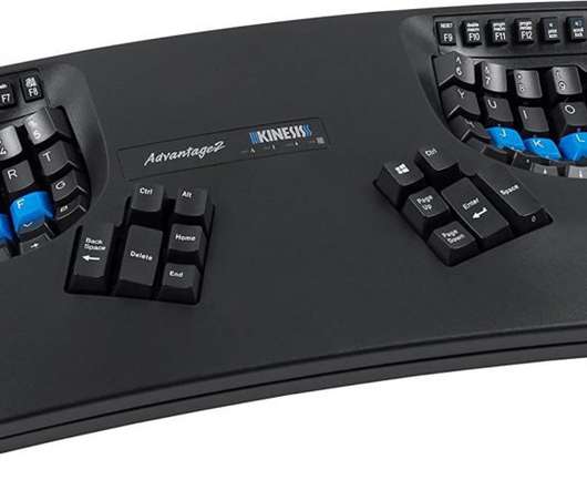
CONTOURED ERGONOMIC SHAPE PROVEN TO INCREASE COMFORT AND PRODUCTIVITY: Patented design features split keywells with concave shape, thumb keys, orthogonal layout, 20 degrees of tenting, and integrated. However, the layout of the keys can be changed. The product comes with the FILCO key puller to alter the layout. $55.53.
Graphic designers use Adobe Photoshop , Illustrator , and InDesign software to create designs, edit images, and layout documents. Graphic designers use various tools and design assets to create their work, from software plugins and stock photos to graphic templates and fonts. Artist's Loft Hardbound Sketchbook, 8.5″
The book's clarity and conciseness become beacons illuminating the path for novices and seasoned designers, leading them through the intricate labyrinth of letters, characters, and fonts. Sale Bestseller No. Buy on Amazon Moreover, “Thinking with Type” is not limited to aesthetics; it bridges art and science. .
We organize all of the trending information in your field so you don't have to. Join 66,000+ users and stay up to date on the latest articles your peers are reading.
You know about us, now we want to get to know you!
Let's personalize your content
Let's get even more personalized
We recognize your account from another site in our network, please click 'Send Email' below to continue with verifying your account and setting a password.


Let's personalize your content