This site uses cookies to improve your experience. To help us insure we adhere to various privacy regulations, please select your country/region of residence. If you do not select a country, we will assume you are from the United States. Select your Cookie Settings or view our Privacy Policy and Terms of Use.
Cookie Settings
Cookies and similar technologies are used on this website for proper function of the website, for tracking performance analytics and for marketing purposes. We and some of our third-party providers may use cookie data for various purposes. Please review the cookie settings below and choose your preference.
Used for the proper function of the website
Used for monitoring website traffic and interactions
Cookie Settings
Cookies and similar technologies are used on this website for proper function of the website, for tracking performance analytics and for marketing purposes. We and some of our third-party providers may use cookie data for various purposes. Please review the cookie settings below and choose your preference.
Strictly Necessary: Used for the proper function of the website
Performance/Analytics: Used for monitoring website traffic and interactions
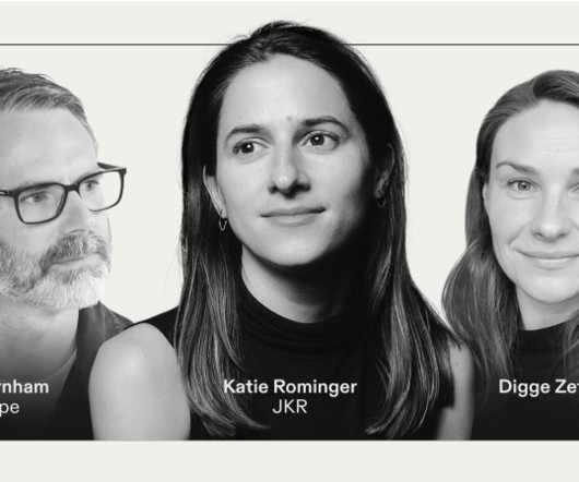
A recent webinar hosted by brand-building platform Frontify delved deep into this topic and offered a profound exploration of how typefaces are revolutionising the way brands speak, feel and connect with their audiences. Burger King, for example, worked with Colophon on a typeface that felt juicy and delicious," she explained.
You'll hear about Kiel Mutschelknaus' innovative method of creating kinetic type with code; Animography's hybrid approach to animated typefaces, in the words of its founder Jeroen Krielaars; and join Aasawari Kulkarni to discuss the potential of variable fonts in the changing landscape of kinetic type for multi-scripts.
Along with artworks vibrantly depicting elements of human biology, Wenjing created a typeface to accompany the work. The installation will feature the nine illustrations in a circle, with metaphors depicted on the outside and interviews presented poetically on the inside using my own typeface," explains Wenjing.
The updated brand features bolder, modern typefaces, an expanded colour palette, and new graphical assets, providing more flexibility and opportunities for LWT. Cass noted the importance of the website's agility, allowing LWT to quickly update content and respond to topical issues. "In
A new protest-inspired brand symbol was designed to compliment Mozilla's custom wordmark and typeface family, helping the brand to stand out in a sea of sameness. The brand's redesigned bespoke wordmark was born of a new semi-slab innovative typeface with its own custom characters.
One of Among Equals' founders has a technical background in sustainability, and its creative team is well-versed in turning complex sustainability topics into compelling creative ideas. To align with the bold, straightforward and confident tone of voice, Among Equals went with Marr Sans Condensed for the typeface.
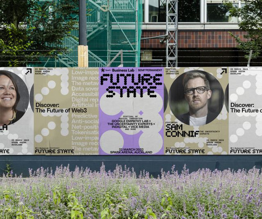
Inspired by the punched tape used to speak with computers in an earlier era, the main wordmark is built with a custom typeface on a dot-grid system. Typography A tier of three typefaces helps the brand communicate its voice consistently and most effectively. First, a custom typeface called Future State was built on a dot-grid matrix.
WOACA Trailer TIFF 2023, bespoke typeface designed by Studio Frith Morning: wash your face with water only, apply a Vitamin C serum, moisturiser and SPF. These unexpected hues are paired with an impressive bespoke typeface inspired by The Zit, a cartoon by Tom Bunk. Maybe an exfoliant, oil or mask, depending on the day.
They give a pleasant approach to learning more about a specific topic without having to read a lot. Whether you are selling anything or simply talking about ordinary topics, including an infographic on your site now and then would only help you. It can: provide a summary of a topic visualize a process. Adding images and icons.
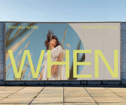
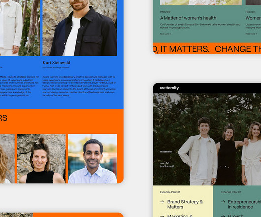
Universal Favourite chose ABC Diatype as the main typeface for its modernity and scientific edge and to bring calm and clarity to communications. To further enhance this sense of intimacy, a series of icons were developed to capture people's different states of mind around this sensitive and personal topic.
An in-depth look at a lesser-known topic. An interesting rebranding project for a lock making company, involves the creation of a custom typeface. What is Developer Experience? Read on CSS Tricks. Visual Site Map Builder. This new service is pretty cool. Enter a URL to receive a visual sitemap. It’s called Octopus. Yale unlocked.
It's supported by a secondary typeface, Albert Sans (of Andreas Rasmussen fame), a modern geometric sans serif that feels trustworthy and honest. Degular Bold, a friendly sans serif by OH no Type Co., Robot Food also developed a suite of simplified icons for applications such as web UI, PowerPoint presentations and animations.
In this course you’ll learn: Sans + Structure – Learn what gives the sans serif typeface its special character. Week 2 – Typefaces and their Stories – Exploring the way a typeface can express connotative meaning, otherwise known as how they can tell stories is the focus of the lesson this week.
It's supported by a secondary typeface, Albert Sans (of Andreas Rasmussen fame), a modern geometric sans serif that feels trustworthy and honest. Degular Bold, a friendly sans serif by OH no Type Co., Robot Food also developed a suite of simplified icons for applications such as web UI, PowerPoint presentations and animations.
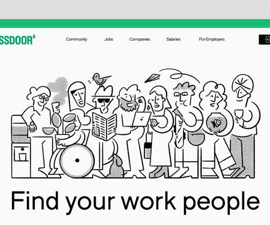
The rebrand coincides with the launch of a new mobile app and web experience, allowing users to seamlessly navigate between insights, jobs, and workplace conversations, facilitating real-time networking, advice, and connections on various work-life topics.
Like all other typefaces, sans-serifs are made up of the usual font components. However, unlike some other typefaces, sans-serifs are missing a few of the typical anatomical features. However, unlike some other typefaces, sans-serifs are missing a few of the typical anatomical features. And to a certain extent, they are.
Designers are abandoning elaborate patterns and excessively sophisticated typefaces. A simple and flat typeface such as sans-serif ensures that logos may be scaled faster and better. As previously said, it is a divisive topic, therefore it is important to examine the target demographic that will be exposed to the logo.
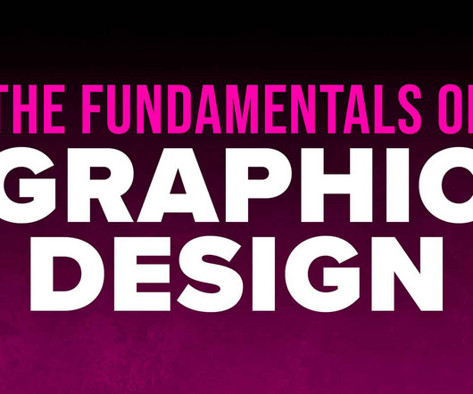
It's more about learning the history of graphic design, the essentials of graphic design theory, and the skills that underline your craft, such as choosing a colour palette, selecting typefaces, creating a grid, and so on. That said, studying graphic design is not about passively absorbing knowledge. Useful apps.
Typography Typeface: Helvetica Typography is one of the core fundamentals of graphic design and is the art or way of arranging type on a page to either be printed or digitally displayed. A typeface is the overall name of a family of fonts. Sans Serif: Sans Serif Typefaces without serifs. See the best script fonts here.
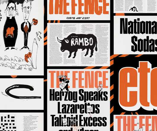
span topics as varied as pop culture, current events, humor and literature. . Swiss-born, London-based designer Clottu established the visual direction for The Fence from the first issue, with a pared-back system of two typefaces, two-color printing, and a refined grid. “We For Issue 8, the custom typeface was dripping. “We
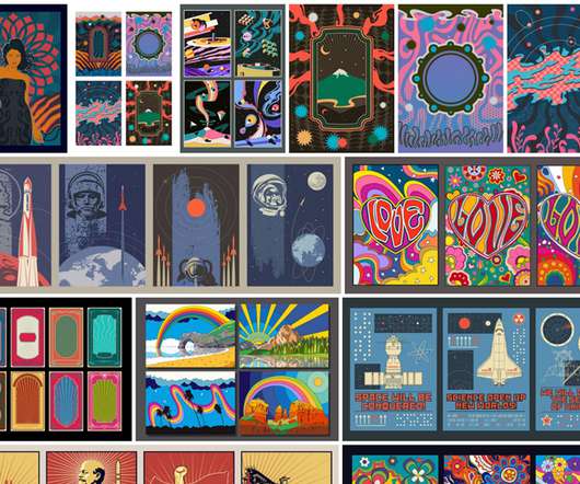
Inspired by vintage, sci-fi, or psychedelic designs, the illustrations are based on various topics. You can find more design assets in our Templates category or browse through our Fonts category to find some of the finest typefaces. They include fully editable poster templates as well as colorful backgrounds and patterns.
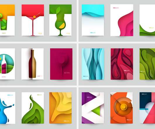
Designed in the popular flat papercut style, the collection consists of a wide range of individual sets that are themed around different topics. In addition, you can find some of the best typefaces in our Fonts category. All of the following templates were created by Adobe Stock contributor @Cgterminal. Download on Adobe Stock.
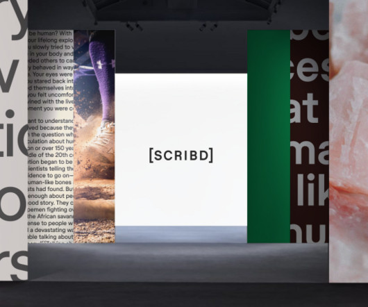
While other tech companies often default to bright, graphic-inspired heavy identities appealing to Gen Z, Scribd wanted to encourage an environment of research where people can discover everything they wish to know about a topic by diving deeper into its platform.
Typography: Learn everything about current typography trends or find professional fonts for all creative needs ranging from elegant serif typefaces to clean humanist sans-serif fonts and natural handwriting styles. This board showcases the power of architecture to shape our world. More: And that’s not all!
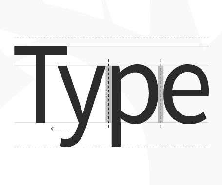
Fundamental typography terms Here are some basics to know: Typeface vs. font: A typeface is an overall design, like Helvetica. A font is a specific style within that typeface, such as Helvetica Bold or Helvetica Light. So, when you choose Helvetica, you’re picking a typeface.
The calligraphic typeface is a perfect pairing. University of California Press Design/Art Direction: Lia Tjandra What a powerful image for this topic. It's always nice when you find something that perfectly encapsulates the books topic without any manipulation, a testament to how real the problem in Detroit is.
There have been countless blogs tackling the topic of graphic design and its rich history. In this resource, LinkedIn went out and spoke to a variety of thought leaders to gain insights on what works for them, how they adapt to change, the future of programmatic advertising, and some off topic info on the last show they binge-watched.
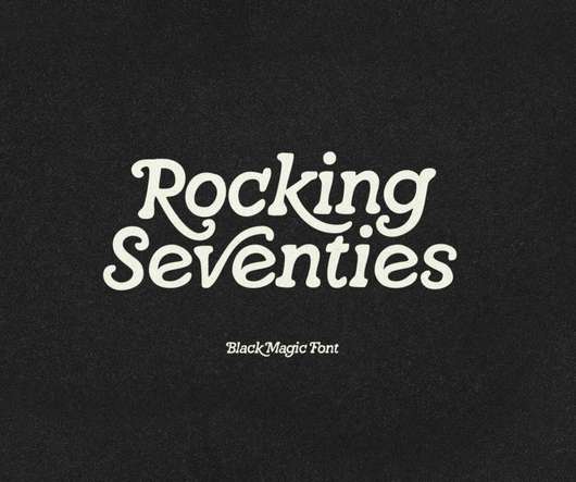
Developed to fill the creators’ need for topic-specific visuals to provide anyone with a quick fix solution with its mix of skulls, robots, gears, factories, and more. Hochstadt Typeface – $15. The Hochstadt Typeface, created by Hustle Supply Co. The Hochstadt Typeface, created by Hustle Supply Co. Learn More.
The answer is instead to be sparing with your choice of typeface and opt for one or two. Visual hierarchy is an intriguing topic in its own right, and one that is worth looking into if you are eager to foster your graphic design skills without necessarily undergoing any formal training.
You can choose from countless topics but all icons are based on a similar style as well as the same size. Do not hesitate to find more design assets in our recommended Templates category or browse through our Fonts category to find some of the best typefaces on the market. These and other Futuro Next icons are available here.
Typography can often be an intimidating topic, but it doesn’t have to be. Designer and educator Mia Cinelli will discuss type classifications, type families, and help us understand the difference between a font and a typeface. You only need to understand the basics to make an impact in your designs. So, let’s begin.
Behold grungy textures, old cassette, and flip phone graphics, acid color accents, and blackletter typefaces. We’ll see an effort to educate a broader audience around topics like cryptocurrency, NFTs, and web3, which will drive the creation of new design assets. Explore this collection. Y2K Grunge. Explore this collection.
What topics will the courses cover? You’ll learn how to write titles and words, discover which typeface is best for your needs, and find out how to use text as a graphic element. The latest version can be downloaded from the Adobe Creative Cloud website linked here for your convenience. Take the course at Domestika.
We’ve included attractive display fonts with strong presence, as well as several classics that look modern over the years and perfectly complement the more untraditional typefaces. An elegant serif typeface available for personal and commercial use. Belda typeface comes with a big typeface family. Moustique.
An example is the use of large, distorted typefaces in posters for electronic music festivals or album covers, which gives the artwork a unique, impactful look and aligns with the experimental nature of the music genre. These designs often feature warped or experimental fonts that reflect the mood or style of the event or music.
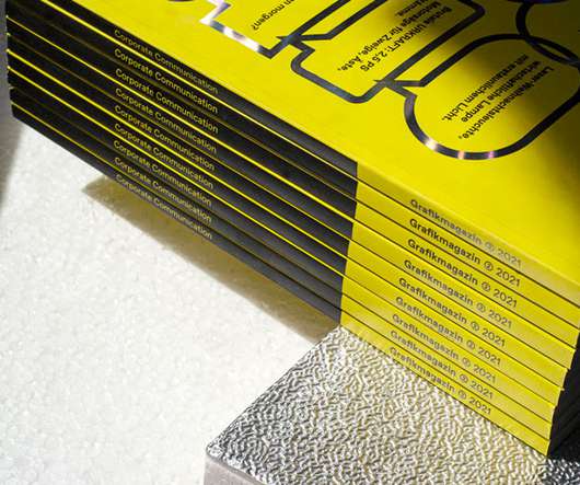
Each issue focuses on a single topic; so far themes have included The Digital Museum, Corporate Communications and What’s Cooking? Once the name had been decided, Holzmann found the typeface Favorit from Swiss type foundry Dinamo. The typeface Arizona, also used by Dinamo, is mostly used for body copy inside the magazine.
Every: Contemporary Serif Typeface. Even though they are a bit harder to read online, serif typefaces actually look better on print, and with this simple yet powerful serif font, you can create a business card that will surely capture the attention of clients and customers. Khaki: Modern Serif & Sans Serif Typeface.
Typography and Color: The Foundations of Visual Identity Drawing inspiration from contemporary Japanese design, the selected sans serif typeface adds strength and sophistication to the overall visual identity. Digital elements, like the animated marquee, further enhance the design by creating a dynamic space for current topics.
If selecting the right typeface has ever felt overwhelming or slightly daunting to you, perhaps reflecting upon font psychology can offer some clarity. Which typefaces are easy to read and which aid memory retention? 3) Serif typefaces significantly increase memory recall. but we can remedy that. Shaikh, A. Chaparro, B.
If you choose fonts with poor legibility or those with busy typefaces, your content will not be properly digested. Ideally, you should only use up to 3 different fonts in your design and your title should always have a display typeface. The typography also contributes to the kind of impression you want to make.
The right typeface is often the key to strong brand identity , a well-designed website, sharp looking brochures, and strong marketing materials. But there’s much confusion and misinformation about typefaces, fonts and how designers and marketers can lawfully use them commercially. How is a font different from a typeface?
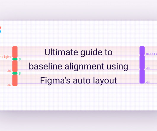
This topic haunted me and presented an unhealthy interest for me for a long time. There is no correlation between a typeface's baseline and the line height. The baseline of a typeface is also specific to the typeface itself, making it challenging and time-consuming to align text elements across multiple typefaces.
In this sense, “The Type Factory” aimed to immerse visitors in the world of typeface design, introducing them to the narrative-oriented typefaces developed by KOBU™ Foundry over the last two years. Additionally, Algarve Design Meeting held several talks around creative topics, in which the agency had the opportunity to be a part of.
We organize all of the trending information in your field so you don't have to. Join 66,000+ users and stay up to date on the latest articles your peers are reading.
You know about us, now we want to get to know you!
Let's personalize your content
Let's get even more personalized
We recognize your account from another site in our network, please click 'Send Email' below to continue with verifying your account and setting a password.


Let's personalize your content