This site uses cookies to improve your experience. To help us insure we adhere to various privacy regulations, please select your country/region of residence. If you do not select a country, we will assume you are from the United States. Select your Cookie Settings or view our Privacy Policy and Terms of Use.
Cookie Settings
Cookies and similar technologies are used on this website for proper function of the website, for tracking performance analytics and for marketing purposes. We and some of our third-party providers may use cookie data for various purposes. Please review the cookie settings below and choose your preference.
Used for the proper function of the website
Used for monitoring website traffic and interactions
Cookie Settings
Cookies and similar technologies are used on this website for proper function of the website, for tracking performance analytics and for marketing purposes. We and some of our third-party providers may use cookie data for various purposes. Please review the cookie settings below and choose your preference.
Strictly Necessary: Used for the proper function of the website
Performance/Analytics: Used for monitoring website traffic and interactions
This trend takes inspiration from the past’s vision of the future, often characterized by neon colors, metallic accents, bold geometric shapes, and vintage typography. Graphic Design Elements: Designers use retro-futuristic color schemes and typography to create posters and social media graphics.
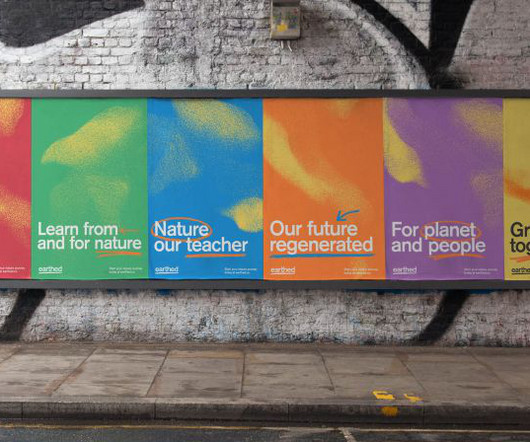
The many topics covered on this site, led by teachers from around the world, include biodynamic farming, food forests, river restoration, urban gardening and earth democracy. The solution for the identity was born from the logotype sitting on a simple hand-drawn underline to represent the ground; therefore being earthed.
Sustainability has been a hot topic in packaging for years now. Eminente Reserva by Moët Hennessy and Stranger & Stranger, 2021 Diamond – Best of Show Pentawards winner. Kadoya citrus juice by MARU, 2022 Pentawards shortlist. Heights by Pentagram, 2022 Pentawards shortlist. Sustainable materials.
As previously said, it is a divisive topic, therefore it is important to examine the target demographic that will be exposed to the logo. Typography. Typography-based logos indicate a conceptual change in the portrayal of words as visual representations, moving from a purely textual level to one that is more engaging and significant.
She has a rare talent for making sense of complex topics and giving them clear strategic focus and creative expression through words and visuals. As an outsider himself, Eliass was drawn to building an inclusive brand with a quality product for everyone. There is no hierarchy; we just work together to make the best work we can."
With elements and textures that allow you to create standard or typography logos. Also included are 30 pre-made logos, 20 pre-made typography logos that come with 30 suggested fonts you can use. The Hand-drawn Pencil Type Tool Kit – Free. This set is great for branding, design and craft projects. Learn More.
Now that we're on the same page, let's dive into the five-step process for creating a timeline infographic: Step 1: Conduct Research and Topic Brainstorming. To brainstorm your topic ideas, you can ask yourself some questions: What is the goal or desired result of your timeline infographic? What's your general approach to the topic?
Holiday-themed typography. Today many web designers use different typography tricks to make the design more effective and modern. Topic-related animations. This pack of topic-related illustrations can serve as an alluring pixel-perfect decoration for your laptop or phone or Halloween party. Hand Designs for Autumn 2019.
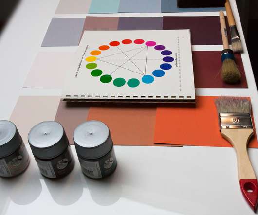
For those unsure where to start here are a selection of Smashing articles on the topic: Color Theory for Designers, Part 1: The Meaning of Color by Cameron Chapman. Typography. Rough, hand-drawn, and almost always all-caps, he made words powerful without being overbearing. ( Large preview ). Words, words, words.
Typography craze. Typography craze. In order to create more innovative and modern compositions, designers are playing with typography big time. Decorated with beautiful flowers, geometric shapes, and more creative elements, artistic typography is certainly the perfect solution to nail the attention. Going monochrome.
Minimalist sites with maxi typography. A huge trend in web design right now is combining photos with super simple hand-drawn 2D illustrations. They will be often minimalist, containing maxi typography and line art elements. Minimalist sites with maxi typography. Patterns in web design. Visit website. Visit website.
Picture unique layouts, engaging typography, vibrant colours, and even bespoke illustrations that scream personality. Every time I hand out my business card, it's almost like I'm offering a piece of my identitylike a mini-resum but printed in style! Now it's time to get your hands dirty and understand what your clients truly need.
The book’s design enhances its usefulness by providing beautifully drawn examples of how to apply the topics addressed in the book. The book covers all aspects of typography, from typefaces and type families to kerning and tracking to the use of grids. Motion design, art, and typography are some of his specialties.
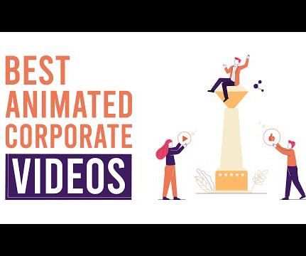
The Power of Animated Explainer Videos in Marketing Animated explainer videos have become a trendy and effective way for businesses and organisations to quickly communicate critical messages, explain complex topics, promote products and services, and bolster brand awareness. Does it align with my brand identity ? Simple is cheaper.
As you navigate the different design disciplines, start to pick areas that you’re drawn to and learn more about that subject to discover where your passions lie and areas you want to explore further. The book covers the development of design, mid-century design, corporate branding, typography, magazine design and iconic posters.
Getting Certifications Programs like freeCodeCamp’s Responsive Web Design Certification formally assess design skills through projects on topics like: Accessibility CSS Flexbox and CSS Grid Responsive design Typography and colour theory Preparing for certifications reveals skill gaps to address while validating abilities.
Your eyes are drawn to particular books as you move through the aisles. This illustration makes it clear that the story may feature magic, adventure, and a beautifully drawn setting. On the other hand, a simple cover with one eye-catching image might grab your interest and entice you to learn more about it.
The bold factual typography combined with soft, fading colors and blended imagery melts together a unique fusion of industrial communication and creative expression”. The bold factual typography combined with soft, fading colors and blended imagery melts together a unique fusion of industrial communication and creative expression.
On the other hand, conflicting designs or messages between sections will confuse readers, who might feel frustrated because they cannot figure out where things do not match as expected; thus, their attention will be drawn away from essential contents/offers provided by such sites. Who are you as a brand, and what makes you unique?
Get your hands on Procreate today and start creating stunning works of art that will leave your audience gasping for breath! Get your hands on Affinity Designer and let your creativity take flight! In October 2011, Adobe acquired the service, cementing its status as a leading digital design and typography tool provider.
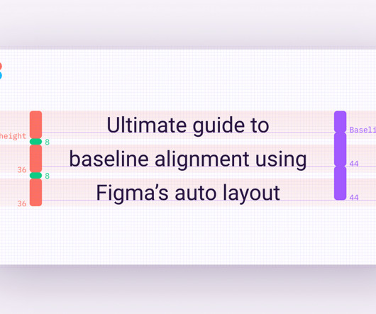
At the time, I was also drawn to some well-documented design systems, such as Material 2 , which offered clear guidelines for creating consistent layouts. Baseline grids, on the other hand, are sometimes mentioned and documented, but rarely implemented or used when designing digital products. We’ll align everything to a 4px grid.
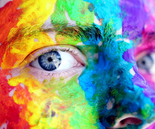
Source and further readings on this topic: Bartels, Andreas, Zeki Semir. On the other hand, if the aim is to drive action, like prompting users to click on a purchase button, a vibrant red or orange might be more effective. Balance, on the other hand, is more about the equal distribution of visual weight in a design.
You can find anything on here from animation to branding to typography. . If you don’t have a writer at hand and you’re looking to write your own clever copy, check out the crafty snippets you find on Microcopy Inspirations. This directory of open-source web fonts is a treasure trove for typography enthusiasts. Fontfabric.
Typography Choosing typography goes beyond a certain font and colour. From digital media to print, ensure you use the same typography throughout your brand. Your typography can be consistent in many ways. To keep typography consistent, creating template structures is a good idea. It’s not appropriate.
The Building Blocks of Creative Website Design Since we know the basics, let's get our hands dirty and learn some tips and tricks about creative web design. Typography: Beyond Words The arrangement of type to make language visible and appealing when shown. Weight & Size Manipulation In typography, size does matter!
Anishinaabe designers are also working with typography in digital and print media and product design. I also met Bulgarian-American designer Luba Lukova , who made a strong impression on me with her visual metaphors and hand-drawn aesthetic. Baha, a monospaced Cree typeface by Sébastien Aubin. Image courtesy of Sébastien Aubin.
Use this guidance that includes your brand story, logo, color palette, image guidelines, typography, and voice and tone to make design decisions. Our eyes are automatically drawn to moving images. Event advertising can involve everything from online ads to creative brand items you hand out on the day. Know Who You’re Targeting.
If it’s hand lettering you’re after, then you’ll find it in doses with Kraitip Sivakriskul. Shillington London graduate and Freelance Digital Designer Nouran Zedan has a beautifully curated Instagram of her latest 3D illustrations, type experiments, handdrawn illustrations and designs. Hand painted type?
Closure is used in photography, painting, advertising, typography, and many other fields. The human eye is drawn to symmetry and repetition. On the other hand, images placed too close to other visual elements may disrupt the harmony of the design. However, this approach may not work for all topics.
Kinetic Typography Intro After Effects Template If you frequent YouTube, you’ve seen plenty of videos that focus on typography. The template has the hand-engraved feel of a 3D animation , but you don’t have to create that yourself. The animated designs can be easily adapted to many topics and video themes.
Tip 3: Experiment with typography. They are great for illustrating more abstract or complex ideas You can choose between artistic, hand-drawn, graphic, geometric, simple outlines, etc all will generate a different tone and feel. Tip #3: Experiment with typography. Tip 1: Use templates. Tip 2: Use plenty of images.
Typography plays a huge role in the marketing strategy of every project. Raisty Hand lettering Script love Font. This font can be used for winter holidays and for any website or topic that has to do with trees and nature. Besides this font is professionally drawn, which makes it unique. Chalk Hand Lettering Shaded.
This category is the most versatile one, offering a choice of responsive templates for any possible topic and website type. Bellissimo is an exquisite website template, whose design is defined by the heavy use of large image-based content areas, handdrawn illustrations and italic fonts. ADRIANNA J. Bellissimo Website Template.
It's perfect for creating sleek logos, stunning illustrations, and crisp typography. It offers an intuitive interface and powerful features that let you create stunning layouts with precise typography, flowing text, and seamless graphics integration. But let's face it; sometimes, people are more drawn to videos than reading text.
Here are some common characteristics of a homepage: Large, bold typography. People are drawn to images, so your homepage should have interesting images and informative photos that help orient your visitors to what you do. When search engines crawl your site, they follow the taxonomy to index all the information about a specific topic.
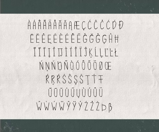
There are plenty of font “families” But first, let’s start with the basic terms in typography. In typography, you will notice the term “serif” quite often. Examples Of Retro Typography in 2021. You can see typography being used as a pivotal way to portray each television era. What Is Serif?
So, are you ready to embark on your design journey and explore the world of colours, typography, and visual storytelling? This includes icons, logos, postcards, and hand-drawn illustrations. Throughout the course, you'll extensively review typography, colour theory , layout and composition, and how to use photos in the design.
” While the topic of childhood obesity is quite severe, the Ministry took a clever approach with this ad. Despite the sad topic, the ad uses various bright, appealing colours like white, pink, blue and yellow. Using clever analogies and eye-catching colours, the French Ministry found an innovative way to tackle a tricky topic.
When you understand your brand and the components that define brand identity (colors, typography, shapes, etc.) These brand identity building blocks include typography, color palette, forms and shapes, and composition. Typography. Typography impacts how people perceive your brand and your messaging. Nor should you.
The yellow wrestler, on the other hand, has an x in the centre and wings down the sides that look slightly like music notes. Anyway, let’s get back on topic. They essentially handed customers two bare brown bottles with a sticker sheet included, encouraging them to customise their bottles however they liked. What do you think?
This directly affects your bottom line, as you’re only able to promote a handful of products when selling through the traditional sales model. There’s no bold typography or eye catching lettering, but instead, a really dull grey colour palette. Even the top navigation bar is poor, and the words are really easy to miss. I want one!
We are both drawn to a very similar aesthetic which informs our buying choices; bold, witty and often naively illustrated pieces which have the ability to make us smile. I focus on typography and editorial design right now, along with publishing my first book. We like to sell posters that we would proudly hang on our own walls.
Typography is nothing if not a complex beast, tasking the designer to balance so many competing factors including hierarchy, order of reading, legibility and contrast, to name but a few. Part inspiration and part workbook, the images of hand-drawn type will inspire and excite any designer to draw and explore type. Buy the book.
Their work incorporates glitches, raw textures, and hand-drawn elements. They want to see the human hand at work. Here are some of the key elements: Hand-Drawn Elements: Think of custom illustrations, handwritten fonts, and sketches. Designers are now experimenting with hand-drawn typefaces.
We organize all of the trending information in your field so you don't have to. Join 66,000+ users and stay up to date on the latest articles your peers are reading.
You know about us, now we want to get to know you!
Let's personalize your content
Let's get even more personalized
We recognize your account from another site in our network, please click 'Send Email' below to continue with verifying your account and setting a password.


Let's personalize your content