This site uses cookies to improve your experience. To help us insure we adhere to various privacy regulations, please select your country/region of residence. If you do not select a country, we will assume you are from the United States. Select your Cookie Settings or view our Privacy Policy and Terms of Use.
Cookie Settings
Cookies and similar technologies are used on this website for proper function of the website, for tracking performance analytics and for marketing purposes. We and some of our third-party providers may use cookie data for various purposes. Please review the cookie settings below and choose your preference.
Used for the proper function of the website
Used for monitoring website traffic and interactions
Cookie Settings
Cookies and similar technologies are used on this website for proper function of the website, for tracking performance analytics and for marketing purposes. We and some of our third-party providers may use cookie data for various purposes. Please review the cookie settings below and choose your preference.
Strictly Necessary: Used for the proper function of the website
Performance/Analytics: Used for monitoring website traffic and interactions
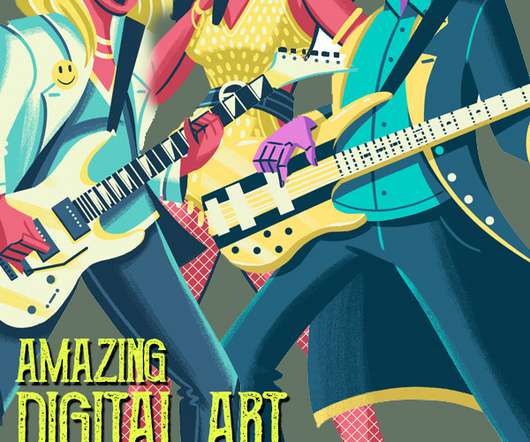
Today we are featuring Creative Art Director and Digital Illustration Designer Zack Anderson , with his amazing science fiction, video games, cartoons, illustration artwork. He is an average dude with a passion for science fiction, video games, cartoons, illustration, mid-century design, and a penchant for writing in the third person.
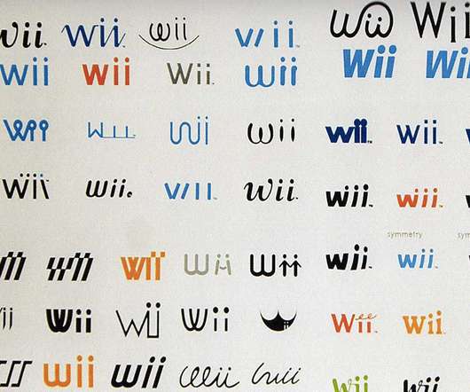
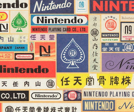
History of the NintendoLogoDesign The Nintendologodesign is one of the most iconic and recognisable logos in the video game industry. But this iconic logo didn't spring up overnight – it has evolved through several redesigns over Nintendo's 100+ year history.
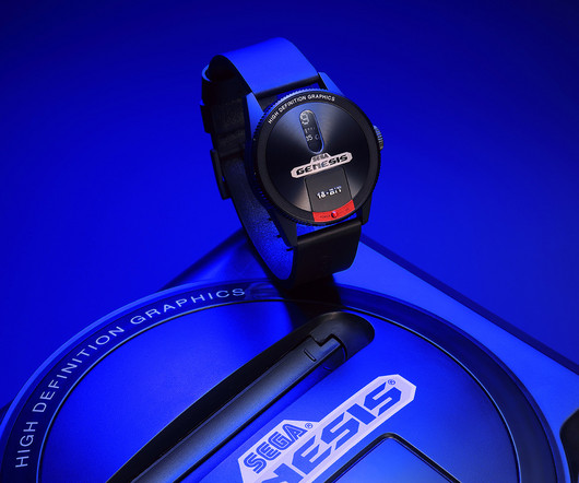
It’s the latter memories designer watchmaker Anicorn taps into with the release of the SEGA x Anicorn Mega Drive/Genesis Watch. Launched and marketed in 1988 as the Mega Drive in Japan, the Sega Genesis console arrived in the US a year after as the yang to Nintendo’s yin.
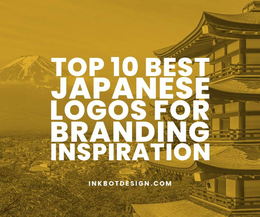
Top 10 Best Japanese Logos for Branding Inspiration Logos are more than simple graphic marks – they visually encapsulate a company's ethos, history, and aspirations. Japanese logos exemplify this, fusing modern minimalism and traditional motifs to craft unique designs.
Let’s go back in time to 90s graphic design for an aesthetic inspired by Nirvana, Beverly Hills, 90210 , Britney Spears, and Saved by the Bell. 90s style graphic design intrepidly moved toward the unknown of the new millennium with vibrant fun and optimism, which was seen throughout the pop culture of the day. Typography.
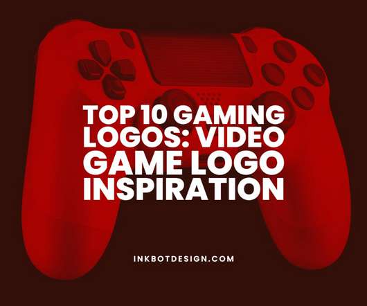
Top 10 Most Iconic and Recognisable Game Logos Game logos are more than just a brand – they become ingrained in our minds as gamers. The style, design, and emotion behind these logos allow us to connect deeply with the gaming experiences they represent. Get ready for a fun trip down memory lane ! Legacy With over 6.3
A great example of a logo using symmetry is McDonalds with its golden arches. When symmetry is used in logodesign, it’s a powerful way of shaping the image and perception that the target audience will have of the brand in question. Put simply, a symmetrical logo is a logo in which the left side is identical with the right.
The Top 10 Most Iconic Video Game Logos Video game logos are an iconic part of gaming culture. A great logo captures the spirit and style of a game in a simple image. For hardcore gamers: these logos can spark fond memories for hardcore gamers and excite them to play their favourite titles.
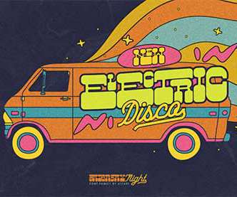
The 70s were a great time for worldwide evolution and development in graphic design. There were many interesting counterculture movements that influenced psychedelic graphics, groovy logos, and advertising. In this article, we'll talk about graphic design and the 1970s logodesign style. 1970s LogoDesign.
Do You Need a LogoDesign for a New Company? When faced with the critical question, “Do you need a logodesign for a new company? When faced with the critical question, “Do you need a logodesign for a new company?” Launching a new business comes with a whirlwind of crucial decisions.
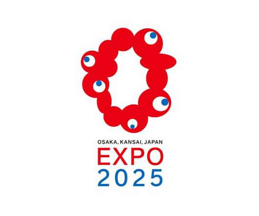
The logo for the Osaka World Expo has been revealed, and its design has proved somewhat divisive for confused onlookers. The logo is comprised of a ring of red blobs and an additional five white and blue “eyes” It was created by a team led by graphic designer Tamotsu Shimada. 12 blobs, five eyes.
Every time you catch sight of their logo, a wave of emotion runs inside you, reminding you how much you enjoy their products or services. Other innocent brands include Nintendo Wii, Innocent Smoothies, Ivory and Volkswagen. Are you so fond of a particular company that it’s hard for you to buy from other brands?
The Pocket Design Pillow Covers and Gamer Socks set offers both comfort and a touch of humor. Get from Amazon Star Wars Galactic Empire Logo Pewter Lapel Pin $9.09 Show your Star Wars fandom in style with this elegant pewter lapel pin, adorned with the Galactic Empire logo. Gamer Pillow Covers & Socks Set $7.99
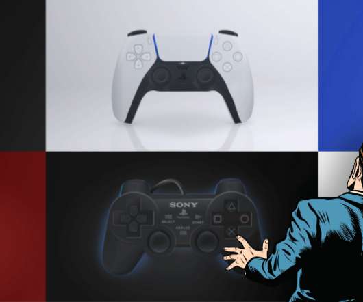
illustrated entirely in Figma Late last Thursday, I was in bed scrolling Instagram and came across a stylized drawing of a Super Nintendo controller. Because, for whatever reason, every design challenge I tackle ends up being a way for me to push the boundaries of that software. It made me wonder if I could do that.in That remaining .001%
Top 10 Eye-catching Red Logos in the World Red is a bold, powerful colour that evokes strong emotions and attracts attention. From Coca-Cola's iconic red ribbon to Netflix's bright red N, some of the world's most recognisable red logos are draped in this eye-catching hue.
Why a Logo is Important to Every Business A company's logo is one of its most valuable assets. More than just a graphic design , a logo is the face of a brand and conveys what a company stands for. With the rise of visual content and social media, logos have become even more prominent and influential.
In the world of web design, starting out is the hardest part of the journey. We’ve put together some of the best tips from expert designers (in alphabetical order) to put you on your path to becoming a better designer. Here are web design tips from experts: David Airey. The Identity Designed book? Jacob Cass.
You might also like our collection of logo templates for gaming. Its bold and condensed design makes this font ideal for creating eye-catching titles and headlines that command attention. Designed for big titles, bold headlines, and subtle subtitles, it is the perfect font for video games.
Being aware of the power of color symbolism is crucial for designers and businesses. . Know the meanings or psychology behind colors and you can predict what your audience should feel when looking at your design. . The sense of energy and adventure red conjures up also works well for entertainment businesses like Nintendo and Netflix.
Being aware of the power of color symbolism is crucial for designers and businesses. . Know the meanings or psychology behind colors and you can predict what your audience should feel when looking at your design. . The sense of energy and adventure red conjures up also works well for entertainment businesses like Nintendo and Netflix.
Top 10 90s Logos: A Nostalgic Look at Iconic Designs Are you a 90s kid like myself? It was a time of vibrant colours, outrageous patterns and unforgettable logos. Let’s dive into 90s graphic design and look at the top ten logos that shaped a generation. This was simplification at its best.
LogoDesign for Gaming: Crafting a Memorable Identity If there's one thing we can all agree on in this digital era, it's the explosive growth of the gaming industry. Welcome to our blog post, “LogoDesign for Gaming: Crafting a Memorable Identity. As of 2023, there were 3.1
50+ Best Gifts for Designers on Every Budget Designers are creative professionals who use their artistic talents to communicate ideas visually. Whether in graphic design , industrial design, interior design, or other specialities, designers rely on inspiration, software, tools, and technology to bring their visions to life.
We are talking about designers, developers, engineers, illustrators, artists, writers, actors, and other creative professions. Wal-Mart, Bloomberg, GoPro, Nintendo, Time Warner Cable, Facebook, and many more. Digital design and development. 99 designs. The type of job itself is also a factor worthy of consideration.
Key elements of the rebrand include a dynamic "LA" logo that seamlessly transitions into the new "Deutsch" wordmark, and AI-generated personal monikers for each employee, cleverly integrating the agency's logo with the letter "D." It is a rich tapestry woven from mixed media, texture, color, language, code, and art.
Japanese branding goes beyond logos or slogans; it’s an attitude towards creating a business identity. For instance, they might think about the neatness found in Sony products or the reliability inherent in Toyota vehicles, remembering the fun associated with Nintendo games, just to mention three examples out of many possible ones.
The redesign of the Airbnb logo in 2014 The Airbnb story Everyone is familiar with the Airbnb story but only a few are aware of how their service became so successful. Airbnb founders, Brian Chesky and Joe Gebbia were industrial design students, based in California, looking for a means to pay their rent. I compete for time.
There were limitations to this design; letters had to be shaped on an 8×8 pixel grid. We spoke to Omagari about what modern day video game designers could learn from vintage gaming, the legacy of arcade game typography and his favourite font from the book. TO: Absolutely. How has its importance changed as video games evolved?
Besides, if the picture is even a tiny smidgen pixelated, the auto-follow instrument following the edges of every pixel, hence making a bothersome "flight of stairs" design when lines ought to be a smooth bend. Here I'm providing Manual Vector Tracing service logo or image for last 5+ Years with 100% client satisfaction.
They let users in Animal Crossing (another hugely popular game on Nintendo Switch) try on their lipstick and makeup stuff on their game characters before deciding if they wanted to buy the actual products in real life. They even involve architects in designing virtual spaces that match the brand's style to the last detail.
Brandish a retro-style design on product packaging and you will likely see an increase in profit. retro marketing Brands that are looking to freshen up their image or simply rally nostalgia-prone audiences will often reach for retro styles in design and advertising. and where it’s taking us? In with the old?—?retro
Company logos are an essential part of any brand’s visual identity, representing the company’s values, products, and services. While some logos may seem straightforward and simple, many are crafted with hidden meanings and subtle nuances designed to convey a deeper message. Why Are There Hidden Messages in Logos?
The attraction we feel to a certain brand is not by chance, but by design. Behind each logo or campaign, is a carefully crafted brand archetype that taps into the subconscious mind. This should be reflected in all visual elements such as the company logo, slogan, and packaging. Is it the snazzy slogan or advertising copy?
Top 10 Gaming Logos: Video Game Logo Inspiration. What's so special about these video game logos? They were all designed by different artists, at different times, with different budgets, and in different styles. Top 10 Gaming Companies Logos. 2 – Nintendo. Gaming has been around for decades.
Below, we learn about how some of our favorite colors were created and how they have evolved to form meaning in society and through design. Adobe, Canon, Nintendo are all prime examples of this in action. Here are examples of templates using the color red: Red Sushi Logo and Red and White Youth Photo Volunteer Flyer.
Working on a pro bono basis, London-based brand communication and design studio Free The Birds developed the identity for the KidzCafe programme. The logo for the KidzCafe was also devised by Free The Birds and follows the rainbow motif by using the multicoloured arches upside down, to create a bowl. HUSH, HUSH+1.
They designed the image to reflect his high status and the idea of royalty. The original design was a blue and white mascot with a red nose, but they made the current design after Mr Peanut began receiving fan mail. These changes have been in place for generations, which gives them a practical design to keep children interested.
Graphic design is a notoriously competitive field and it can be tough for companies to stand out. But, at least twenty graphic design firms from around the world have proven to be the best in their field, with gorgeous portfolios filled with impressive clients and prominent design campaigns. Frog Design. MetaDesign.
the SecretLab Magnus Metal Desk is built on a meticulous design with premium materials. For the Batman fandom, this is a call phone holder or phone mount for your car shaped as the Batman logo. Relive your love for the Super Mario game with the Super Mario Maker 2 game for Nintendo Switch. Secretlab Magnus Metal Desk.
Designing a product goes beyond just making it look cute. What makes the Michelin Man so lovable is his unique design and how cleverly he represents what he sells. His design may be simple, but it’s unique enough to be easily seen on packaging or commercials. There's actual psychology involved in the process. 21 – Mr.
We organize all of the trending information in your field so you don't have to. Join 66,000+ users and stay up to date on the latest articles your peers are reading.
You know about us, now we want to get to know you!
Let's personalize your content
Let's get even more personalized
We recognize your account from another site in our network, please click 'Send Email' below to continue with verifying your account and setting a password.


Let's personalize your content