This site uses cookies to improve your experience. To help us insure we adhere to various privacy regulations, please select your country/region of residence. If you do not select a country, we will assume you are from the United States. Select your Cookie Settings or view our Privacy Policy and Terms of Use.
Cookie Settings
Cookies and similar technologies are used on this website for proper function of the website, for tracking performance analytics and for marketing purposes. We and some of our third-party providers may use cookie data for various purposes. Please review the cookie settings below and choose your preference.
Used for the proper function of the website
Used for monitoring website traffic and interactions
Cookie Settings
Cookies and similar technologies are used on this website for proper function of the website, for tracking performance analytics and for marketing purposes. We and some of our third-party providers may use cookie data for various purposes. Please review the cookie settings below and choose your preference.
Strictly Necessary: Used for the proper function of the website
Performance/Analytics: Used for monitoring website traffic and interactions
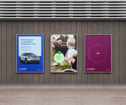
SomeOne has proved that accessibility and aesthetic can coexist in its latest work for The Motability Scheme, which has helped anyone with a qualifying mobility allowance in the UK to get moving for the last 45 years. This created an interesting challenge: how to improve every aspect of the brand experience for its diverse audience."
As part of a two-year collaboration with How&How, the conservation charity reinvents itself with a new logo, custom typeface and migration-inspired patterns. So they turned to How&How. The result of this process was a brand idea that How&How called 'Force for Nature'.
Abstract discussions are valuable, but real progress happens when you have something concrete to work with. This approach taught me how to connect the conceptual with the practical, allowing for faster iteration and more effective collaboration." For me, typefaces and visual identities are inseparable.
Modernist Graphic Design in Britain 1945-1980 , written by graphic designer Ian McLaren and academic Tony Pritchard, examines how designers helped reshape society during a period of profound national transformation. Consequently, the book explores how the period's political tensions influenced creative output.
The pandemic was awful, let's make no bones about it, but just how many talented creatives discovered their true calling during lockdown? The pandemic was awful, let's make no bones about it, but just how many talented creatives discovered their true calling during lockdown? For the Polish pop band Big Bike Orchestra.
The rapid evolution of AI is reshaping how we think about design. That's how Jan Eumann, executive creative director at Wolff Olins , is feeling right now, anyway. Instead, we focus on where society is headed and how we can have a meaningful impact where it matters. Beyond that, new AI platforms like Exactly.ai
Illustration agencies and their clients have always preferred illustrators whose work shows consistency over artists with portfolios containing a bit of this and a bit of that, even if some of it looks cutting-edge. It always comes back to a strong point of view – someone who knows who they are and what they want to say with their work.
3D artist Jose Andrés García explains how he used Character Creator and iClone to bring the Spanish heroes of American independence back to animated life. One group working to correct that balance is The Legacy: El Legado Español, which is dedicated to promoting Spain's legacy across the continent.
There never seems to be an imperative other than to draw something – even when she tackles a difficult brief for one of the big brands she works for. Looking at the work, it's easy to imagine her pencil on the page as she plays with ideas and immerses herself in this handmade world. I enjoy spending time with my work.
Local agency People People explain how they went about it. Concept, research and influences People People's principal and founder, Sara Green, explains the thinking behind the redesign. The final designs also incorporated influences from the 1980 American sports comedy Caddyshack and Wes Anderson's more recent movies.
Graphic designers share their expert insights on how to do so. So it's worth considering how you go about it. As anyone who's been a graphic designer for more than a few days will know, selecting the perfect font for a project is crucial. Meanwhile, you can read the full discussion on Linkedin and Threads.
Illustration agencies and their clients have always preferred illustrators whose work shows consistency over artists with portfolios containing a bit of this and a bit of that, even if some of it looks cutting-edge. It always comes back to a strong point of view – someone who knows who they are and what they want to say with their work.
More than 40 students exhibited their work this year, with several earning prestigious Pencil awards. More than 40 students exhibited their work this year, with several earning prestigious Pencil awards. And its ability to prepare students for industry is clear to see. If that doesn't instantly make you go 'Wow!',
For the 2025 edition, PRINT Magazine enlisted The Collected Works to craft a dynamic visual identity and hero film that embodies the theme of "cultivating creativity." From the outset, The Collected Works drew inspiration from the natural world, particularly macro photography of microscopic plants and creatures. "We
At the start of 2022, Taiwan-based illustrator Poan Pan was at the start of his freelance career a recent graduate of Central Saint Martins, navigating the uncertainties of working independently. Even better, I've expanded my practice into design, working on visual identity and editorial design projects," Pan shares.
Illustration by Mia Angioy for Creative Boom In the last of our special six-part series, we explore how sonic branding can elevate your brand's presence by leveraging Epidemic Sound's expansive library of music and sound effects. But less obvious is how, in practice, you bridge the gap between the two.
Influur helps content creators get work with brands for a decent compensation. Studio Herrström explains how they crafted a fresh visual identity for the agency that can help boost their mission. We chatted with the creative director and founder, Erik Herrström, about how they responded to the brief.
Most live event illustrators work in fashion and beauty. Most live event illustrators work in fashion and beauty. From murals to infographics to caricatures, if you can create on the fly, there could be work in it for you. People love seeing timelapse videos of her work taking shape. For the Mayor of London.
Working in independent record stores during his teens only fuelled his appreciation for physical design objects. Design can be surface decoration, but the best work has a clear idea behind it." Despite working on high-profile brands such as Bupa, Yamaha, and Mars, Tonge soon realised that he wasn't a typical 'big brand' person.
The right font has the power to set the tone, convey emotion, and make your work stand out. With so many fonts for posters available, understanding how each style works can help you choose the right font for the right project. Posters need fonts that are bold and legible from afar to grab attention quickly.
In addition to profiling established creatives, we like to keep in touch with new talent on the scene, so we caught up with Beth Bennett to see how she's found her first few years in the industry. The work in question is Bennett's Snakes with Legs museum series, which reimagines classic artworks with snakes (yes, you read that right).
At the heart of the new identity is a dynamic Vision animation, representing the transformative process that defines DNEG's work. Di Cola says: "We wanted to visualise how DNEG turns blank slates into boundary-pushing creations. The move aligns with DNEG's evolution from a VFX leader into a broader creative force.
Rabbithole explains how it developed it. We chatted to creative director Tim Dee to learn how they went about it for 2024. Having a holistic review provides us valuable insights," he adds, "enabling us to consider broader areas where our work can add value. It also helps us shape the following year's brief and scope of work."
Inclusive Sans by Olivia King From experimental modularity to enhanced accessibility, this month's releases showcase how type design continues to evolve in both form and function. This month's selection is particularly notable for how it spans the full spectrum of contemporary type design. With over 1.25 Marsam by Typonym 3.
James Wignall has curated a new reel to encapsulate his recent animation work and created a fresh visual identity to boot. James has created a showreel, website and brand identity to reflect how his direction has evolved. Although he loved all the work in his previous reel, a lot has changed, and it was time to update things.
This striking work is typically inspired by themes including personal childhood experiences, nostalgia, Brazilian culture, early Gen-Z kids' backgrounds, Y2K aesthetics, and '90s cartoons. We chatted about the importance of authenticity, diverse cultural influences, and the power of illustration to tell inclusive stories. It's my life.
Branding agency How&How has created a new identity for the 'street side bar' brand YumBun, rooted in 'progressive optimism'. The studio started working with YumBun founder and CEO Lisa Meyer on the project in November last year. It was so much fun working on the different iterations of this little guy," says How. "We
As we delve into graphic design trends 2025 , web design trends 2025 , and logo design trends 2025 , we’ll also highlight the influence of AI, typography innovations, and sustainable practices. The world of visual design is constantly evolving, and 2025 promises to deliver some of the most exciting transformations yet. What is Maximalism?
It's an approach that's clearly paid off because now, as an adult, he's an in-demand artist who has worked for the likes of Vice, De Correspondent, Illustratie Biennale, and many more. In his younger years, Franco-Belgian comics gave Melcher an indication of how he could turn his artistic fascination into a career.
He also notes how many fusion brands rely heavily on sun-related visuals - think sun-based emblems and orange and yellow colour palettes - because fusion is a process happening at the heart of the sun. Among Equals is behind the identity for new UK energy programme STEP, designed to position the brand as ambitious as NASA's Apollo missions.
The work of London-based illustrator and animator Anna Broadhurst is instantly recognisable thanks to its distinctive colours and use of dynamic geometric shapes. Inspired by the strong shapes and bold colours of Petra Eriksson, Anna has channelled this influence into her work to create in-your-face yet visually pleasing images.
From books and newspapers to posters, billboards and signage, typographical designs need to work as much in the analogue world on screens. And that means studying how type works in a physical environment. Read on to find out what it's all about. Oh, what a time to be a designer. The joys of the physical Why?
So how did it all go, so right? We chatted with Butcher Billy to find out how he approached the project, how nervous he felt, and where his influences lay. When and how did the job come about? Butcher Billy. What's it like to design official art for Stranger Things? They said I would be a perfect fit.
She tells us how music and contradictory feelings shape her work. Describing her work as "eye candy", her art has an appropriate sharpness and sourness to it. This mix of feelings also extends to how Milagros got into art. Initially, Milagros studied graphic design, an influence that is still evident in her work today.
Interiors have always been such a big part of me, and working with BoConcept, a Danish company, makes it even more special. How did your background in fashion influence this decision, and possible future projects? Its all about working and collaborating with inspiring human beings. My walls are full of art.
Plange is no stranger to collaborations, having worked with iconic brands such as Manolo Blahnik , Roche Babois , and Nike Basketball , to name just a few. She blends the rich cultural history of her Ghanaian heritage with American sportswear to create contemporary, modern works with obvious historical ties.
Little did its founder know just how much his sportswear would leave such an enduring legacy. The former world number one's clothing range has had such influence that it's now the focus of a new exhibition at London's Design Museum this summer. All images courtesy of Design Museum. But this isn't just for fashion appreciators.
Auckland-based illustrator Joseph Carrington creates instantly recognisable work thanks to his sleek, deceptively simple style. We caught up with him to learn how this results from a lot of graft and how representation has helped progress his career. Another ingredient which has infused itself into Joseph's work is his location.
Award-winning UK illustrator Elly Walton's quirky style brings whimsy and depth to her editorial, advertising, and design work. In our exclusive interview, she reveals how she crafts these storytelling visuals. This early appreciation for hidden stories within illustrations would become a hallmark of Elly's work.
How is it feeling? Also included is a 100-page guidebook that explains the meaning of each body part, its location and function, and how it can influence your body and emotions. The set is presented as an oracle deck and comes on 400gsm matte art paper. There are no set rules to playing with an oracle deck.
For him, these symbols were a good starting point for his drawings and illustrations, and they can still be seen in his work today. Nowhere is this influence more evident than in Facts & Figures, Sebastian's newest zine, which sees pictograms reinterpreted in a strange and amusing fashion. What do they all mean?
We caught up with him to hear how they're made and the ways in which graffiti shaped his process. I did this until my early twenties, eventually replacing it with art school and work. "I I decided to become a professional illustrator when I was 19 where I had worked part-time for a national news wire in San Francisco.
Like many creatives, for Clough, the act of creating is about problem-solving and asking herself whether something is possible or how it would look stitched. This impulse to see things in multicolour and surround herself with all things beautiful reflects how she intuitively fell into embroidery. It's what I am naturally drawn towards."
We organize all of the trending information in your field so you don't have to. Join 66,000+ users and stay up to date on the latest articles your peers are reading.
You know about us, now we want to get to know you!
Let's personalize your content
Let's get even more personalized
We recognize your account from another site in our network, please click 'Send Email' below to continue with verifying your account and setting a password.
Let's personalize your content