Remove features colour-clash
article thumbnail

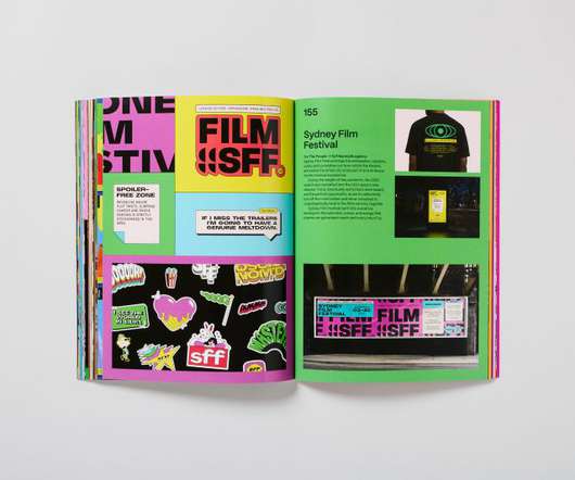
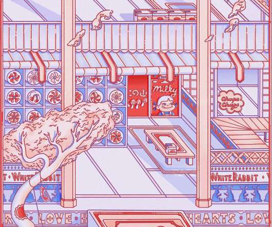
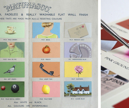
Rule-breaking palettes are celebrated in a new book about daring graphic design colour schemes

Creative Boom

Colours are a fundamental part of graphic design, but even using them in a seemingly 'incorrect' way can produce striking, eye-catching results. And it's these colour schemes that rip up the rule book, which is the focus of a new book recently released by Counterprint.

article thumbnail

Lauren Ly's obsession with mini markets spills out into Japanese ukiyo-e style illustrations

Creative Boom

Looking closely at Lauren Ly's highly detailed illustrations reminds us of those pictures we loved to draw as kids of fun factories, fantasy shops and conveyor belts, dreaming up colourful worlds from our wild imagination. I'm obsessed with mini-markets," Lauren tells Creative Boom.

Marketing 355
Insiders

Sign Up for our Newsletter

This site is protected by reCAPTCHA and the Google Privacy Policy and Terms of Service apply.

Trending Sources

article thumbnail

Brand Consistency and Web Design: The Key to Online Success

Inkbot Design

Their sites seem like Dr Jekyll and Mr Hyde: there’s so much going on with different messages being sent out left, right, and centre; colours contradict each other; fonts clash violently while images fight for attention space, leaving visitors wondering what precisely this organisation represents. What Is Brand Consistency?

article thumbnail

Spotlight on: LPOL, a British brand specialising in sustainable bags and unique art prints made from leather offcuts

Creative Boom

Founded by Central Saint Martins graduate Katy Maskell Bell in 2009, LPOL (short for Lost Property of London) began life with its first collection featuring a tote bag made out of coffee sacks and vintage Liberty fabric, which she then launched with the aforementioned prestigious store.

article thumbnail

Collins Modern Classics gives some much-loved books a new look

Creative Review

These new editions bring a fresh set of covers to well-known titles, wrapping them in clashing two-colour palettes and featuring graphics inspired by the contents of each title. The graphics have also been given a print grain filter to add some extra texture.

Textures 106
article thumbnail

Neubrutalism style in UX: a twist on the dominant modern minimalist

UX Collective

Sure they might offer different features, but even then I struggled to remember which feature I saw in which app. Immediately noticeable are the solid clashing colours; large bold text in quirky fonts immediately tells you where you are and what you can do there. What is Neubrutalism? Trends come and go.

article thumbnail

How to Design the Perfect Product Label: A Step-by-Step Guide

Inkbot Design

Using colours, shapes, fonts and imagery that pop will draw the consumer's eye. Communicate Key Information Product labels must highlight essential details like the product's name, key features or ingredients, company brand, quantity or size, and product benefits. Make sure colours align with your brand palette.