This site uses cookies to improve your experience. To help us insure we adhere to various privacy regulations, please select your country/region of residence. If you do not select a country, we will assume you are from the United States. Select your Cookie Settings or view our Privacy Policy and Terms of Use.
Cookie Settings
Cookies and similar technologies are used on this website for proper function of the website, for tracking performance analytics and for marketing purposes. We and some of our third-party providers may use cookie data for various purposes. Please review the cookie settings below and choose your preference.
Used for the proper function of the website
Used for monitoring website traffic and interactions
Cookie Settings
Cookies and similar technologies are used on this website for proper function of the website, for tracking performance analytics and for marketing purposes. We and some of our third-party providers may use cookie data for various purposes. Please review the cookie settings below and choose your preference.
Strictly Necessary: Used for the proper function of the website
Performance/Analytics: Used for monitoring website traffic and interactions
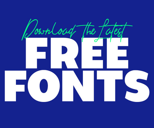
The latest free fonts in the serif category offer a balance of elegance and readability, making them ideal for use in brochures and professional branding materials. Their refined appearance works well for projects that require a touch of sophistication, such as corporatebranding or high-end product packaging.
Creative work in 2025 is experiencing a significant shift towards the Textural & Analog Revival , a trend that favors the imperfect, the tangible, and the human. Instead of flawless gradients and crisp vectors, designers and artists are embracing textured grains, analog scrapbooking, and hand-painted visuals.
Unlike minimalism, which strives for visual restraint, maximalism encourages designers to layer textures, combine multiple styles, and create a sense of abundance. A minimalist logo with a splash of maximalist color or texture gives brands a modern yet bold identity.
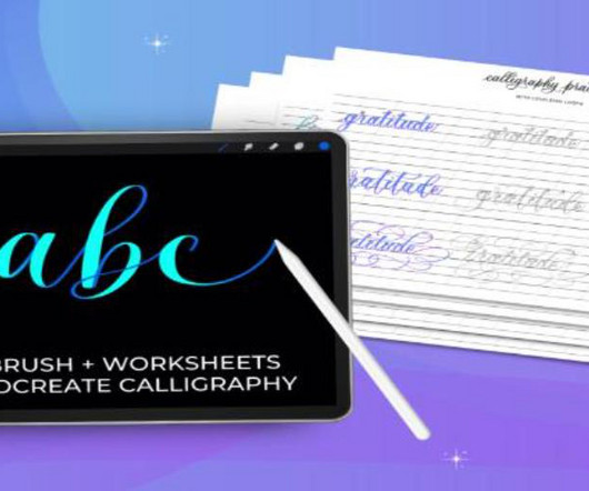
Today’s Procreate lettering brush market offers an incredible variety of options, from smooth monoline brushes that create consistent stroke weights to textured brushes that add organic character to your work. Perfect for adding decorative flourishes when paired with calligraphy tools.
Perfect for corporatebranding, legal documents, and professional certificates. Its intimate, flowing letters make it ideal for beauty brands, romance-themed designs, and personal branding. Qeillita – Signature Font Qeillita offers a delicate, feminine signature style with graceful flourishes.
This choice was perfectly aligned with the monogram’s design, creating a harmonious and impactful corporatebranding system. The identity is built on carefully balanced contrasts—the boldness of the type against clean white space, the sharp lines of the monogram against softer photographic textures.
The smooth, streaky texture creates beautiful ribbon-like effects that are perfect for decorative lettering, flourishes, or adding dynamic movement to your compositions. Coffee FREE Procreate Brush Warm up your lettering with this cozy brush that captures the rich, organic texture of coffee stains and watercolor bleeds.
This textured London font features hand-painted brush strokes with organic imperfections that give designs a raw, urban edge. Geryn Rough London Font Geryn Rough is a vintage-inspired London font that combines weathered textures with classic British typography.
Perfect for corporatebranding, certificates, and professional documents where you want to maintain authenticity while projecting confidence and reliability. Excellent for high-end brands, editorial design, and premium packaging where elegance meets approachability.
Consistent Imagery : Use similar graphic elements or patterns your brand employs. Voice and Tone : Reflect your brand's voice through design. A playful brand can use quirky illustrations, while a corporatebrand may focus on clean lines and minimalistic aesthetics. The final product screamed elegance!
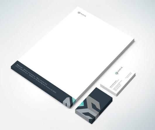
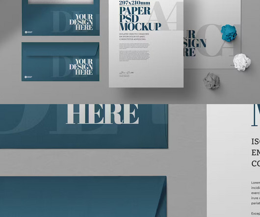
Faint geometric outlines in the background add a touch of modern sophistication, a subtle visual texture that suggests precision and forward-thinking. This clean corporate stationery layout, made possible by a premium letterhead template , is perfect for businesses that want to project a modern and trustworthy image.
With fully customizable options, these mockups ensure that every detail, from colors to textures, aligns perfectly with your brand vision. They help businesses visualize the final product before production, making them ideal for client presentations, marketing materials, and branding showcases.
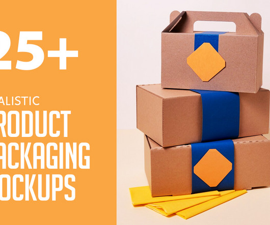
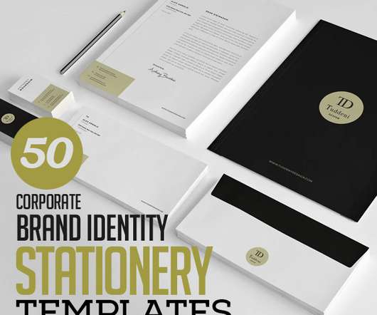
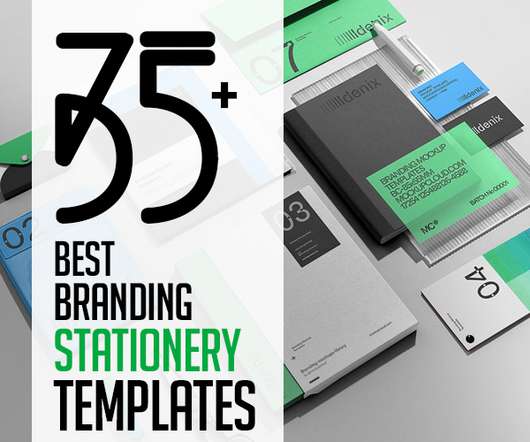
25 New Corporate Catalog & Brochure Design Templates. 15 Best Seamless Vector Textures Sets. 80 Free Watercolor Textures. Here is the list of 50 Professional CorporateBranding / Stationery Templates Design. Montoya Corporate Identity. Corporate Identity – Creative. Unlimited Downloads.
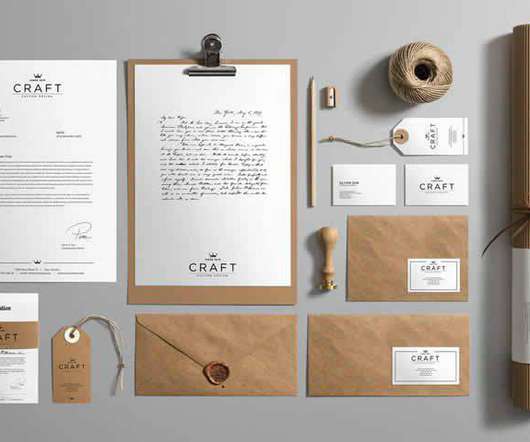
The Power of Presentation: How creative stationery mockups elevate your corporatebranding! For graphic designers working on corporatebranding, a logo and color palette are just the beginning. A truly cohesive brand identity extends to all touchpoints, including the seemingly small detail of business stationery.
50 Professional CorporateBranding / Stationery Templates Design. 25 New Corporate Catalog & Brochure Design Templates. 80 Free Watercolor Textures. Take a look at beautiful commercial fonts for professional design, based upon suggestions from designers all over the world.
This Elegant Brand Identity will help you to promote your business. Builder | Construction CorporateBranding Identity. Construction Corporate / Branding Identity Stationary Pack – 5 identity items. Stationary / Branding with Shadow Mockups with quality textures. Pure Branding Mockup.
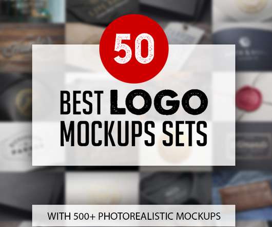
There are 50 sets of logo mockups with different effects and environments to showcase your corporatebranding designs great for presenting your logo design, badge, sign, text or shape. Background textures option and editable background colors. Highest quality photorealistic best logo mockups for logo presentation.
Free Minimal CorporateBranding Mockups with Overlay Effects. The main features of a well-built mockup are versatility, realism, and high-quality textures, which we successfully implemented into this file. The download features 14 premade scenes, 10 background textures, natural shadows, lighting overlay options and much more!
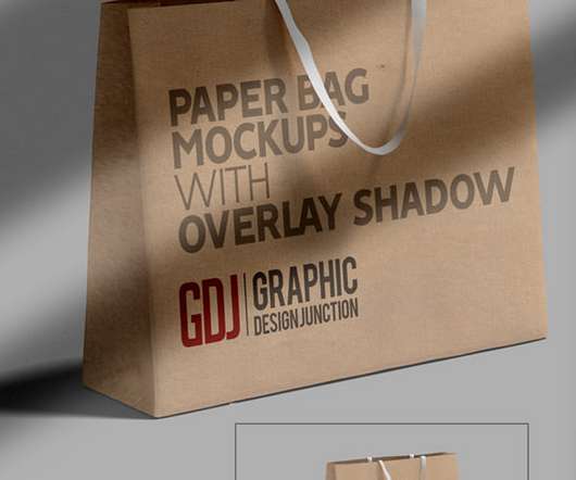
You can easily choose any color, texture, pattern or illustration to add — they all are destined to look the best way possible. Free Minimal CorporateBranding Mockups with Overlay Effects. And last but not least: choose one of two possible angles of a shopping bag, which you consider to be more pleasant.
The mockups include in this bundle are embossed on beach wood, stamped logo on wood, engraved on beach wood, engraved on textured wood, painted on a wooden wall and painted on an old grunge wooden wall. Copper Foil Logo Mockup is modern mockup for branding or promote your brand. Create a neat presentation in a second.
Corporate Identity Branding Mockup Templates (Photoshop PSD). Minimalist and incredibly professional, these isometric corporatebranding identity mockups for Photoshop are perfect for B2B audiences! You can even edit background textures and colors! CorporateBranding Identity Mock-ups (Photoshop PSD).
Brush sets include realistic paint brushes, Procreate brushes, stroke brushes, watercolor brushes, stipple brushes, textures, splatters, blenders and pencil brushes for illustrations. 21 Creative Branding Visual Identity and Logo Design Examples. Business visual identity can be the most valuable asset for any company or brand.
With soft shadows, subtle highlights, and realistic textures, neomorphic design adds depth and realism to digital experiences. Kozowood In Balance With Nature Website Design Kozowood’s “In Balance With Nature” website design likely features earthy tones and organic textures, reflecting their connection to the natural world.
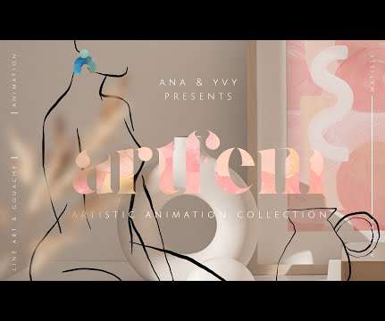
This is me painting the texture for the Artfem animated collection. Take my water texture product. Here’s another example: the original paint strokes and setup for what ended up being a digital texture pack: I have a ton of stuff on my computer which didn’t work out or which I didn’t finish—pure creative chaos.
Posters and ads feature vintage-style borders and textures, postcard graphics, and Seventies-style curvy type. It’s a clever strategy to give the concept of lab-grown meat a cozier personality and distance the branding from the clinical reality of the product. Experiment with texture to bring monochrome designs to life.
Our favourite example is their Bright Park branding campaign —made for a Russian car dealership based in the Perm region—which is like watching living chemistry. Superdesigners created a series of motion graphics and animations which draw the viewer into the textures, light and sounds that one might experience while driving.
They work fantastically for corporatebranding, print media, and an assortment of other font needs. A vintage font with rough splatter textures, this typeface is essential to any retro-inspired design. A font like this goes wonderfully with watercolor or ink wash textures, allowing users to mimic a truly handmade style.
Usually, the customer will hand a brief with resolution specs or brand pointers like “we’re rebellious” or “we’re after a conservative look” All those little elements will go into certain features of the typeface. A lot of corporate designs get watered down.
This beautiful font comes with an additional gold foil texture jpeg that adds a touch of luxury and glamour to any project. This texture is perfect as a background, accent or overlay to complement the Hazel Deco font. This font is essential to any designer's toolbox with its stunning uppercase design and added gold foil texture.
Omega Collection takes advantage of the power and memory bandwidth of PS4 to rework all textures in the game. Compared to the original games, textures are now clear when viewed up close: you can even read some of the small text on the ships for the first time. Wipeout HD Ingame Branding by Alex Townsend. Made in CS3.”
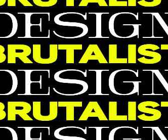
We often see brutalist design in design pieces from brands that are open to exploration. Since the style can look artsy, highly experimental, and conceptual, it’s difficult for it to work for corporatebrands. Nevertheless, fashion brands like Nike and print materials for the music industry also make use of this style.
Omega Collection takes advantage of the power and memory bandwidth of PS4 to rework all textures in the game. Compared to the original games, textures are now clear when viewed up close: you can even read some of the small text on the ships for the first time. Wipeout HD Ingame Branding by Alex Townsend.
Experiment with contrasting colours, sizes, shapes and textures to direct attention where you wish. Embrace Consistency Create a consistent look across all your content pieces using a cohesive visual style that ensures brand recognition. Think minimalistic chic rather than visual chaos.
They balanced clean, grid-based layouts from the International Typographic Style with handmade brush strokes, fabrics, origami textures, and calligraphy. We see this in branding elements like Muji’s logo or Issey Miyake’s fashion silhouette. Tactile irregularities in printing, textures, or brush strokes add individuality.
The typeface you select for your logo should reflect your brand's personality and values. For instance, a fun, playful brand may opt for a rounded, bubbly typeface, while a professional, corporatebrand might prefer a more traditional serif font.
The rise of consumer culture driven by advertising and corporatebranding led to pioneering work from agencies like Doyle Dane Bernbach, which took a more creative advertising approach. In media and marketing, white space, visual hierarchy, and negative space allow designers to draw attention to critical messages and brand elements.
For graphic designers, corporatebranding is a delicate dance. By placing the design on a textured background, complete with shadows and lighting effects, you give your client a tangible sense of how the card will look and feel when printed. You will also be able to change the shadow overlay, background color and texture.
Humanist sans-serif fonts balance legibility and personality, making them suitable for various applications, including body text, corporatebranding , and user interfaces that require a friendly and approachable feel. These fonts are characterised by irregular shapes, rough edges, and textures, which give designs a raw and edgy vibe.
These fonts have a clear-cut personality that perfectly suits contemporary designs and corporatebranding. This level of control allows them to fine-tune the text's density and texture, contributing to the overall aesthetic quality of the design.
Opt for a retro style to pay tribute to the original Spielberg era of Indiana Jones and The Goonies , or turn to metallic textures and eye-popping 3D styling to bring an action element to designs. . Use them for corporatebranding projects or website designs that require a little more edge and interest. .
Corporatebranding is not just about choosing a catchy name and designing a memorable logo. A game changing corporatebrand is a mix of outstanding strategy, visuals, storytelling, engagement, and application. We live in a world where we’re constantly bombarded with brands, advertisements, slogans, and social media.
Omega Collection takes advantage of the power and memory bandwidth of PS4 to rework all textures in the game. Compared to the original games, textures are now clear when viewed up close: you can even read some of the small text on the ships for the first time. Wipeout HD Ingame Branding by Alex Townsend.
Curator and graphic designer Andrew Blauvelt, who penned one of the essays in the book, sees new wave design as a direct reaction to the way the Swiss International Typographic Style (flat, abstract symbols and logos; minimalism; sans serif type) had been widely disseminated and then codified by 1960s and ’70s corporatebranding.
Scale your pattern up to create large blocks of color and distinct shapes, or scale it down to create more of a textured, detailed look. Check out how Anna Trympali has done just that here in this branding for “Art of ?” A little texture. Consider adding in some subtle texture to soften it up a little. Less is more.
We organize all of the trending information in your field so you don't have to. Join 66,000+ users and stay up to date on the latest articles your peers are reading.
You know about us, now we want to get to know you!
Let's personalize your content
Let's get even more personalized
We recognize your account from another site in our network, please click 'Send Email' below to continue with verifying your account and setting a password.


Let's personalize your content