This site uses cookies to improve your experience. To help us insure we adhere to various privacy regulations, please select your country/region of residence. If you do not select a country, we will assume you are from the United States. Select your Cookie Settings or view our Privacy Policy and Terms of Use.
Cookie Settings
Cookies and similar technologies are used on this website for proper function of the website, for tracking performance analytics and for marketing purposes. We and some of our third-party providers may use cookie data for various purposes. Please review the cookie settings below and choose your preference.
Used for the proper function of the website
Used for monitoring website traffic and interactions
Cookie Settings
Cookies and similar technologies are used on this website for proper function of the website, for tracking performance analytics and for marketing purposes. We and some of our third-party providers may use cookie data for various purposes. Please review the cookie settings below and choose your preference.
Strictly Necessary: Used for the proper function of the website
Performance/Analytics: Used for monitoring website traffic and interactions
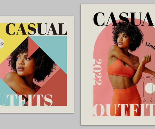
These predictions will give you a glimpse into the exciting directions graphic design is heading in, providing valuable insight into the trends that are set to lead in the coming year. Retro-futurism reflects a playful yet sophisticated look, making it popular across branding, website design, and digital art.
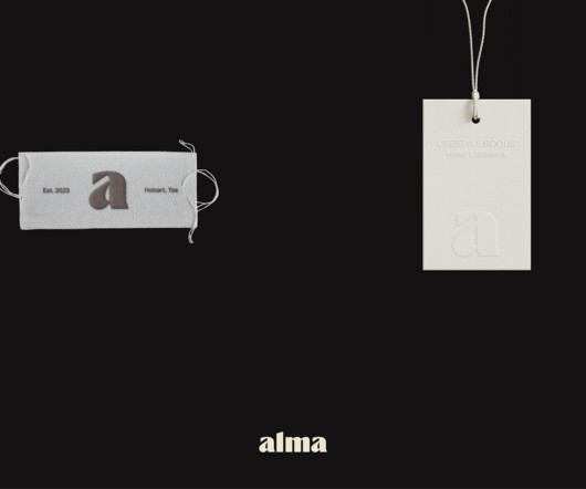
Maria Heer's design for the "Alma" logo is modern and minimalist. The brand name uses a bold font, creating a strong contrast that feels both elegant and energetic. The consistent application of the logo, typography, and color palette ensures that every touchpoint reinforces the Alma brand.
Understanding the Foundation of Visual Identity Design At the heart of every successful brand lies a well-defined visual identity design. Visual identity design is the process of creating the visual elements that represent a brand , including its logo, color palette, typography, imagery, and more.
Dark Mode: Implementing Dark UI in Your Web DesignStrategy Dark Mode in UI/UX refers to a design aesthetic where the interface features predominantly dark colours, as the name suggests. This web design trend offers a viable alternative to light-themed user interfaces.
Over 1,500,000+ Fonts, Mockups, Freebies & Design Assets. In a bid to stand out, designers often make the mistake of overloading interfaces with many fonts and colors. For starters, visual consistency includes sizes, fonts, and buttons that impact a product’s learnability. Unlimited Downloads.
7 Best Ecommerce Website DesignStrategies to Skyrocket Sales The internet is a busy marketplace that never sleeps. Using suitable fonts communicates brand personality better while enhancing readability and guiding customers’ eyes exactly where we want them directed. It’s always open, and so are other people’s businesses.
Also, see our feature on the best poster fonts and powerful fonts. Creative Poster Design Tips 1. Use a basic background image with a bold font for the creative poster design, or vice versa. When you choose a simple design, you can readily predict where your readers’ attention will be drawn.
Use consistent colors, fonts, and visual elements that align with your brand’s identity. Use size, color, and positioning to emphasize key messages or call-to-action buttons. Experiment with Typography Typography is a powerful design element that can convey emotion and personality. Subscribe to our newsletter!
While there are logo trends that come and go every year when it comes to color, layout , and typography, there are a few key designstrategies mega-brands have used to make their logos stand out against the competition, and better yet, become instantly recognizable. Which leaves one question: what is your logo telling them?
Typography That Works: Typographic Composition and Fonts. When you’re starting out as a graphic designer, you may spend a lot of time perfecting the logo that portrays your brand to prospective clients, but what about the typography on your website or business card? Using simple shapes in a design. Designing with negative space.
So, even though you might have an inspiring business story to share, without a designstrategy in place, it’s most likely to fall flat. Not a designer? You can get started with annual report design templates to create reports that keep readers interested. Here’s an example of a well-designed annual report.
Be it a logo and color palette or an entire campaign layout, “there’s an undeniable pragmatism to our work,” says Peraza. Since most of Hyperakt’s clients don’t have in-house design expertise to deploy a design system, the studio keeps it simple when it comes to guidelines and type systems built for their nonprofit clients.
This free course by Michigan State University walks you through the process of conveying information with effective type, color, and layout choices. This free Coursera specialization offered by CalArts is the perfect opener for anyone looking to design impactful websites and apps — no matter what field you're coming from. Adorn Roman.
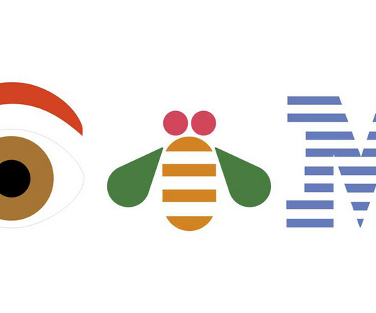
1891 This design reflected the era well, with ornate fonts and design elements that were popular in the early 20th century. International Business Machines” was written in a serif font , all caps, against a black rectangle. The 1962 logo design established the concept that IBM logos have followed in the decades since.
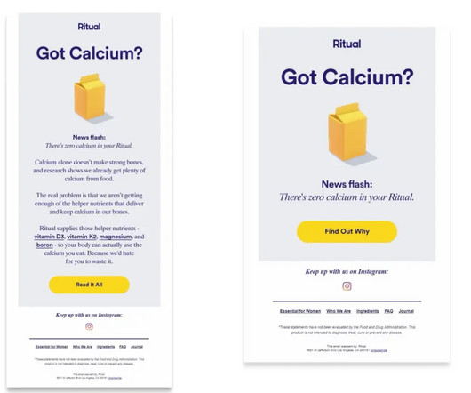
All this will define your designstrategy. We recommend color-filling the primary CTA to make it stand out. But we have across brands whose email footers are almost a quarter of the template and chockablock with information written in a very low font size. all contribute to design. Use bold and large text.
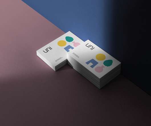
UNI is the name of this design studio, and Eunice Su hopes to create a “sustainable” design. ” The designstrategy revolves around the four core values of the brand: unit, balance, aesthetics, and exploration. The logo design is based on the UNI unit.
The website can stand out with an amazing combination of color palette choices and using gradients in the text. Intello includes a very interactive modern website design and the company works with reputable partners like NASA, NordVPN, Credit Agricole, and Spotify. What we love about this website: Great color combinations.
, but I am so glad it was because it opened my eyes to different types of design fields and thinking. Since then I’ve worked at Fitbit designing visual systems for their new products/services, and am currently in a design/strategy role as a Creative Specialist on the Twitter Next team.
The design is both playful and enigmatic, encouraging players to delve deeper into the game world. This theme is reflected in the color palette, typography, and overall visual style. The primary serif font, Editorial New, adds a narrative quality to the brand, making every interaction feel like part of an unfolding story.
With the right CMS tools, you can create an engaging, professional website with little-to-no design or coding experience. Thanks to new developments in technology, the best nonprofit websites are able to put user engagement at the forefront of their designstrategy. Optimize for mobile devices. Maintain an active blog.
I designed the logo around the idea of ‘access’—bridging the gap between quality and affordability. I drew inspiration from ornately designed bows of antique skeleton keys to design the logomark and I kept the logo font simple and approachable. What has been your experience running your studio?
Some of the most iconic movie posters were created by American graphic designer Saul Bass in the 1950s and 1960s, who favored a graphic, collage-style approach in his poster designs for Hitchcock classics Vertigo and The Man With the Golden Arm. the Extra-Terrestrial (1982), Back to the Future (1985), and The Terminator (1985).
Tutorials To aid designers and developers in augmenting their abilities and broadening their information resources, Webdesign Ledger not only offers articles but also tutorials. These tutorials encompass a diverse array of subjects such as responsive design, typography, color theory, and frontend development among others.
In this section, I will discuss some options and features that you can use to improve your strategy for selecting colours. Adobe Color, Coolors, and Paletton are examples of resources that allow you to try out different combinations of colours effortlessly.
10 Packaging DesignStrategies for Unwrapping Success You're just walking down the aisle in the supermarket, surrounded by a sea of products screaming for your attention. That's the power of great packaging design. Let's dive into some of the best packaging designstrategies currently on the go. Intriguing.
Match Agency’s New Branding and Web Design Approach abduzeedo 1007—24 Discover Match Agency’s fresh branding and web designstrategy, featuring a bold palette and minimalist design. Match Agency, a creative force in branding and web design, has just unveiled a fresh visual identity to celebrate its second anniversary.
In 2019, 80% of online users used a mobile device to search the internet, making it an important consideration in your school’s web designstrategy. Sticking to the same font as well as two or three colors will make sure your forms are consistent with the rest of your website. Make sure it’s mobile-responsive.
So, if you're one of the 77% who believe in accessibility but haven't quite achieved it, the following insights about email accessibility might make you rethink your email designstrategies. Choose Readable Fonts and Sizes Font Choice : Stick with sans-serif fonts for the body text. Font Size : Bigger is better.
These bright and colorful lighting solutions are no longer just the domain of commercial spaces like bars and restaurants. They are now becoming an increasingly popular choice for homeowners who want to make a bold statement in their interior designstrategies.
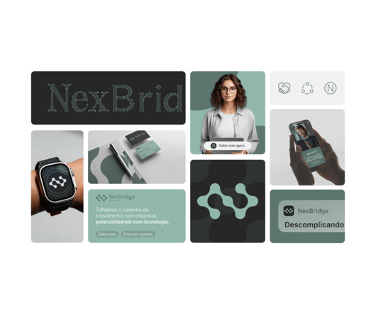
This design project, rooted in São Paulo, Brasil, encapsulates the essence of bridging complex technological gaps, allowing businesses to concentrate on their core competencies. The designstrategy focuses on creating a visual language that resonates with the company's mission of driving innovation.
Much of the topic is researched and explored on why people are attracted and compelled to certain shapes and colors more than others. Clean Lines Distinct and simple shapes Loud and contrasting colors (the color conversation is quite deep and we won’t get into that in this article. Only because of the shapes and colors.
5 Crucial Website DesignStrategies You Shouldn’t Ignore In order to create a website that stands out from the competition, you’ll want to focus on implementing these five key designstrategies. Focus on using a limited color palette, high-quality images, and consistent typography throughout your site.
Be sure to check the contrast ratio of any colour combination you’re using by using an online tool such as Color Oracle. For example, someone who is visually impaired may want to print documents with larger font sizes. Start with a solid foundation: Build your sites with HTML5 and CSS3 (and not Flash).
As you begin to build or revamp your organization’s website, your users’ experience should be at the forefront of your web designstrategy. Successful web design means your site visitors have a positive experience and can easily navigate your pages, immediately finding the information they seek. Let’s take a closer look.
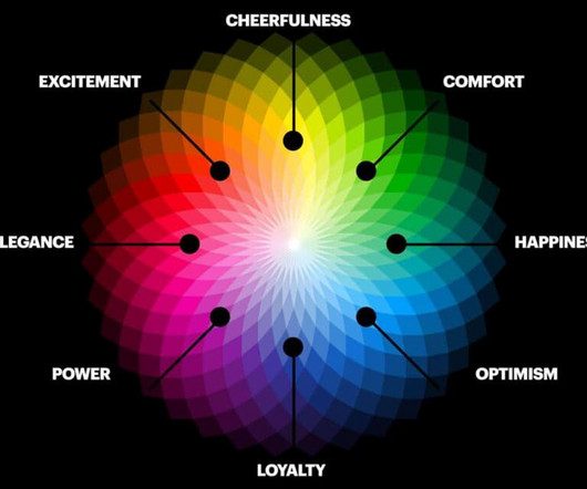
As we wrote , You can communicate a lot – and do it efficiently and effectively – if you understand your brand and make informed, thoughtful choices regarding fonts, shapes, lines, colors, and composition. Here, the color of the rose is just as important as the flower itself.
These are the people that help a company become a brand by creating their logo, choosing font styles, color palettes, and more. Marketing and Advertising Design. This what people think of and where the roots of Graphic Design are. I’d love to invite you to a FREE 1:1 Branding and DesignStrategy Session.
It’s fonts, colors, and logos among other pieces of information. A logo is pretty self-explanatory, but as a refresher, it’s the symbol that reflects a business’s personality and reputation and drives the rest of their brand visuals. The style guide is at least one page and provides details on the brand.
It’s really hard to design for “everyone” and “everything”. Visuals meaning photos, drawings, fonts, and colors set the tone and create the vibe. For the ads that aim to induce fear, we’re going to see fonts that are Victorian in nature with curls and points in the letters.
Color Theme. Over 1,500,000+ Fonts, Mockups, Freebies & Design Assets. Importance of Website Design Tips for Technology. Use this website design tips for technology to rank better. Color Theme. It is essential to have a color theme that is visually soothing. Ease of Website Navigation. Conclusion.
Symbols, colors and a variety of design features might be used to transmit information. UX design should presuppose that users have no background data protection knowledge. In fact, deceptive patterns in data protection are the exact opposite of Privacy-Enhancing Design. No Previous Data Protection Knowledge.
But when you suddenly become responsible for strategy (as may be the case in a startup or smaller company), you may get nothing short of goosebumps?—?and Dear designer: Strategy doesn’t have to be stressful ? By Meghan Wenzel Morisawa , the official font provider for Tokyo 2020. and for good reason.
Whether youre adjusting text blocks, swapping images, or tweaking the colors to align with your brand, the process is straightforward and efficient. Incorporate brand elements like custom colors, fonts, or logos to make it uniquely yours. Architects delivering conceptual plans or designstrategies.
Design Elements for Attention Here's the fun part! To truly grab attention, consider these designstrategies: Bold Patterns : Geometric shapes, stripes, and abstract graphics can create dynamism. Bold fonts for a business name or catchy tagline can be incredibly effective. Vintage-Inspired Designs Feeling nostalgic?
We organize all of the trending information in your field so you don't have to. Join 66,000+ users and stay up to date on the latest articles your peers are reading.
You know about us, now we want to get to know you!
Let's personalize your content
Let's get even more personalized
We recognize your account from another site in our network, please click 'Send Email' below to continue with verifying your account and setting a password.


Let's personalize your content