This site uses cookies to improve your experience. To help us insure we adhere to various privacy regulations, please select your country/region of residence. If you do not select a country, we will assume you are from the United States. Select your Cookie Settings or view our Privacy Policy and Terms of Use.
Cookie Settings
Cookies and similar technologies are used on this website for proper function of the website, for tracking performance analytics and for marketing purposes. We and some of our third-party providers may use cookie data for various purposes. Please review the cookie settings below and choose your preference.
Used for the proper function of the website
Used for monitoring website traffic and interactions
Cookie Settings
Cookies and similar technologies are used on this website for proper function of the website, for tracking performance analytics and for marketing purposes. We and some of our third-party providers may use cookie data for various purposes. Please review the cookie settings below and choose your preference.
Strictly Necessary: Used for the proper function of the website
Performance/Analytics: Used for monitoring website traffic and interactions
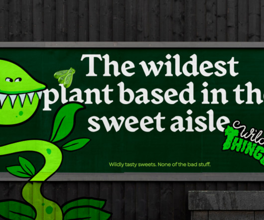
How&How helps Wild Thingz build a category-defining rebel sweetie brand from scratch – something that pleases both parents and kids. The project began by examining the existing category to see if there were any opportunities. And the whole messaging calls out the category for containing "so much crap".
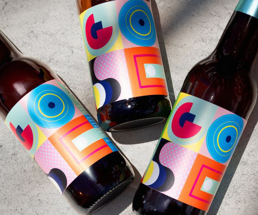
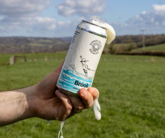
GOSE required an identity as unique as its product, which Bala delivered through semi-abstract illustrations and an acidic colour palette that reflects the beer's salty flavour. This is why we fell in love with the idea of designing its label," he adds.
Image licensed via Adobe Stock Designers should pay attention to a new report from the World Economic Forum. Worried about your job in graphic design? That's a stark turnaround from the previous report, which categorised graphic design as a "moderately growing" profession. If not, then maybe you should be.
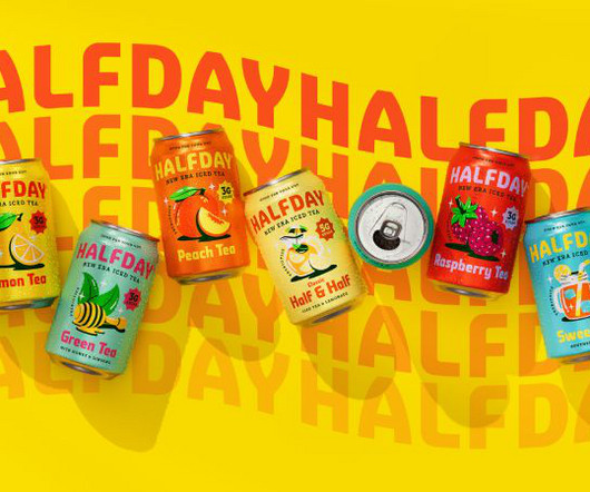
HALFDAY, known for its prebiotic iced teas with all-natural ingredients and reduced sugar, already had a product that ticked all the functional boxes. At that time, brightly coloured bottles lined the shelves, brands embraced loud design, and iced tea was more about indulgence than wellness.
Image licensed via Adobe Stock Selecting the perfect typeface for your design projects couldn't be more important. Graphic designers share their expert insights on how to do so. As anyone who's been a graphic designer for more than a few days will know, selecting the perfect font for a project is crucial.
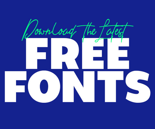
If you are a graphic designer, staying updated with trends is key to staying ahead. Using the latest free fonts and fresh typography styles can instantly improve your work and keep your designs looking modern and creative. In past years, fresh font styles have emerged, catering to a wide range of design needs. The good news?
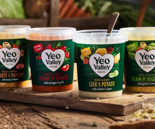
New illustrations are a key part of the brand's new identity, designed to help its new Greek and Kefir products stand out on the shelf. London-based B&B studio has revamped Yeo Valley Organic's entire visual identity and product range architecture through a combination of small tweaks and more dramatic overhauls.
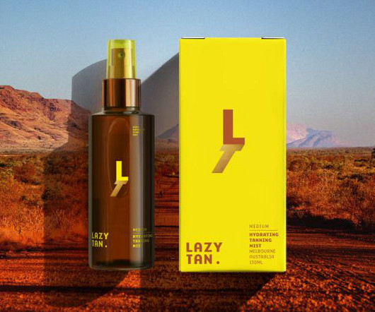
The studio designed some shady graphics that show you can get a tan without the hassle or harm to your skin. Through its identity, Lazy Tan wanted to spotlight its hassle-free product and celebrate sun avoidance as a smart, modern choice. There's nothing quite like the glorious feeling of a fresh tan.
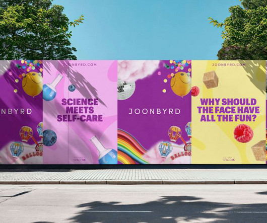
Blending magical moments, science, storytelling and a hint of nostalgia, Almighty's designs position Joonbyrd at the forefront of the beauty and wellness industry. Headquartered in London, Joonbyrd is a company focused on creating skincare, wellness, and lifestyle products that promote emotional wellbeing alongside physical benefits.
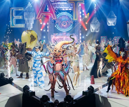
2024 WOW Show, Crazy Curiosities of Creature Carnival Blending performance art, fashion design, music and contemporary dance, The World of Wearable Art was an intoxicating cocktail of creative disciplines. Elsewhere, the Weta Workshop Emerging Designer Award was won by New Zealander Katherine Bertram for her garment Termite Cathedral.
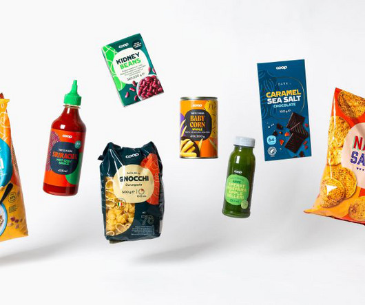
Swedish studio Bercow is helping the Nordic retailer reimagine 3,500 products across four countries, harmonising diverse market identities through clever use of a superellipse. The project began in spring 2022 and is now coming to fruition as the first products featuring the new designs hit shelves in Sweden, Denmark, Norway and Finland.
Professional Exploration Category Winner: The Governess by Trevin Wyant We reveal the winners of the World Illustration Awards 2023, and share their winning pieces. Looking for visual inspiration? Or are you just wondering what sort of commercial art can win awards these days? Want to enter for next year?
"A strong relationship is mutually collaborative, never dictatorial, where solutions come with strategic rationales, thinking is shared, and curious questions are asked," says Wedge founder and chief design officer Justin Lortie. After multiple rounds of testing, the design team got to the desired result.
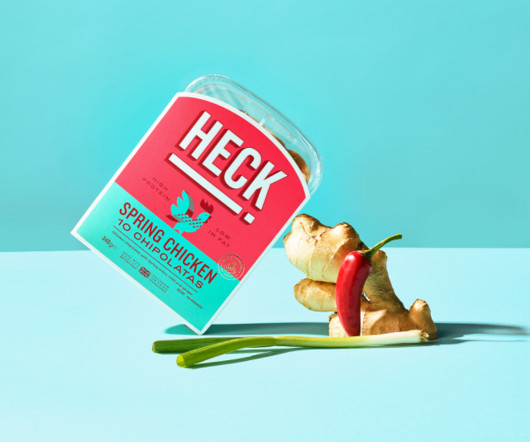
They've now unveiled playful new branding designed to reinvigorate the category appeal to a younger audience. Developed in partnership with global design consultancy Elmwood , it's all designed to appeal to a younger audience by tapping into new trends and create a basis for long-term product development.
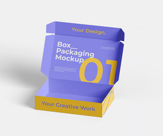
Box packaging plays a crucial role in presenting products effectively. Whether you’re working on branding projects or showcasing your design skills, having high-quality mockups can make all the difference. Here, we present 50+ box packaging mockups , divided into premium and free categories, to help you elevate your designs.
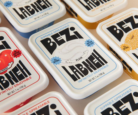
Red Antler used its expertise working with start-ups to design a category-disrupting dip for New York foodies. For those who don't know, Labneh is a Middle Eastern dairy product made from strained yoghurt with a similar texture to mascarpone cheese. The new Labneh company hit shelves across NYC this September.
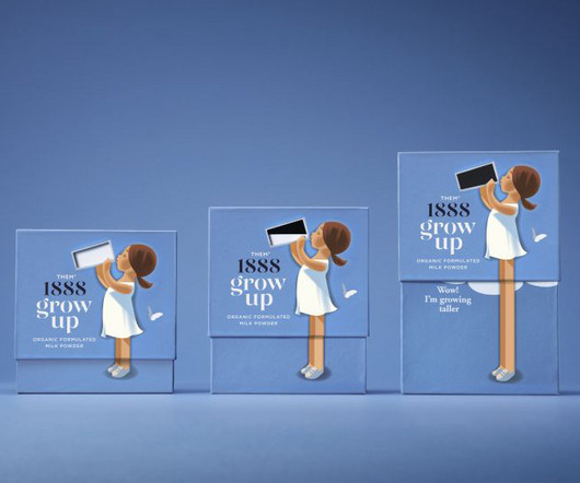
From soft, retro-inspired illustrations to packaging that demonstrates the product's effects, Them 1888's new milk powder brand is set to stand out among competitors. Milk powder isn't exactly a staple product in Western countries and I don't mean baby formula; I mean a powder alternative to the pints of milk we have in our fridge.
Becks Skinner, design director at Supple Studio, explains how the team used the farm itself as a creative playground: "We worked with Spilsbury to create a suite of textures by printing, rubbing and inking everything from hay bales to fence posts and industrial machinery. But the brand's farm-first ethos goes beyond the logo.
Influur was already a successful enterprise, hosting a diverse community of over 30,000 creators across various categories for branded events and social media collaborations. So they turned to Austrian design agency Studio Herrström. If the job is done, compensation should be provided," Erik reasons.
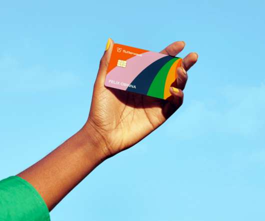
"Flutterwave is such a powerful and dynamic brand that exudes the spirit of African entrepreneurship and so our collaborative approach was critical to this, ensuring the brand remained authentically African while standing out in its category," says Roman Stikkelorum, managing director at Verve.
Various Formats Mockups can help speed up your graphic design work and give you time to be more creative. In the graphic design world of 2023, it's getting more and more difficult to make your work stand out. So it's vital to ensure your designs are presented in the best possible light, not only on your site but also across the web.
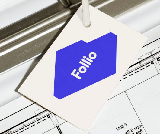
Follio was created to fill a gap in the market for architecture and interior design tools. New Genre has created the website and identity for Follio, a new digital platform designed to help large enterprises organise, manage and deliver interior design standards while streamlining workflows and ensuring cohesion.
The call for submissions is open for the 2023-2024 A’ Design Award & Competition – want to enter? Projects that focus on innovation, technology, design, and creativity are being accepted for consideration until February 28, 2024. Check out some of the 2022-2023 award winners below for some confidence and creative inspiration.
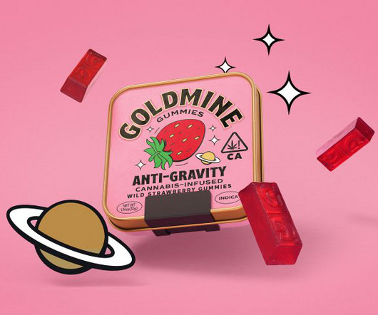
Leeds-based consultancy Robot Food has been doing just that, working with cannabis company Breez to launch a new candy product, Goldmine Gummies, in the US state. Initial research and brief At the start of the process, Robot Food worked with the Goldmine team to analyse the category and take the new brand to the next level.
Jose's 3D journey Based in Málaga, Spain, Jose's journey into 3D animation began unexpectedly through his work in interior design and architectural visualisation. "My These broadly fell into two categories. Seamless pipeline The production pipeline Jose developed showcases the versatility of Reallusion's software suite.
Japanese-style fonts bring a unique blend of tradition and modernity to design projects, making them a popular choice for businesses and creatives alike. Whether you’re working on branding, packaging, or web design, the right Japanese-style font can evoke cultural authenticity, elegance, or contemporary simplicity. Download 2.
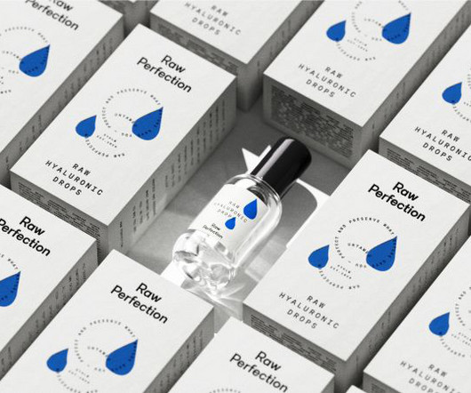
That's the message that vegan and cruelty-free skincare brand Raw Perfection drives through its new identity, designed by Scandinavian consumer brand and design agency Everland. According to Larsson, three things drew the design team to the project: "super-high ambitions, a passionate founder, and exceptionally high-quality products."
Bath-based brand and packaging design agency Sunhouse has redesigned OG orange juice brand Tropicana, using heritage in a contemporary way to position it as the category leader and aligning with its new campaign, 'THAT juice'. To reflect the craft and care that goes into the product, Sunhouse chose Brother 1816 as the primary font.
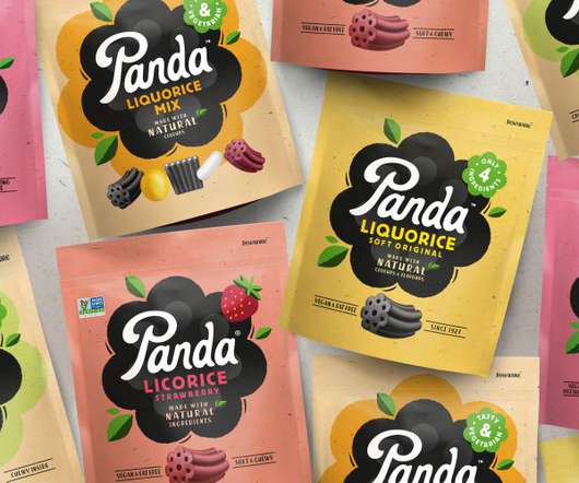
A big requirement of the brief was to ensure Panda's branding "reflects and retains its position as the category leader while helping it secure new store listings and dialling up stand out on-shelf," according to the agency. The packaging also needed to be distinctive, as some of Panda's products, such as the liquorice bars, are so small.
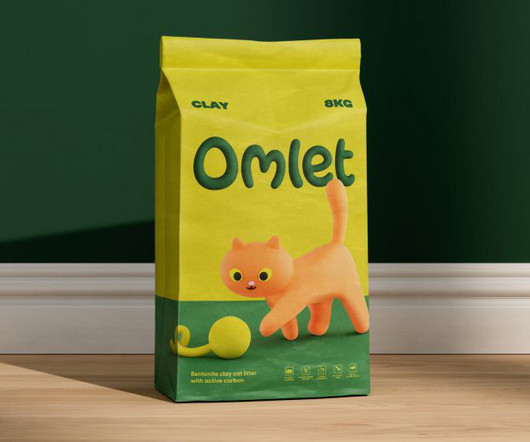
Regarded as a pioneer in the pet products industry, Omlet shakes things up by factoring in pet behaviours when it comes to designing its offerings. Designed to encapsulate the fun and whimsy that Omlet is known for, the new identity is a charming and colourful delight. "The A world of wonder for pets and pet owners alike."
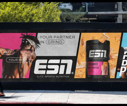
Standing for Elite Sports Nutrition, ESN is Germany's biggest sports nutrition brand, with an industry-leading array of products for performance-driven people and elite athletes. It also pays homage to the brand's heritage through a bold, simple and energetic design. But just like any big-range brand, ESN has lost its way over time.
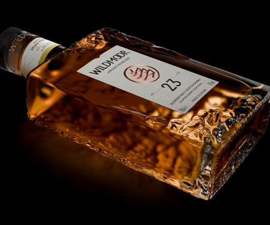
Amid the rising popularity of Japanese whiskeys, LOVE has designed a new brand that combines two cultures while staying true to the category's time-honoured codes. Manchester-based creative agency LOVE has designed a new luxury whiskey brand from scratch in collaboration with William Grant & Sons (WG&S).
But if you've spent more than five minutes in a meeting or scrolling through design briefs, you'll know there's a whole lexicon of tired, overused buzzwords that have lost all meaning. Premium If you've ever worked on a design brief for a tech company, you'll know that "premium" is a go-to descriptor.
The result is a clean, image-led site that showcases Italy's producers and rich culinary heritage, sitting alongside a newly crafted logotype by Koto, which pays tribute to classic Italian graphic design, echoing the bold and ornate lettering found on packaging and signage across Italy.
The 'less is more' concept is a powerful one in design. Corporate clients, in particular, may end up trying to cram multiple messages into one design; either to please all the competing parts of the business, or because they just lack focus concerning what their business is actully about. This wasn't AI-scanning product reviews.
The popularity of its products has led to a number of new ranges being introduced over the last seven years, including high-protein food and beverages, zero/low-sugar tasty alternatives, and beauty from within supplements. The expressive 'M' is instantly distinctive, becoming a lifeline thread that runs through the whole design. "We
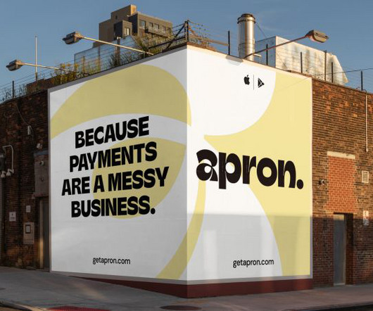
Credit: Opening Line / Outsiders / Apron Opening Line founder Zosia Swidlicka and Outsiders Creative Partner Tom Rogers explain how their teams collaborated with to create a fintech identity that transforms payments from a painful process to a positive experience without leaning into category clichés.
Carla Palette explains how her brand identity design helps convey that message effectively. And they've collaborated with Carla Palette , a brand identity designer and art director currently working in Berlin, to help get this message and ethos across. Tresi is on a mission to help people buy amazing furniture at affordable prices.
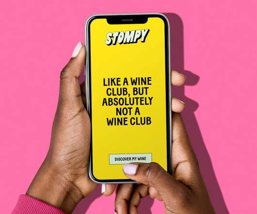
Playful in its manner, the extruded type is transformed into repetitive patterns throughout the identity, alluding to the brand's different categories of wine. The happiness continues in the copy and website design, too. They help bring in joy and show that Stompy doesn't take itself too seriously," adds Jessica.
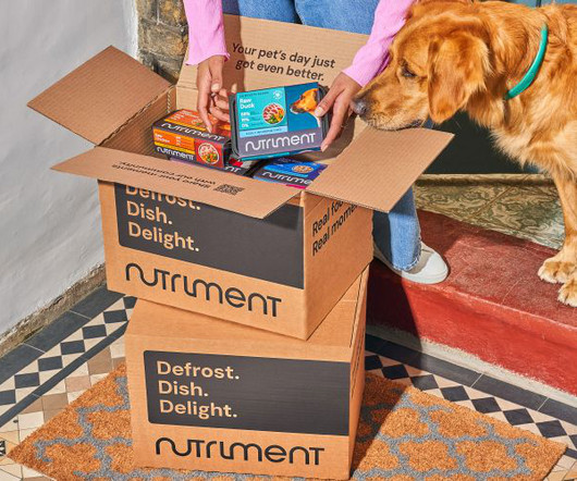
Pet food brand Nutriment was founded in 2013 when raw diets were still a small niche within the category. Robot Food was brought in to update Nutriment's visual and verbal identity, including a new packaging design, with the goal of better communicating its science-driven approach, which differentiates it from competitors.
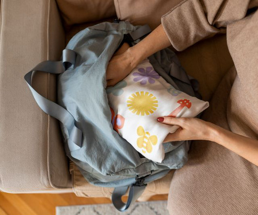
The studio's head of design, Meg Jannott, describes the brief as "exciting and ambitious" while stressing the importance of the client's category as parenting is overwhelming enough without having to sift through hundreds of brands that don't resonate with them. So they stuck with the original name.
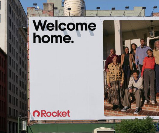
Detroit-based fintech platform Rocket recently revealed a new identity designed by Otherway. With no true category leaders from which to draw inspiration, Otherway instead looked beyond the sector for inspiration. "As Holt explains how the new identity prioritises real stories, featuring genuine Rocket clients in candid photography.
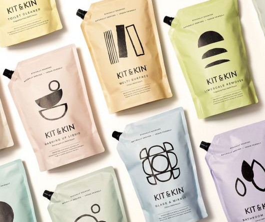
Kit & Kin was known for its mother-and-baby products but needed to extend its brand to a broader range of household goods. In theory, we all like the idea of products that protect the environment. When it comes to cleaning products, that means having refillable bottles and ingredients that are kind to the Earth.
We organize all of the trending information in your field so you don't have to. Join 66,000+ users and stay up to date on the latest articles your peers are reading.
You know about us, now we want to get to know you!
Let's personalize your content
Let's get even more personalized
We recognize your account from another site in our network, please click 'Send Email' below to continue with verifying your account and setting a password.


Let's personalize your content