This site uses cookies to improve your experience. To help us insure we adhere to various privacy regulations, please select your country/region of residence. If you do not select a country, we will assume you are from the United States. Select your Cookie Settings or view our Privacy Policy and Terms of Use.
Cookie Settings
Cookies and similar technologies are used on this website for proper function of the website, for tracking performance analytics and for marketing purposes. We and some of our third-party providers may use cookie data for various purposes. Please review the cookie settings below and choose your preference.
Used for the proper function of the website
Used for monitoring website traffic and interactions
Cookie Settings
Cookies and similar technologies are used on this website for proper function of the website, for tracking performance analytics and for marketing purposes. We and some of our third-party providers may use cookie data for various purposes. Please review the cookie settings below and choose your preference.
Strictly Necessary: Used for the proper function of the website
Performance/Analytics: Used for monitoring website traffic and interactions
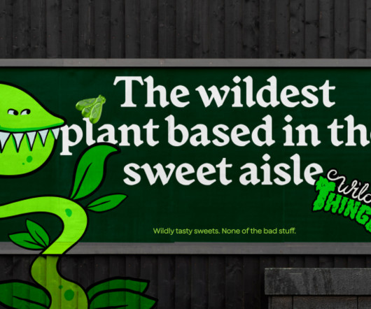
How&How helps Wild Thingz build a category-defining rebel sweetie brand from scratch – something that pleases both parents and kids. The project began by examining the existing category to see if there were any opportunities. And the whole messaging calls out the category for containing "so much crap".
The peculiar taste profile of this beer style is its distinctly salty flavour because the original production process used salty water from the Gose River in Bavaria, Germany. This, paired with the product's unique taste, gives meaning to the entire brand experience, which is totally disruptive in its category.
People can use the search tool, or browse our categories by artist, century, style, theme, or tag," Green notes. To aid users, the archive provides detailed rights statements for each image, clarifying the legal status of both the original work and its digital reproduction.
Bath-based brand and packaging design agency Sunhouse has redesigned OG orange juice brand Tropicana, using heritage in a contemporary way to position it as the category leader and aligning with its new campaign, 'THAT juice'. Tropicana's rebrand coincides with a shift in the category, likely due to the turbulent economy of recent years.
A new look rooted in the land The original Somer Valley Brewing logo depicted a literal landscape, but Supple Studio saw an opportunity to create something more abstract and ownable. "We This earthy, grounded approach ensures that every aspect of Somer Valley Brewing's identity is tied back to its origins.
Appealing to a new generation of cocktail lovers was central to the brief and - with the rollout of new flavours from Pickled Bean to Lime and Extra Spicy - the identity needed to support Mott's ambition to go beyond the classic original cocktail and expand the expression.
Im happy to report an unexpected turn of events along my redemption arc, which originated days after the 20th anniversary edition where I dreamt an imaginary rivalry with the prolific VanHooser. Most Original: Infinity Lounge Chair by Monte A. Most Original: The Infinity Lounge Chair by Monte A.
Founded by dermatologist Dr Alexis Granite, it aims to create a new category called "Affective Wellness", which combines beauty and skincare with emotional and mental wellbeing in body care products such as body wash, lotion, scrubs and serums. Here, Joonbyrd's brief was to inject joy and fun into the beauty and wellness category.
"Flutterwave is such a powerful and dynamic brand that exudes the spirit of African entrepreneurship and so our collaborative approach was critical to this, ensuring the brand remained authentically African while standing out in its category," says Roman Stikkelorum, managing director at Verve.
These broadly fell into two categories. In these cases, I created the characters based on facial features which were appropriate to their place of origin," he explains. "I Using the Headshot plugin for Character Creator made it easy for Jose to generate fully animated 3D characters from historical portraits and photographs.
The judges went through over 1,800 submissions this year, choosing one winner for three different categories (children's, adult fiction and adult nonfiction), plus second and third-place awards. The third-prize winners of each category will receive a Wacom Intuos Medium tablet and Penguin Random House design books to the value of £100.
A big requirement of the brief was to ensure Panda's branding "reflects and retains its position as the category leader while helping it secure new store listings and dialling up stand out on-shelf," according to the agency. Panda is the original liquorice, and it needed to better communicate its role as a brand leader.".
Let's get physical After spending hours every day staring at screens, what better treat for your eyes than an original, physical art print, acting as a beacon of personalisation and sophistication and providing a blend of contemporary appeal and timeless charm? Of course, it's important to find a piece that personally speaks to you.
Originally launched during lockdown, Take Stock quickly achieved best-seller status on Amazon in the UK. The repositioning aims to drive category growth and assert Freja as the leading brand in stocks and broths.
This novel approach plays with notions of digital ownership and originality in type design, pushing the boundaries of how we think about visual identity. Rather than simply scaling the original design, Deterling has redrawn the typeface with semi-condensed proportions that improve copyfit while providing more even rags and justification.
Featuring 36 athletes within 58 shots, the animation showcases a diverse range of sports and captures the subtleties and nuances in the expressions and movements of each category. Achieving its elegant final design required hundreds of hours, meticulously refining frame by frame, to preserve the essence of the original designs.
The studio's head of design, Meg Jannott, describes the brief as "exciting and ambitious" while stressing the importance of the client's category as parenting is overwhelming enough without having to sift through hundreds of brands that don't resonate with them. So they stuck with the original name.
I was inspired by Prince because of his stubborn dedication to being original and for having such a range in his music," Sam explains. To help keep himself organised, he breaks his work down into three categories: nouns, verbs, and typography. Barry McGee for showing the world that Graffiti was just as legit as other genres.
Falling into the category of house mullet (when the front and back facades don’t match), Tiara House’s ornamental frontage keeps its Victorian roots, but has been updated with a neutral palette. The original bedrooms have been restored with the wood floors stripped and lime washed. Photography by Dianna Snape.
The packaging's bold colour is mixed with red Istrian earth from the olive groves – just like the clay that was originally used to make the vessels. One such winner was Studio Tumpić/Prenc 's contemporary bottle design for Istriana, inspired by Roman containers that might have stored olive oil. It was a really easy decision for us."
Larsson describes the beauty category as "a design-intense category featuring a sea of minimalist designs mixed with beautiful flamboyant solutions"." According to Larsson, three things drew the design team to the project: "super-high ambitions, a passionate founder, and exceptionally high-quality products."
From the Big Bang - which has been renamed the Big Pop - right the way through to how we developed opposable thumbs and tongues finely tuned to the taste of Pringles, the short spot packs in laughs and original visuals to get its message across. It even gets Charles Darwin's seal of approval.
Denmark has a number of food brands that are primarily known for their slightly vintage illustration, with several of them originating from the 50s and have not changed since," says Simpy co-founder and creative director Thomas Kjr.
The brand's journey from its original identity, 'Foods by Ri', to its new moniker, Everiday, marks a pivotal shift. Midday's innovative design strategy builds on this mission and introduces a modular system that anticipates rapid growth across diverse product categories.
Originally established in 2008 as a boutique grocery store, Anton&Anton has now started to position itself as a soulful alternative to large supermarket chains. One valuable insight we gained was the opportunity for a new type of ready-made meal category: one made from high-quality ingredients without being positioned too premium.
The original design intention had been to attract discerning parents with a stylish Scandi-inspired look and feel rather than leading on overly childish or baby-based codes. We are over the moon with how our brand now effortlessly fits in a new category and can potentially attract a new group of eco-conscious consumers."
The world's largest brand and design agency Landor & Fitch has unveiled a new name and visual identity reflecting its wider offerings as a company and paying homage to its aquatic origins. We use our new brand colour, the ultramarine blue, to signal redefining the brand and design category.
Too often, style migrates from one category to another, or the identity of a sub-culture (visually speaking), is exploited in a commercial context. This is where ‘authenticity’ emerges, to support genuine origin credentials, or to mask the appropriation with narrative context.
The identity features a typeface called TP Atten (the original drawing of New Atten), which is based on the voice of naturalist Sir David Attenborough. Span has designed a new identity for Chicago's Nature Museum, taking inspiration from Illinois's native prairies.
In a post-pandemic world, "people are increasingly looking for more original ways to spend time away from home" he adds, and so the design team was tasked with rejuvenating the brand for a new, modern audience while staying true to its history.
The Morphy font dissects elements from the original logotype but now modernised across the structure to bring an "engineered authority" to the brand. Otherway developed a bold, new packaging design to "cut through the noise of a traditionally cluttered category" as part of the brand reset.
It wanted the new identity to pay respect to its unique origin story but also reflect its phenomenal growth as Australia's tastiest frozen meal service. The original illustrations enjoyed a punk and "rough-around-the-edges" flair, something that drew the studio to references to traditional tattoos.
There's no point in just being wacky just for the sake of it, though: there has to be an underlying, original idea or goal if you want to push typography forward. Use in design Pigeonholing this font, though, isn't easy: its free-flowing marker nib-to-square angles put this experimental typeface into a mixed-use category.
The philanthropic event, held in partnership with Champagne Pommery , saw over 200 dazzling submissions from three design categories: most original, best likeness to an iconic form, and Pommery prize for that which uses the supplies provided. The contest provides our community a place in the larger design conversation.
Frive – formerly known as Lions Prep – was originally targeted at gym goers, while its new brand looks to open the menu to a variety of people needing speedy, nutritious meals. Among Equals has collaborated with ready-to-eat meal brand Frive on its new identity as it moves to improve how we eat in the UK.
We immersed ourselves in the world of interiors and homewares so that we could confidently create clear space for Yellowpop to stand out in its category," Koto tells Creative Boom. "We Alongside the rebrand, Yellowpop launches its latest collection of original neon designs.
This approach breaks away from the category's traditional focus on perfection, and injects a sense of play and enjoyment back into sport. The new Decathlon brand platform is rooted in this new positioning, entitled 'make sport yours'; enabling everyone to embrace sport on their own terms and live happier, healthier lives.
These fonts span across categories, offering something for everyone—from whimsical Christmas-themed typography to professional logo fonts and everything in between. Display Font Thirsty Dog 26. Fuego Font New Fonts Free For Graphic Designers Explore the complete list of 26 stunning fonts curated especially for graphic designers like you.
The words are flagged under three categories: Jargon, Unoriginal, and Overstated. Ultimately, they designed it to help themselves, their clients, and the wider creative community write with more clarity, creativity, and originality. If it contains any problematic words from the app's growing database, you'll get a gentle nudge.
Original idea Dr Shah, who's amassed an online audience of nearly 20 million followers under the moniker @DermDoctor, first approached Practice in 2022 with an idea. Practice, which specialises in building category-defining, mission-driven brands from end-to-end, only selects a small handful of client projects to work on every year.
Within this collection, organize categories as shown in the image below for a clear structure. Additionally, consider creating a central unit category that standardizes all unit values across the design system. For instance, within the Display category, you mighthave: Display-XL: For the most impactful, attention-grabbing text.
The Pentawards annual packaging design competition has announced its shortlist, featuring projects in the sustainability category that demonstrate exceptional material innovation. Wet pulp vs dry pulp In 2021, Sony released Original Blended Material, an environmentally conscious paper material.
The goal was to balance Twinings' long-standing legacy with a fresh, modern aesthetic that would appeal to a new generation of tea drinkers in the competitive ready-to-drink category. The colour palette is dominated by natural, earthy tones, reflecting the product's plant-based origins. Typography complements this approach.
Tania Boler Tania Boler is the founder and president of Elvie, a London-based company that develops innovative technology products to improve women's lives in overlooked categories such as breast pumps and pelvic floor health. Founded in 2013, Elvie has grown into a global market leader for premium breast pumps in the U.K.
We organize all of the trending information in your field so you don't have to. Join 66,000+ users and stay up to date on the latest articles your peers are reading.
You know about us, now we want to get to know you!
Let's personalize your content
Let's get even more personalized
We recognize your account from another site in our network, please click 'Send Email' below to continue with verifying your account and setting a password.
Let's personalize your content