This site uses cookies to improve your experience. To help us insure we adhere to various privacy regulations, please select your country/region of residence. If you do not select a country, we will assume you are from the United States. Select your Cookie Settings or view our Privacy Policy and Terms of Use.
Cookie Settings
Cookies and similar technologies are used on this website for proper function of the website, for tracking performance analytics and for marketing purposes. We and some of our third-party providers may use cookie data for various purposes. Please review the cookie settings below and choose your preference.
Used for the proper function of the website
Used for monitoring website traffic and interactions
Cookie Settings
Cookies and similar technologies are used on this website for proper function of the website, for tracking performance analytics and for marketing purposes. We and some of our third-party providers may use cookie data for various purposes. Please review the cookie settings below and choose your preference.
Strictly Necessary: Used for the proper function of the website
Performance/Analytics: Used for monitoring website traffic and interactions
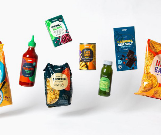
For instance, Coop's logo is used differently in the four countries, and in addition to the packaging design, part of the task was to find a way to handle the logo on the packaging. This meant that these three colours and shapes had to be avoided, and instead, a new way to apply the logo had to be presented.
Bath-based brand and packaging design agency Sunhouse has redesigned OG orange juice brand Tropicana, using heritage in a contemporary way to position it as the category leader and aligning with its new campaign, 'THAT juice'. Giles observes that the juice landscape has become "a sea of sameness".
While the brand logo has been evolved, its hand-drawn typography and iconic heart shape have been maintained. Meanwhile, for the Kefir and Greek recipe products, B&B worked on renaming, re-messaging and more drastic redesigns overall. "Establishing a firm brand foundation that would allow for further innovation was key," she adds.
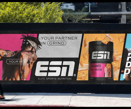
It was a conclusion that was agreed upon with ESN, with the creative director at The Quality Group, Marcel Henke, saying: "Our work with Robot Food has ensured our new visual identity better reflects our leadership position in the category. A perfect example of these concepts in action is the new ESN logo.
One valuable insight we gained was the opportunity for a new type of ready-made meal category: one made from high-quality ingredients without being positioned too premium. Logo and typography The Anton&Anton logotype was the only brand element retained in this rebranding project, and for good reason. "It
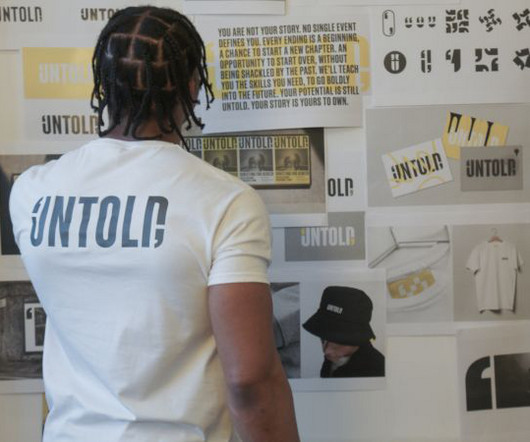
If the charity's problem was a disconnect with the prisoners, what better way to rectify this than to involve them in the redesign process? Untold's old logo "Honest yet hopeful, bold yet relatable" Untold's new brand strategy – devised by the young offenders – was the result of a group brainstorming session.
The new 50 Trending Minimal Free Fonts great for logo design and branding. Our 100 greatest free fonts has been a extremely popular post in fonts category and its shared thousands of time. Essential Rules To Follow When Designing a Logo. 30 Creative Logo Templates for Inspiration # 60.
A Logo Vector Graphic is the Unskippable Secret to a Flawless Brand Identity. This is precisely where understanding the immense power of a logo vector graphic becomes not just helpful, but absolutely essential. And Why Should This Matter for Your Logo?) ” This is the essence of a logo vector graphic. Vehicle wraps.
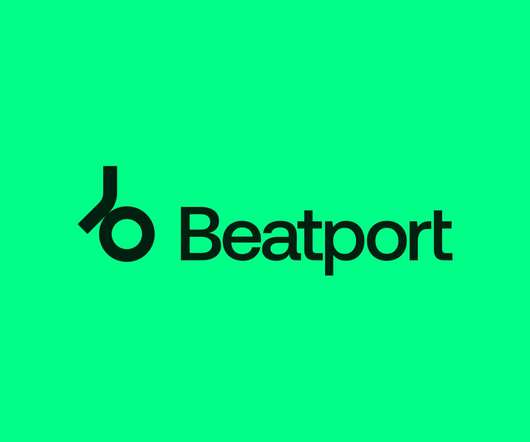
The redesign is the first brand update for Beatport since 2012, and marks a move away from the company’s headphones motif, which has been in use since the company’s founding. The post Beatport unveils a new vinyl-inspired logo appeared first on Creative Review. ” kurppahosk.com.
How Much Does a LogoRedesign Cost? Selecting or updating a company, product, or brand logo is an essential decision with financial and perceptual implications. With the average logoredesign costing anywhere from £2,000 to £500,000, understanding the key factors influencing this investment is essential.
Thinking of Redesigning a Logo? Here’s How to Do It A logoredesign can be a daunting yet exhilarating project. Your logo is the face of your brand and makes that vital first impression on customers. A practical, memorable logo conveys what your company stands for and builds brand recognition.
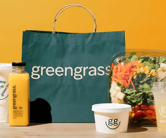
The people at studio Anagrama were asked to redesign, update, and create a visual strategy for GreenGrass that changes the unappetizing perception that many people have about healthy food. For the redesign, they developed an evolving logo that reinforces the brand values and manages to convey a relaxed and approachable personality.
To stay competitive and fresh in their customers minds, the company enlisted the help of London-based DesignStudio to create a new logo, app, and updated illustrations. The logo’s previous handwritten font has been replaced by a much stronger, bolder typography that captures your attention. ” – DesignStudio.
Iconic LogoRedesigns: Hits, Misses and Controversies Logos are some of the most iconic symbols in our visual world. As brands evolve to meet changing consumer demands or culture shifts, iconic logos often get redesigned as part of more significant rebranding initiatives.
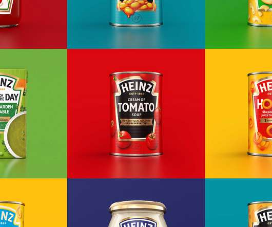
The new cohesive brand identity unites Heinz's expansive portfolio across over 20 product categories globally and features refreshments to the logo, visual identity, brand strategy, packaging, tone of voice and brand experience touchpoints. Logo detail on a can. Jones Knowles Ritchie provided text. Identity elements.
How Much Does a Logo Design Cost? One of the most critical factors in the success of a branding campaign is the logo design cost. Logos are vector graphics used to represent a business by portraying a product, service, or the name they carry. Several things make a logo great. Finding a good designer is simple.
First, we cut the Y in the logo and then in a visual style we added an easily applicable "wipe", an unmistakable film and video editing technique. Logo on different colors. Logo on different photos. Logo in different colors. Swipe logo animation. Studio Najbrt project page. Typography and icons. Stationery.
Johnnie Walker Logo Evolution: The Unfiltered Analysis Most billion-dollar companies have one thing in common – they obsess over tiny details that 99% of businesses ignore. And nothing reveals this obsession more clearly than the evolution of their logo. The walking man isn't just a logo. It's a psychological weapon.
Logo Design and Branding: Build an Identity A company's logo is often the first impression people get of a brand. However, creating an effective logo involves more than just drawing an image. Psychology, emotion, and strategic thinking go into making logo design and branding that genuinely resonates with target audiences.
Abstract Logo Design Inspiration & Top 10 Examples. Abstract logo designs have been popular for startups, but large organisations have recently begun adopting them. This departure from reality or literal representation can be complete, partial or slight, leaving you wondering what the logo represents.
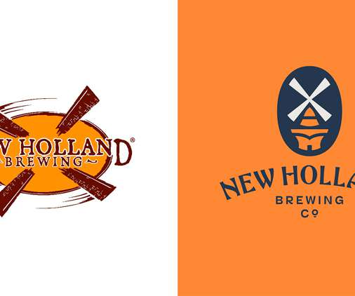
The logo has been redesigned, along with a wider identity overhaul which includes a bespoke typeface and packaging. The previous logo (left) and the updated version (right) Established in 1996, the craft beer originates from Holland, which is a small city in Michigan founded by Dutch Americans.
Are you looking for appetite-provoking food logos to inspire your creativity? In this collection of yummy food logos, we’ve gathered great designs that appeal to the eyes and the appetite, as well. Some of the logo designs are pretty stylized while others are quite detailed. Minimalist and simplified logo designs.
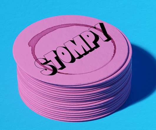
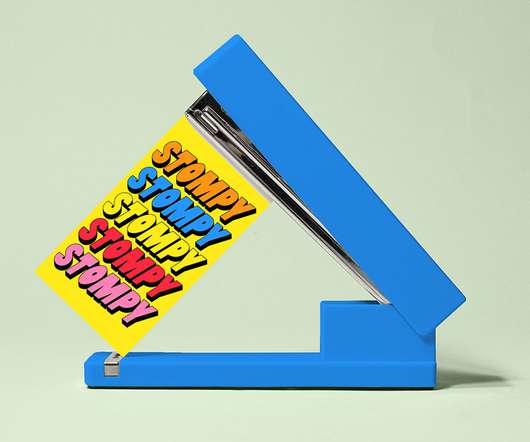
&Walsh redesigns the stuffy wine landscape with Stompy. Logo: The name Stompy refers to the art of grape stomping. Patterns: We extended the use of repetition to Stompy’s different categories of wine, which serve as useful patterns within their e-commerce photography. Key Brand Elements: .
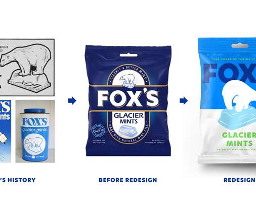
Redesigning Peppy. Hard sweets like Fox’s are a “declining category” amid the popularity of soft sweets like Haribo and the new branding hopes to “sway it to a younger consumer”, he adds. There is also a hidden design detail in the redesigned Peppy. ’” [link]. Inspired by the past.
Why a Logo is Important to Every Business A company's logo is one of its most valuable assets. More than just a graphic design , a logo is the face of a brand and conveys what a company stands for. With the rise of visual content and social media, logos have become even more prominent and influential.
With anything from logos and poster design through to app screens and packaging, it’s a fun, inventive way to riff off other creative ideas and help expand your own. Design to Redesign. Try these other brief generators to download generated briefs with a bit of structure to guide you: Brief Box. Fake Clients. What Should I Design.
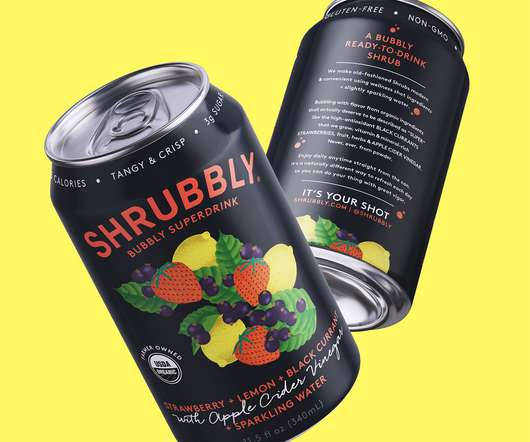
Come late summer 2021, with more regular consumer habits on the return, Sayre approached ROOK/NYC hoping to elevate Shrubbly beyond the level of his earlier established functional beverage category competitors. Category - Beverage / CPG. Agency location - New York, NY. Product Market Country - US.
You can see it all over the web or social media these days – some companies hire other graphic design businesses to create catchy adverts for them, while others create eye-catching logos and images themselves. Before you redesign it, however, identify your targeted audience. Will a redesign help you gain new clients directly?
The Evolution and Impact of the Unilever Logo Design The iconic Unilever logo has encapsulated the company's far-reaching impact and evolution from a small soap manufacturer to a leading multinational consumer goods powerhouse for over a century. In 1964, Unilever introduced its logo's updated, more refined version.
These awards celebrate innovative ideas in a wide range of categories, from brand identity and logo design to brand strategy and communications. Who it is for: Agencies, studios, and in-house design teams Region: Worldwide Categories: Type of campaign (e.g. It awards the best brand agency and the best brand designer.
Vintage Logo Design: Inspiration & Examples Vintage. While computer technology has enabled some incredible graphic feats today, many contemporary logo designs still owe an artistic debt to the vintage logos that came before them. This article will focus on vintage logo designs from this visually unified 50-year period.
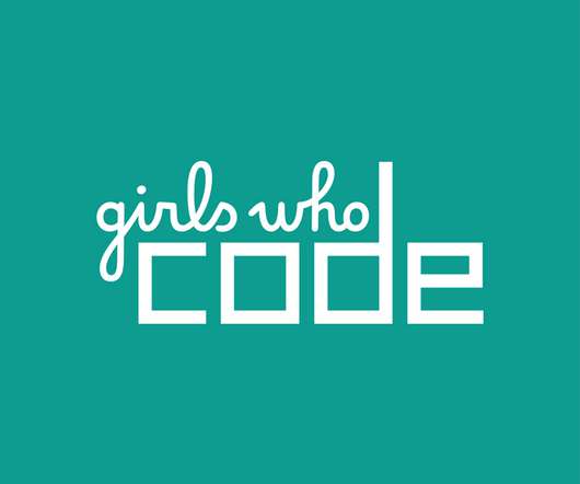
The brand refresh includes a logo update, website redesign as well as new visuals for physical materials such as tote bags and badges. ” Logo update. The logo is a subtle update. Booklyn-based design studio Hyperakt has updated the visual identity for coding collective, Girls Who Code (GWC).
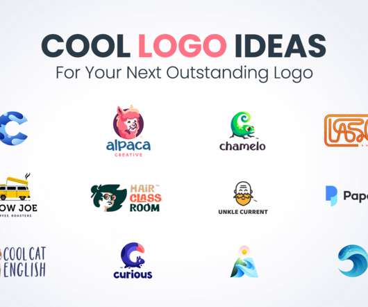
Are you looking for cool logo ideas to boost your creativity for your next logo design? In this selection of logo ideas, we’ve included some really amazing designs in various categories: lettermarks, negative space logos, logotypes, illustrated logos, and symbolic logo designs. Have a look.
My plan was to choose one EdTech platform, audit its UX, and, if necessary, redesign it. Overall, this UX audit and redesign concept would be of great use to UX designers, business owners, and marketing people because it presents a way to audit and fix a product’s most obvious usability issues. Why did I choose edX? Take SimilarWeb.
Evolution of the BP Logo: A Century of Design & Branding Most companies redesign their logo to look prettier. BP spent $211 million on a logo that nearly destroyed them. Nobody talks about the brutal truth: BP's logo journey isn't just about pretty colours and fancy design trends. That's not hyperbole.
Logo Design Types: Exploring Visual Branding In today's saturated market, developing a solid brand identity is more important than ever for businesses and organisations to stand out. And the most critical element that forms the cornerstone of a memorable brand is a skillfully crafted logo.
It involves creating a new brand name , logo, design system, marketing materials, messaging, and more to replace outdated or ineffective branding. These offer logos, templates and branding tools for approximately $200-$2,000. How Much Does It Cost To Rebrand? Quality ranges dramatically within this budget level. This defines reach.
“The OG of Weird Logos”. Many of its stores feature fueling centers, health clinics, and pharmacies and it creates its own private label brand products across almost every category in 37 manufacturing plants across the U.S. billion it makes it one of the largest in the world. Yesterday, Kroger introduced a new identity designed by DDB.
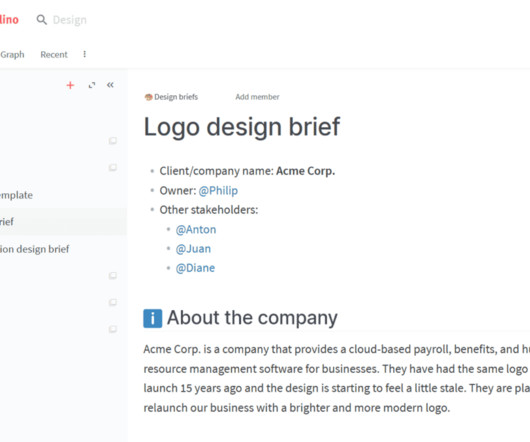
Mandatory assets – Logos, brand guidelines , and image libraries are available. Now, let’s explore how to craft an effective design brief for standard projects: How to Write a Logo Design Brief A company logo is the cornerstone of your brand identity, symbolising your business at a glance. Provide examples if possible.
Tips for Designing Corporate Symbols: Crafting Your Visual Identity Have you ever wondered why some logos grab you by the eyeballs and others pass by entirely unnoticed? When you do this right — when you create a symbol that truly captures the soul of your brand — you aren’t just making another logo. It isn’t magic. It isn’t luck.
Like our beloving Bruno Mars, you’ll soon find us sipping wine in a robe after seeing Stompy’s brand new identity, redesigned by &Walsh. Inspired by the idea of doing wine your way, &Walsh’s creative team uses bold type, bright colors & humorous illustrations to make buying wine as joyful as drinking it!
Third-party trust signals like star reviews, customer logos, and testimonials provide unbiased social proof that boosts conversion rates. An e-commerce shopper may also see suggested products on category pages that match items recently viewed. Individual page redesigns can also produce over 20% traffic lifts when well-optimised.
Your logo design , colours, messaging, and overall identity are precious to you. Your logo is updated, not replaced. Some examples of successful brand refreshes include Spotify updating its bold, bright green logo while maintaining strong brand recognition. But over time, your brand can start to feel stale.
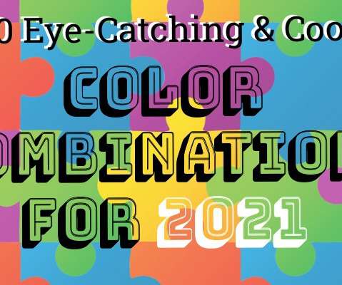
I t remains the same whether you are choosing colors for a flyer, a photograph, a business card design, and choosing the perfect color combination for a logo or your website. Choosing the right color scheme for your brand or website is as important as selecting the right font for your logo design or ensuring you have a captivating brand name.
We organize all of the trending information in your field so you don't have to. Join 66,000+ users and stay up to date on the latest articles your peers are reading.
You know about us, now we want to get to know you!
Let's personalize your content
Let's get even more personalized
We recognize your account from another site in our network, please click 'Send Email' below to continue with verifying your account and setting a password.


Let's personalize your content