

20 Cool Logos With A Hidden Meaning
Designer Daily
JUNE 24, 2025
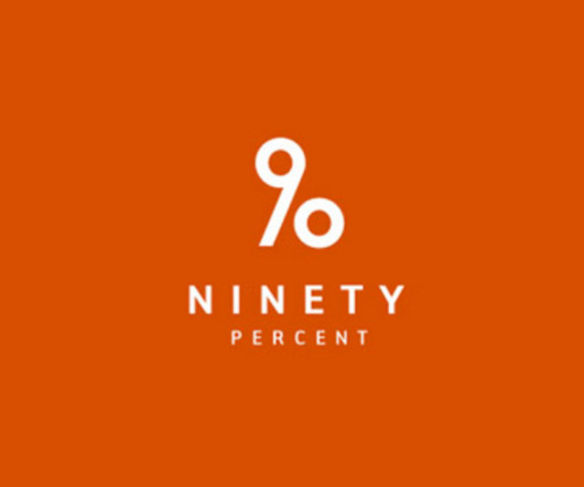
However, the number 90 is designed in a way to turns it into a percentage symbol as well. Sony Vaio This one is a bit more tricky and requires some technical knowledge, but the Sony Vaio logo includes the “analog” and “digital” symbols. Brilliant! Piano Forest See a piano keyboard? Well played! Magic Coffee Yep!


Let's personalize your content