article thumbnail

The 10 Best Social Media Kits & Templates for Photoshop

SpeckyBoy

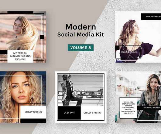
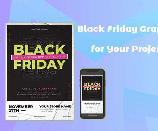
Being active on social media is a must if you want to reach your audience, engage with them, and build their trust. If you want to make sure they engage with your posts, then sharing catchy posts and images are the best ways to stand out in a social media feed, no matter which platform you’re on. Modern Social Media Kit Vol.

Photoshop 131
article thumbnail

How to Detect User Preferences with CSS

SpeckyBoy

It’s all possible through CSS media features. A media query can detect user preferences at the device level. Color schemes (dark or light), color contrast, and reduced motion are primary examples. We’ll use three media features included with CSS. But CSS allows us to go the extra mile for users.

Insiders

Sign Up for our Newsletter

This site is protected by reCAPTCHA and the Google Privacy Policy and Terms of Service apply.

Trending Sources

article thumbnail

Creative Careers You Can Get With a Graphic Design Degree

Designer Daily

Immerse yourself in shaping the visual style and imagery of various media, from advertising to movies and magazines. Through layouts, color schemes, typography, and graphics, create seamless digital journeys. Create captivating animated visuals for film, television, video games, and digital media.

article thumbnail

8 Free Templates for Creating Memorable Openers in After Effects

SpeckyBoy

Free Animated Fonts for After Effects. It comes with full-color control, and you can easily change the text and other elements to your own. Glitch Media Opener (with Envato Elements). For any grunge or retro-style project, check out this Glitch Media opener template. More Free After Effects Templates.

Templates 127
article thumbnail

Key Elements and Trends Of Modern Website Design

Graphic Design Junction

Modern website design also emphasizes the use of innovative technologies and features, such as animations, interactive elements, and advanced search capabilities. Consistency in design Use a consistent design throughout your website, from the layout to the color scheme and typography.

article thumbnail

Weekly News for Designers ? 558

Speckyboy Design Magazine

Write fewer media queries with the clamp() CSS function – Use this handy technique to specify minimum and maximum values for things like font size and padding. Working with JavaScript Media Queries – Yes, you can use media queries for your JavaScript! Parsel – Download this tiny, permissive CSS selector parser.

article thumbnail

Simplifying Form Styles With `accent-color`

Smashing Magazine Graphics

This technique works cross-browser, and will still be necessary if checkboxes need to be fully custom (with animations, and so on). But in many cases we don’t need any fancy styling — we simply need to be able to apply a brand color and move on. Color Schemes. This expresses the color schemes in order of preference.

Color 118