This site uses cookies to improve your experience. To help us insure we adhere to various privacy regulations, please select your country/region of residence. If you do not select a country, we will assume you are from the United States. Select your Cookie Settings or view our Privacy Policy and Terms of Use.
Cookie Settings
Cookies and similar technologies are used on this website for proper function of the website, for tracking performance analytics and for marketing purposes. We and some of our third-party providers may use cookie data for various purposes. Please review the cookie settings below and choose your preference.
Used for the proper function of the website
Used for monitoring website traffic and interactions
Cookie Settings
Cookies and similar technologies are used on this website for proper function of the website, for tracking performance analytics and for marketing purposes. We and some of our third-party providers may use cookie data for various purposes. Please review the cookie settings below and choose your preference.
Strictly Necessary: Used for the proper function of the website
Performance/Analytics: Used for monitoring website traffic and interactions
Static Rerun, AKA Matt Stetson, runs an Instagram archive with the mission objective of “recreating, reliving and rewinding back to the 80s and 90s” through impressively curated objects of the past. “I I just want to create something that will instantly transform the viewer to a warm memory or happier time,” says Matt.
There is pride in the Hen Harrier popular upon the land, which has been provided with a safe haven through this rewinding scheme. Now in public ownership, the area is of great importance to the local community, both human and animal alike.
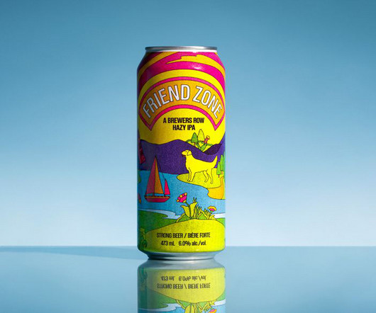
These include a reference to Moody Ales' famed Lavender Sour, Yellow Dog's namesake, a lion for Brave Brewing, a phone for 80's-inspired Rewind, a boat for Twin Sails, and Parkside's iconic bird. But we also liked how its neutrality complemented the illustration and didn't appear like any of the collaborating brand's logos."
History of the Shell Logo Design: A Journey Through Time Ever found yourself on a cross-country road trip, your fuel gauge dipping dangerously low when the sight of a luminous yellow-and-red shell streaking across a sea of blue sky rescues you? Welcome to our deep dive into the history of the Shell logo design—a journey through time!
Over the course of the year we’ve seen geometric designs used in social media posts , posters , business cards , logos , ads , artwork , book covers and much more. From geometric logos and typography to experimental geometric distortion, our list covers everything you need to know on the subject. Rewind to the 90s.
Exposure Logo Animated by Justin Lawes I’ll rewind a bit to talk about what Exposure is—It’s a “visual storytelling platform” that I’ve been using since 2013. We’ve made a logo for a skate shop , an animation studio , and a creative director all using this same sprint technique and it’s been really really fun.
Deep Dive into the Top 10 TV Show Logos In the competitive world of television, a show's logo holds immense power. More than just a visual identifier, an impactful logo can immediately evoke a show's essence and tone while forging an emotional connection with viewers. The era, tone, and themes become apparent at a single glance.
We really loved the bold choice of type and for the custom logo inspired by the ’70s aesthetic and the brand assets designed for the magazine, using colors from the non-binary flag. As she puts it, “Just Rewind It fully embraces the past, humor and self-awareness. Herman Scheer. Meredith Schomburg.
Before and after logo comparison. At first glance the old logo wasn't that bad but once you hit rewind and pause, man, it was a wreck. Logo on bike. Logo on bike, details. Various shots of the bikes in the wild, with the new logo. Concrete project page. Hot accent detail. Wild postings. Various applications.
The Evolution of the Jaguar Logo Design Today, we dive deep into the world of one of the most iconic automotive logos of all time—the Jaguar emblem. Over the years, the Jaguar logo has undergone an enchanting transformation, adapting to the ever-changing landscape of branding aesthetics and consumer preferences.
Remember, just like when creating an effective logo design , your videos need to be appropriate! Rewind ten years, and the idea of filming your own video series would have been a completely unviable and “off the wall” business idea. If you’re in the bouncy castle business, you’re going to want something lighthearted and fun.
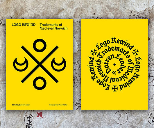
LogoRewind , by designer Darren Leader , is a book about the visual language of Medieval Norwich , England. It preserves the city’s medieval “logos” and documents the history of Norwich’s past and its impact upon the earliest era of commercial branding.
Playful icons and smiley face marks replace what would typically be a Kodak or Fuji on logo VHS tapes. Insert, play and enjoy – but remember to rewind when you're done.". "The Pragmatica typeface provides that simple, default feel while supporting the broader vibrant expression.
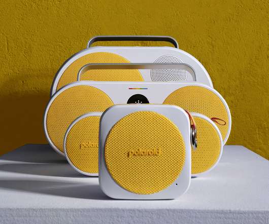
The colors are directly drawn from the iconic Polaroid color spectrum logo (though, where are the green and orange options?). Polaroid P3s. ” Polaroid P4. Polaroid P4. We’re really curious about the sound quality of these Polaroid players, noting this isn’t traditionally the realm of the Polaroid brand.
Get a Logo Design & Branding. A logo is compulsory for your business and for that you would definitely need some expertise from the design department. There are several free online logo making and graphic design websites such as Canva and Snappa. to work on your logo and branding. Or hire Jacob at a higher cost.
To begin, it’s worth rewinding and asking: What is outsourcing, and what makes it effective? Need a logo for your company ? This gives their teams the chance to focus on the work at which they excel, rather than attempting to complete projects in which they have no expertise. Outsourcing: An Overview.
Playful icons and smiley face marks replace what would typically be a Kodak or Fuji on logo VHS tapes. Insert, play and enjoy… remember to rewind when you’re done. The Pragmatica typeface provides that simple, default feel while supporting the broader vibrant expression.
Besides, in the age of fast-forward, how does this trend of longing to rewind the tape get so much love and attention? One way of tackling this can be in the form of revisiting old-school looks in logos in the spirit of rebranding, much like Burger King’s retro aesthetic making a comeback. all at once.
Designhill Logo Maker Type: Logo Design This AI-powered tool allows designers to quickly generate logos by answering a few questions about style, business, and preferences. The AI then uses this information to create various logo options that designers can customize further.
The Evolution of the Lacoste Logo: A Stylish Design Journey Let's rewind to the 1920s, shall we? Most importantly, it displayed that memorable crocodile logo, which caught everyone's eye. Initial Logo Designs and Inspirations 1933 You might ask: “Why a crocodile?” He wanted something understated yet impactful.
We organize all of the trending information in your field so you don't have to. Join 66,000+ users and stay up to date on the latest articles your peers are reading.
You know about us, now we want to get to know you!
Let's personalize your content
Let's get even more personalized
We recognize your account from another site in our network, please click 'Send Email' below to continue with verifying your account and setting a password.


Let's personalize your content