This site uses cookies to improve your experience. To help us insure we adhere to various privacy regulations, please select your country/region of residence. If you do not select a country, we will assume you are from the United States. Select your Cookie Settings or view our Privacy Policy and Terms of Use.
Cookie Settings
Cookies and similar technologies are used on this website for proper function of the website, for tracking performance analytics and for marketing purposes. We and some of our third-party providers may use cookie data for various purposes. Please review the cookie settings below and choose your preference.
Used for the proper function of the website
Used for monitoring website traffic and interactions
Cookie Settings
Cookies and similar technologies are used on this website for proper function of the website, for tracking performance analytics and for marketing purposes. We and some of our third-party providers may use cookie data for various purposes. Please review the cookie settings below and choose your preference.
Strictly Necessary: Used for the proper function of the website
Performance/Analytics: Used for monitoring website traffic and interactions
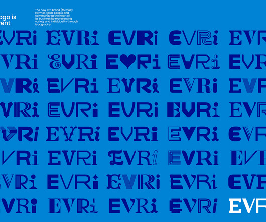
We meet the Manchester muralist, who is on a mission to bring people together, start conversations, and make a difference in the community through graffiti. What's great about murals is they're large-scale and often outdoors," says Oskar Walin AKA Oskar With a K. Logistics is key to painting a beautiful mural on time and on budget.
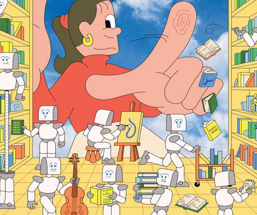
While 2024 has been pretty morale-sapping for many illustrators, perhaps 2025 will bring new hope and enthusiasm to the sector. We are settling down to the idea that AI is just a tool , and while it can replicate artists' styles, the output is derivative by definition and often flawed. A consistent style with a point of view It's nothing new.
While 2024 has been pretty morale-sapping for many illustrators, perhaps 2025 will bring new hope and enthusiasm to the sector. We are settling down to the idea that AI is just a tool , and while it can replicate artists' styles, the output is derivative by definition and often flawed. A consistent style with a point of view It's nothing new.
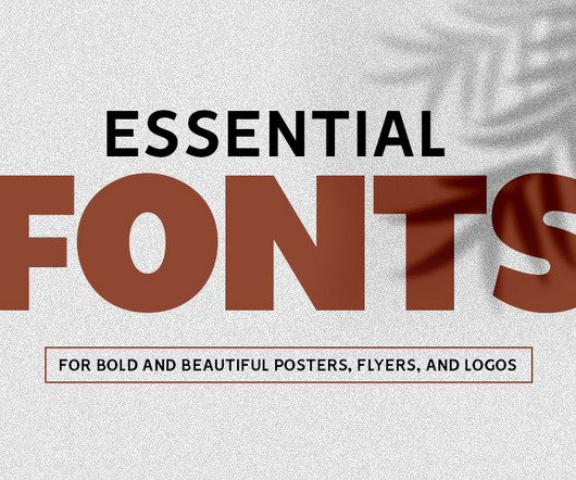
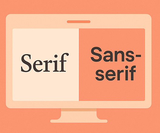
For posters, a strong, big bold fonts helps communicate urgency or excitement, while script fonts can bring elegance or charm to logos. With so many fonts for posters available, understanding how each style works can help you choose the right font for the right project.
Koto Motion Director Santiago Avila explores how motion has evolved from an afterthought to a strategic necessity, why brands should invest in motion-first identities, and what the future holds for dynamic branding. Motion has become a fundamental way brands communicate, engage, and stay recognisable across digital and physical worlds alike.
As 2024 wraps up, we’re on the cusp of entering 2025, a year set to see the immense impact of AI across all computing fields, particularly in web and graphic design. With these advancements, the graphic design trends continues to evolve, driven by new technology, cultural shifts, and bold ideas.
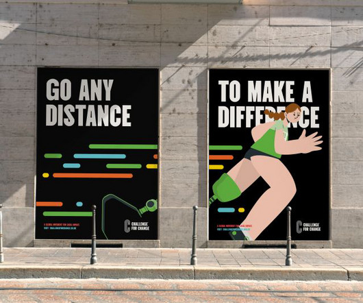
Studio Up North brings inclusive yet impactful branding to a global initiative empowering everyday athletes to "go the distance" for a meaningful cause. There are longer and shorter shapes that show it doesn't matter how far you go, what you do or where you do itevery kilometre counts."
How AI-Powered Generative Design Works The Impact on Visual Design Applications of AI-Powered Generative Design The Future of AI in Design Challenges and Ethical Considerations Why AI-Powered Generative Design is One of the Top Visual Trends for 2025 Trend 3: Biophilic Design and Nature-Inspired Aesthetics What is Biophilic Design?
From a video game starring a potato in crisis to a fragmented memory installation featuring over 40 works, Nastia's career so far has been anything but linear, which is just how she likes it. "I I didn't come out of the womb knowing how to live a professional life." And I always strongly advocated against these things.
At the heart of this approach is typography , which is how we make text look and feel. By integrating typography into a design system, teams can effortlessly scale designs across desktop, tablet, and mobile, ensuring a consistent visual language. This is the beauty of a design system, it makes the whole process smoother and faster.
It’s the visual cornerstone of a brand’s identity, instantly communicating its values, personality, and purpose. They struggle to scale well and can lose their impact when reduced to a smaller size. So, how can you achieve simplicity? But how do you create a logo that leaves a lasting impression? Memorability.
Ever found yourself staring at a beautifully designed website, a striking poster, or even just a well-laid-out magazine and thought, Wow, how did they do that? Let’s Talk Layout & Composition First, let’s talk about how things are arranged. How does a designer organize content? Believe me, Ive been there too.
📖 Reading Time: 5 minutes 🏷️ Categories: Design, Branding, Marketing 📅 Published: [DATE] Top 8 Free iPhone Apps Every Designer Should Know About The iPhone isn’t just a communication device; it’s one of the most underrated tools in a designer’s arsenal. Here’s a list of the 8 best free iPhone apps that every designer should have installed.
For a business in the construction and renovation sector, that promise must communicate trust, precision, and unwavering expertise. This is the story of how a strategic brand identity design transformed Alsace Réno, a respected renovation company, into a modern powerhouse. Alsace Réno isn’t new to the game. Think about it for a moment.
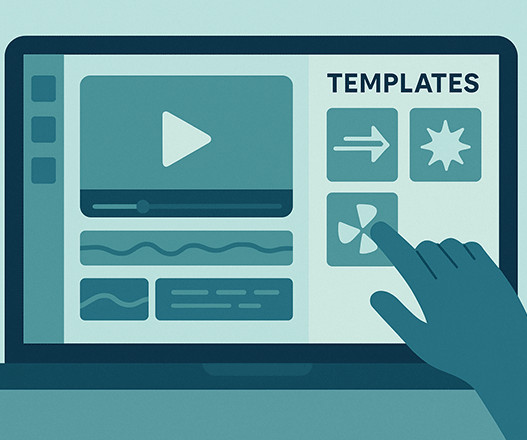
In this post, we’ll break down what motion templates are, where to find them, and how to use them effectively to boost engagement, clicks, and conversions. How to Customize a Motion Template Once you pick a motion template, the next step is to make it your own. That’s where motion templates come in. What Are Motion Templates?
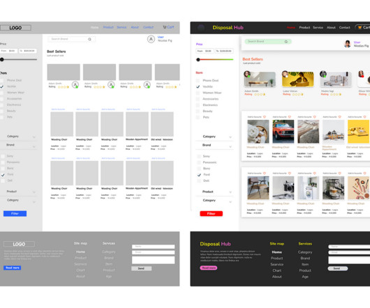
Heres how to stop wasting your time and produce better designsfaster. Buckle up and get some coffee, its going to be a longnight. Buckle up and get some coffee, its going to be a longnight. Wireframes miss the plot on nearly every perceived benefit. Everyone in UX does it and insists its critical, so it must beright?
It communicates a core truth so profoundly that it feels inevitable. For Jupi , an AI-powered decision-making OS, the challenge was immense: how do you visually represent an invisible, complex process? Scaling a business introduces a paradox. So, how do you restore clarity without adding even more complexity?
Each inconsistency, no matter how small, chips away at the brand’s integrity and confuses the audience. The Strategic Foundation Before you can define how a brand looks, you must define what it is. This part helps create detailed profiles of ideal customers, ensuring all communication is perfectly targeted.
For digital-first brands, typography isn’t just a style choice, it’s a core part of how the brand communicates across screens. The right font pairing can create hierarchy, improve readability, and define the brand’s tone without saying a word. But with so many fonts to choose from, combining them effectively can be tricky.
Understanding these paper sizes is not merely a technical exercise for designers or printers; it is to grasp a universal language of dimension and proportion that shapes how we create and consume information globally. This is not just about paper; it’s about a framework for clarity, efficiency, and international communication.
The story of skeuomorphism in design isn’t just a footnote in tech history; it’s a fascinating cycle that reveals how we think, how we learn, and what we crave from our technology. How would you communicate? ” An affordance is a visual cue that tells you how to use something. And guess what?
Business owners, paralysed by choice, often end up with a complicated mess. A logo that tries to say everything ends up saying absolutely nothing. It’s about communication at its most efficient. They scale effortlessly. They Communicate Instantly (No Decoder Ring Needed) This is the big one. ” The result?
Do you find yourself wondering how artists achieve such vibrant, scalable graphics? Are you prepared to explore how you can develop your unique style for creatingvector illustrations in Adobe Illustrator ? With their bold colors and flawlessly clean lines, dont you think vector illustrations are fascinating, too? Just have a look here.
Many use elements of classic design to communicate stability and expertise. The question is, how do you achieve that look effectively? Think of this collection not just as a set of files, but as a key that unlocks a treasure chest of creative potential. It’s more than just a resource; it’s your new partner in design. The Badfest vol.
But then comes the next challenge: how do you show it off effectively? How do you convey its real-world impact to clients or your audience? It lacks context, scale, and that tangible quality that helps people truly envision your work in a physical space. It answers unspoken questions: How big is it?
Understanding the shape psychology in design is like getting a secret decoder ring for visual communication. Ready to see how these fundamental building blocks shape our perceptions? Mastering this language means communicating more effectively, building stronger brand identities, and even guiding user behavior. Neglecting it?
Professional and Modern Aesthetics When a brand wants to communicate authority and reliability, lettermark logos are the go-to solution. Professional and Modern Aesthetics When a brand wants to communicate authority and reliability, lettermark logos are the go-to solution.
Simply put, engagement measures how much your audience interacts with your content. This includes: Likes : A quick thumbs-up or heart can speak volumes. It reflects how well you resonate with your audience. Brand Visibility : Higher engagement levels drive your posts up in social media algorithms. It's a ripple effect!
Meanwhile, no matter how many bells and whistles they're adorned with, others evaporate from memory faster than a politician's promise. Those intricate details turn into a muddy smudge when scaled down. Utterly wrong. The brutal truth? Simple logos win. They always have, and they always will. This is a showcase of clarity.
The future of graphic design isn't about how things are made. Most predictions about the future of graphic design are hot air. They’re written to sound futuristic, not to be useful. The truth is, as a business owner, you’re probably asking the wrong questions. These are distractions. It’s about why they’re made. It's automating blandness.
The real question is how you can harness its power to your advantage. How can you use it to amplify your unique voice, honor your craft, and uphold your ethical standards? They speed up ideation, iteration, and final execution. Instead, think of it as a new, powerful lens that helps you sharpen your focus.
It works blown up on the side of a building. It doesn't rely on fine details that disappear when scaled. Your logo's job is not to explain what your company does. You don't need a house in your logo if you sell homes. If you make coffee, a coffee bean logo is probably a mistake. They're theirs. ” That's nonsense.
When systems act on their own, experience design is about balancing agency — not just user flow Illustration by Rob Chappell For years, UX teams have relied on the user journey map, a standard tool of design thinking, to visualize and communicate user intent, behavior, and flow. It’s a dynamic, fluid scale that shifts throughout a session.
Choose Software That Makes Your Workflow Seamless How you handle the day-to-day running of your business can directly impact your brand, especially if you appear on customer review sites. It took up a lot of my time and made me feel rushed. Clients want consistency, professionalism, and a clear reason to choose you.
We’re here to dissect it, to pull it apart and see how it works. It was just management catching up to the reality that their customers had already created. They aren’t sacred relics to be admired in a gallery. They are tools. Functional, hard-working assets designed to do a particular job: identify a business. A hi-fi stereo shop.
I’ve seen them at mid-size scale-up companies. Managers expect to stay up-to-date. Level-up Craft and Product Experience over time. Exercising these muscles regularly without pressure to implement every piece of feedback levels each other up over time, helps us see out of the box, and builds trust / understanding.
Here’s how it works. See our typography through the decades series to find out how thats changed over time). It’s integral to how we share – and how we grow and evolve together. It’s integral to how we share – and how we grow and evolve together. Why not try a subscription?
As the founder of Inkbot Design , I've seen how a brand's identity can make or break its connection with customers. The story showcases how a company's visual identity, mainly its logo, can become so deeply embedded in consumer consciousness that any change can trigger intense reactions.
Here’s how it works. Why not try a subscription? Every issue is packed with art and design inspiration Delivered to your IOS or Android device Never miss an issue From £9.99 Comments ( 0 ) ( ) When you purchase through links on our site, we may earn an affiliate commission. A rebrand is never a trivial decision.
You'll discover how this iconic Mexican beer brand has maintained its visual integrity while evolving. Key Transformations Through Decades You'll notice how the logo underwent significant refinements between 1925 and 1950. Milestone Changes and Their Impact The most impactful change came in 1980 when the logo was refined.
Text provides information the user needs–communicating what the website is about, guiding them to action, and keeping them engaged. Many characteristics make up an accessible font, but it doesn’t constrain your selection of fonts as much as you’d assume. A guide to accessible typography. Text is the most important element on a webpage.
The studio worked with graphic designer Hugh Miller, who embedded himself in the day-to-day workings of the team, observing how they communicate and create. Their team had grown, their capabilities had expanded, and their creative collaborations had diversified. But their identity hadn’t quite kept pace. “It
This approach isn’t just about looking good; it’s about communicating effectively and creating an immediate connection with the viewer. Think about how quickly you want to convey a mood or message a clean design often does this fastest. Forget cluttered layouts and clashing colors. Just have a look here.
The London-based company, known for its reusable bottles that fund the collection of ocean-bound plastic, partnered with Made Thought and Tokyo Calm to rebuild its brand from the ground up, with results that feel both powerful and purpose-driven. As Ocean Bottle continues to scale – especially in the U.S.
We organize all of the trending information in your field so you don't have to. Join 66,000+ users and stay up to date on the latest articles your peers are reading.
You know about us, now we want to get to know you!
Let's personalize your content
Let's get even more personalized
We recognize your account from another site in our network, please click 'Send Email' below to continue with verifying your account and setting a password.


Let's personalize your content