Remove 2004 Remove Fonts Remove Publishing Remove Typography
article thumbnail

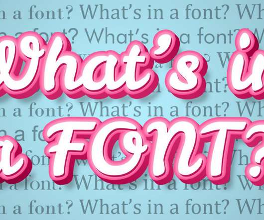
14 fonts to fall in love with: trending typefaces that designers adore

Creative Boom

And if there's one obsession that designers feel truly passionate about, it's typography. But while font choice may be deeply personal, that doesn't mean you can't play the field once in a while. To celebrate Valentine's Day, then, we asked the community for the fonts they adore the most in 2023. Nan Tragedy by NaN 3.

Fonts 545
article thumbnail

Becoming type-sensitive with the psychology of fonts

UX Collective

Becoming type-sensitive with font psychology The fonts you include in your designs can dramatically shape how they impact your audience and what emotions they evoke. Typography also drives a handful of other cognitive processes that often get overlooked?—?but but we can remedy that. Happy learning!

Fonts 96
Insiders

Sign Up for our Newsletter

This site is protected by reCAPTCHA and the Google Privacy Policy and Terms of Service apply.

article thumbnail

The Ferrari Logo Design: Speed, Prestige and Passion

Inkbot Design

The font and typography of the Ferrari name have also changed periodically. In the 1970s, the Ferrari letters took on a simple, san serif italic font. The most recent logo evolution took place in 2004. The typography used for the company name also communicates core brand values.

Sports 52
article thumbnail

The 37 Best Design Books to Level Up Your Skills

Inkbot Design

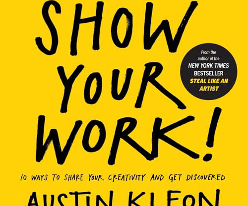
To help, I've compiled this list of the 37 best design books covering various specialities – from typography and layout to UX and web design. Norman (Author) English (Publication Language) 288 Pages – 09/19/2002 (Publication Date) – Basic Books (Publisher) −$14.98 $1.97

article thumbnail

From Mad magazine to B-Movies: An Oral History of Beastie Boys’ Artwork

Eye on Design

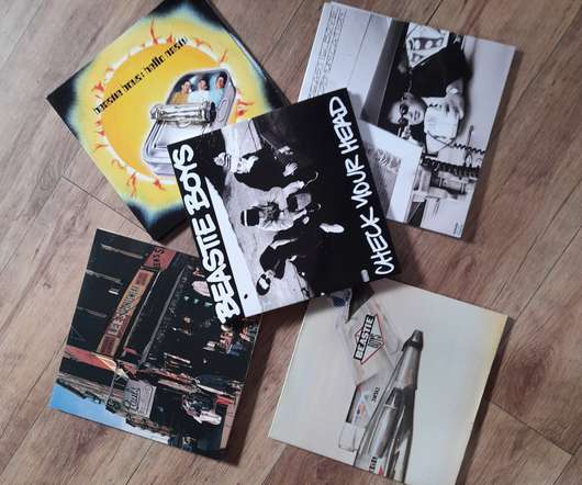
A number of other ideas were exercised before we landed on the one that was published. The typography is my handwriting. One of the most difficult tasks was their request to use an architectural style font; at the time none existed in digital form. To the 5 Boroughs (2004) . Beastie Boys, Check Your Head collage.

Magazine 145
article thumbnail

Wanderlust Approved: Top 10 Travel Logos You’ll Want to Follow

Inkbot Design

The word “Expedia” typography is clean and modern, conveying a sense of efficiency and professionalism. Over the years, the Expedia logo has undergone only minor changes, such as adjustments to the typography and colour palette , to keep it fresh and current while maintaining its distinctive identity.

Travel 79
article thumbnail

Metra tickets, 1990–1991

Fonts in Use

In 2004, Nick started collecting. In a recent blog update, Nick comments : In the early 90s, ticket designs varied significantly with new typography and visual styles appearing each month. However, I do enjoy some of the typography from the 1990s tickets. The bitmap caps (“D/A”) are likely custom.

Fonts 36