Remove 2003 Remove Advertising Remove Fonts
article thumbnail

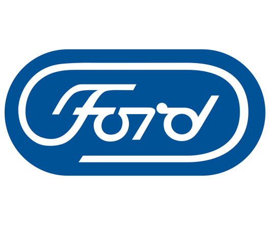
Behold, the Ford logo we deserved (that got rejected)

Creative Bloq

Having not updated its logo since 2003, Ford is well overdue a new look, and while this sleek alternative design sadly never got to see the light of day, Id love to see it have its time to shine in the future. Every issue is packed with art and design inspiration Delivered to your IOS or Android device Never miss an issue From £9.99

article thumbnail

The 50 Best Fonts for Logos in 2021

Design Wizard

Finding The Perfect Logo Fonts. Finding the best fonts for logos can be a tricky task. A font can change the entire look of the logo as the typography you use ultimately determines the personality of your branded logo. There are thousands of fonts out there, but only a select few are a cut above the rest.

Fonts 148
Insiders

Sign Up for our Newsletter

This site is protected by reCAPTCHA and the Google Privacy Policy and Terms of Service apply.

article thumbnail

10+ Best Desktop Publishing Software (2023)

Just Creative

The main feature of this software is multilingual support, the advanced management of OpenType fonts, the capacity to manage transparent effects, and its capability to integrate with the other products offered by Adobe Systems. This enables you to share your content, fonts, and graphics across projects. Pros Cons Available for free.

article thumbnail

History Of The McDonald’s Logo Design Evolution

Inkbot Design

It appeared on everything from signage to packaging to advertising, cementing the arches as synonymous with McDonald's brand. Fonts The McDonald's logo employs a custom sans-serif font called McLawsuit for its name. The font has a rounded, friendly look with consistent letter widths.

article thumbnail

Pantone Matching System: A Guide for Designers

Inkbot Design

If you’re running a digital marketing agency, you’ll know the importance of matching colours and fonts across multiple platforms. Pantone has been used in marketing and advertising for decades, but it’s only recently that Pantone has taken centre stage in designing, making colour trends easier to forecast and understand.

Print 98
article thumbnail

100 Amazing One Letter Logos: Monogram Logo Design

Inkbot Design

Their logo consists of a stylised wordmark in a custom sans-serif font, with a distinctive feature—the letter “A” designed to resemble the shape of a heart and the “B” forming a speech bubble. It prominently displays the company name in uppercase letters, with the “B” stylised in a unique, angular font.

article thumbnail

Comparing the Most Common CMS Systems

Canny

WordPress was released in 2003 by founders Matt Mullenweg and Mike Little, and is one of the most popular CMS platforms used by both small and large businesses. When it comes to adapting your content there are lots of options from embedding videos to uploading your own fonts. Time consuming work!