Remove topics typography-serifs
article thumbnail

LIT's rebrand of German retailer Gravis draws on the past but looks to the future

Creative Boom

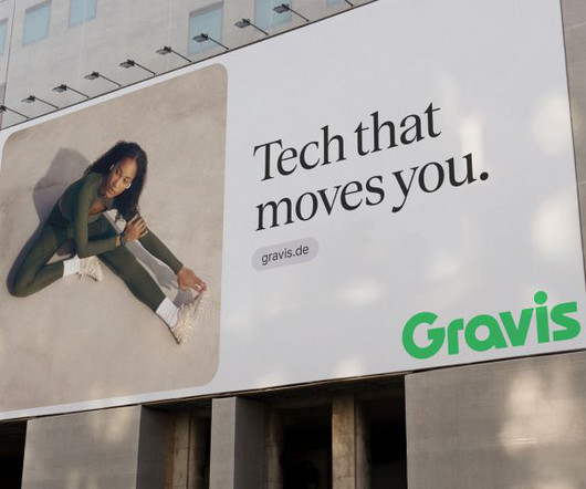
A thoughtfully chosen serif font further reinforces this historical connection. The colours, typography and art direction all add up to a brand refresh that feels, well, quite refreshing. The result is a striking and iconic logo paired with a vibrant colour scheme that reflects the spirit of innovation.

article thumbnail

Level Up Your Design Game: 5 Proven Fundamentals of Graphic Design You Need to Know

Just Creative

You will hear these terms used together to mean how a designer has placed images, shapes, and typography to create a pleasing design that attracts the viewer and delivers the right message to that viewer. It is about repeating shapes, typography, style, colors, and design elements to be recognizable and not confuse viewers.

Insiders

Sign Up for our Newsletter

This site is protected by reCAPTCHA and the Google Privacy Policy and Terms of Service apply.

Trending Sources

article thumbnail

The Best Figma Fonts of 2024 

Noupe

Quicksand Quicksand is a versatile and user-friendly display sans serif font, ideal for educational materials and tech products. Poppins Poppins is a geometric sans serif font known for its modern twist on a classic style. If you need a thin sans-serif font that’s easy to read, Nunito is a solid option. billion times.

Fonts 112
article thumbnail

University Press Cover Round-Up

Spine Magazine

This cover is so striking and hits all the marks from typography to illustration to colors that absolutely vibrate with that oh-so-subtle background texture. The play of negative space paired with the 70's pornographic inspired typography gives this the perfect balance of "wink-and-a-nod" and "you can see this cover at academic conferences."

Textures 110
article thumbnail

Top 10 Best Design Books to Kickstart Your Career

Inkbot Design

You'll learn from the best, from the basics to more advanced topics. She also shares her thoughts on typography and how you can use type. And she explains how to choose the right fonts , whether serif or sans-serif and how to use type for branding and design. This is an essential read for anyone interested in the topic.

article thumbnail

Becoming type-sensitive with the psychology of fonts

UX Collective

Typography also drives a handful of other cognitive processes that often get overlooked?—?but The following science-backed ideas will hopefully inspire some typography decisions that will best suit your project and goals. For larger chunks of text, you may want to choose Sans-serif fonts for a speedier read?—?which Shaikh, A.

Fonts 94
article thumbnail

Optimising Page Layout Design for Better UX

Inkbot Design

Optimising your page design requires considering multiple factors, from typography and whitespace to grid systems and responsive design. Optimising typography improves readability, which enhances user experience. Typography Elements to Optimise Font family – Simple, familiar fonts optimise readability.

Layout 85