Remove topics typography-inspiration
article thumbnail

Roam magazine celebrates the modern folk movement in a refreshing new way

Creative Boom

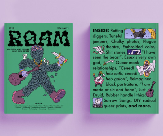
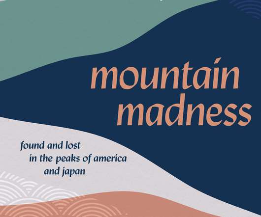
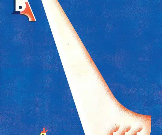
Diverse topics Roam is a collaborative magazine that aims to celebrate and preserve the modern ways people engage with the past. A fun illustration on the front cover pairs nicely with the squiggly, earthy typography; design touches that convey the duo's aim to "make the discovery and reading of folk fun again".

Magazine 511
article thumbnail

Print's not dead: the best magazines for graphic design inspiration

Creative Boom

For graphic designers especially, print magazines offer a source of inspiration that's tangible and immersive and presents content in a completely different visual way to digital. It showcases the best in visual communications, from typography to illustration and everything in between. The next issue comes out in late October.

Magazine 508
Insiders

Sign Up for our Newsletter

This site is protected by reCAPTCHA and the Google Privacy Policy and Terms of Service apply.

Trending Sources

article thumbnail

Why TYPEONE magazine is a must-read for graphic designers

Creative Boom

All photography by Yeshen Venema TYPEONE magazine isn't just a beautifully designed print publication; it's also full of key insights about the evolving interaction between typography and graphic design. Ultimately, typography doesn't exist in a vacuum but is just one element in a dynamic and ever-evolving design landscape.

Magazine 452
article thumbnail

Pentagram finds a joyful new spin on yoga branding for Love Supreme Projects

Creative Boom

As a discipline, there are lots of familiar images associated with yoga, so the challenge for Pentagram and studio Love Supreme Projects was to find a new spin on the topic. Or a class full of people practising their breathing exercises? That's exactly what Pentagram partner Marina Willer and her project team have achieved though.

Brand 443
article thumbnail

LIT's rebrand of German retailer Gravis draws on the past but looks to the future

Creative Boom

The campaign motifs take inspiration from the aesthetics and user experience of Apple products, fostering a sense of familiarity and appeal among consumers. The colours, typography and art direction all add up to a brand refresh that feels, well, quite refreshing. "The

article thumbnail

How Semi Permanent Studio designed the visual identity for Future State 2023

Creative Boom

Inspired by the punched tape used to speak with computers in an earlier era, the main wordmark is built with a custom typeface on a dot-grid system. Typography A tier of three typefaces helps the brand communicate its voice consistently and most effectively. We reckon Semi Permanent Studio has done a great job.

Brand 320
article thumbnail

&Walsh celebrates the art of risk-taking in brand identity for wealth tech platform

Creative Boom

Wealth management isn't normally the sexiest of topics. The new name then inspired the entire brand idea: Risk is the Fabric of Life. It visually represents the brand idea by wrapping around different elements like people and typography as a metaphorical representation of weaving risk into your wealth management strategies.

Brand 452