This site uses cookies to improve your experience. To help us insure we adhere to various privacy regulations, please select your country/region of residence. If you do not select a country, we will assume you are from the United States. Select your Cookie Settings or view our Privacy Policy and Terms of Use.
Cookie Settings
Cookies and similar technologies are used on this website for proper function of the website, for tracking performance analytics and for marketing purposes. We and some of our third-party providers may use cookie data for various purposes. Please review the cookie settings below and choose your preference.
Used for the proper function of the website
Used for monitoring website traffic and interactions
Cookie Settings
Cookies and similar technologies are used on this website for proper function of the website, for tracking performance analytics and for marketing purposes. We and some of our third-party providers may use cookie data for various purposes. Please review the cookie settings below and choose your preference.
Strictly Necessary: Used for the proper function of the website
Performance/Analytics: Used for monitoring website traffic and interactions
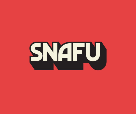
It was equally crucial to ensure that the brand didn't come across as too polished or sterile, reflecting both a comedic edge and expert storytelling to be able to carry serious historical topics. The logo aimed to create something big and bold that could stand out in both small podcast icons and large out-of-home advertising. "It
It's paired with an organic cell shape that reacts to the world around it, the wordmark and logo form interacting and reinforcing the other. To further enhance this sense of intimacy, a series of icons were developed to capture people's different states of mind around this sensitive and personal topic.
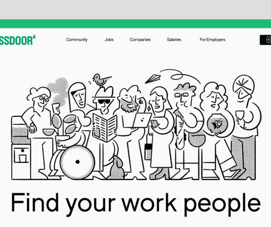
The rebrand coincides with the launch of a new mobile app and web experience, allowing users to seamlessly navigate between insights, jobs, and workplace conversations, facilitating real-time networking, advice, and connections on various work-life topics.
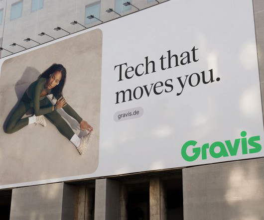
Logo and identity LIT's team of branding experts embarked on a journey to craft a new, contemporary identity for Gravis, breathing new life into the brand. The result is a striking and iconiclogo paired with a vibrant colour scheme that reflects the spirit of innovation.
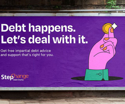
The former StepChange logo was retained as part of a radically updated "brand world" that prioritises inclusivity and oozes confidence. But where StepChange's new branding really comes to life is through its striking illustrations and icons, which use bold black linework and the charity's ownable brand colours.
The former StepChange logo was retained as part of a radically updated "brand world" that prioritises inclusivity and oozes confidence. But where StepChange's new branding really comes to life is through its striking illustrations and icons, which use bold black linework and the charity's ownable brand colours.
The studio's global executive creative director, Lisa Smith, says: "When we asked people to draw Mozilla's logo, most ended up sketching the Firefox logo. The flag derives from the 'M' for Mozilla and a pixel that nods to its iconic Tyrannosaurus rex symbol designed by Shepard Fairey.
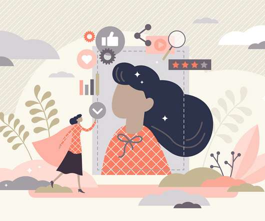
They give a pleasant approach to learning more about a specific topic without having to read a lot. Whether you are selling anything or simply talking about ordinary topics, including an infographic on your site now and then would only help you. It can: provide a summary of a topic visualize a process. Adding images and icons.
For example, a brand logo that’s included in every slide builds brand recognition. You have unlimited options here, for example: a consistent shape the same image crop your brand logo. Flavor Your Presentation With Icons. Familiar icons you can use are images, charts, and graphs. Experiment With Color Blocking.
This has increased the value for brand positioning and that is why the demand for logo, clipping path , photo retouching is increasing at the highest rate. In this blog, we’ll look at the top UX/UI logo trends for 2021, as well as what’s driving the shift and why you should pay attention to them. Logo Trends.
You can also see our list of logo design resources that can help you create effective and memorable logos for your clients. Free Icons: 7. Iconfinder Iconfinder is a leading icon search engine, offering millions of high-quality icons for personal or commercial use. Free Fonts: 12.
We make every piece of our resume design, such as text, color, photos, design spaces and other related topics, to ensure that you will definitely be selected for a job interview and we also hope that if you use our resume design you must be selected for your expected Job employment. No more need to edit icon images!
Sometimes, having the right tools can help make the process of designing a logo or even a brand much easier and with this list of the top Logo & Branding Kits for designers, you can have the tools you need to produce high-quality work every time. Professional Logo Design Mockups PSDs, Ai, Templates, Free & Premium Downloads.
Their day-to-day tasks may include creating logos, icons and other graphics; brochures, flyers and posters; packaging and product labels; website layouts and app interfaces; and more. For more on this topic, read The Complete Graphic Design Salary Breakdown. What is the average salary of a graphic designer?
They’ll also tell you that, far from being a relic of the past, the ratio is all around you — and you can use it to create impactful, well-proportioned logos , and other designs. Let’s glance at a few of the ratio’s design applications and then take a closer look at how it has been used to create some of the most iconic company logos.
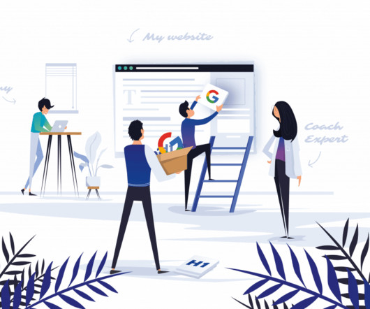
Your business is more memorable when users can associate your site’s URL with the company name, message, and logo. For instance, logos and exit icons sit at the top left and top right, respectively. Moreover, headings enhance topic identification to facilitate the ranking of search queries. Headers also boost SEO.
Our handpicked selection includes fully editable vector art, illustrations, icons, graphic design templates, and background patterns. The modern but neutral design is well suited for a wide variety of topics. The bundle includes diagrams, flowcharts, icons, actually everything you need for advanced data visualization.
Topic-related animations. This pack of topic-related illustrations can serve as an alluring pixel-perfect decoration for your laptop or phone or Halloween party. It’s packed with 32 Halloween-related icons of all possible colors and forms. Add topic illustrations to cards, web designs, surfaces, etc. Little Witches.
Logo Design 01 – $149. Logo Design 01. Whether you’re a freelance designer or design student, learning more about logo design and construction can help further your career. Along the way, students will complete 6 modules covering topics such as Letter Marks and Monograms, Word Mark Logos, and Symbols/Icons.
Plus brand positioning, neuroscience, brand personality, messaging, storytelling, brand naming, tag lines, logo design, brand identity design, brand experience and more. Logo Geek Podcast — Best for Logo & Identity Design Is there anything better than a cool logo ? And it’s not all aesthetics either.
These tools analyze user inputs and preferences to generate logos, color schemes, and website designs tailored to a brand’s unique needs. Example: The 3D animated explainer videos produced by The New York Times are an excellent example of how motion graphics help break down complicated topics and make them visually engaging and digestible.
Easy to use smart objects like QR Code, Logo and Icons. You Just purchase Jewelry Shop Business Card and add your logo, information and just print it. All elements, including the logo, you can resize without losing quality. with Trim & bleed area. You may be interested in the following articles as well.
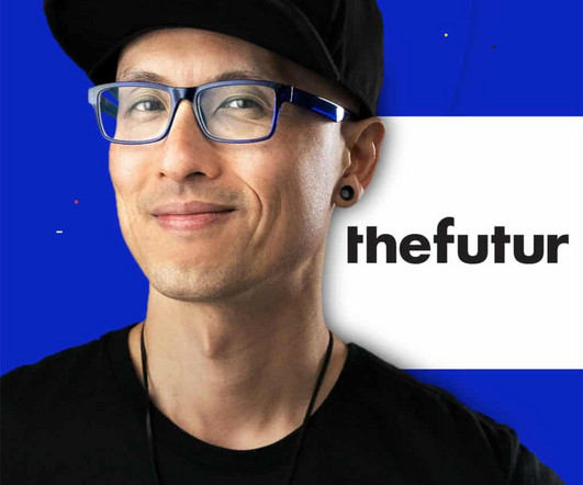
This course by the brilliant James Martin of Made By James’ (who has a brilliant logo design book ) shares the method for designing stand out brand identities that speak to your client, their industry and most importantly… their audience. The Futur also offers student & military discounts. Click here to claim 35% off.
Tip #1: Make the logo prominent. The logo serves as a company’s digital face. The logo can represent the company on a variety of different platforms — social media and email signatures to name a couple. Link : The logo needs to be linked to the home page.It Icons can be helpful web design elements.
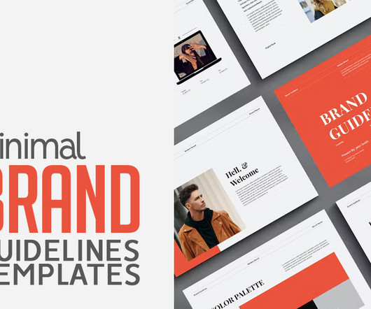
Boasting over 50 unique slides, the template covers essential topics such as core values, typography, color schemes, and media guidelines. Plus, it includes a convenient table of contents for easy navigation through sections like logos, imagery, online presence, social media strategy, packaging, and additional information.
Logos are one of the core parts of a company’s branding strategy. Although there are many other components to a business’s branding plan, the logo occupies a special place of importance. And if the logo design itself is simple, it makes it even easier for a consumer to remember and associate that symbol with your brand.
By opting for sustainable paper handles and an elegant black gloss foil logo - while remaining a fully recyclable mono-material solution - Kubrak's team showed that sustainability and premium branding can successfully converge.
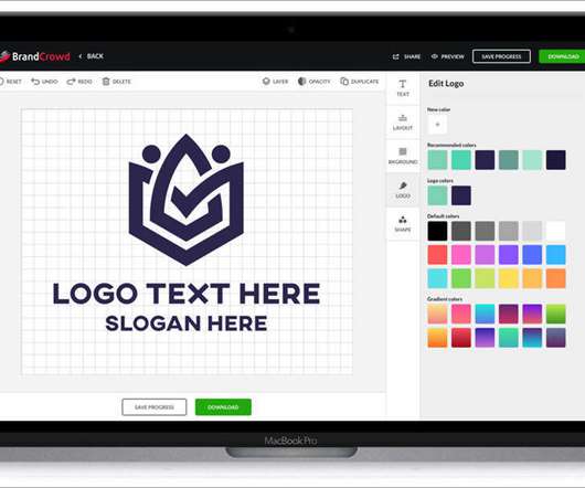
These tools are covering all the aspects you need for your website, i.e., website creation, logo, invoicing, fonts and icons, optimizations and development. BrandCrowd — Online Logo Maker. On this platform you will find logos created with gorgeous icons as well as free icon libraries.
Use supportive text – Include phrases explaining the video topic. Overlay simple icons – Relevant shapes and visuals reinforce the topic. Big banner tips: Reflect branding – Echo visual elements that identify your channel, like logos, colours and icons. Don't rely on passive icons alone.
Now that we're on the same page, let's dive into the five-step process for creating a timeline infographic: Step 1: Conduct Research and Topic Brainstorming. To brainstorm your topic ideas, you can ask yourself some questions: What is the goal or desired result of your timeline infographic? What's your general approach to the topic?
Our selection includes fully editable vector art, illustrations, icons, and background patterns. Hand-Drawn Outline Doodle Icons on Artificial Intelligence. These hand-drawn outline doodle icons on the topic of artificial intelligence can be downloaded here. Free Vector Graphics of Flat Food Icons. Free Download.
Logo Design and Branding: Build an Identity A company's logo is often the first impression people get of a brand. It's an iconic representation meant to communicate the essence of what a company stands for in a simple, memorable way. However, creating an effective logo involves more than just drawing an image.
For a much more detailed look at the topic, please see our article Raster vs. Vector. While Illustrator is suitable for a wide range of projects, it’s ideal for things like logo design and branding, icons, mascots, characters, patterns, fonts, geometric elements, print-based design, and more. Logo design.
You'll learn from the best, from the basics to more advanced topics. You'll get lots of real-world examples, from logos to websites to books, to show you what good design looks like. There are 20+ projects in the book, including an exercise to help you determine what kind of logo you'd like.
App icon design, subconscious, and typography… WTF? Could our subconscious be driving us to notice specific icons more than others? This subconscious attraction toward an app can happen for many reasons, and the design of the icon is a large part of that. Why are we attracted to open up certain apps?
From the logos on your favourite products to the fonts and colours used by your go-to websites, graphic designers shape the visual world we live in. You can target specific skills like logo design or choose comprehensive training to expand your knowledge. Top 10 Free Graphic Design Courses Online Graphic design is everywhere.
Every aspect of your business, from packaging and product design to product naming and logos, should reinforce and strengthen your brand. These books can be a great starting point if you're getting into this topic or an excellent refresher for experienced designers. It is the central core of your identity. Sale Bestseller No.
Graphic design is more than just designing logos and typography. From learning to sketch and style your designs to learning how to make a logo, there's no shortage of resources online. Free icons. The Noun Project is a website that seeks to build a global visual language of symbols and icons. Icon Finder.
With this in mind, today we’re going to narrow down the topic and review our predictions for Logo Design trends 2022 based on our team’s research. In this article: Tall Logos. Outline Logos. Serif Logos. Neon Vision and Holographic Logos. Cartoon Logos. Tall Logos. Z Logo by José.
It can even generate icons and images according to the sketch. Image Credit/ Looka Looka is an AI-based logo maker that uses your preferences and combines them with AI to make a logo design. It is not time-consuming, as it is will generate custom logos according to your selection of preferences.
Now, let's dig deeper into best practices for designers around these concepts… Research Target Keywords and Topics keyword research provides the foundation for creating pages that target practical search queries. Work with the client to identify relevant topics and the keywords people use to find those topics.
Infographics: Combining charts, text, and images, infographics offer a comprehensive overview of a topic in a visually engaging way. This can be as simple as a logo that animates on load or an icon that changes state when hovered over. Interactive Visualizations: Take user engagement to the next level with interactive elements.
A custom logo maker can transform your brand identity in seconds so you can create an entire portfolio with stunning visuals. ARC Studio logo template From team logos and modern business designs to animated logos, you can find an awesome selection of cool logo templates from Placeit and Envato Elements.
We organize all of the trending information in your field so you don't have to. Join 66,000+ users and stay up to date on the latest articles your peers are reading.
You know about us, now we want to get to know you!
Let's personalize your content
Let's get even more personalized
We recognize your account from another site in our network, please click 'Send Email' below to continue with verifying your account and setting a password.


Let's personalize your content