Remove topics geometric
article thumbnail

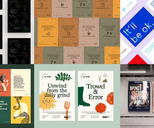
New look and new showreel for Mutant Hands

Creative Boom

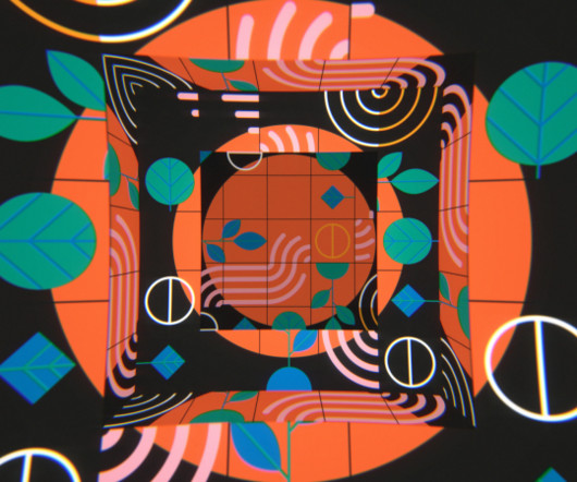
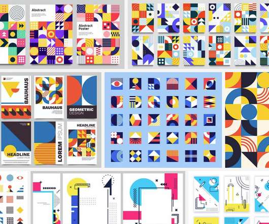
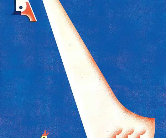
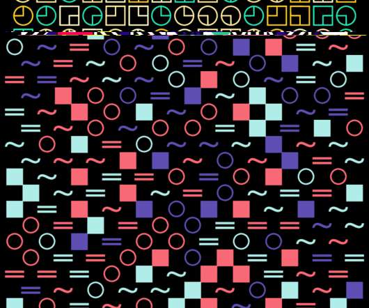
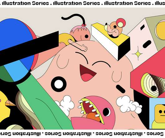
Geometric forms have always played an important role in James' work – particularly circles and semicircles. I worked closely with the creative director and founder, Dom Latham-Koenig, to turn what could have been quite a dry topic into a fun, character-driven narrative," says James. Created with Jing Zhang for ITUPP, Dubai.

Animation 284
article thumbnail

The best ambigram logos (and two controversial designs that didn't work)

Creative Bloq

The Sun Microsystems logo The ultimate ambigram logo is geometric perfection (Image credit: Sun Microsystems) The Sun Microsystems logo is perhaps the best ambigram logo of all for its geometric perfection. The logos still in use, with the text now placed diagonally.

Branding 268
Insiders

Sign Up for our Newsletter

This site is protected by reCAPTCHA and the Google Privacy Policy and Terms of Service apply.

article thumbnail

The new Game Awards logo shows less can be a lot more

Creative Bloq

This contrast is also apparent in the choice of typography, with the clean and clear geometric sans-serif Gellix complemented by the pointy and more classical ABC Arizona Serif. The new brand colour palette uses a baroque gold with crisp black and white, again amplifying the mix of modern minimalism and prestige.

article thumbnail

10 Top Graphic Design Trends for 2025

Graphic Design Junction

This trend takes inspiration from the past’s vision of the future, often characterized by neon colors, metallic accents, bold geometric shapes, and vintage typography. Retro-futurism reflects a playful yet sophisticated look, making it popular across branding, website design, and digital art.

article thumbnail

What Is a Digital Brochure? (20+ Templates and Examples)

Design Shack

The unique geometric design used in this brochure template makes it stand out from all the other designs. There are 12 unique pages in this digital brochure which are ideal for making digital magazines for fashion and lifestyle topics. And there are 12 unique pages for you to choose from. The template includes free fonts as well.

article thumbnail

The Best Helvetica Alternatives: Top 10 Superior Fonts for Modern Design

We And The Color

This usually means it’s a sans-serif, specifically a neo-grotesque, with uniform stroke widths and a clean, geometric structure. Its letterforms are more geometric and refined than Helvetica’s, giving it a calm and sophisticated presence. A good alternative should share some of Helvetica’s core DNA.

Fonts 68
article thumbnail

Why typography is key to good branding, straight from a pro

Creative Bloq

For French audiences, geometric sans serif typefaces are most aligned with the concept of ‘high quality’ 02. This is often why big global brands tend to choose very neutral geometric humanist sans serifs for their brand typography. Geometric humanists are inherently neutral and flexible. __proto__=t,e},r(e,t)}n.d(t,{A:()=>r})}}]);

Branding 206