This site uses cookies to improve your experience. To help us insure we adhere to various privacy regulations, please select your country/region of residence. If you do not select a country, we will assume you are from the United States. Select your Cookie Settings or view our Privacy Policy and Terms of Use.
Cookie Settings
Cookies and similar technologies are used on this website for proper function of the website, for tracking performance analytics and for marketing purposes. We and some of our third-party providers may use cookie data for various purposes. Please review the cookie settings below and choose your preference.
Used for the proper function of the website
Used for monitoring website traffic and interactions
Cookie Settings
Cookies and similar technologies are used on this website for proper function of the website, for tracking performance analytics and for marketing purposes. We and some of our third-party providers may use cookie data for various purposes. Please review the cookie settings below and choose your preference.
Strictly Necessary: Used for the proper function of the website
Performance/Analytics: Used for monitoring website traffic and interactions
Inclusive design is designing to be inclusive of as many users as possible, considering all aspects of diversity in users. With increased understanding, compassionate discussions around how to design for disabilities are becoming increasingly common in the web industry. But even with this growth, there are misconceptions: accessibility is still frequently thought of as “design for blind people” when it’s so much more than that.
If typography is writing with preformed and reusable letters (or, to put it more conceptually, with the instructions for making those letters) that can be combined and recombined into arbitrary texts, then there is no aspect of typography that hasn’t been challenged, undermined, or expanded by digital type. In this context, much has been made — and rightly so — of the significance of the OpenType Variable format , but Shiva Nallaperumal ’s Calcula shows us how fluid the l
In 2018, Adobe Photoshop is still one of the top software choices for web designers. It’s an incredibly powerful and versatile tool in itself, however Photoshop plugins can further. The post Top 10 Photoshop Plugins for Web Designers in 2019 appeared first on Onextrapixel.
We as humans are visual people, so it makes sense that by adding images to your website you immediately make it more dynamic. But you don't have to just plop an image in and call it good. With the Squarespace image block there are 6 different layouts to choose from to add more creativity to your site. And they work the same no matter what template you're on!
Speaker: Amber Asay, Creative Director and Founder of award-winning design studio Nice People
Understanding what trends are happening and how they’re impacting the competitive landscape is crucial to providing top dollar design strategy to your clients. With so many trends coming and going, it can be overwhelming to determine which ones you should capitalize on and which ones might not be worth the trouble. In this exclusive webinar with Amber Asay, we’ll explore graphic design trends that need to die, trends that are starting to pick up and why, trends that have come and gone, and how t
Inclusive design is designing to be inclusive of as many users as possible, considering all aspects of diversity in users. With increased understanding, compassionate discussions around how to design for disabilities are becoming increasingly common in the web industry. But even with this growth, there are misconceptions: accessibility is still frequently thought of as “design for blind people” when it’s so much more than that.
Arabic texts for storytelling are ordinarily long and continuous. Their accessibility is at the core of texts’ legibility that engages the readers and sustains their interest in contents. The readers need to see, discern, and identify letterforms and words. Part of the designer’s response to the readers’ needs includes the selection and use of a practical and intelligible typeface with a character and a voice. 29LT Riwaya is such a typeface, bringing clarity and accessibility to lengthy and encu
I started creating WordPress online courses in 2014. At the time it was for fun and really just to see if I could create one (I never intended it to be the main part of my business). But now, years l.
49
49
Sign up to get articles personalized to your interests!
Graphic Arts Today brings together the best content for graphic arts professionals from the widest variety of industry thought leaders.
I started creating WordPress online courses in 2014. At the time it was for fun and really just to see if I could create one (I never intended it to be the main part of my business). But now, years l.
If Professor X ever goes looking for a super powered mutant with control over color, I recommend he make a beeline for Nathan Fowkes. For years I've admired Fowkes' astonishing facility with color. This recent painting of a rainy London street knocked my socks off: That jagged lightning bolt of color may look spontaneous, but it has at least ten kinds of smart in it: Contrast the color of the reflected light on the sidewalk with the warm light from the traffic headlights behind it, and then the
S**t. The writing. We forgot about the writing. The thing, the design thing…it needs words! Oh man, so many words. I thought somebody…wasn’t the client going to.s**t. We’ve got to get the writing done. We’ve got to get the writing done! How are we going to get the writing done?! Don’t worry, friend. I’m here. We’ll get the writing done. The first step is to accept a hard truth: someone has to do the writing.
Though typeface designs are traditionally based on written letters, which themselves are comprised of strokes, the practice of typeface development is premised on contours instead. Open a standard font-editing application today and you will see nodes and handles that can be manipulated to determine contours, the shape of the edge where black meets white.
From Jeff Bazos, to Mark Zuckerberg, to Elon Musk, all successful entrepreneurs will have taken at least one risk at some point in their career. In order to succeed you must first fail is a mantra well established in the business world, but how many of us play by that rule? Leaving a steady-paying job to start your own business is a risk in itself and it can often take a lot of time and bravery to take that leap of faith.
Brands must create and share impactful content to thrive, but they have less people, tighter budgets, and fewer resources to do so. Learn how to publish and market digital content with the same professionalism as organizations with million-dollar budgets.
It is easy to understand how a few shapes created for a banknote can inspire a whole typeface; the bold big characters need to stand out in a complex composition of ornaments, fine-tuned illustrations, and geometric patterns. I am curious to see the 1918 Chinese banknote that inspired Nickel. The long triangular serifs make me think of those Latin typefaces that appeared in the second half of the nineteenth century, rather than a Glyphic style.
What first struck me about IBM Plex Sans was its form. It’s not the first typeface in which right-angle interiors contrast with smooth exteriors. But it does achieve a remarkable balance of this effect, applying it overtly to some shapes — the tail of the a , the ear of the g — and far more subtly to others, with the straight segments of the bdpq bowls.
“Something can be good, or it can be original; it can rarely be both.” That’s a saying I’ve heard attributed to Matthew Carter, without being able to pinpoint the source. In any event, Digestive distinctly qualifies as both. It joins a tiny club of original display faces that are unambiguous, singular, and well executed. The aptly named Digestive deftly blends two formal inspirations deployed in a beautiful group of letters.
Typographic history favors metal and paper, specifically metal on paper. It is less kind to the ephemeral expressions of language made visible, like written or painted letters, or even letters carved in stone. Shopfronts fade or get painted over, posters weather and disintegrate, carved inscriptions disappear with buildings that get renovated or torn down.
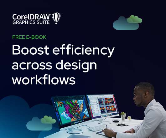
As the design industry evolves, teams are facing new challenges and a need to produce more outstanding creative work than ever. Leaders must learn how to adapt their processes to solve today’s—and tomorrow’s—unique design challenges. In this e-book, you’ll learn how to establish your creative workflow and leverage the power of CorelDRAW® Graphics Suite to streamline the entire design process, from start to finish.
A note from the editors: We’re pleased to share an excerpt from the Introduction of Scott Kubie’s Writing for Designers , from A Book Apart. S**t. The writing. We forgot about the writing. The thing, the design thing…it needs words! Oh man, so many words. I thought somebody…wasn’t the client going to…s**t. We’ve got to get the writing done. We’ve got to get the writing done!
Welcome to our twelfth annual celebration of new type design. These are not necessarily the “best” typefaces, nor the most popular or top-selling (the big retailers already have that covered). What can be said is that each of these 2017 releases inspired at least one admirer among our distinguished group of designers, educators, and enthusiasts to take time away from their day jobs and pen their personal praises.
There are many reasons why I chose Eugene Yukechev’s FF Casus from a plethora of the year’s releases. I first met Eugene in 2004, when I was still a Type and Media student. Back then, Eugene was already a successful graphic designer from Novosibirsk. His studio was the best in town and could favorably rival any of its Moscow counterparts. Five years later, in 2009, when I had returned to Moscow and launched my Type & Typography course at the British Higher School of Art and Design , I notic
It’s the year 2017. Typefaces’ circles are perfect, lines are straight, and gratuitous corrections have been seamlessly injected into every letterform, in an attempt to achieve optical perfection. But wait. What is this? Dr ? What kind of a name is that for a typeface? And what’s wrong with the glyphs? Well, in my opinion, there’s nothing wrong with them.
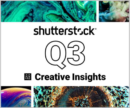
In today’s competitive markets, how do you make sure that your content not only stands out but performs well? How can you predict whether certain design choices will result in clicks, engagement, downloads, and other drivers of ROI? Shutterstock’s Creative Insights Report (Q3) is your window into the hottest trends that are transforming the creative world.
Gerstner-Programm from Forgotten Shapes restores a previously inaccessible typeface to a new audience. Sharing this important work allows designers to examine past technologies and their aesthetic outcomes, and provides intimate insight into the late Karl Gerstner’s methods and approach. Gerstner Programm was designed by Karl Gerstner in an attempt to harmonize and extend Akzidenz-Grotesk.
In recent years, Arabic typefaces have increasingly responded to contemporary visual communication and new media needs, and so have their aesthetic diversity. The design of large families that accommodate multiscript and complex typographic articulation are becoming quite common, but few are as extensive as 29LT Bukra. Initiated a decade ago specifically for an advertising campaign of large super-graphics in public space, the fonts have been growing slowly and evolving naturally into an ex
I’ve never been sold on the post-bitmap mechanical aesthetics in type design. I find these projects to be too coarse or obvious. I convinced myself that such a brief could only be a trap, design wise. That was before Tobias Holzmann tweaked the idea to create Protokoll , which is way more than just a brilliant name! On Out of the Dark’s website, Protokoll claims to be “entirely parametric”, which I believe is entirely false!
Type designers have to walk a fine line when creating type directly inspired by a specific location. We love discovering new source material and find it endlessly fascinating, but are simultaneously aware of the potential pitfalls (stereotype, appropriation, overgeneralization, and so on) in riffing off the vernacular of a place. There are plenty of examples of insensitive type design that purport to reflect the character of a certain region, but really are just caricatures.
Thomas Edison once said “Vision without execution is hallucination.” This statement applies not just to invention, but to graphic design. One of the greatest strengths of graphic designers is the ability to first develop a concept and then execute it to make it real. From visualization and ideation all the way through to actuation and execution, each step of this process takes skill and expertise.
Being a graphic design undergraduate obsessed with type in 2012 meant waiting with bated breath for the yearly crop of Type and Media student projects made visible through an annual web showcase. 2012 did not disappoint, and the work of Aleksandra Samu?enkova graced my eyes for the first time. An overpowering sense of wonder filled me when I looked beyond the initial letters and words, and appreciated Pilot in paragraphs.
The word “exciting” is not one I normally expect to reach for when writing about a humanist sans serif — in many ways, the vanilla ice cream of typeface genres. But this brand of vanilla comes with extra hot peppers: Nara Sans ’ solid roman is accompanied by unexpectedly expressive italics. Two of them. The family structure is inherited from the same designer’s seriffed Nara (2009).
Mazagan was inspired by a French typeface family called Marocaines , originally published during the Belle Époque — the golden age of the late nineteenth century characterized by excitement and buoyancy, along with visual expressions of flowing lines and references to luscious botanical structures. I love it when type designers are willing to take on a historical typeface influenced by previous aesthetic preferences and turn it around, emphasizing what makes it stand out.
Graphik Arabic is a pleasant and contemporary design that is versatile in usage and fun to play with. The family has quite a range of weights and succeeds in maintaining its rhythm and family feeling throughout its range. This will surely be a good resource for graphic designers wishing to design with Arabic text. Of particular note is the dynamic and tightly spaced rhythm — no easy feat to pull off.
Speaker: Eden Spivak, Design Expert and Editor at Wix & Nir Horesh, Accessibility Lead and Senior Product Manager at Wix
When we design products or websites for people like ourselves, there are many others who are, as a result, left out. From visually impaired users who rely on assistive technology, to people with a temporary injury such as a broken arm, tech users are forever diverse and beautifully unique. The products we design can, and should, reflect the extremely wide range of human experiences and needs.
Not many type designers will tell you that their typeface isn’t readable, but David Jonathan Ross , in his description of Fit , proclaims that “it is not recommended for setting any copy that you actually want people to read.” He’s right, of course. Fit is ridiculously unreadable. And yet it’s fantastic. Fit may appear simple, but it clearly required a lot of complex thinking to make it work so well.
Akiem Helmling, Bas Jacobs and Sami Kortemäki of Underware have made a really nice contribution to the genre of sans serif types and to web typography with the introduction of Zeitung. Consisting of eight weights in roman and italics, the family has forms and proportions designed for reading at conventional text sizes. And most importantly, its solid readability is firmly rooted in the character spacing.
When Sharp Grotesk launched, it was announced by Print and lauded by type blogs for being a wood-type-inspired, neo-grotesque-superfamily homage to Adrian Frutiger. Frankly, it seemed a little gimmicky to me. Gimmicky and ubiquitous — once you become acquainted with Sharp Grotesk, you start to notice it everywhere. This may be largely because of its adoption by Dropbox and the company’s extensive billboard campaigns.
The nineteenth century never really went away. Even as early Modernism proclaimed an austerely rational future, it leaned heavily on the workhorse grotesques of the past. Today, classic sanses like Klim’s Foundry Grotesk are used more and more to spice up the bland tidiness of late Modernist design. And the seriffed faces of the late 1800s have inspired a growing number of recent releases, including DJR’s Roslindale , Out of the Dark’s Gza , Colophon’s Value Serif , and The Designers Foundry’s M
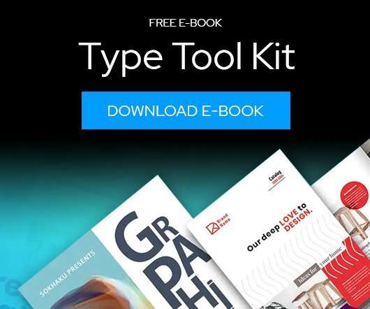
Download this free eBook to learn how you can create stunning typography, using the basics, such as placing text, to advanced controls like ligatures, variable fonts, effects, tracking, range kerning, and everything in between. Learn how to: Use Character Control to add variety to your font styles. Use Paragraph Control to manage spacing, alignment, justification and more.
We organize all of the trending information in your field so you don't have to. Join 66,000+ users and stay up to date on the latest articles your peers are reading.
You know about us, now we want to get to know you!
Let's personalize your content
Let's get even more personalized
We recognize your account from another site in our network, please click 'Send Email' below to continue with verifying your account and setting a password.


Let's personalize your content