This site uses cookies to improve your experience. To help us insure we adhere to various privacy regulations, please select your country/region of residence. If you do not select a country, we will assume you are from the United States. Select your Cookie Settings or view our Privacy Policy and Terms of Use.
Cookie Settings
Cookies and similar technologies are used on this website for proper function of the website, for tracking performance analytics and for marketing purposes. We and some of our third-party providers may use cookie data for various purposes. Please review the cookie settings below and choose your preference.
Used for the proper function of the website
Used for monitoring website traffic and interactions
Cookie Settings
Cookies and similar technologies are used on this website for proper function of the website, for tracking performance analytics and for marketing purposes. We and some of our third-party providers may use cookie data for various purposes. Please review the cookie settings below and choose your preference.
Strictly Necessary: Used for the proper function of the website
Performance/Analytics: Used for monitoring website traffic and interactions
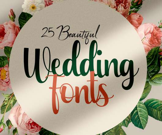
Download the beautiful wedding fonts for those who are needing elegance and stylish for their designs and particularly well suited for wedding invitations, save the date cards and feminine branding. Fonts are perfect for creating stunning branding, sleek wedding invites, versatile holiday cards, and sweet book covers. A beautiful combination of fonts that will give your designs extra calligraphy feeling that complements the script perfectly.
I’m going to break with a decade of convention and jump right in. I love this. I was sold as soon as I saw the logo, it’s in the BP&O Gallery. It’s rare you see this kind of logo today. It’s mostly, and understandably, logotypes that prevail today. Those that are striped down to function well on multiple devices. Blanding?
The evolution of user interface in digital editing tools. Foto de Shubham Dhage en Unsplash ( Leer la versión en Español ) A couple of weeks ago, I watched the Briar Levit documentary titled “ Graphic Means ”, which talks about the history of graphic design, from linotypes to photo compositions, and finally, the Pasteup, the analog version of the current digital graphic design.
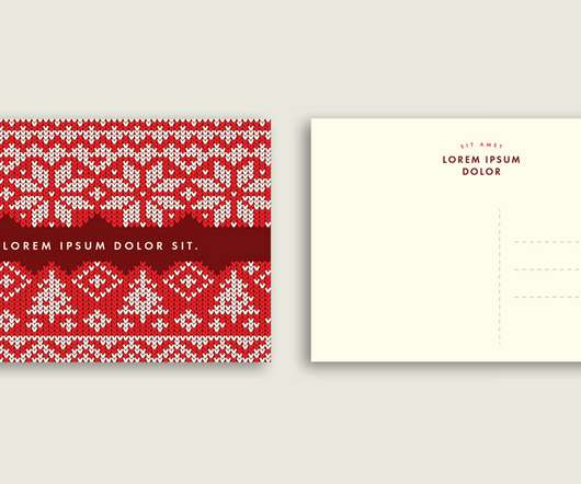
Available for free download with an Adobe Stock trial subscription, these Christmas postcard templates come in the style of knitted sweater pattern textures. Do you want something special for your Christmas postcards this year? If so, these Adobe Illustrator templates might be the perfect solution. Created by Adobe Stock contributor @Wavebreak Media , this set contains two postcard layouts with a red, knitted Christmas texture.
Speaker: Amber Asay, Creative Director and Founder of award-winning design studio Nice People
Understanding what trends are happening and how they’re impacting the competitive landscape is crucial to providing top dollar design strategy to your clients. With so many trends coming and going, it can be overwhelming to determine which ones you should capitalize on and which ones might not be worth the trouble. In this exclusive webinar with Amber Asay, we’ll explore graphic design trends that need to die, trends that are starting to pick up and why, trends that have come and gone, and how t
On this issue of Type Founds, I venture into a decade-plus-old series of catalogues featuring free fonts that you too can get your hands… Continue reading on UX Collective ».
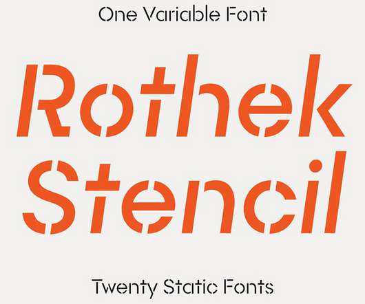
Designed by Evgeny Tantsurin of type foundry Groteskly Yours, Rothek Stencil is a professional font family that comes with one variable font and twenty static styles. Rothek Stencil is a stenciled, slightly modified version of Rothek, a geometric sans serif originally released through Groteskly Yours. It comes in 20 static styles or as one variable font.
How Walt Disney created great user experiences before UX was invented. Don Norman introduced the term “UX” in 1995, which is recognized as the beginning. Even though it took off from here, other people were already practicing UX without calling it that way. Walt Disney was one of those people. The Walt Disney mindset Walt Disney excelled at creating user experiences because he prioritized providing a valuable experience to his customers.
How Walt Disney created great user experiences before UX was invented. Don Norman introduced the term “UX” in 1995, which is recognized as the beginning. Even though it took off from here, other people were already practicing UX without calling it that way. Walt Disney was one of those people. The Walt Disney mindset Walt Disney excelled at creating user experiences because he prioritized providing a valuable experience to his customers.
Animated GIFs are interesting and all, but the time taken to load the are not. Because they consist of frames of animations, they are usually big in terms of file size. This means it is a pain to load web pages, especially if you have many of them. But the good news is, Animated GIFs can be optimized. In other words, their file size can be shrunk without compromising the image quality.
The New York-based photographer uses an expressive colour palette, grand compositions and carefully considered props to add a new dimension to commercial photography.
The book is part of the publisher’s Vintage Britain series, which has used archive photography to celebrate everything from picnics and holiday camps, to dog shows and the London Underground. This latest edition turns its attention to the cultural importance of the capital’s historic drinking establishments. Spanning the last decade, the photographs reveal a rapidly changing city as war.
Brands must create and share impactful content to thrive, but they have less people, tighter budgets, and fewer resources to do so. Learn how to publish and market digital content with the same professionalism as organizations with million-dollar budgets.
Prince, Robin Williams, Nile Rodgers, Cher, Arnold Schwarzenegger, David Bowie. These are some of the faces you might have found in the nightlife hotspot of late 1970s Los Angeles known as Flipper’s Roller Boogie Palace. Now, in archive photography blown-up on the walls, these same faces look down on visitors to the new Flipper’s, as it bids to revive its West Hollywood heyday in the west London.
What does it take to design a symbol that lasts for 60 years, and should all designers go back to the drawing board? CR catches up with esteemed graphic designer and logo legend Tom Geismar.
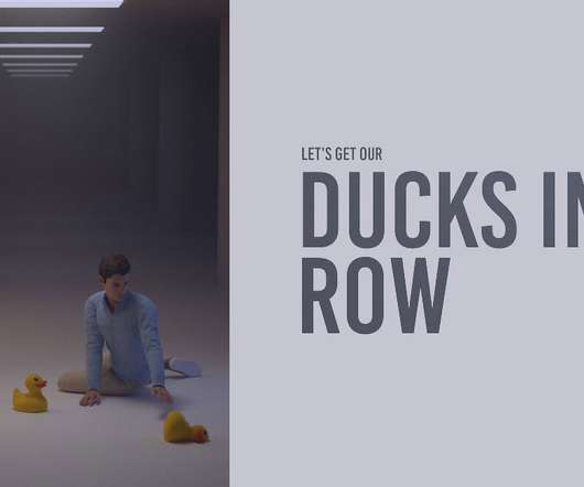
According to Nobody Famous: “I wanted to start rendering daily in Blender to get better at quickly coming up with ideas. I decided to play with common phrases that are overused in office settings.” More: Nobody Famous , Instagram h/t: boredpanda. Source.
Designing a website as a newbie web designer can be tough. Many new designers get bogged down in excessive details and give up. Remember, Rome wasn’t built in a day, and your first website shouldn’t be the Colosseum. It should be something more like a grass hut—nothing pretty, but it gets the job done. . Once you’ve laid the foundations of a basic website, you’ll be ready to start chiseling away at that masterpiece.
Thomas Edison once said “Vision without execution is hallucination.” This statement applies not just to invention, but to graphic design. One of the greatest strengths of graphic designers is the ability to first develop a concept and then execute it to make it real. From visualization and ideation all the way through to actuation and execution, each step of this process takes skill and expertise.
Björk was born on October 21, 1966, in Iceland’s capital city, Reykjavik. From the age of six until she was 14, she attended a local music school, where she studied the classics, and learned to play the flute and the piano. These amazing portraits of Björk were taken by photographer Herb Ritts in 1989, when she still was in the Sugarcubes. h/t: vintag.es.
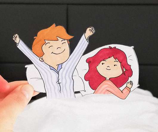
According to Ana Stretcu: “My name is Ana Stretcu and I created a series called “I was cutout for this” based on paper cutouts designed to add an aww-factor to the photos I take during a road trip. I didn’t want my travel photos to end up in a forgotten folder on my laptop, so I decided to make them more memorable by adding a quirky little twist.
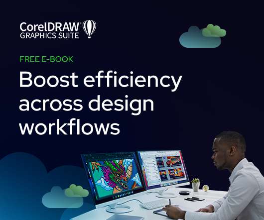
As the design industry evolves, teams are facing new challenges and a need to produce more outstanding creative work than ever. Leaders must learn how to adapt their processes to solve today’s—and tomorrow’s—unique design challenges. In this e-book, you’ll learn how to establish your creative workflow and leverage the power of CorelDRAW® Graphics Suite to streamline the entire design process, from start to finish.
Ramón Ramos is a Spanish artist based in Canada with a strong passion for geometric paper craft. His work is inspired by old and new decorative art elements from different cultures all over the world, and through his practice he explores the possibilities of geometric volumes and challenges the viewer’s perception. More: Ramón Ramos , Instagram h/t: theinspirationgrid.
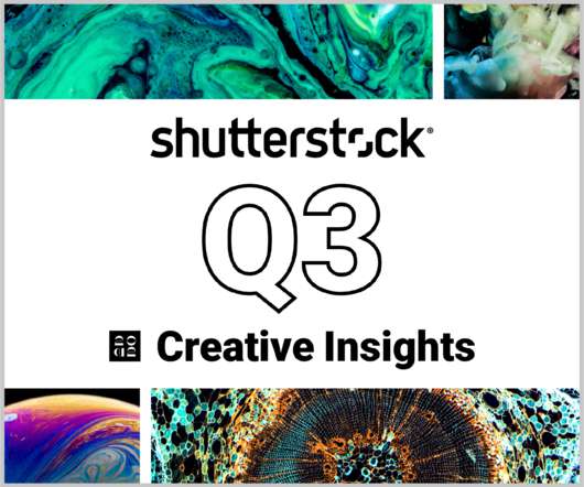
In today’s competitive markets, how do you make sure that your content not only stands out but performs well? How can you predict whether certain design choices will result in clicks, engagement, downloads, and other drivers of ROI? Shutterstock’s Creative Insights Report (Q3) is your window into the hottest trends that are transforming the creative world.
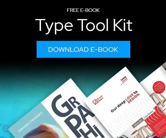
Download this free eBook to learn how you can create stunning typography, using the basics, such as placing text, to advanced controls like ligatures, variable fonts, effects, tracking, range kerning, and everything in between. Learn how to: Use Character Control to add variety to your font styles. Use Paragraph Control to manage spacing, alignment, justification and more.
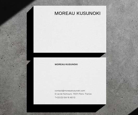
Branding and visual identity for Moreau Kusunoki by Voodoo Voodoo. abduzeedo 1124—22 Dialogues between space and time — Berlin-based studio VOODOO VOODOO creates a new visual identity for architecture practice Moreau Kusunoki. Moreau Kusunoki is an internationally renowned Franco-Japanese international architecture practice founded in 2011 by Nicolas Moreau and Hiroko Kusunoki, whose combined experiences include working at the renowned architecture firms of SANAA, Kengo Kuma, and Shigeru Ban.
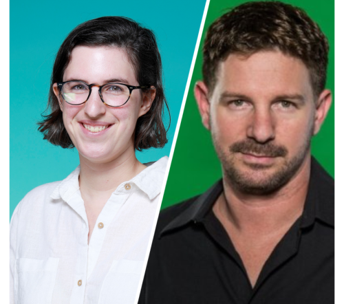
Speaker: Eden Spivak, Design Expert and Editor at Wix & Nir Horesh, Accessibility Lead and Senior Product Manager at Wix
When we design products or websites for people like ourselves, there are many others who are, as a result, left out. From visually impaired users who rely on assistive technology, to people with a temporary injury such as a broken arm, tech users are forever diverse and beautifully unique. The products we design can, and should, reflect the extremely wide range of human experiences and needs.
We organize all of the trending information in your field so you don't have to. Join 66,000+ users and stay up to date on the latest articles your peers are reading.
You know about us, now we want to get to know you!
Let's personalize your content
Let's get even more personalized
We recognize your account from another site in our network, please click 'Send Email' below to continue with verifying your account and setting a password.


Let's personalize your content