This site uses cookies to improve your experience. To help us insure we adhere to various privacy regulations, please select your country/region of residence. If you do not select a country, we will assume you are from the United States. Select your Cookie Settings or view our Privacy Policy and Terms of Use.
Cookie Settings
Cookies and similar technologies are used on this website for proper function of the website, for tracking performance analytics and for marketing purposes. We and some of our third-party providers may use cookie data for various purposes. Please review the cookie settings below and choose your preference.
Used for the proper function of the website
Used for monitoring website traffic and interactions
Cookie Settings
Cookies and similar technologies are used on this website for proper function of the website, for tracking performance analytics and for marketing purposes. We and some of our third-party providers may use cookie data for various purposes. Please review the cookie settings below and choose your preference.
Strictly Necessary: Used for the proper function of the website
Performance/Analytics: Used for monitoring website traffic and interactions
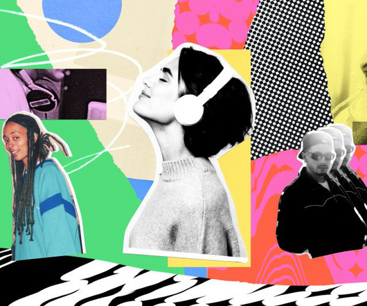
Music and sound have the power to evoke emotions, set the tone, and leave a lasting impression on your audience. Just as visual elements like logos and colour schemes create recognition, a well-crafted sonic identity can instantly trigger brand associations and emotional responses.
A new monogram, sleek colour palette and complementary family of typefaces all contribute to a more memorable and emotive brand experience for the accessible luxury bathroom supplier. It conveys the emotional appeal of the products to win a lasting place in customers' minds.
JUST went abstract with its design with a palette that reflects the "shifting colours and emotions of the twilight hours". One particular feature we love is how the theatre's website changes its coloured backdrop depending on the time of day. So, how do you capture all the pink, red, purple and golden hues of a perfect sunset?
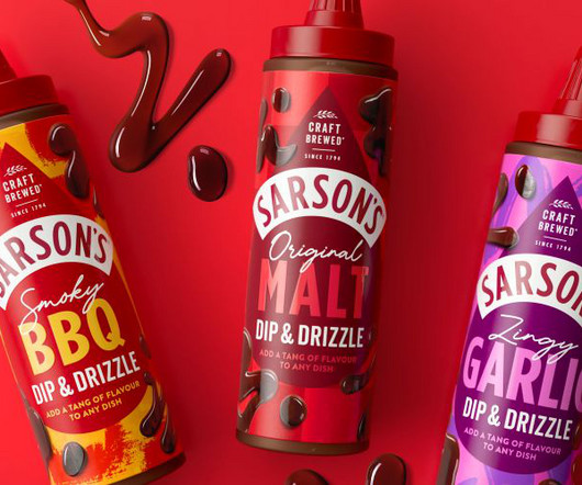
In order to reach them, the studio sought to blend "modern foodiness" with Sarson's heritage by retaining some of its recognisable assets to build an emotional connection through familiarity. Everything from the colours and font animations to the photography was designed to be amplified and communicate Sarson's tangy USP.
I am presenting myself in garments that I wear when I design and in colours that are not represented on the sonochromatic colour-music scale and, in that sense, have no sound.". Colour to Sound Analysis, How to make Digital tangible. We chatted to Constanze to further explore the thinking behind her genre-defying project.
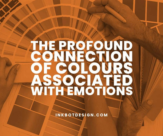
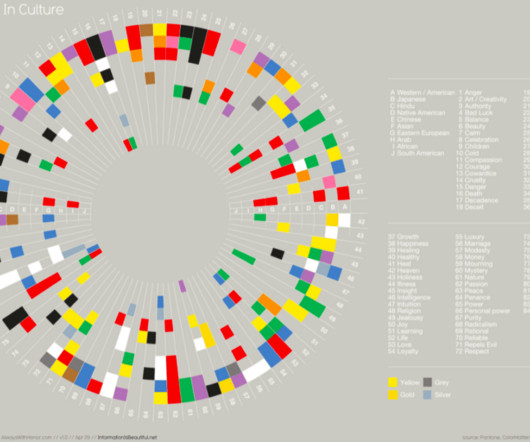
The Profound Connection of ColoursAssociated with Emotions The hues surrounding us have an intriguing power over our moods and recollections. From the warm vermillion that stirs passion to the cool cerulean that evokes tranquillity, colours captivate us in a way few other things can.
The iconic concert hall's new branding evokes the emotion and eclecticism of its music by majoring in motion and interactivity. A new graphic system for concert key visuals was also developed, moving the brand away from a pragmatic approach that solely focused on delivering information to a new one which majors on emotion.
The right soundtrack can transform your visuals, evoke emotions and captivate your audience in ways that visuals alone simply can't achieve. Emotional resonance : Music has the unique ability to tap into our emotions, setting the tone and mood for your visual story. Yet there's just one problem.
We wanted to illustrate the 'joy of togetherness', harking back to folktales and legend using Olga's art, which is synonymous with whimsical storytelling and emotional depth", says Little. Despite the product's success, the founders struggled with the design, experimenting with four different bottle designs in as many years.
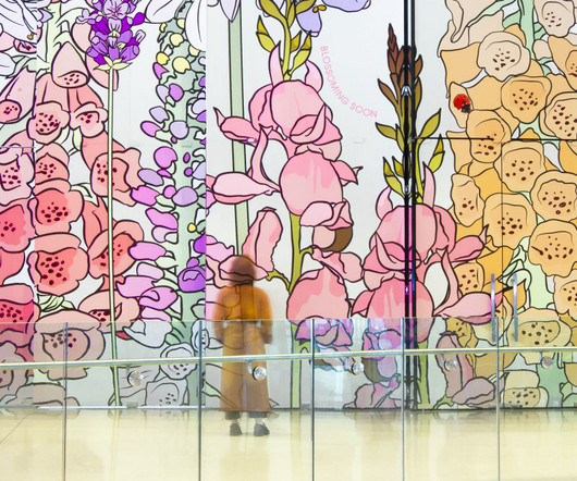
That's because looking at natural images increases activity in brain regions that regulate emotion and attention and helps increase alpha-wave activity associated with relaxation and meditative states. In fact, 75% of Londoners reportedly live with insufficient access to green spaces. This displays 1.5
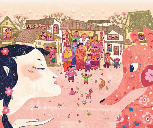
Based on the story by the leading Chinese children's book author Liao Xiaoqin, this series of images portrays the folktales associated with different solar terms, from the Spring lady to the Summer auntie, and from the Winter old man to everything in between," she tells Creative Boom.
They are choosing this brand because of its association with high-end retail. Physical stores, not a common entity for something as ubiquitous as a phone case, are all unique and more like colourful Apple Stores, sandwiched between international designer labels. Hong Kong has been a centre of trade for centuries.
Handcrafted and intricate in their detail, Natalie Wong's colourful paper sculptures reimagine retro game consoles such as the Nintendo Gameboy, NES One Console and Sony's PlayStation One. Each has been created using a six-tone colour palette, drawing on vintage design references. "I Retro games have a two-fold appeal," she explains.
As my focus is primarily on illustrating women in a conceptual, emotional, and figurative capacity, it felt natural to place the female form at the centre of each illustration — portraying each character as powerful, yet gentle." We caught up with her to learn more about how they portray women as both powerful yet gentle.
But for the Maryland Institute College of Art graduate and Pippin Properties-represented illustrator, creativity is just as much associated with getting through the bad times as it is documenting the good. For these artists, the brutality of history is a canvas, and their art becomes a channel to express their emotions of anger and misery.
Carey's evocative pieces are inspired by her own personal associations with childhood sickness and at-home remedies given to her by her parents. As an artist, work is recognised for its bold and vibrant colour palette and integrated typography. Importantly, this is not merely an academic exercise.
Coley Porter Bell's strategy involved turning the positive nostalgia associated with Jammie Dodgers into excitement. To achieve this, the studio converted the brand's most unique emotional and functional aspects into an ownable brand idea. This ensured that it was readable but still "light-hearted and fun", says Sodipo.
Today, Bulletproof works with the likes of Cadbury, Football Association Wales and Soapsmith from studios in London, New York, Sydney, Singapore and – most recently – Shanghai. Hip-hop was just emerging in the UK, and he became obsessed with graffiti art ("getting him in trouble with the boys in blue and rival gangs").
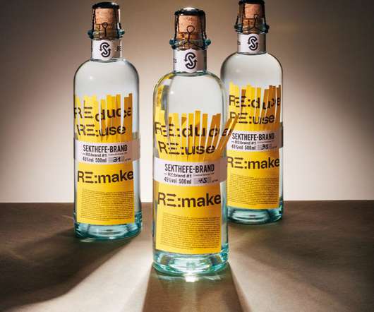
Sustainable design Platinum winner: re:incarnated spirits by Ruska Martín Associates Imagine being able to put 'award-winning' next to your name on your bio: what could that do for your career? Well, if you work in packaging design, the time for wondering is over. So 2023 is the perfect time to enter your work.
Colours, type, motion, shapes, and so on are huge visual identifiers! This is exacerbated by clickbait media reports expressing faux shock at how a company or public body spends millions on a logo. Yet as freelance AD, motion artist, and video producer Heather Seidel Bosi points out. There's more to a brand's identity than a logo.
The work was based on a key consumer insight that travelling is associated with a feeling of with freedom, until consumers are faced with the reality of a typically complicated process. The colour palette, meanwhile, has moved away from the nationalistic identity to predominantly black and white with hints of purple.
I'm starting to see a number of projects using funky, bold, custom typefaces as a primary element in the brand identity," he tells us and points to Colour Mill by Universal Favourite as a good example. The custom typeface is a nod to piping icing textures, appropriate for a food colouring brand with lots of flavours.
It is the face of the brand, the symbol that customers will associate with the company. Different colors evoke different emotions and associations, making the choice of color palette critical in conveying the brand’s message. These elements work together to create a consistent and recognizable brand image.
Enter “emotional attachment” – this refers to the phenomenon whereby we associate a logo with a specific brand experience and, as a result, develop an emotional connection to the logo. These logos have an impressive design and evoke emotional responses from consumers. How is this accomplished?
A logo is an artistic arrangement of colours, shapes, and typography and a visual representation of a brand's personality , values, and message. When done right, a logo can be a powerful tool that evokes emotions and helps create a strong connection between a brand and its target audience.
Negative Associations : Sometimes, brands find themselves in hot water due to scandals or controversies. Here's how to get started: Visual Identity Check : Review your logo, colour schemes , typography, and overall design. Let's say that their time has passed. Your brand might feel tired and dated. Are they modern and appealing?
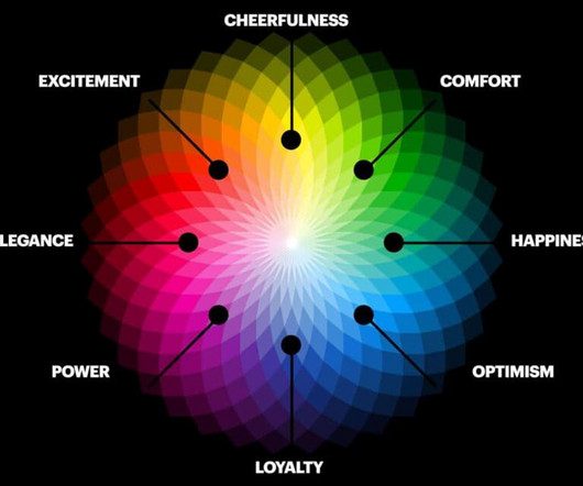
The Power of Colour in Branding and Marketing Colour plays a vital role in branding and marketing. A company's colours communicate messages about its personality, values, and image. Colours invoke emotions, memories and associations in people and can be used deliberately to influence customer perceptions and behaviour.
The Science of Colour Psychology: How It Impacts Brand Perception Hey there, fellow brand enthusiasts! Well, my friends, it's time to unravel the secret behind this captivating phenomenon: the science of colour psychology. In the fascinating world of branding, colours hold immense power. Don't believe me?
Colours in Logo Design: Tips and Branding Advice In terms of branding, colour is an essential element. Before a word is read, it represents your company, sending messages and eliciting emotions. What are the secrets behind colour psychology, and how can they work in my favour?
Use it to your every advantage to connect with your target audience and inspire an emotional reaction from them. They want to show off all their assets, programs, awards, associations, contact details and everything else that you can think of. This article has been contributed by Aslam Multani. First impressions matter. Keep It Simple.
Vision boards help you stay passionate and tap into the emotional side of motivation. To customise your images, you could add borders or change the colour of the picture. Deciding on a Colour Scheme. Getting the colour scheme right is more important than you might think. Use Your Vision Board to Focus On What you Want.
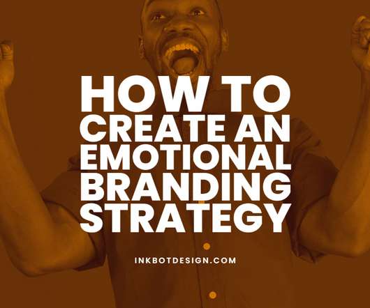
How to Create an Emotional Branding Strategy & Brand Examples. There’s power in our emotions. As human beings, emotions are a natural part of our everyday lives. As a creative professional, leveraging the power of emotions can unlock a deeper relationship with your prospective consumers. Thankfully, no.
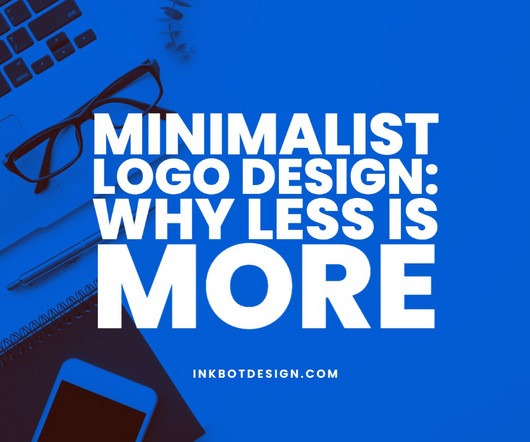
” This approach to logo design focuses on simplicity, clarity, and the power of visual elements to evoke strong emotions and create lasting impressions. They are designed to communicate a clear message with an economy of form, using basic shapes, clean lines, and a limited colour palette.
You might not be conscious of it, but the colours, shapes, and compositions used in brand logos, websites, and marketing materials play a crucial role in creating a memorable impression on your mind. Visual elements have an extraordinary capacity to convey messages, evoke emotions, and forge lasting connections.
They embody the unique traits that set your brand apart from competitors and foster a deep, emotional connection with your target audience. These elements encapsulate the values, purpose, and mission your brand stands for and the feelings and emotions it evokes.
Contrast: Contrasting elements, such as colours, shapes, and textures, can create a striking visual impact that directs attention and adds dynamism to your work. Repetition: Repeating elements such as colours, shapes, or patterns can reinforce a visual theme and create a sense of consistency.
This design approach features clean lines, uncomplicated typography, and restrained colour palettes , all working together to accentuate the product's quality and convey an effortless simplicity. Using a restrained colour scheme, designers can create a sophisticated, timeless aesthetic that feels modern and classic.
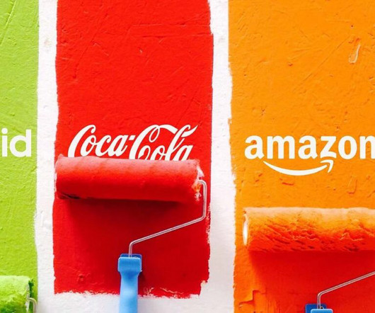
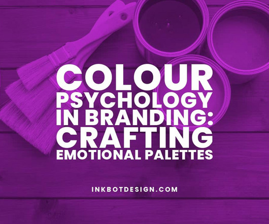
Colour Psychology in Branding: Crafting Emotional Palettes Can you think of coloursassociated with certain brands? For example, Hermes’ signature colour is orange, while Coca-Cola’s is vibrant red. These colours are present in their logos, typography, and even packaging. No worries!
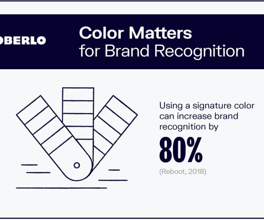
Colour Choice in Logo Design: Psychology and Science Selecting the right colours for your company's logo is no small task. Your chosen colours will shape customers' perceptions of your brand and help determine how memorable it is. This comprehensive guide will explore the science and psychology behind logo colour choice.
Brand Identity Design: Crafting an Authentic and Memorable Brand Image Have you ever caught a mere glimpse of a logo, tagline, or colour scheme and instantly recognised the brand behind it? Therefore, crafting a solid brand identity is more than designing a cool logo or choosing your company's colours. Let's dive in!
Corona Logo Design: Colours, Fonts, and Hidden Meanings Meanings within brand identities have always fascinated me, and Corona's logo stands as one of the most recognisable beer emblems globally. Another fascinating transformation occurred in the 1960s when I observed the brand introducing the signature blue and gold colour scheme.
This comprehensive article will explore the art and science behind creating logos that capture attention, foster emotional connections, and endure brand loyalty. Effective logo design helps establish a solid and consistent brand identity , allowing customers to instantly recognise and associate with the business.
It's also crucial when creating your logo to choose colours that communicate your brand identity and evoke the desired emotional response. For example, blue is often associated with stability and trust, whereas red can symbolise passion, excitement and energy. A good logo should be more than just a pretty image.
An In-Depth Look at Colour Theory Colour theory is the art and science of using colour effectively. It guides colour mixing and how colours can work together harmoniously. Understanding colour theory allows artists, interior designers, web designers, and others to make informed decisions about colour use.
We organize all of the trending information in your field so you don't have to. Join 66,000+ users and stay up to date on the latest articles your peers are reading.
You know about us, now we want to get to know you!
Let's personalize your content
Let's get even more personalized
We recognize your account from another site in our network, please click 'Send Email' below to continue with verifying your account and setting a password.


Let's personalize your content