Remove Color Remove Interior Design Remove Textures Remove Theme
article thumbnail

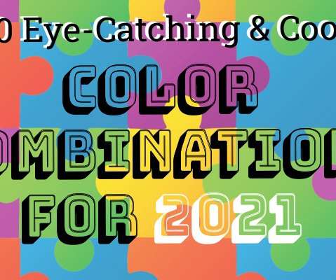
80 Eye-Catching & Cool Color Combinations For 2021!

Design Wizard

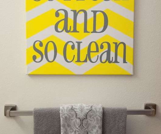
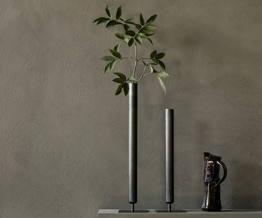
Browse our color combinations to step up your creative game and reap the rewards. Knowing what colors go together is a skill in itself and it can have a positive impact on all areas of your life. Once you gain an understanding of what different colors mean and the theory of color , you’ll see how they can influence perceptions.

Color 218
article thumbnail

AvroKO Blends Past With Present for the Centara Reserve Samui Resort

Design Milk

The designers have skillfully updated these influences, opting for simplified forms and geometric patterns, all while introducing a striking theme that plays with the perception of weight and buoyancy across the resort’s design. The material palette is deliberately muted, emphasizing texture over color.

Insiders

Sign Up for our Newsletter

This site is protected by reCAPTCHA and the Google Privacy Policy and Terms of Service apply.

Trending Sources

article thumbnail

100+ Best Art Deco Patterns, Elements & Frames for Graphic Design

Just Creative

An Art Deco pattern is known for its precise and clear lines, geometric shapes, and decoration characterized by rich colors, bold geometric shapes, prolific ornamentation, and much more. You can use Art Deco patterns to instill an attractive vintage style to your digital designs with ease.

Patterns 200
article thumbnail

39 Must-Have Creative Assets in this Month’s Drop

Creative Market

Una Matison has a beautiful collection of photos and videos for use in social network projects, especially for Instagram designers and marketers. Her creations stand out for their soft pastel color palettes and classy typography. Based in Australia, KAZER STUDIO specializes in typeface design and brand identity. 1871 Project.

Templates 178
article thumbnail

How To Start Your Brand With A Mood Board

Six Leaf Design

Things to keep in mind when creating your mood board include colors, textures, patterns and lifestyle images that give you that tingly feeling when you look at them because they are exactly what you want your brand to communicate. In our board for Eagle’s Rise Ranch we started to see lots of dark, dramatic colors and pops of copper.

Brand 189
article thumbnail

Behind the Vibrant Return of 70s Patterns

Creative Market

This removal from today’s tech stressors might be the reason visual artists of the day could dig deep and hone in on textures would really connect with their audiences, regardless of whether those audiences were art lovers or just consumers. Then again, upheaval is a frequent theme in human history, cutting across all cultures.

Patterns 122
article thumbnail

BAUX and Tarkett Prove Synergy Is the Future of Circular Design

Design Milk

With a shared ethos for well-being, environmental responsibility, and beauty, the two companies synergize to launch a collection of multi-textural flooring, wall, and ceiling surfaces nuanced in a corresponding colorful language developed by international design studio Form Us With Love. They have a strength for play in color.

Color 100