This site uses cookies to improve your experience. To help us insure we adhere to various privacy regulations, please select your country/region of residence. If you do not select a country, we will assume you are from the United States. Select your Cookie Settings or view our Privacy Policy and Terms of Use.
Cookie Settings
Cookies and similar technologies are used on this website for proper function of the website, for tracking performance analytics and for marketing purposes. We and some of our third-party providers may use cookie data for various purposes. Please review the cookie settings below and choose your preference.
Used for the proper function of the website
Used for monitoring website traffic and interactions
Cookie Settings
Cookies and similar technologies are used on this website for proper function of the website, for tracking performance analytics and for marketing purposes. We and some of our third-party providers may use cookie data for various purposes. Please review the cookie settings below and choose your preference.
Strictly Necessary: Used for the proper function of the website
Performance/Analytics: Used for monitoring website traffic and interactions
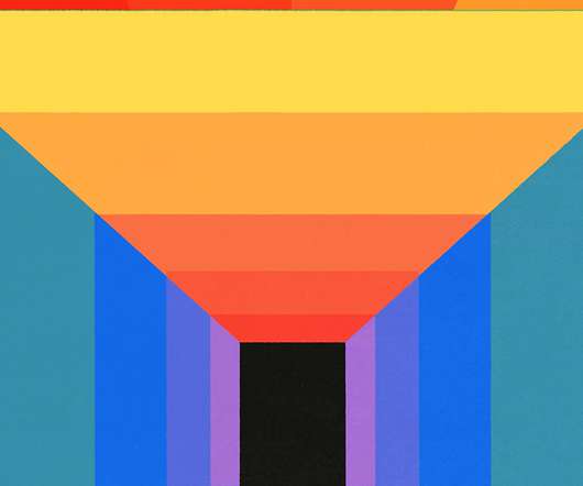
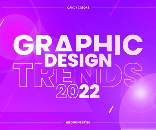
With its commanding typography and bold geometric interplay, this template provides a sophisticated foundation for promoting any creative event. The first thing you notice is the typography. A Closer Look: Geometry, Color, and Space Beyond the striking typography, the design’s genius lies in its use of simple geometric shapes.
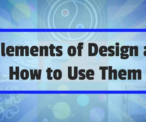
They are: Contrast Balance Hierarchy Alignment TypographyColor Proximity Space Lets explore them one by one. Contrast: Making Elements Stand Out Imagine a page of text where everything is the same size and color. Color: Brighter or more contrasting colors stand out. Forget complicated formulas and obscure jargon.
Mirko covers essential topics such as colortheory, typography, and effects. This knowledge is vital for anyone looking to create effective digital products. Exploring UI Elements As learners advance, they delve into various UI elements.
It is about composition, typography, and colortheory. You need to add unique elements. This requires you to infuse your own knowledge and skills. It’s about understanding design principles. These are what set you apart. This Swiss Graphic Design-inspired poster template by Blackcatstudio is available on Adobe Stock.
Stay updated on the latest trends in typography, colortheory, and visual hierarchy. Discover innovative uses of materials, inspiring color palettes, and clever space-saving solutions. Let’s take a closer look at some of the key areas covered: Graphic Design: This board is a haven for visual communicators.
The Reign of the Unreadable Font Typography matters, right? Poor Communication: Colors can send the wrong message. Lack of Harmony: Colors should complement each other. What we can learn: Understand colortheory. Use color palettes thoughtfully. We’ll explore why they didn’t work. Get feedback.
This is the visual design, typography, color, imagery, and aesthetic polish that users actually see and touch. Tools Visual frameworks like PARC, gestalt principles, and colortheory. It should feel obvious. Surface Layer This is the final coat of paint. But don’t mistake “final” for “least important”.
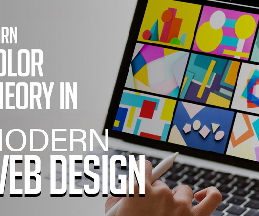
In the ever-evolving landscape of web design, colortheory remains a fundamental pillar. The judicious use of colors can significantly impact the aesthetics, usability, and overall user experience of a website. Colortheory is the foundation upon which all aspects of visual design rest.
Learn the basics: Start with the fundamentals of design theory, colortheory, typography , and composition. You may be interested in the following articles as well. These are the foundational skills of graphic design and will help you create designs that are aesthetically pleasing and visually impactful.
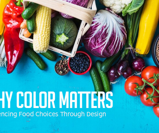
A canny use of colortheory, typography finesse, and sharp layout strategies that foster understanding with ease. ColorTheory: Stirring up the Appetite Most food establishments utilize a specific set of colors in their branding. Sketch the branding, typography, color palette and incorporate specific trends.
Communicate through image-making and typography. Broken into five courses including Fundamentals of Graphic Design, Introduction to Typography, Introduction to Imagemaking, Ideas from the History of Graphic Design, and Brand New Brand. Typography. Graphic Design Theory. ColorTheory. What you will learn.
Those three are well-known as Typography, Gestalt, and Interface. The New Typography; A Handbook for Modern Designers. Jan Tschichold The New Typography; A Handbook for Modern Designers. Typographie: A Manual for Design. Emil Ruder Typographie: A Manual for Design. ERROR:#N/A $11.73 Buy on Amazon 7. Emil Ruder.
Keep your typography simple and easy to read, staying away from complicated or overly intricate fonts. Pay Attention to ColorTheory. Similar to the way that fonts create an impression, colors tend to evoke different emotions and feelings when viewed. Colortheory in branding is just as important as choosing your fonts.
Typography That Works: Typographic Composition and Fonts. When you’re starting out as a graphic designer, you may spend a lot of time perfecting the logo that portrays your brand to prospective clients, but what about the typography on your website or business card? Introduction to Typography.
Select articles on color: Using Colour: Real World Examples The Colour Wheel and ColorTheory Pantone Swatches on Squidoo Color Wheel – ColorTheory on Canva The Best Colour Tools Online Line Are your lines straight and slim, or thick and squiggly?
It literally sets in motion a series of new features, such as ultra-dynamics parallax, radical safe button, super-crispy moldable typography, and immaculate future-proof device style to break free from the tyranny of sameness. You may be interested in the following articles as well.
Challenges and Inspirations for Designers While the Quantum Color Palette offers a vast and unexplored playground for designers, it also presents challenges in terms of harmonizing seemingly disparate colors. The Artistry of Typeface Selection At the heart of Emotive Typography lies the deliberate and thoughtful selection of typefaces.
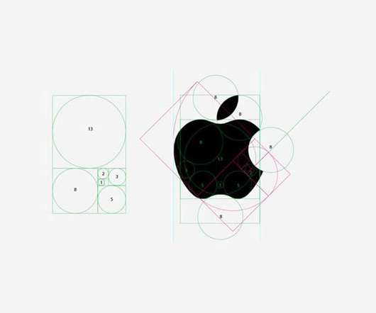
Here are some basic theories that help designers and visual communicators organize information and create eye-catching logos, brand images, and overall great designs. ColorTheory. The now-iconic purple color scheme was also introduced, along with a new font and style. This is an example of colortheory at work.
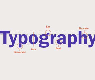
Typography. The Ultimate Guide to Basic Typography. Typography is an essential part of graphic design. Typography has a fascinating history and it’s come a long way to become what it is today. How to Improve the Accessibility of Fonts and Typography in Your Designs. 3 Tips to Help You Avoid Bad Web Typography.
“Color is a challenge,” says designer and Pentagram partner Eddie Opara in a trippy and instructive animation that explains why certain shades resonate with our emotions and prompt us to act. Watch the first episode featuring designer Erik Spiekermann and the importance of typography below. ?.
Visual Design Theory – Understanding colortheory, the basics of composition, and how to use typography among other things are all necessary for designing visually appealing websites. Web Design Tools – There are certain tools commonly used by web designers (e.g. Figma) that you will need to master (more on this later).
Well, a little more than ‘use bright colors,’ I’m afraid. Study colortheory then apply it to your projects in tasteful, audacious ways. Several excellent articles on the subjects on the subject listed at the end of this section, and the ‘Colors’ category of Smashing Magazine is home to plenty more. Typography.
You will hear these terms used together to mean how a designer has placed images, shapes, and typography to create a pleasing design that attracts the viewer and delivers the right message to that viewer. It is about repeating shapes, typography, style, colors, and design elements to be recognizable and not confuse viewers.
Canva Design School Canva Design School offers a range of online courses, tutorials, and resources for designers, including topics like branding, typography, and colortheory. It offers a range of features, including advanced typography, gradient and pattern fill, and shape-builder tools. Free Graphic Design Courses: 35.
Depending on the type or shade, you can use colors to emphasize elements or evoke certain feelings. Choosing the right colors is crucial when you’re trying to tell a story with your design. Make sure you know the fundamentals of colortheory to choose colors that complement each other. Typography.
When customers encounter this energetic color paired with mouthwatering food photos, they’re more likely to feel compelled to interact or make a purchase. But it’s not just about choosing the right color. You also have to consider images, typography, and other design elements to create an interface that tempts and persuades.
ColorTheory. Don’t just copy other people’s color schemes without understanding why and how they arrived at their color choices. Colors have a myriad of different meanings and associations attached to them, both by the designer and by the viewers. The Rules Of Typography. Same as above.
Another cool reference that I found was Typography is Sexy Part I, II and III over at Fuel your Creativity. However, big typography has always inspired me, so making a tutorial on this was something that I welcomed with open arms. It was because of that inspiration that I decided to keep my colors for this poster simple.
It provides a solid foundation upon which other branding elements, such as color schemes, typography, and marketing materials, are built. They understand design principles, colortheory, and typography, ensuring that the logo is not only aesthetically pleasing but also functional.
With elements and textures that allow you to create standard or typography logos. Also included are 30 pre-made logos, 20 pre-made typography logos that come with 30 suggested fonts you can use. The kit provides you with full editable files for Illustrator and if you use Photoshop, files are included for both shapes and textures.
This trend is very adaptable to all formats from illustrations and animation, to web design and typography. This trend comes with typography that breaks the standards. This twist looks most impressive in kinetic typography where the messages get unveiled through motion. Vibrant eye-candy color schemes. Happy Burguer Day!
This theme will inspire design elements such as the color scheme, typography , and visuals you choose to include in the rest of the report. Use bright colors and bold fonts that draw attention and are in line with your brand guidelines. Make sure you don’t clutter the cover page with too much text. Maintain consistency.
Through the clever use of typography, colortheory, and layout, designers can evoke specific emotions and create an instant connection with their audience. It is about conveying a message, whether that message is the functionality of a product, the identity of a brand, or the essence of an artistic piece.
You Can’t Watch a Movie Without Mentally Redesigning the Posters You go to the cinema and instead of enjoying the trailers, you’re too busy critiquing the typography on the posters. Being a design nerd means you have a unique perspective on the world, one where alignment, colortheory, and typography reign supreme.
These resources can teach you everything from the basics of colortheory to advanced design software techniques. It requires an understanding of colortheory, typography, composition principles, software proficiency and communication skills—more on this later! Can I learn graphic design on my own?
The industry thrives upon designers who can deliver a range of creative content in the arenas of advertising, book design, magazine design, information maps, typography and beyond. In their design course , you will learn about design principles, design cycle, typography and the business of design. Shaw Academy. Shillington.
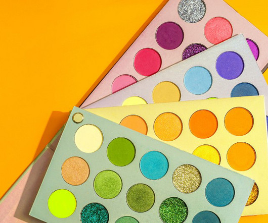
50 Totally Free Lessons in Graphic Design Theory. Color, Texture, and Imagery. It's important to understand the basics of colortheory and get a feel for how to work with colors. Color can make areas of a design pop off the page or recede into the background. Advanced ColorTheory: What Is Color Management?
A brand’s visual identity is a combination of graphic elements that represent and identify it, including its logo, color palette, typography, imagery, and other design elements. It’s important to follow the principles of colortheory and color psychology in order to select the right shades.
Put simply, it refers to the art of visual communication that combines images, typography and other design elements to convey a message or create a visual identity for a brand or product. Understand the Role of a Graphic Designer Graphic design is a fascinating career that has grown in popularity and importance over the years.
Mobile Responsiveness , User Experience , SEO , Image , Content Quality , Conversion Rate , Accessibility , Navigation Structure , Typography , Color Scheme , Interactivity , SocMed Integration , Browser Compatibility , Readability Show more Show less 5. How to optimize my website's Loading Speed without compromising on design?
That isn’t to say you can use bright colors in professional logo designs, but it’s always good practice to remember what works and where you can explore more creative directions. If you need a refresher on colortheory, you can check out this article on the difference between complementary and analogous color schemes.
The more detailed chapters cover specific techniques like special effects, typography, and 3D graphics. It’ll cover everything you need from grid systems, typography, patterns, textures, and a dozen other helpful topics. Anyone who wants to learn Photoshop in a step-by-step process will get a lot from this book.
As a graphic designer, you can use your artistic talents to communicate ideas visually through images, layouts, typography, colours, and more. Online BAs and BFAs take around four years of full-time study, covering: Fundamentals: Design and composition, typography, colour theory, etc. Sound appealing?
From typography to layout, right through to color and special effects, this list runs through a few basic rules, tips, tricks and guides to some common errors and how to banish them from your design. So, the more important elements are made to hold the most attention through scale, color, type etc.
We organize all of the trending information in your field so you don't have to. Join 66,000+ users and stay up to date on the latest articles your peers are reading.
You know about us, now we want to get to know you!
Let's personalize your content
Let's get even more personalized
We recognize your account from another site in our network, please click 'Send Email' below to continue with verifying your account and setting a password.


Let's personalize your content