This site uses cookies to improve your experience. To help us insure we adhere to various privacy regulations, please select your country/region of residence. If you do not select a country, we will assume you are from the United States. Select your Cookie Settings or view our Privacy Policy and Terms of Use.
Cookie Settings
Cookies and similar technologies are used on this website for proper function of the website, for tracking performance analytics and for marketing purposes. We and some of our third-party providers may use cookie data for various purposes. Please review the cookie settings below and choose your preference.
Used for the proper function of the website
Used for monitoring website traffic and interactions
Cookie Settings
Cookies and similar technologies are used on this website for proper function of the website, for tracking performance analytics and for marketing purposes. We and some of our third-party providers may use cookie data for various purposes. Please review the cookie settings below and choose your preference.
Strictly Necessary: Used for the proper function of the website
Performance/Analytics: Used for monitoring website traffic and interactions
By reimagining classic elements like vintage typography or retro colorschemes with a contemporary, high-tech twist, they create visuals that feel both familiar and forward-thinking. This can include using old-school fonts and neon color palettes in ad visuals for a nostalgic, tech-forward look.
Whether you’re a designer, marketer, or brand strategist, staying ahead of these trends is essential to creating relevant, impactful designs. Staying informed on these trends is crucial for designers, marketers, and brands looking to stay ahead in a rapidly changing visual landscape.
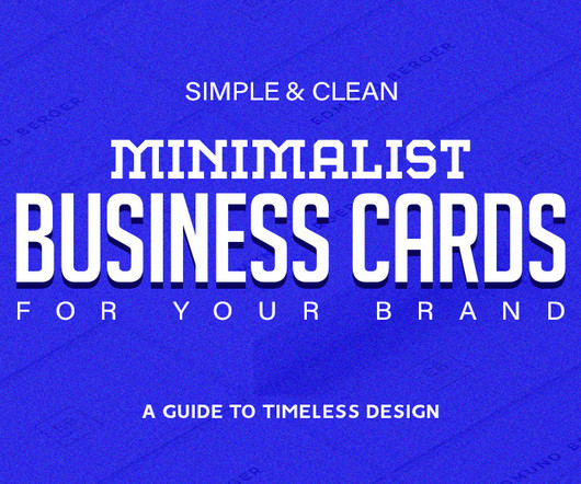
It’s a tangible representation of your brand, a physical object someone can hold onto and reference later. But in a world bombarded with flashy marketing, how do you create a business card that stands out? inch business card with bleed, CMYK colorscheme, and 300 DPI resolution for professional results. inch bleed.
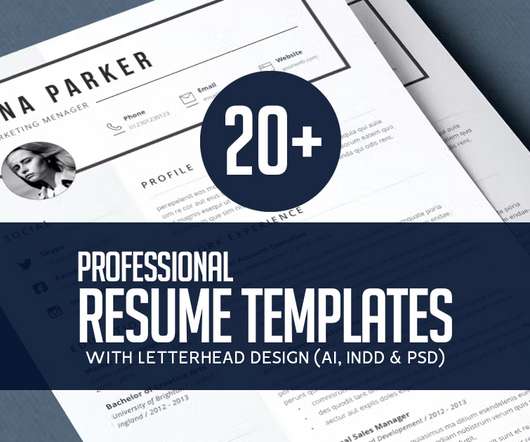
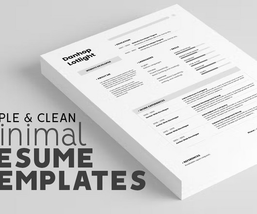
In the current employment market, oftentimes candidate’s resumes can stay in employers hand only for a few seconds so don’t settle for the usual boring and predictable templates, move forward and choose professional templates for your resume. These template files can be easily customized using Microsoft® Word on a Mac or PC.
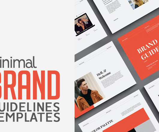
In these templates colorschemes to typography choices, designers can easily reference the guidelines to maintain visual consistency while exploring creative variations. In digital marketing era establishing a strong brand identity is essential for standing out amidst the competition. Minimal Brand Guidelines 2.
For these, you will need to work with a consistent colorscheme and branding, as you would for any other corporate design, but also with the right banner sizes, as they vary from platform to platform and can be a bit burdensome to find.
Check this: Free CV / Resume Templates In today’s competitive job market, Resumes often receive just a fleeting glance from employers. For additional guidance, refer to the accompanying template for valuable tips. Vibrant colorschemes can be used strategically to highlight key sections or to create a cohesive visual identity.
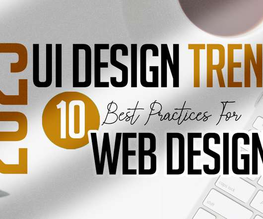
As the world advances, market online UX and UI design becomes more essential than before, and with this comes a lot of changes in UI trends. According to several studies, this colorscheme helps to improve visual hygiene by lowering eye strain and the luminance generated by device screens. 10 UI Design Trends for Web Design.
But, your brand is more than just a logo and color-scheme, it’s your company’s personality. Whilst most businesses understand the need for a properly branded website and marketing materials, many people underestimate the importance of branding in the office. Do your logo and color-scheme fit your business?
In today’s competitive market, establishing a unique and recognizable brand is essential for businesses of all sizes. Visual identity design, on the other hand, refers to the visual elements that represent the brand , including the logo, colorscheme, typography, imagery, and more.
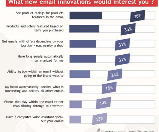
Similarly, marketing practices have also evolved to adapt to changing customer behaviors and preferences. Just like social media marketing and email marketing , email design has undergone a tremendous transformation over the years, and it is set to reinvent new possibilities in 2021. Optimism or hope. Interactivity.
With a modern layout and customizable features, it’s tailored to professionals in marketing, graphic design, and other visually-driven disciplines who want their resume to reflect their creative mindset. Feel free to find other recommended graphic design resources in the popular Templates section on WE AND THE COLOR.
In today’s crowded market, your logo is more than a picture – it’s your brand’s voice. Marketing and Promotion : High-quality mockups can be used in marketing materials to create a cohesive and professional brand image. The right mockups can transform a simple logo into a captivating brand story.
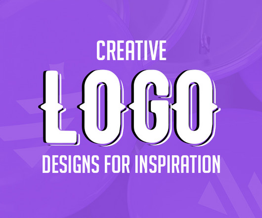
Leadbox Marketing & Sales Logo Design By Alex Tass 8. Farmers Market Logo Design By Alex Seciu 25. Source Leadbox Marketing & Sales Logo Design By Alex Tass The Leadbox Marketing & Sales logo by Alex Tass is a brilliant representation of synergy between marketing and sales.
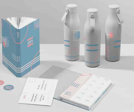
A well-crafted visual identity is cohesive, memorable, and versatile, extending across all touchpoints – from your website and social media to packaging and marketing materials. Colors can influence how a brand is perceived, conveying messages and values without words. ’s signature blue.
Brand identity includes visual elements such as your logo, slogan and colorscheme. As a marketer, one of your most important jobs is to improve prospective customers’ awareness of your brand. According to Venngage, 89% of marketers ranked improving brand awareness as their top goal for 2020. What is Brand Recognition?
For web design and UI/UX, it translates into earthy colorschemes and minimalistic layouts that are fresh yet grounded. View example View example Packaging and product design can benefit from natural textures and muted colors, giving a tactile quality that resonates with the trend’s focus on natural beauty. View example 5.
To ensure your logo is used correctly on products, marketing material, and online, insert specific guidance about your logo into your brand guide. Often brands define the use of white space around a logo by referring to something already contained in the logo. This makes it easier for designers to reproduce your specific brand colors.
You must get your hands on this template if you are a mindset coach, entrepreneur, marketing manager, content creator, etc. Learn More Colorful 3D Digital Marketing Business Instagram Post So, you have done everything to promote your digital marketing business, yet the client base is minimal.
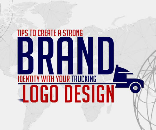
To help you navigate the process of creating a powerful trucking logo , here are detailed tips divided into key subheadings, complete with examples, logo design quotes, and relevant image references. How to Create a Strong Brand Identity: A strong brand identity is essential for standing out and building trust with your audience.
If you’re not getting enough traffic to meet targets, you should both analyze your online marketing and look for ways to strengthen your website. Just make sure it’s something your target market will want too. Otherwise, your website and marketing may need to take a different approach to reach the right people.
You might think that brochures are an afterthought these days due to the penetration of digital marketing, but that couldn’t be further from the truth. Each of these top creative brochure templates for marketing from Envato Elements has tons of professional and creative design options.
Different colors symbolize different things; like how black is usually associated with being sophisticated or mysterious, blue corresponds to cool or calming, green means growth, and red is sexy or exciting. Go for a monochromatic colorscheme if you want to work with varying shades and tints of the same color.
You might think that brochures are an afterthought these days due to the penetration of digital marketing, but that couldn’t be further from the truth. Each of these top creative brochure templates for marketing from Envato Elements has tons of professional and creative design options.
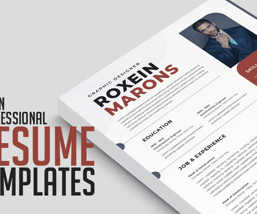
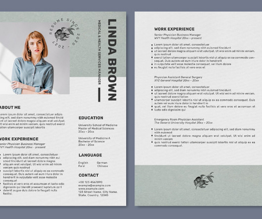
In today’s competitive job market, a standout resume is essential to catching the attention of hiring managers and securing your dream job. Whether you’re a graphic designer, a software engineer, or a marketing professional, clean professional CV resume templates offer versatile options that cater to every industry and role.
Tyler Comrie, founder of the design studio, TyCo , and alum of HarperCollins and Knopf, says at the end of the day, cover trends come down to marketing. Oftentimes, there’s an inherent tension between the designer working on a cover and the team marketing it.
Targeting customer pain points is always a good starting point for your marketing strategy. Often referred to as guerilla advertising and a technique many marketers dream of, street art can have a huge impact on a marketing campaign. Villainize the Consumer’s Problem to Increase Sales. Source: Safeguard Hygiene.
Marketers, like myself, like to think that it’s obvious for everybody outside of the marketing bubble that great branding is essential and it doesn’t stop at choosing a name, logo, and colorscheme for your business (to be forgotten at some point). The importance of brand consistency is indisputable.
A resume is also a marketing document for companies and in your network to help you meet other hiring opportunities. This makes it all the more imperative to make a proper resume in the competitive job market, and there are various templates online that can help you make the right one for your needs.
If you want to establish a more personal connection, appeal to your target market with lines that mimic handwriting. Color immediately stands out in any design. Depending on the type or shade, you can use colors to emphasize elements or evoke certain feelings. Edit in Design Wizard. Edit in Design Wizard. Edit in Design Wizard.
In today’s competitive job market, having a standout resume is crucial to make a lasting impression on potential employers. ColorScheme : Rawpixel has carefully chosen a harmonious colorscheme that aligns with modern design trends, adding a touch of sophistication to your resume.
They want to convey a certain message to potential customers and they know that the right brand colors will help them to do that. The colors they choose are often based on color psychology. Color psychology refers to the meanings we take from certain colors and the way colors make us feel.
Each monument carried icons, mascots, and insider references from the developer community, merging playful aesthetics with thoughtful design. According to Adam Walden, VP of Brand and Corporate Marketing at GitHub, “BUCK continues to bring taste, craft, story, and incredible attention to detail to everything we do together.”
One of the elements in a brand kit, is a color palette , or colorscheme. If you choose to go with a pink logo, it’s important to also make sure it’s aligned to your brand color palette, or that you update your color palette to look good with a pink logo. Bubblegum, pink and red. Soft pink and burgundy.
Read on to learn everything you need to know about expressing your brand identity through visual communication, marketing materials and graphic design assets. This includes everything from website and logo design to your social media and marketing collateral. What is corporate identity? Aren’t they one and the same? The problem?
Throughout the 1820s, publishers began covering annuals in a sort of wrapping paper, printed with minimal text, enough to identify the volume—these were referred to as “dust jackets”. By the 1870s, dust jackets were common, but their marketing value remained unexplored as they were left blank. The colorscheme is monotone.
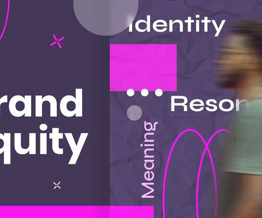
You can measure the success of your company easily by financial statements, customer satisfaction, new and returning customers, employee performance reviews, and staying current on the market. In marketing, brand equity is the term that describes the brand’s recognition and added value in its name. The Benefits of Brand Equity.
Throughout the 1820s, publishers began covering annuals in a sort of wrapping paper, printed with minimal text, enough to identify the volume—these were referred to as “dust jackets”. By the 1870s, dust jackets were common, but their marketing value remained unexplored as they were left blank. The colorscheme is monotone.
Direct Marketing Association statistics show that as many as 79% of people retain, share, or at least look at the contents of a flyer or leaflet. And if you're a marketer or graphic designer working with clients, designing a flyer from scratch is time-consuming. Marketing - Informational Flyer Presentation Template (PSD).
It represents the brand’s digital image and reveals the hidden beneficial factors in the market. They can not survive in the markets without their creative and inviting logos. There are myriad options for logos that are enchanting the market with their creative methodology. The Various Types Of Logos. Online Logo Makers.
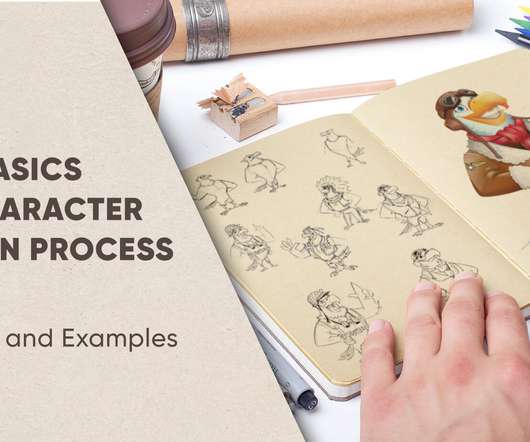
References are absolutely crucial when it comes to character design. Reference Image Source 1 / Reference Image Source 2 / Reference Image Source 3 / Reference Image Source 5. This brings us to the next important step, which is making different views as reference materials. ColorSchemes.
Designing for the pluriverse diagram, based on a reference by Mauricio Mejía Genderless design is a myth The concept of genderless, universal design is an illusion. Art directions that are bold, blocky, emotionally restrained, and conservative in color are associated with masculinity. The gender binary is harmful in many ways.
Retro or vintage design refers to a broad range of graphic design styles which lift influences and inspiration from different historical eras and retro style design, from mid-century modern graphic design and 50s art styles to vintage 70s graphic design. What Is Nostalgic Marketing? What does retro style mean? What Is Vintage Design?
In this article, we will have a glimpse of what Color Design , Color Theory is, see a few tips for choosing a colorscheme, and apply colors to a Widget. Red pigment Our conscience already developed awareness about colors. Color Wheel representing Hues A Tint is a hue lightened with white color.
We organize all of the trending information in your field so you don't have to. Join 66,000+ users and stay up to date on the latest articles your peers are reading.
You know about us, now we want to get to know you!
Let's personalize your content
Let's get even more personalized
We recognize your account from another site in our network, please click 'Send Email' below to continue with verifying your account and setting a password.


Let's personalize your content