Remove clarendon
article thumbnail

The best new typefaces for February 2025 from leading foundries and designers

Creative Boom

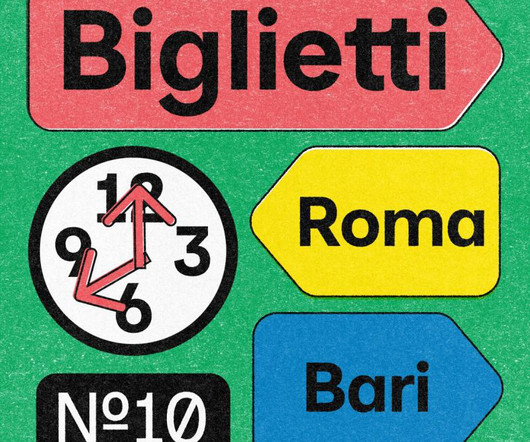
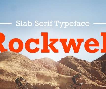
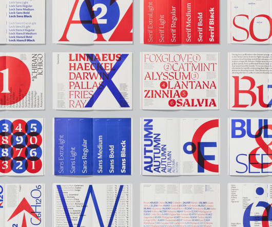
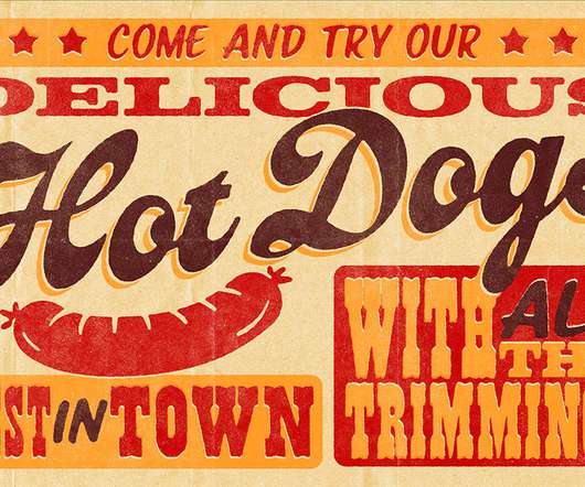
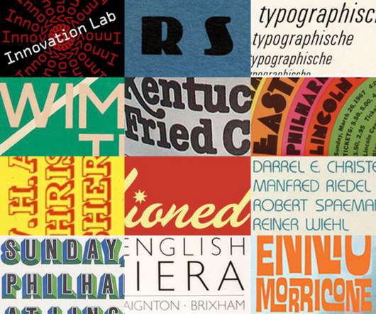
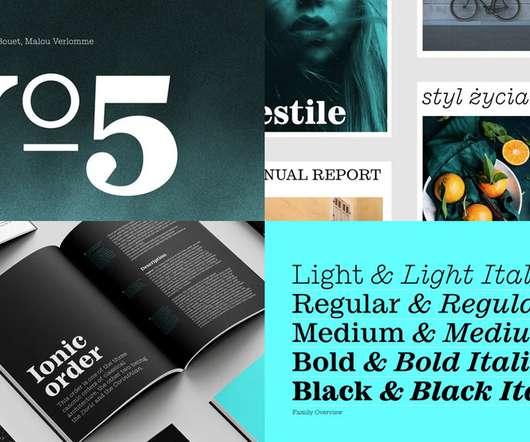
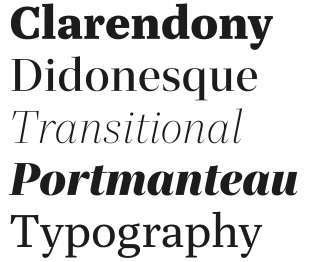
This extensive 20-font family bridges the gap between stern neo-grotesque slab serifs and traditional Clarendons, offering a distinctly modernist interpretation that feels fresh and contemporary. Marsam by Typonym Seven years in the making, Marsam represents a masterful reimagining of the slab serif genre.

article thumbnail

Best Slab Serif Fonts for Logos & Branding

Just Creative

Clarendon – $29. Clarendon – $29. Originally appearing in England in 1845, the classical Clarendon font family was redesigned in 1953 by Edouard Hoffman and Hermann Eidenbenz and precipitated the revivals of the font that followed. Rockwell – $35. Bondie – Condensed Slab Serif Font – $15. Learn More.

Insiders

Sign Up for our Newsletter

This site is protected by reCAPTCHA and the Google Privacy Policy and Terms of Service apply.

article thumbnail

The best new typefaces for October from leading foundries and designers

Creative Boom

In the words of its creator, Evan Deterling: "Marsam roams that arid desert between the severe, emboldened geometry of the 'Egyptian' neo-grotesque slab serifs and the graceful, bracketed serif forms of traditional Clarendon.

article thumbnail

14 fonts to fall in love with: trending typefaces that designers adore

Creative Boom

How the Neo-grotesque genre – represented by the likes of Helvetica, AG Book, or Unica – might change if they retained the higher contrast found in early Gothics derived from Clarendon/Egyptiennes, where someone had simply lopped the serifs off." Pastiche Grotesque by Order 12.

article thumbnail

10 best business card fonts

Moo

Clarendon An industry classic, Clarendon is an often-mimicked slab-serif font originally designed in 1845. Clarendon is also known for its decorative letters, such as the capital Q and capital R, which all end with curved, elaborate strokes. Using Clarendon on your business cards will surely command attention at first glance.

article thumbnail

Email Design Trends 2021: Are You Ready To Up Your Email Strategy?

Just Creative

Everyone simply used a generic bold like Clarendon slab-serif. Brands have now started experimenting with bold typography to convey their message to recipients. Bold typography dates back to the 19th century. In those times, varying weights did not exist. Now, they’re back on-trend, and for good reason. Below is an example to prove my point.

article thumbnail

Video Tutorial: Vintage Letterpress Poster Design in Photoshop

Spoon Graphics

Activate the WTR French Clarendon font – [link]. ? Then I’ll show you some useful tricks to simulate the visual traits of old prints with the help of some Photoshop filters and my free brushes and texture packs. Get 30% Off Skillshare Membership – [link]. ? Activate the Colt font – [link]. ?