This site uses cookies to improve your experience. To help us insure we adhere to various privacy regulations, please select your country/region of residence. If you do not select a country, we will assume you are from the United States. Select your Cookie Settings or view our Privacy Policy and Terms of Use.
Cookie Settings
Cookies and similar technologies are used on this website for proper function of the website, for tracking performance analytics and for marketing purposes. We and some of our third-party providers may use cookie data for various purposes. Please review the cookie settings below and choose your preference.
Used for the proper function of the website
Used for monitoring website traffic and interactions
Cookie Settings
Cookies and similar technologies are used on this website for proper function of the website, for tracking performance analytics and for marketing purposes. We and some of our third-party providers may use cookie data for various purposes. Please review the cookie settings below and choose your preference.
Strictly Necessary: Used for the proper function of the website
Performance/Analytics: Used for monitoring website traffic and interactions
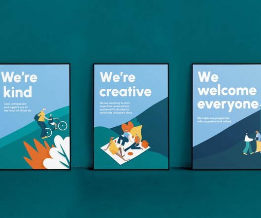
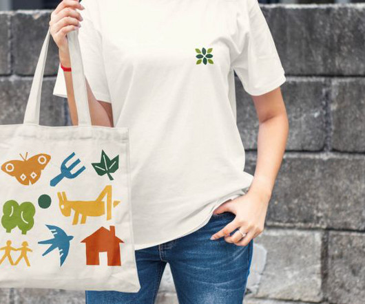
The design agency has hit all the right notes with its new branding for the UK domestic abuse and sexual violence charity. Launched in 2003, the charity was founded by Tamsin Larby, producer of The Vagina Monologues, whose experience in theatre revealed how performance could be used to engage people in the prevention of abuse.
As part of a two-year collaboration with How&How, the conservation charity reinvents itself with a new logo, custom typeface and migration-inspired patterns. Logo, typography and patterns The new logo is a custom 'C' with a hidden counter form inspired by a rhinoceros horn.
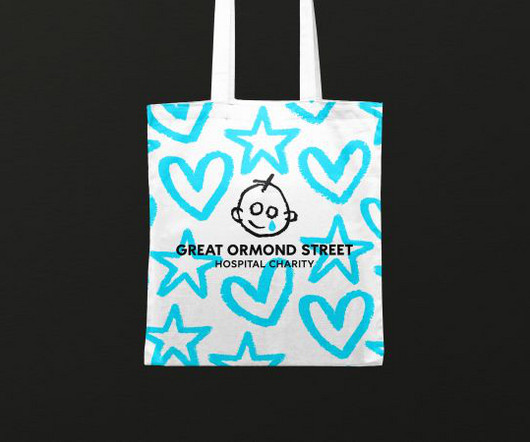
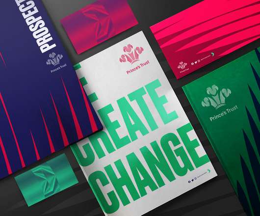
Working in collaboration with Stuart Gough, Pentagram, JKR, and Impero, the charity launches its refreshed brand and positioning today. The identity draws on the iconic logo's heritage, created in 1987 for the Wishing Well Appeal and inspired by a patient's drawing. The project began through extensive consultation and collaboration.
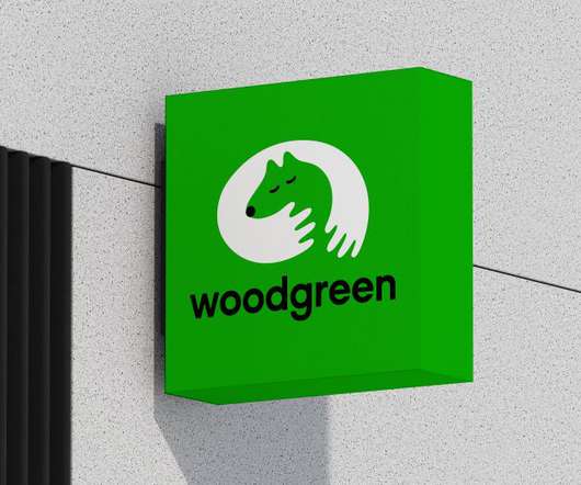
Marina Willer and her team at Pentagram are behind a super cute new identity for leading pet charity Woodgreen that has been designed to reflect the charity's special mission: "to help pets and their people". At its centre lies a heartwarming symbol that captures the unbreakable bond between animals and humans.
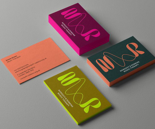
Pentagram has collaborated with the UK's largest music therapy charity Nordoff and Robbins to create a new visual identity which communicates its groundbreaking work through sound wave-inspired graphics. Accompanying this phrase was a new name for the charity, which tweaks the existing title in a subtle but clever way. Enter Pentagram.
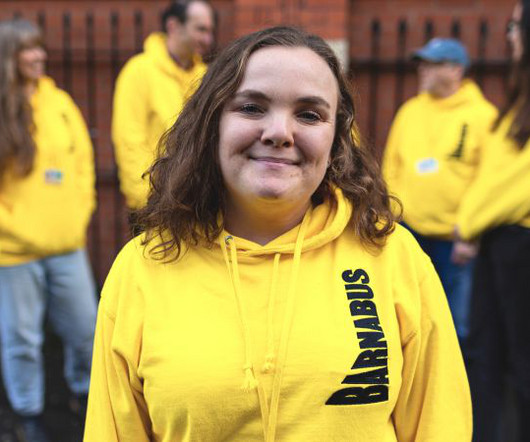
If charities evoke too much doom and gloom, it can encourage hopelessness rather than energy and ambition. Angus Prior and Rob Jenkins's rebrand of the homeless charity Barnabus instead takes an optimistic and confident approach. It was about being bold, reflecting a charity with huge ambitions for addressing homelessness."
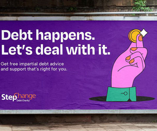
Empathy and pragmatism are the significant themes behind a revamped identity for StepChange, the national debt charity. Founded in 1993, it's a charity that offers free, impartial debt advice and solution servicing. The work by Robot Food hopes to break down any stigma around managing money. Let's Deal With It'. But what is StepChange?
The logo was also adjusted for better legibility at smaller sizes, and a new landscape lockup was developed, modernising the charity's proposition without too many changes. The charity wanted autonomy to stay at the forefront of discussions on Malawi's environmental threats."
Empathy and pragmatism are the significant themes behind a revamped identity for StepChange, the national debt charity. Founded in 1993, it's a charity that offers free, impartial debt advice and solution servicing. The work by Robot Food hopes to break down any stigma around managing money. Let's Deal With It'. But what is StepChange?
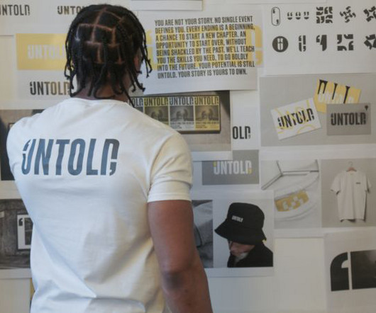
Here Design recently worked with a group of young offenders in prison to design a new identity for Untold, a charity that offers vocational training for young men in UK prisons. If the charity's problem was a disconnect with the prisoners, what better way to rectify this than to involve them in the redesign process?
Most recently, the studio led a rebrand for John Lewis , which unified the UK retailer's branding and visual identity across channels, while their work for animal charity Battersea created an inclusive brand identity that connects with pet lovers everywhere.
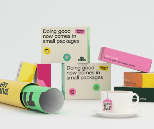
Started and supported by a growing network of big-name charity partners, it connects those in need with those who want to give. Brand idea and logo The brand centres around the idea: 'Mini missions that matter to you'. At the heart of the rebrand is the new logo. In other words, OnHand makes it easy to do good.
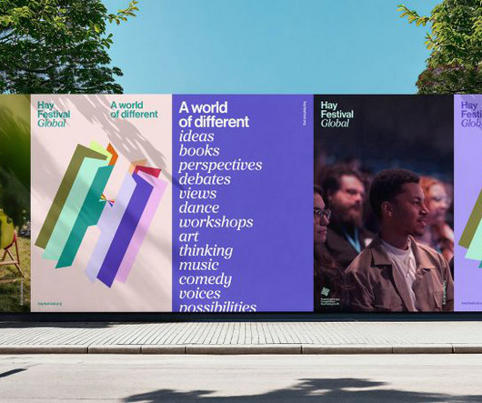
The new identity unifies the charity's multiple editions, projects and social purpose under a core brand, highlighting its internationalism and impact. And so the dynamic, multi-layered logo reflects the organisation's many different "chapters", including its festivals, forums, events, digital platforms and educational programmes worldwide.
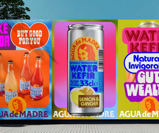
At the same time, Agua de Madre supports real-life mothers, too, as the company gifts one percent of profits to female-focused charities every year. Indeed, the name itself, which translates as 'water of the mother', pays homage to the "mother" culture used in fermentation.
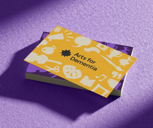
Breathing new life into the UK-based charity and championing the voices of those affected by dementia. The UK-based charity stands by the mantra that 'life doesn't end with a diagnosis' – it marks the beginning of a new chapter where Arts for Dementia can be a guiding light for those who need it.
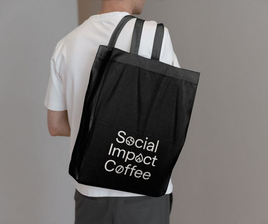
So instead of looking at this as a charity, we applied the rigour and accountability of business to the business of doing good." Logo, icons and tone Inspired by Social Impact Coffee's eye-catching social contribution, a logo built from the % symbol builds accountability into the brand's heart.
Top 10 CharityLogos That Inspire Change A charity'slogo is often its most valuable and recognisable asset. An effective logo can instantly communicate the organisation's mission, values, and purpose. A logo is a vital differentiator and allows organisations to be easily distinguished from others.
A logo is more than just a pretty image, it’s a fundamental element of a brand’s identity. The creative logo design isn’t just about aesthetics; it’s about communicating a story, evoking emotions, and leaving a lasting impression. A well-crafted logo is instantly recognizable.
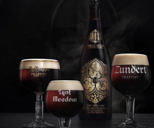
And, three: that part of the proceeds go to charity. Working in close collaboration with Svetlana and the abbots at each monastery, Ruud directed the development of a logo for the neck of the 75cl bottle, a main label design and three illustrations one to demonstrate each of the rules.
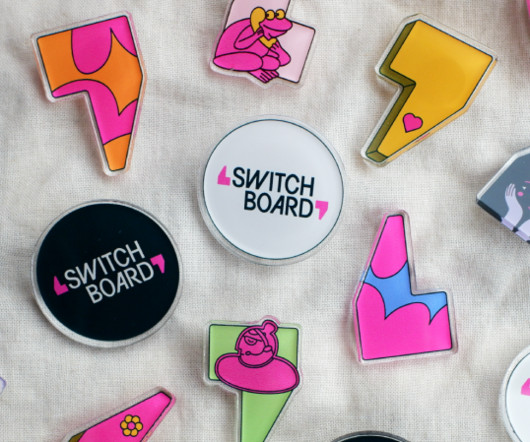
So London-based Nice and Serious was able to look back at the charity's work since its inception in 1974 to draw inspiration when Switchboard decided on a rebrand to mark the milestone. The logo itself takes its form from this bit of history, with bespoke lettering housed in the space between the two marks.
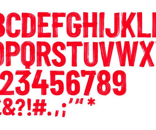
This is the 66th round up of logo design inspiration gallery and showcase featuring professional logo created by top designers. In this Business Logo Design collection you can feel how important is sketching and story-boarding. As a designer, I know how important is Logo for any business or brand. What is a LOGO?
Designed to highlight the charity's unique services and way of working, the identity has already seen positive responses from key stakeholders. Everything from the new name to the visual and verbal identities needed to introduce the new charity and its approach in the right way and make clear why it is different from others in its sector.
It’s often the launch of major charity rebrands that puts the gulf between how the design world views something, and how the rest of the world might, into sharp relief.
And they've partnered with Out of Place Studio – a Bradford-based design agency specialising in arts organisations, charities and the third sector – to create a new visual identity for the scheme.
Graham Nolan by Billie Charity We explore coach Helen Jane Campbell's excellent new book and what it can teach independent creatives. Layla Robinson by Billie Charity "When I worked in PR – which I did for 20 years – I'd be out on boats, inside factories, tasting products at fayres or learning a new skill, from finance to kung fu.
These modern flyer designs are a fitting choice for 4th of July Parties – from bars, restaurants & hotels to churches, schools, charities & local community groups. 30+ Best Logo Mockups. Logo Design In Adobe Illustrator – 25 Best Tutorials. 50 Best Logos Of 2020. 21 Fresh Free Fonts For Graphic Designers.
Now two leading charities have merged to tackle the problem, appointing Pentagram to create its new identity. On a mission to change all that are two of the UK's biggest lung charities which have merged to create a single charity under the name of Asthma UK and British Lung Foundation Partnership.
50 Best Logos Of 2020. 26 Creative Logo Design Templates for Inspiration. Social Welfare: Charity & Non-Profit HTML Template. Design Tonic – Website Design. Visit Website. Seventh Movement – Website Design. Visit Website. You may also like: 50 Resume Templates – Best Of 2020. 45 Free T-Shirt Mockup Templates PSD.
The charity funds world-class research (over £500million invested to date), ensures everyone affected has access to the right support at the right time, and campaigns for better treatments and care. As well as the logo, Pentagram's team created the tone of voice, graphic language, animation and photography style. Logo, stacked.
Breathing new life into the UK-based charity and championing the voices of those affected by dementia. The UK-based charity stands by the mantra that 'life doesn't end with a diagnosis' – it marks the beginning of a new chapter where Arts for Dementia can be a guiding light for those who need it.
Food redistribution charities like FareShare are also doing their bit to rebalance the narrative, with 91% of the food they distributed in 2022 being surplus that would otherwise have gone to waste. Still, you'll wonder what this has to do with the creative industries.
15+ Charity Branding Tips for Non-Profit Branding Building a strong brand is critical for any charity or non-profit organisation aiming to increase awareness, engage donors, and fulfil their mission. An effective brand allows a charity to communicate its purpose, values, and impact compellingly. Everything else flows from here.
DesignStudio has refreshed the branding for UK mental health charity Mind, in a bid to reveal the organisation’s “fighting spirit and authentic personality” as it looks to push for social change and become a source of inspiration. Established in 1946, Mind is among the oldest charities of its kind in the UK.
Established in 1820, the Royal Astronomical Society (RAS) is an academic society and registered charity in the UK that "encourages and promotes the study of astronomy, solar-system science, geophysics and closely related branches of science" with 4,000 members that consists of primarily professional astronomers and geophysicists.
And outside her day job, she's the co-founder of Woodism , an art collaboration that celebrates children with autism whilst raising money for charity. Charlotte's work has won awards at D&AD, Cannes Lions and Creative Circle, and she was recently shortlisted in The Drum's Creative Woman of The Year Awards. Charlotte Adorjan.
The campaign charity provides advice and assistance to those in housing need. According to Superunion design director Jonathan Brodie, the new look goes back to the charity’s roots in its embrace of activism. Superunion has designed the new branding, which launches alongside a campaign by ad agency Who Wot Why.
The studio worked with the charity’s in-house design team and brand consultant Dan Dufour on the project which comprises a new logo, wordmark, bespoke illustrations and photography. The charity was established in 1911 in London by deaf banker Leo Bonn. The new visual identity accompanies a name change for the charity.
Eminente Reserva by Moët Hennessy and Stranger & Stranger With its crocodile-shaped logo and textured glass bottle, this rum was inspired by its native Cuban land that locals call "Isla del cocodrilo" (Island of the crocodile). The front label reveals the brand logo and product description using embossing, debossing and hot gold stamping.
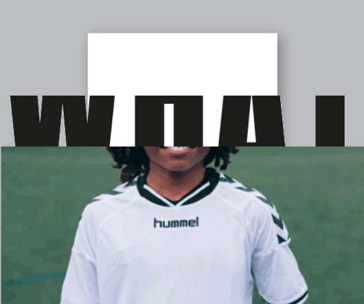
The identity for Football Beyond Borders (FBB), a UK charity that educates young people through sport, has been updated by design studio Alphabet. While the logo remains the same, the graphic and visual system — including typography, colour palette and set of icons — have been updated.
It may be an eCommerce site, a site for a restaurant or a family business, or even a charity organization. Let’s say that Google sees you published a blog post, “How To Ace Logo Design”, where you are trying to rank for the keyword logo design. The reader follows a link to the competitor’s company logos post.
50 Creative Logo Design Inspiration #108. You may be interested in the following articles as well. 2023 UI Design Trends: 10 Best Practices For Web Design. 40+ Websites with Modern Design Trends For Inspiration. 50 Creative Landing Page Design Templates. Unlimited Downloads. Over 1,500,000+ Fonts, Mockups, Freebies & Design Assets.
The charity works with people between the ages of 11 and 30, guiding them through challenges at various stages of their lives, from support with difficulties at school to unemployment. The identity is designed to channel ideas of progression and growth, based on the charity’s motto, Start Something. someoneinlondon.com.
They represent and source creative talent for some of the world's recognised brands and labels, as well as indie labels, start-ups and charity organisations. Artists represented by Dutch Uncle include Noma Bar, Saddo, Debora Szpilman, Satoshi Hashimoto and Gray318.
UK children’s charity, the National Children’s Bureau (NCB) has launched their first rebrand in 12 years. The charity, which works across the issues affecting children to influence policy and deliver a better childhood for the UK, approached us to help tell its story with renewed clarity. NCB’s role has never been more important.
We organize all of the trending information in your field so you don't have to. Join 66,000+ users and stay up to date on the latest articles your peers are reading.
You know about us, now we want to get to know you!
Let's personalize your content
Let's get even more personalized
We recognize your account from another site in our network, please click 'Send Email' below to continue with verifying your account and setting a password.


Let's personalize your content