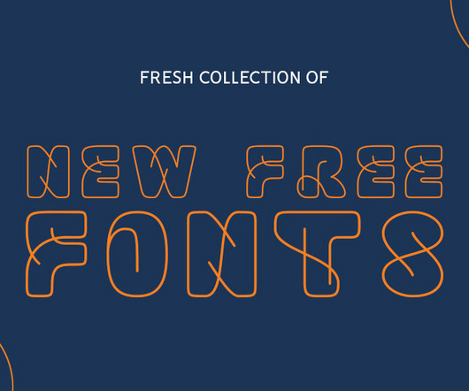
This site uses cookies to improve your experience. To help us insure we adhere to various privacy regulations, please select your country/region of residence. If you do not select a country, we will assume you are from the United States. Select your Cookie Settings or view our Privacy Policy and Terms of Use.
Cookie Settings
Cookies and similar technologies are used on this website for proper function of the website, for tracking performance analytics and for marketing purposes. We and some of our third-party providers may use cookie data for various purposes. Please review the cookie settings below and choose your preference.
Used for the proper function of the website
Used for monitoring website traffic and interactions
Cookie Settings
Cookies and similar technologies are used on this website for proper function of the website, for tracking performance analytics and for marketing purposes. We and some of our third-party providers may use cookie data for various purposes. Please review the cookie settings below and choose your preference.
Strictly Necessary: Used for the proper function of the website
Performance/Analytics: Used for monitoring website traffic and interactions
Credit: Opening Line / Outsiders / Apron Opening Line founder Zosia Swidlicka and Outsiders Creative Partner Tom Rogers explain how their teams collaborated with to create a fintech identity that transforms payments from a painful process to a positive experience without leaning into category clichés.
With the better-for-you drinks category becoming increasingly crowded, HALFDAY needed to ensure its functional benefits were clear, but also that the great classic taste of the liquid shone through," Bruce explains. Typography was another key ingredient in capturing the right balance of nostalgia and modernity.
Using the latest free fonts and fresh typography styles can instantly improve your work and keep your designs looking modern and creative. Whether you’re designing a logo, creating typography for brochures, or working on brand guidelines, the latest free fonts can be a game-changer.
Typography has a huge part to play when it comes to graphic design. You can either pair two different fonts within the same typeface category, such as using an uppercase font for the heading and then the counterpart for the body text. Not only does it help with legibility, but it also helps to promote the tone and message of a graphic.
Creating efficient, consistent, and flexible typography for digital platforms using modern design system principles. At the heart of this approach is typography , which is how we make text look and feel. When typography is well-designed, users can engage with content smoothly without distraction.
Flexible design system A related challenge was finding a design system that can be recognised as Coop throughout the store but allows each category to stand independently and compete with the category leader. These spread across four languages and a wide range of categories, from batteries to frozen fish to freshly squeezed juices.
BfVA looked to Dutch design for inspiration, manifesting through bold typography, which comes to life in the smart abstracted forms of the wordmark and a flexible grid system that allows the winning work to take centre stage.
Competitor research revealed that negative perceptions, such as streaky finishes, unnatural tones, and complex routines, burdened the self-tanning category. The warm, natural colour palette reflects the product's promise of an authentic glow, while the typography balances modern sophistication with an inviting, effortless feel," says Gibbs.
The judges went through over 1,800 submissions this year, choosing one winner for three different categories (children's, adult fiction and adult nonfiction), plus second and third-place awards. This, paired with my love for vintage typography and design, is my inspiration. Congrats to all the winners!
While the brand logo has been evolved, its hand-drawn typography and iconic heart shape have been maintained. We see this through exciting innovations in categories such as gut health with the launch of Gut Boost drinks in their ever-growing Kefir range."
"Flutterwave is such a powerful and dynamic brand that exudes the spirit of African entrepreneurship and so our collaborative approach was critical to this, ensuring the brand remained authentically African while standing out in its category," says Roman Stikkelorum, managing director at Verve.
Some of the type of designs that can be sent for this category include: Symbols, Logos, Typography, Posters, Books and Page Layouts, 2D Packaging and More. Graphic Awards Sub-categories and their descriptions are available on this page. The deadline. Previous winners of a Graphics and Visual Communication Award.
They've now unveiled playful new branding designed to reinvigorate the category appeal to a younger audience. has a strong field-to-fork family heritage, and we wanted to keep that in play while introducing a wider sense of category excitement and impact," explains Greg Taylor, chief provocation officer at Elmwood London.
Bath-based brand and packaging design agency Sunhouse has redesigned OG orange juice brand Tropicana, using heritage in a contemporary way to position it as the category leader and aligning with its new campaign, 'THAT juice'. Tropicana's rebrand coincides with a shift in the category, likely due to the turbulent economy of recent years.
Even if you love typography, your view of it may be blinkered by geographic and historical filters. From the screens we tap on, the movies we clap for, the transit system we navigate or the books we cosy up with, typography is around us all the time. This new project provides a glimpse into Canadian type history from 1752-1985.
Much like the fashion category, the interior design category operates in trends that recycle over time," says Cara. It applies them to the interior category, visually presenting itself as an exclusive brand whilst boasting an honest and inclusive pricing approach through an easy-to-understand visual design system and tone of voice.
Free fonts are essential in design, as typography shapes the overall look and feel of any project. These new fonts come from all popular categories, including serif, sans-serif, script, display, and more, ensuring that you always have the perfect typography for any project. Vertiger Font Opening 2025 with a new free font.
The studio's head of design, Meg Jannott, describes the brief as "exciting and ambitious" while stressing the importance of the client's category as parenting is overwhelming enough without having to sift through hundreds of brands that don't resonate with them. So they stuck with the original name.
Every year, the best-performing organisations across various categories are awarded along with a top 30 list of best employers, helping to drive best practices across the industry. Typography and colours For typography, Ben used Delvard Serif , which is professional yet modern, while Mulish complements this nicely for body copy.
Pet food brand Nutriment was founded in 2013 when raw diets were still a small niche within the category. The studio's account director, Emma Collingswood, highlights Robot Food's work on other brands in the pet food category, such as Harringtons, NAW, Wagg, and YuMove.
You see, typography is more than just picking pretty letters. Search for “font pairings” or “typography inspiration” Here are a Few Examples of Great Font Pairings: Let’s look at some classic and effective pairings: Merriweather (serif) and Open Sans (sans serif): This is a versatile and readable combination.
Typography is a vital element in any creative project, setting the tone and conveying the message with style. Typography trends are constantly evolving, and staying ahead of the curve means experimenting with new styles that can elevate your work.
The team was particularly captivated by the typography from these artefacts, often in all caps, dramatic, and sometimes angular, which Fresneda says "hints at some danger or edge-of-your-seat excitement"." Typography followed a similar logic, inspired by pulp novels, propaganda posters, and newspaper headlines.
Among my favorite kinds of typefaces are those that don’t fit neatly into predefined or existing categories; those that dip their toes into more than one genre, or take their cues from disparate historical periods. The post Fonts in the Twilight Zone appeared first on I Love Typography.
Influur was already a successful enterprise, hosting a diverse community of over 30,000 creators across various categories for branded events and social media collaborations. Typography and colour palette The visual identity system uses Duplet Open, a timeless and elegant typeface that gives the brand credibility.
Whether you’re aiming for a rustic, vintage look or a contemporary , professional vibe, there’s a font in these categories that can help you achieve your desired effect. Within the realm of graphic design and typography, fonts assume a central role in communicating messages, establishing a mood, and eliciting emotional responses.
To help keep himself organised, he breaks his work down into three categories: nouns, verbs, and typography. It’s easy to lose perspective when I’m not self-reflecting so I think of the categories as my table of contents, helping to examine the macro view of my work. It enables me to discover the voids I need to fill," he says.
Paired with bold colours and updated typography, the new look aims to help Badger appeal to a wider demographic. Badger is strongly positioned to lead the charge within the premium ale category but to do so, we needed a bolder approach", he explains. Characters related to the brand's rich history were the way to do this.
Larsson describes the beauty category as "a design-intense category featuring a sea of minimalist designs mixed with beautiful flamboyant solutions"." We employed these illustrations to disrupt the perfection typically associated with typography and the precise use of white space, layout, and information."
It was a conclusion that was agreed upon with ESN, with the creative director at The Quality Group, Marcel Henke, saying: "Our work with Robot Food has ensured our new visual identity better reflects our leadership position in the category. Similarly, the new typography was carefully chosen to reflect the attitudes of the ESN brand. "We
The closest reference we found was music festivals, which helps set the design and branding of the 57 Festivals events apart from anything in the same category." Logo and typography Once the illustrations were approved, Oat Studio extended this style across all festival materials, including social media assets, T-shirts and signage.
This guide explores 70+ Japanese-style fonts , categorized by their design styles, and provides insights into how each category can enhance modern design and branding. Japan Bento Japanese Style Display Font Japan Bento, Inspired by Japanese Kanji Typography. Embrace the beauty of Japanese typography with “Japan Daisuki.”
The typography, in turn, is bold and playful, using friendly sans-serif fonts that keep the design approachable while still feeling premium. The goal was to balance Twinings' long-standing legacy with a fresh, modern aesthetic that would appeal to a new generation of tea drinkers in the competitive ready-to-drink category.
Discover Some Experimental Bold Typography in Anahit Lyudvigian’s Visionary Poster Series Armenian graphic designer Anahit Lyudvigian has created a series of bold, conceptual poster designs as personal design studies. Each poster feels like a living entity, where typography interacts with its environment. Subscribe to our newsletter!
Whether you’re on a journey to become a typography expert or just curious about what it takes, here are ten classic signs that someone has developed deep expertise in the field. After studying these questions, typography experts identify specific areas of interest within the field. Remember key typography concepts.
Learning about Typography: The Typography Primer Book was actually first published waaaay back in the day, circa 2000, but the contents are still very relevant over a decade later, and includes Glossary of Typographic Terms. I’ve printed mine out, and actually had it spiral bounded and laminated. What’s in a Letter 2.
Since blue, white, and gold seem to be the license to operate in this category, the studio opted for a blue background colour to help customers understand that this is milk. The typography was chosen as it was seen to be a good match to the illustration style.
There's no point in just being wacky just for the sake of it, though: there has to be an underlying, original idea or goal if you want to push typography forward. Use in design Pigeonholing this font, though, isn't easy: its free-flowing marker nib-to-square angles put this experimental typeface into a mixed-use category.
Midday's innovative design strategy builds on this mission and introduces a modular system that anticipates rapid growth across diverse product categories. We especially love the choice of typography, a classic serif dripping in confident style. The colour palette feels appetising, hinting at organic foods and earthy flavours.
This was inspired by the idea that Mochiya floats above the noise, above the category, occupying its own space entirely. As for typography, Regular Practice opted for a "wordmark-centric approach", says Kristoffer Sølling, co-founder and creative director.
And the new designs for National Landscapes by Nice and Serious fall straight into that category. The patchwork idea naturally lent itself to a layout system based on a flexible, dynamic grid, which could be used to house patches of photography, illustration and typography and create endless variations," Peter adds.
They've just announced their 2023 winners, and we share the winning work in the seven main categories below. This browser-based design tool offers everything you need to make visually complex projects on the web: the most up-to-date typography, impressive animations, and complete creative freedom with no layout restrictions.
That’s the power of typography. From the books we read to the websites we browse to the signs that guide our way, typography is constantly shaping how we perceive the world around us. Think of it like this: words are the content, the raw material, and typography is the vessel that carries them.
We organize all of the trending information in your field so you don't have to. Join 66,000+ users and stay up to date on the latest articles your peers are reading.
You know about us, now we want to get to know you!
Let's personalize your content
Let's get even more personalized
We recognize your account from another site in our network, please click 'Send Email' below to continue with verifying your account and setting a password.
Let's personalize your content