This site uses cookies to improve your experience. To help us insure we adhere to various privacy regulations, please select your country/region of residence. If you do not select a country, we will assume you are from the United States. Select your Cookie Settings or view our Privacy Policy and Terms of Use.
Cookie Settings
Cookies and similar technologies are used on this website for proper function of the website, for tracking performance analytics and for marketing purposes. We and some of our third-party providers may use cookie data for various purposes. Please review the cookie settings below and choose your preference.
Used for the proper function of the website
Used for monitoring website traffic and interactions
Cookie Settings
Cookies and similar technologies are used on this website for proper function of the website, for tracking performance analytics and for marketing purposes. We and some of our third-party providers may use cookie data for various purposes. Please review the cookie settings below and choose your preference.
Strictly Necessary: Used for the proper function of the website
Performance/Analytics: Used for monitoring website traffic and interactions
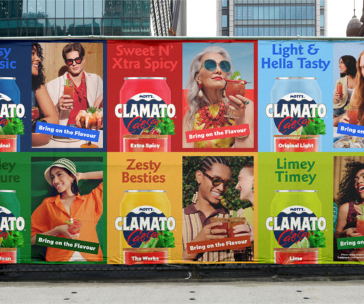
If you're not a local, think of this drink as the Canadian Bloody Mary - the cocktail you always saw your parents enjoying growing up at every BBQ, holiday party and brunch special. The Mott's team behind this one deserves a round of applause." After multiple rounds of testing, the design team got to the desired result.
As we saw in our Abba logo history , the idea came from a magazine photoshoot in which each band member held up a card with the first letter of their name. Benny Andersson held up his B the wrong way around, but the photographer recommended using the image anyway. An honorary mention in the automobile category goes to Ford.
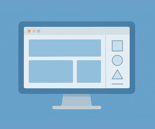
Text Resizing: Users should be able to scale text up to 200% without loss of content or functionality [11]. In Figma, you can set up this system by creating a collection called Primitive Type to house all these primitive tokens. Within this collection, organize categories as shown in the image below for a clear structure.
Rounding the forms of the ‘a’ and ‘g’, Olivia and her team designed the typeface to be friendly and approachable, echoing the accessible nature of Penguin’s books. Sign up to our newsletters and we'll keep you in the loop with everything good going on in the creative world.
We have taken a big liking to AOCs sister brand, the Philips Evnia monitors, in many of the ultrawide and curved categories among the best monitors for photo editing , graphic design and video editing , but after my time with the Porsche-branded AGON, that stranglehold may be loosening. designed by Porsche? DisplayPort 1.4, air resistance?
We have lots of logo design roundups on Creative Bloq around different categories of brand marks, from circular logos to cursive logos and even ambigram logos. He says the fiendish quiz features just a tiny sample of the more than 200 similar designs that hes roundedup so far. "I Can you do any better?
Drawn to depicting plants, animals and other elements of nature from clay’s ability to seamlessly create “rounded forms and curvy lines”, the artist doesn’t always mould things as they might normally be. Sign up to our newsletters and we'll keep you in the loop with everything good going on in the creative world.
Let's break down some top contenders in this category. 1 – Open Sans – Highly Versatile and Readable First up is Open Sans. Trust me; it's akin to that dependable friend who shows up whenever you need a hand. 12 – PT Serif – Blends Classic and Contemporary Styles Next up is PT Serif.
All of this is tied in with “witty and charming tone of voice,” Joe rounds off. Sign up to our newsletters and we'll keep you in the loop with everything good going on in the creative world. One of these quips reads ‘trade your clutter for cold hard butter’, another reads, ‘Sunday service’.
Words Ellis Tree — Date 30 July 2025 Work Graphic Design Typography Font Logo Identity Process The London-based designer Ciaran Birch has moved into the freelance life since we last caught up with him way back in 2019. Discover Antwan Horfee’s collection of Japanese playing cards Up the Seagulls!
She tells us, “I couldn’t really pay a team to help me, so all I can do is really give a shoutout to those who helped me to colour in all the thousands of pages that make up the film.” Came up with nothing, still don’t drop a dime on mockups,” she told us when we asked about her tips for saving money as a designer. “No Just create.
The team knew the festival needed to be more than just a springtime event; it needed to become a year-round source of cinematic discovery. The answer wasn’t a simple touch-up. It cemented its status as a continuous, year-round platform for discovering outstanding cinema. What a moment for reflection, right?
Its soft, rounded forms are whimsical yet controlled, avoiding the overly childish feel that can sometimes plague bubble fonts. The ability to mix and match these fonts within a single design, or even within the same word, opens up a vast playground for typographic experimentation.
📖 Reading Time: 5 minutes 🏷️ Categories: Design, Branding, Marketing 📅 Published: [DATE] 40 Geometric Logos: The Power of Shapes in Branding Let’s be honest. Business owners, paralysed by choice, often end up with a complicated mess. A logo that tries to say everything ends up saying absolutely nothing. ” The result?
Sonata, designed for MuseScore, incorporates rounded, elegant curves reminiscent of musical notation, whereas Shred, inspired by Ultimate Guitar, features sharp, angular terminals that reflect the intensity of a guitar solo. Sign up to our newsletters and we'll keep you in the loop with everything good going on in the creative world.
Because digital work and animation are more in demand, the need for up-to-date software is also increasing. Another cost to consider are the fees associated with market stalls which can be up to 200/day. Online storage is also an important consideration for sharing and transfering files as well as backing up your work.
📖 Reading Time: 5 minutes 🏷️ Categories: Design, Branding, Marketing 📅 Published: [DATE] The Fanta Logo History: What Every Rebrand Got Right & Wrong Most corporate rebrands are exercises in vanity, dressed up in marketing nonsense. It was round. The soft, round letters were replaced with a more generic, slanted typeface.
Let's dive deeper into some of the all-time classics that define this category. It has a mechanical skeleton while maintaining softer, rounded shapes. Its rounded edges differentiate it from other sans-serifs, offering a softer overall appearance. Classic sans-serif fonts are a fantastic choice to communicate clarity and style.
In this article, we’ve roundedup over twenty free pixel fonts available for download. It features a rounded look to soften those sharp edges. Beyond that, this True-Type font is a fun way to spice up your designs. The Power of Pixelation Pixel fonts are one of the more fun typographic categories.
📖 Reading Time: 5 minutes 🏷️ Categories: Design, Branding, Marketing 📅 Published: [DATE] 45 Typographic Logos That Prove Font Choice Is Everything Most people are utterly lost when it comes to logo design. The Myth of the “Clever” Symbol Everyone brings up the FedEx logo. A rounded sans-serif could be the answer.
📖 Reading Time: 5 minutes 🏷️ Categories: Design, Branding, Marketing 📅 Published: [DATE] Triangle Symbolism in Logo Design: Tips and Examples Ever wondered why so many brands reach for the triangle? It points up. The easy answer is that it looks ‘dynamic’ or ‘strong’. That’s what most people say. And it’s a lazy, incomplete answer.
I collected, discovered, found and eventually discarded – many didn’t make it through the countless rounds of letter castings we held,” Paula says. The final logo is made up of two different Letraset typefaces, all aligned exactly as they were when first transferred from plastic to paper.
Sign up to our newsletters and we'll keep you in the loop with everything good going on in the creative world. It's Nice That Newsletters Fancy a bit of It's Nice That in your inbox?
Words Sudi Jama — Date 2 July 2025 Work Animation Illustration Award Drawing Activism Family Irish-Palestinian illustrator Yosef Phelan’s work is an exploration into heritage, both jagged and rounded in exclamations in violent ends and heartfelt stories of generational traumas and unapologetic identity.
That’s why setting up a clear structure from the start isn’t just helpful—it’s essential. Developers can locate components for handoff, project managers can review progress, and designers can focus on refining the work, not cleaning up someone else’s canvas. Well-structured Figma files save time.
Living up to expectation, Comma Type has released CMM Coda, a mighty and mellow monospace typeface that – albeit friendly and accessible with soft, rounded edges – has a stringent and rigorous creative context. Sign up to our newsletters and we'll keep you in the loop with everything good going on in the creative world.
Whether you’ve been meaning to build a site or just want to try something fresh and intuitive, this is your chance to set yourself up with a beautiful portfolio—forever. As a test, I spent a couple hours building a new website for myself from scratch ( check it out ). You might like it!
Its a versatile, beautifully rounded typeface where a feeling of warmth quite literally meets dynamic motion. Its rounded forms exude friendliness and approachability. This opens up a universe of creative possibilities. It offers a well-rounded suite of options to meet diverse design requirements. It has an opinion.
Think of it as Aether, but leveled up! The core of the design process focused on refining the squarish-round letterforms. You can purchase the typeface from the following platforms: MyFonts Creative Market YouWorkForThem You can find more typefaces in the Fonts category on WE AND THE COLOR. Subscribe to our newsletter!
The typeface chosen was a robust, rounded sans-serif, which lent the logo a sense of stability and strength – qualities essential for a burgeoning oil company. A square black border framed this clean backdrop, its corners slightly rounded to soften the overall appearance. BP needed to keep up. It helped them stand out.
That is until you realize that your NGOs board is made up of the families and friends of the same aforementioned weird billionaires (who individually could probably afford to solve whatever problem your NGO attempts to fix), and that the non-profits dependance on major donors means that they fundamentally decide what you do and dontdo.
These specialist judges will be considering work in the Craft in Branding categories (sponsored by Frontify) including Sonic, Motion, Brand Strategy, Illustration (sponsored by ProArt), Copywriting and Typography. Were also announcing the panel for our new Innovation categories, made up of Experiential, Emerging Tech and Interactive.
📖 Reading Time: 5 minutes 🏷️ Categories: Design, Branding, Marketing 📅 Published: [DATE] Why Your Approach to Branding for Small Businesses is Failing Let’s be honest. A rounded script feels friendly and personal. Most of what you’ve read about “branding” is probably rubbish. Ensure the font is, above all, readable.
📖 Reading Time: 5 minutes 🏷️ Categories: Design, Branding, Marketing 📅 Published: [DATE] B2B Brand Positioning: Choose Who to Ignore Most business-to-business companies are utterly, painfully invisible. One is a category. Instead, they created and owned a new category: “Revenue Intelligence.” To compete on price.
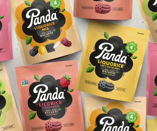
This Way Up has created a playful new identity for all-natural candy brand Panda Liquorice, enticing younger audiences to "be more Panda". Panda's competitors all look the same: a round, black logo and white type," says David Pearman, This Way Up's creative director.
Our vision was to bring back the best from their history and turn up the heat across the board to let the nation know they mean business," says Universal Favourite. Driven by the clever line 'Heat Up. But with over seventeen years of brand iterations, its look had become diluted and lost in a sea of sameness.
So, in this guide, we'll get some advice from fellow creatives who have navigated the ups and downs of the creative journey. And if that's not possible, well, that's where side projects come in, or maybe even setting up your own creative business. But ultimately, that can end up making you exhausted and miserable.
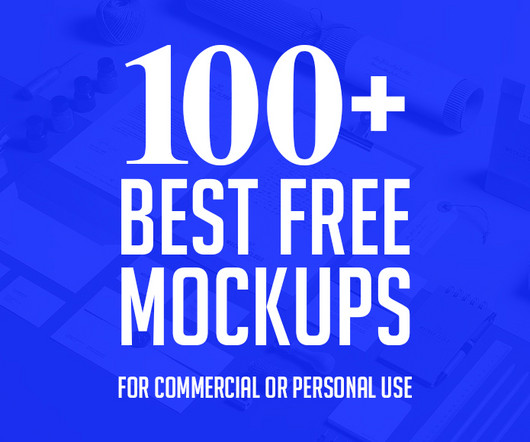
Free Round Coaster Mockup 40. Paper Bag Mock Up 41. Free Crew Neck T-Shirt Mock-up Female 43. Free Two Sides Rounded Corner Business Card Mockup 84. Free Iphone X Cover Best free mockups 36. Free Macbook Pro Mockup 37. Instagram Mockup 38. Free Logo Branding Coffee Cup Mockup 39. Free Cotton Tote Bag Mockup 42.
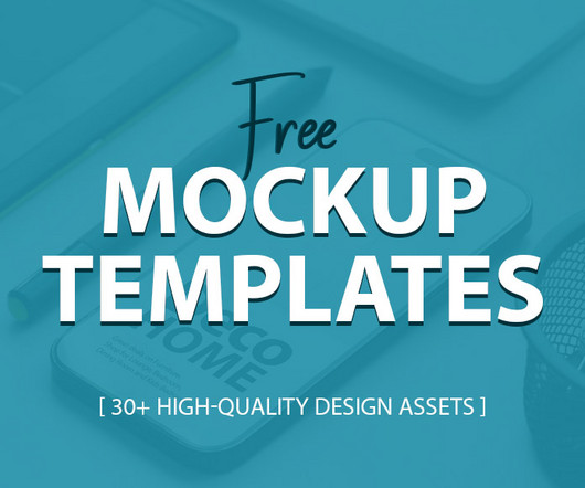
Buckle up and get ready to elevate your designs with these fantastic resources! Free Round Coaster Mockup 12. Here are some key aspects to evaluate before hitting download: Resolution: A high-resolution mockup ensures your design details remain crisp even when scaled up. List of Free Mockup Templates: 1. Free Mini Tag Mockup 2.
Red Antler used its expertise working with start-ups to design a category-disrupting dip for New York foodies. Luckily, Brooklyn-based studio Red Antler specialises in working with start-ups and new ventures and was excited to rewrite the rules of the dip category.
If you’ve ever been tasked with writing blog posts, then you probably know that coming up with the idea after idea can be difficult. We thought we’d offer some advice to those blog post writers who are tearing their hair out, scrambling to come up with yet another new and innovative post idea. You want to keep the blog fresh.
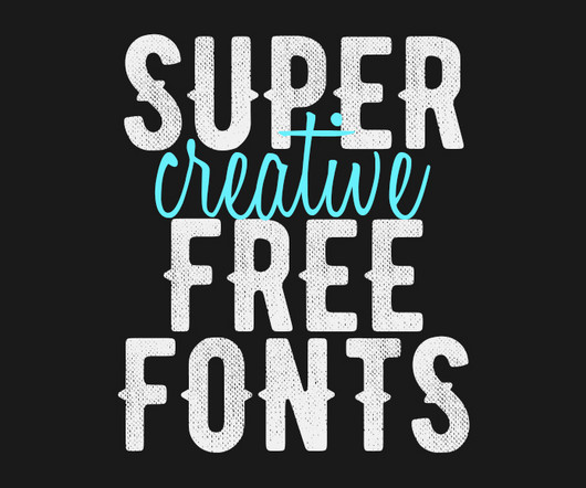
This democratization of design tools has opened up endless possibilities for both amateur and professional designers. Onoma Stylish Round Font 9. They come in various styles and categories, from sleek modern sans-serif fonts to ornate vintage scripts. List of Super Creative Free Fonts: 1. Astonpoliz Geometric Shapes Font 2.
Tania Boler Tania Boler is the founder and president of Elvie, a London-based company that develops innovative technology products to improve women's lives in overlooked categories such as breast pumps and pelvic floor health. the engineering workforce is made up of only 16.5% She's also passionate about women in engineering. "In
Fonts that can fit a broad category can be described as a display font. You can see our choices below and while they may not line up with what you think are the best display fonts for graphic design, we encourage you to read a bit further. Before we get started, let’s figure out what a display font is. What are Display Fonts?
We organize all of the trending information in your field so you don't have to. Join 66,000+ users and stay up to date on the latest articles your peers are reading.
You know about us, now we want to get to know you!
Let's personalize your content
Let's get even more personalized
We recognize your account from another site in our network, please click 'Send Email' below to continue with verifying your account and setting a password.


Let's personalize your content