This site uses cookies to improve your experience. To help us insure we adhere to various privacy regulations, please select your country/region of residence. If you do not select a country, we will assume you are from the United States. Select your Cookie Settings or view our Privacy Policy and Terms of Use.
Cookie Settings
Cookies and similar technologies are used on this website for proper function of the website, for tracking performance analytics and for marketing purposes. We and some of our third-party providers may use cookie data for various purposes. Please review the cookie settings below and choose your preference.
Used for the proper function of the website
Used for monitoring website traffic and interactions
Cookie Settings
Cookies and similar technologies are used on this website for proper function of the website, for tracking performance analytics and for marketing purposes. We and some of our third-party providers may use cookie data for various purposes. Please review the cookie settings below and choose your preference.
Strictly Necessary: Used for the proper function of the website
Performance/Analytics: Used for monitoring website traffic and interactions
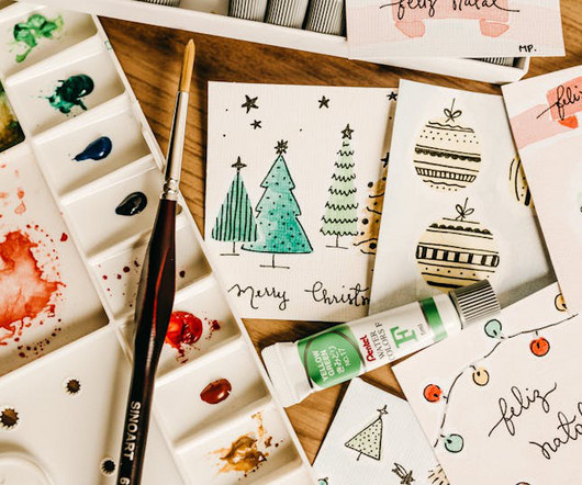
Go back into the archives and find styles that may influence your choices or bend the rules and pinch it from another category or industry. Khurram learned this lesson the hard way: "Once, I chose a fancy script font for a campaign that looked great in print but was unreadable on mobile," he recalls.
By integrating typography into a design system, teams can effortlessly scale designs across desktop, tablet, and mobile, ensuring a consistent visual language. Within this collection, organize categories as shown in the image below for a clear structure. web, tablet, mobile ). As vinney notes, this is a key aspect[3,4].
An honorary mention in the automobile category goes to Ford. If you missed it, Odido is the new name for T-Mobile in the Netherlands. Designed by Phil Gibbon, the logo makes effective use of the mirror-ablity of the letters D an C from the companys initials in an ambigram logo with maximum impact.
If you run email campaigns, review templates for design consistency and mobile responsiveness. Are you reviewing just your website, or does the audit include mobile apps, marketing materials, and social media graphics? It’s helpful to group them by category, such as typography, buttons, layouts, or illustrations.
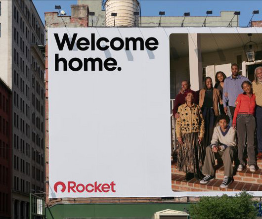
With no true category leaders from which to draw inspiration, Otherway instead looked beyond the sector for inspiration. "As Although mortgages are one of life's biggest financial decisions, the category has historically lacked a human touch, so incorporating authenticity and emotion was crucial.
📖 Reading Time: 5 minutes 🏷️ Categories: Design, Branding, Marketing 📅 Published: [DATE] Top 8 Free iPhone Apps Every Designer Should Know About The iPhone isn’t just a communication device; it’s one of the most underrated tools in a designer’s arsenal. Figma’s mobile version also closes the gap between design and execution.
Creating mockups for websites and mobile apps. Additionally, feel free to take a look at our guide to the best graphic design software in 2025 or find creative inspiration in the Graphic Design category. The latest news on professional software can be found in the Technology category. Making animated GIFs and simple video edits.
With the 90s aesthetic “more than just being on-trend,” the simple brick mobile represents how “the mobile phone changed everything – it was a lifeline to your people,” Joe says. Moving further down this route, Studio Joe’s choice to use Nokia imagery was deliberate.
iPad Pros: Powerful stand-alone device – no Mac or PC required Lifelike drawing feel when combined with the Apple Pencil Sizes and specs to suit most budgets Lightweight, mobile, great for travel or drawing on the couch Bonus uses – email, streaming, music, makeshift coffee table!
Create categories like: Navigation Forms and inputs Modals and alerts Cards and containers Lists and tables Within each category, include platform variants where needed. With a solid foundation and thoughtful organization, your team can design faster and more confidently across web, mobile, and beyond.
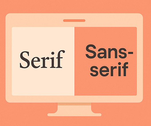
Try them out on mobile devices. Check out our selection of the 50 best fonts based on 10 typography trends for 2025 or browse through WE AND THE COLOR’s Fonts category for more. It keeps everything consistent. Test Your Font Pairings: Don’t just assume your fonts work well together. Test them out in different contexts.
Good font pairing can: Guide users through content with a clear visual hierarchy Help users identify brand voice and personality at a glance Ensure consistency across multiple platforms (web, mobile, social, etc.) Avoid fonts that rely on thin lines, high contrast, or tight spacing if they’ll be used on mobile or small displays.
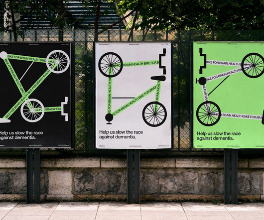
A mobile app screen also features "The 50KM Route" outlined by the bike's morphing lines. The Power of Thoughtful Design This project, which won gold in the Young Lions competition's design category, proves a point. This demonstrates strong UI/UX thinking, even in a conceptual stage. It guides attendees.
Let's break down some top contenders in this category. Dynamic: It maintains clarity in various sizes, making it ideal for mobile devices. After all, what looks good on a desktop may not work on a mobile. These elegant, clean typefaces have become the go-to choice for many designers, and I can see why!
This is your definitive guide to the latest Adobe Firefly advancements, from its powerful new mobile app to its multi-model ecosystem. The Game Changer: The New Adobe Firefly Mobile App Released in June 2025, the native Adobe Firefly mobile app for iOS and Android has officially untethered generative AI from the desktop.
Features include AMP support for fast mobile performance and a selection of customizable demos, like the popular Grocery Mega Market one-page website. The collection spans 190 categories and 28 unique styles. XStore stands out for its robust Full Site Builder, which many users highlight as its top feature.
Let's explore two significant trends: personalisation and customisation and the growth of mobile video advertising. At Inkbot Design, we ran a campaign for a fitness app where we segmented our audience into three distinct categories: avid gym-goers, beginners, and yoga enthusiasts. The result?
link] Phoebe Mohan, Nottingham Trent University: Dooze The alcohol-free drinks category can be quite po-faced, so Phoebe Mohan’s playful identity for 0% nightcap Dooze is a breath of fresh air. A fine example of inclusive design rendered with style and sensitivity.
📖 Reading Time: 5 minutes 🏷️ Categories: Design, Branding, Marketing 📅 Published: [DATE] The 10 Best Tools for Identifying Fonts (And When to Use Each One) You've spent far too long staring at a screenshot. It’s on your desktop, mocking you. That perfect font from a competitor's website, an Instagram post, or a PDF brochure.
Consider the diverse applications your logo faces: Tiny icons on mobile apps. Feel free to browse WE AND THE COLOR’s Graphic Design and Branding categories for more inspiring content. It will remain perfectly crisp. Sharp emblems on business cards. Crisp graphics on your website. Large banners for trade shows. Vehicle wraps.
Consider the subtle sounds in a well-designed mobile app that provide feedback and create a satisfying user experience. Feel free to browse through WE AND THE COLOR’s Graphic Design category for more inspiring articles. Sound and motion can also play a crucial role in evoking emotion. Header image by Danjazzia (via Adobe Stock).
Today’s mega menus are cleaner, smarter, and more mobile-friendly than ever before. If your site has lots of pages or product categories, a mega menu might just be your best option. A mega menu is an expanded drop-down menu that shows multiple categories, links, or sections at once. What Is a Mega Menu?
📖 Reading Time: 5 minutes 🏷️ Categories: Design, Branding, Marketing 📅 Published: [DATE] The Future of Graphic Design: Trends and Predictions Forget the crystal ball gazing into the graphic design industry. Does it feel like it was designed for a mobile phone screen or a desktop from 2015? Does it look consistent?
This typeface is not merely another addition to the sans-serif category; it is a thoughtful and versatile tool engineered for clarity, expression, and enduring appeal, making it a vital asset for today’s designers. It stands as a testament to how historical forms can be reinterpreted to meet contemporary design needs.
The greeting card app landscape has evolved into two main categories: apps for creating and customizing cards, and apps specifically designed for emailing digital greeting cards. JustWink leverages American Greetings’ extensive library of designs while focusing on mobile-first sending capabilities.
📖 Reading Time: 5 minutes 🏷️ Categories: Design, Branding, Marketing 📅 Published: [DATE] Book Covers: How They Make or Break Your Passive Income We all know the phrase “don't judge a book by its cover.” Your cover needs to work as a tiny thumbnail on a mobile screen. How do I know if my genre conventions are working?
📖 Reading Time: 5 minutes 🏷️ Categories: Design, Branding, Marketing 📅 Published: [DATE] Apple Pencil vs Wacom Stylus: Review for Creatives The endless debate over Apple Pencil vs. Wacom is mostly noise. The primary decision is this: Are you committing to a mobile-first workflow (iPadOS) or a traditional desktop workflow (macOS/Windows)?
The silhouette was perfected for pixel-based displays, ensuring it was rendered clearly on everything from early mobile phones to high-resolution displays. This distinction helped Johnnie Walker achieve recognition that transcends the spirits category, becoming one of the world's most recognised logos across any industry.
📖 Reading Time: 5 minutes 🏷️ Categories: Design, Branding, Marketing 📅 Published: [DATE] Triangle Symbolism in Logo Design: Tips and Examples Ever wondered why so many brands reach for the triangle? The easy answer is that it looks ‘dynamic’ or ‘strong’. That’s what most people say. And it’s a lazy, incomplete answer.
📖 Reading Time: 5 minutes 🏷️ Categories: Design, Branding, Marketing 📅 Published: [DATE] Elevating Your Online Presence Through Strategic Branding and Digital Experiences Let's be honest—when did you last trust a company with a sketchy website? If you're like most people, probably never.
Let's dive deeper into some of the all-time classics that define this category. Uses : Web applications, mobile interfaces, and print. Uses : Mobile apps, marketing materials, and infographics. Classic sans-serif fonts are a fantastic choice to communicate clarity and style.
Includes a few categories such as animals, mandalas, and numbers Good choice for those looking for very basic, quick coloring sessions Observation: ColoringOnline isnt particularly modern, but it gets the job done for casual coloring. Its accessible and works well for very young users who need clear, simple navigation.
📖 Reading Time: 5 minutes 🏷️ Categories: Design, Branding, Marketing 📅 Published: [DATE] Designing a New Business Card? When you list your mobile, office phone, WhatsApp, Telegram, and carrier pigeon details, you tell them, “I'm disorganised and you'll never know which one works.” Absolutely not.
It’s a kind of mobile living room. Witnessing cars as extensions of everyday social life in the United States, Lycien felt stimulated by Americans’ intimate relationships with their transportation. That closeness to the car, that everyday intimacy, became part of the work almost naturally,” says Lycien.
📖 Reading Time: 5 minutes 🏷️ Categories: Design, Branding, Marketing 📅 Published: [DATE] Top 10 Best SaaS Design Agencies to Work With You've got a great SaaS idea, product-market fit, and some early traction. Still, the reality is that it doesn't matter if your design doesn't deliver.
The condensed nature of the font saves space, making it an excellent choice for multi-column layouts or environments where space is limited, such as mobile interfaces or compact print designs. If so, feel free to browse WE AND THE COLOR’s Fonts category. FBS Machro addresses this by balancing aesthetic appeal with practicality.
The subjects I usually focus on are cultural capital, mobility and playing with social norms,” says Victoria. People exit cars on their way to the party, pub patrons light cigarettes with matches – indoors. Hairsprayed dyed red hair glows as luminous as the countless pints of amber lager.
The zoot suit, influenced by Texas’ Pachuco culture, became a uniform of youthful defiance – a rejection of “Juan Crow” racial policies that limited Mexican American mobility and rights. California is no stranger to mass detention.
Website : App Store Key Features : Mobile app for logo design Over 200 customizable templates Tools for customizing text, colors, and layout Ability to save logos and access them anytime Best For : iOS users who want to create logos on the go. Choose your line of business from 35+ logo categories. Dont start from scratch.
As a test, I spent a couple hours building a new website for myself from scratch ( check it out ). I like the collage-style layout I was able to create for this series of photos.
📖 Reading Time: 5 minutes 🏷️ Categories: Design, Branding, Marketing 📅 Published: [DATE] Your Customer Acquisition Strategy is Broken. Usability: Is my website straightforward, especially on a mobile phone? Let's Talk About Why. Let’s not dance around the subject. You’re spending money—maybe a little, perhaps a lot. Fix it now.
📖 Reading Time: 5 minutes 🏷️ Categories: Design, Branding, Marketing 📅 Published: [DATE] 5 Website Design and Content Strategies To Connect With Customers How do you use website design and content to connect with your ideal customers? Instead, they demand speed, accessibility, mobile responsiveness, and an aesthetically pleasing design.
Maintain cross-platform consistency: Your brand should feel cohesive across all digital platforms (such as web, mobile, and desktop). Rodolpho is a judge on this years Brand Impact Awards, which includes a new category, Interaction, focusing on UX/UI in branding. Rely on your unified design system and shared UX principles.
Green offered distinction in a market where competitors used red (Texaco, Mobil) or yellow/red (Shell). BP's green-yellow palette created distinctive brand recognition in a category dominated by red. While competitors like Shell used red/yellow and Mobil used red/blue, BP's green allowed them to stand out visually at service stations.
We organize all of the trending information in your field so you don't have to. Join 66,000+ users and stay up to date on the latest articles your peers are reading.
You know about us, now we want to get to know you!
Let's personalize your content
Let's get even more personalized
We recognize your account from another site in our network, please click 'Send Email' below to continue with verifying your account and setting a password.


Let's personalize your content