Remove 2014 Remove Fonts Remove Typography
article thumbnail

Neo-Brutalism: breaking rules, loudly

UX Collective

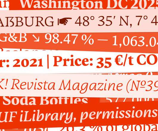
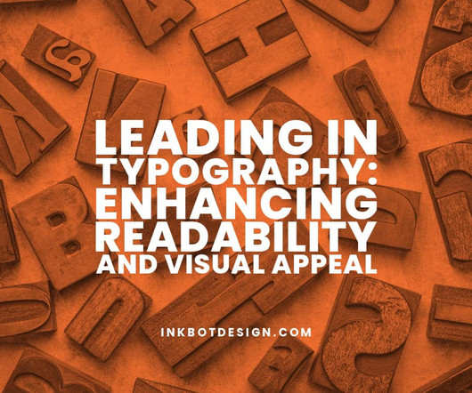
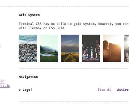
BrutalistWebsites.com , launched in 2014, began curating a wave of digital spaces that embraced HTML as-is — unstyled links, harsh boxes, system fonts, and unapologetically misaligned layouts. Oversized and Loud Typography Typography is the main character. Then came websites that turned that rawness into a statement.

article thumbnail

Andy Vella: How I designed the artwork for Songs of a Lost World

Creative Boom

However, we started working more closely and collaboratively after I released my book, Obscure, in 2014. Typography and logo I've always created a new logo for each album. This logo was created from eight or so photocopies of my favourite serif fonts, and the typeface had an emotion which really worked around the sound.

Insiders

Sign Up for our Newsletter

This site is protected by reCAPTCHA and the Google Privacy Policy and Terms of Service apply.

article thumbnail

Star Wars movie posters from Hungary

Fonts in Use

To most people, the graphic designer and retired typography professor is best known for his ambigrams , and especially those he made for Dan Browns 2000 novel, Angels & Demons. In a 2014 interview , Helnyi was asked about a debate among fans who wondered whether hed even watched Star Wars before designing the poster.

article thumbnail

Star Wars Hungarian movie posters

Fonts in Use

To most people, the graphic designer and retired typography professor is best known for his ambigrams , and especially those he made for Dan Browns 2000 novel, Angels & Demons. In a 2014 interview , Helnyi was asked about a debate among fans who wondered whether hed even watched Star Wars before designing the poster.

article thumbnail

Decoding the Cisco Logo: Symbolism, Branding, and Legacy

Inkbot Design

Key changes: More detailed bridge representation Bolder typography Introduction of the “systems” descriptor This wasn't just aesthetic evolution. The typography became more substantial – communicating stability as Cisco went public in 1990. How has the typography in Cisco's logo evolved? This wasn't accidental.

article thumbnail

Why the PayPal Logo is Both a Genius Move and a Boring Mess

Inkbot Design

The first widely used PayPal logo was brutally simple: the word “PayPal” in a heavy, no-nonsense sans-serif font. The font became thinner and more spaced out. The Big One: Fuseproject and the 2014 Monogram Revolution By 2014, the world had changed. PayPal's 2014 redesign wasn't born from boredom.

article thumbnail

Jim Parkinson, 1941–2025

Typographica

Later in life, when Jim wasn’t drawing logos or making fonts, he was painting signs. Name: Email: Website: Comment: Δ Colophon Founded in 2002, Typographica is a review of typefaces and type books, with occasional commentary on fonts and typographic design. Fonts In Use Type at work in the real world. Not how you think.