This site uses cookies to improve your experience. To help us insure we adhere to various privacy regulations, please select your country/region of residence. If you do not select a country, we will assume you are from the United States. Select your Cookie Settings or view our Privacy Policy and Terms of Use.
Cookie Settings
Cookies and similar technologies are used on this website for proper function of the website, for tracking performance analytics and for marketing purposes. We and some of our third-party providers may use cookie data for various purposes. Please review the cookie settings below and choose your preference.
Used for the proper function of the website
Used for monitoring website traffic and interactions
Cookie Settings
Cookies and similar technologies are used on this website for proper function of the website, for tracking performance analytics and for marketing purposes. We and some of our third-party providers may use cookie data for various purposes. Please review the cookie settings below and choose your preference.
Strictly Necessary: Used for the proper function of the website
Performance/Analytics: Used for monitoring website traffic and interactions
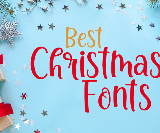
Whether you’re designing greeting cards, holiday-themed branding, or decorative invitations , choosing the right fonts can set the mood and make your work shine. Christmas fonts are a must-have for any designer or hobbyist aiming to capture the warmth, joy, and nostalgia of the holiday season. Grace Christmas Font 2.
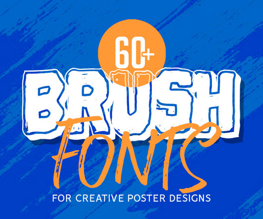
The ultimate collection of creative Brush Fonts for posters is here to inspire and elevate your designs. Brush fonts are dynamic, stylish, and ideal for crafting unique posters that grab attention. Designed to stand out, brush fonts are perfect for professional and personal projects alike. Proudly present brush font Corza.
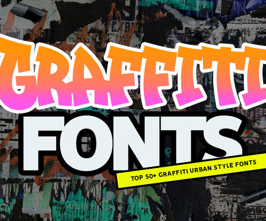
From street to screen, top graffiti fonts for stunning typography and lettering. Graffiti-inspired fonts are more than just an artistic expressionthey’re a bold way to infuse personality, energy, and urban flair into your projects. The beauty of graffiti fonts lies in their ability to combine artistry and functionality.
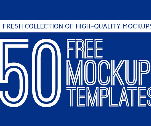
Unlimited Downloads Over 1,500,000+ Fonts, Mockups, Freebies & Design Assets Mockups 6,131 items Fonts 5,191 items Download Now List Of Free Mockups – Download Now 1. Tag Mockup 17. Free fonts, for example, can give your text elements a unique feel that aligns with the overall aesthetic of your project.
Unlimited Downloads Over 1,500,000+ Fonts, Mockups, Freebies & Design Assets Mockups 6,131 items Fonts 5,191 items Download Now You may be interested in the following articles as well. Cloth Tag Mockup Bakery Branding Mockup The following mockup is completely free. I made it exclusively for the mockups-design.com website.
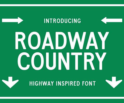
Few things communicate strength and clarity like the fonts you see on street signs. In this post, we’ve rounded up the best street & street sign fonts , from clean, modern sans-serifs to grungy, industrial styles that channel the energy of city life. These fonts are great for any project where readability and presence matter.
” – Forbes Here are a few key reasons to make it part of your process: Brand consistency: Inconsistent use of colors, fonts, or imagery can weaken your brand identity and confuse users. Look out for mixed font families, overuse of bold or italics, and inconsistent letter spacing. That’s an ROI of 9,900%.”
For instance, a tech company might opt for sleek lines and futuristic fonts. Typography Variations: Different fonts and weights can create a natural flow. For instance, use bold fonts for headings and lighter fonts for body text. Use the same fonts, colours, and button styles throughout your site.
" More from Work Search Search Events Next Generation Showcase Creative Jobs Board Home Menu Disciplines Advertising Animation Architecture Art Creative Industry Digital Event Fashion Film Graphic Design Illustration Photography Product Design Publication Popular Tags 3D Book Branding Collage Comic Exhibition Font Food & Drink Identity Logo (..)
Experimenting with raw geometric shapes reminiscent of ceramic art works and contemporary, minimal approaches, Chloe’s muscular typeface features easter eggs in the shape of vases hidden inside of the font design. Based on kaolin, a pale white natural clay, Kaolyn has the simple elegance of this timeless medium.
In one poster, Elya incorporates a hilariously frank ‘Untitled’ text box, toying with the idea of the digital default, systematic fonts, automatic leading – Elya forces the viewer to recognise that she is always working from the starting point, smashing it and glueing it back together to create new bodies of forward-thinking graphic design.
He founded AH fonts, his brand-focused custom type foundry and AH Work, a studio specialising in culture, hospitality, fashion, and commerce projects, as well as having worked with brands such as Apple, Uber, as well as Columbian singer J Balvin. Creating distinct visual identities is Andrés’ bread and butter.
Sink , a bold retro sans serif font crafted by Marvadesign, stands out as an exemplary typeface that combines strength with subtle softness. This careful balance of power and warmth makes Sink not just a font but a versatile tool for impactful design. Pairing Suggestions Sink pairs well with thinner, more neutral fonts.
The price tag doesn’t always match the design quality, and that’s a hard lesson many designers learn the expensive way. Premium graphics use fonts that feel intentional and appropriate, not just whatever was trending that month. We’ve all been there.
Share Words Emma Taggart — Date 19 June 2025 Tags Ones to Watch 2025 Features Creative Industry Advice Process Share Applications are currently open for It’s Nice That’s Ones to Watch – a talent showcase championing the next generation of creatives.
With a monthly or annual subscription, you get access to thousands of graphics, templates, mockups, fonts, and more—all with commercial licensing included. It’s ideal for professionals who work on a wide range of projects and want consistent access to premium assets without paying per item.
Use font sizes and weights strategically to guide the reader’s eye through the information naturally. Stick to no more than two different fonts—one for headings and another for body text. Decorative fonts work well for event titles but should be used sparingly. Start with a clear visual hierarchy.
Marcin Wichary dives deep into the Gorton font, calling it the hardest working font in Manhattan. The history of this strange font spans over a century and Ive seen it in so many countries by now, used in so many situations. But its impossible for me to say Gorton is the most hard-working font in the world.
" More from Work Search Search Events Next Generation Showcase Creative Jobs Board Home Menu Disciplines Advertising Animation Architecture Art Creative Industry Digital Event Fashion Film Graphic Design Illustration Photography Product Design Publication Popular Tags 3D Book Branding Collage Comic Exhibition Font Food & Drink Identity Logo (..)
Each brush recreates the distinctive thick and thin strokes of traditional blackletter scripts, complete with the subtle imperfections that make handwritten fonts feel genuinely organic. Gothic Handwriting Procreate Brushes Transform your digital canvas into a medieval manuscript with these authentically crafted Gothic handwriting brushes.
Words James Chae — Date 8 July 2025 Tags The View From. POV Forward Thinking Review of the Year Editorial Team Jenny Brewer Olivia Hingley Ellis Tree Elizabeth Goodspeed Liz Gorny Extra nice Extra Search Account Social How small studios stay independent in Korea Our Seoul correspondent finds links between small business and design innovation.
The tone was set with the new logo first, which features font design created from different materials, ranging from fuzzy to bubbly, representing the plethora of textiles in the world of Gumball. We really wanted to lean into the different effects used in the show, and the word ‘tactile’ was thrown around a lot.”
Now, her open-source and variable font has been commissioned by Penguin Books in a slick, contemporary custom font called Penguin Inclusive Sans. Staying true to this spirit of inclusion, Olivia has helped serve its primary brand font across its global publishing house. This project has been incredibly humbling and rewarding.
Date 24 June 2025 Words Paul Moore Tags Work Advertising Animation Campaign Stop Motion Sport Process Share Having developed cartoon shows for Netflix and a new iteration of Don’t Hug Me I’m Scared for Channel 4, the production studio Blinkink flexes its creative muscles across live-action puppetry, 2D, CG, stop-motion, and even AI animation.
" More from Work Search Search Events Next Generation Showcase Creative Jobs Board Home Menu Disciplines Advertising Animation Architecture Art Creative Industry Digital Event Fashion Film Graphic Design Illustration Photography Product Design Publication Popular Tags 3D Book Branding Collage Comic Exhibition Font Food & Drink Identity Logo (..)
Have you ever sketched an idea, designed a font, or created a piece of art and thought, “People would love this” ? You can tweak colors, fonts, and layouts, making the digital space an extension of your creative identity. For type designers, the product is often the font file itself. This visual flexibility is huge.
" More from Work Search Search Events Next Generation Showcase Creative Jobs Board Home Menu Disciplines Advertising Animation Architecture Art Creative Industry Digital Event Fashion Film Graphic Design Illustration Photography Product Design Publication Popular Tags 3D Book Branding Collage Comic Exhibition Font Food & Drink Identity Logo (..)
A patchwork of trends, borrowed fonts, and ‘this’ll do for now’ decisions that slowly became permanent.” These five words – typically Australian slang – are what the duo behind After Hours uses to describe its new identity. The old brand looked fine. That was the problem,” says co-founder Shy Trutwein. “It It said nothing.
Words Paul Moore — Date 17 June 2025 Tags Work Digital Graphic Design Rebrand Web Design Music Branding Share Speaking to Alina Kotlyachkova, programme manager of ESH, a Moscow-based design agency concocted in university, I felt like I was falling down a rabbit hole.
Reading "Photos as a living organism: " More from Work Search Search Events Next Generation Showcase Creative Jobs Board Home Menu Disciplines Advertising Animation Architecture Art Creative Industry Digital Event Fashion Film Graphic Design Illustration Photography Product Design Publication Popular Tags 3D Book Branding Collage Comic Exhibition (..)
" More from Work Search Search Events Next Generation Showcase Creative Jobs Board Home Menu Disciplines Advertising Animation Architecture Art Creative Industry Digital Event Fashion Film Graphic Design Illustration Photography Product Design Publication Popular Tags 3D Book Branding Collage Comic Exhibition Font Food & Drink Identity Logo (..)
Image: author I conducted research to introduce and compare several commonly used UI font metrics, highlighting their pros and cons. This analysis may help you define the most suitable font to meet the products needs. This is why many modern, screen-optimized fonts feature a higher x-height. of visual arc.
" More from Work Search Search Events Next Generation Showcase Creative Jobs Board Home Menu Disciplines Advertising Animation Architecture Art Creative Industry Digital Event Fashion Film Graphic Design Illustration Photography Product Design Publication Popular Tags 3D Book Branding Collage Comic Exhibition Font Food & Drink Identity Logo (..)
Date 24 June 2025 Words Paul Moore Tags Work Advertising Animation Campaign Stop Motion Sport Process Share Having developed cartoon shows for Netflix and a new iteration of Don’t Hug Me I’m Scared for Channel 4, the production studio Blinkink flexes its creative muscles across live-action puppetry, 2D, CG, stop-motion, and even AI animation.
Customers can enjoy nice readability and visual aesthetics, whether placed on billboards or tiny tags. Tips on Creating Effective Lettermark Logos Small businesses pursuing to unlock the full potential of lettermark logos should: Select Appropriate Typography and Fonts. Poor Font Pairing. Disregarding Industry Relevance.
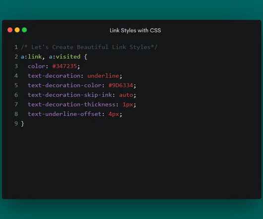
See the Pen Link Styling:text-decoration-skip-link by Eric Karkovack text-decoration-thickness The thickness of a link’s underline typically follows what’s defined in the font-weight property. Note that this property doesn’t impact instances of the HTML underline tag ( <u> ).
Discover The DRIPHAUS Typeface: Your Secret Ingredient for a Brand That Feels Real Have you ever searched for the perfect font? You want a font that has a story. A font with a soul. The DRIPHAUS Typeface + Label Kit by Aja M Johnson of designartboard is more than just a font. First, let’s talk about the font itself.
Reading "New Designers at 40: " More from Work Search Search Events Next Generation Showcase Creative Jobs Board Home Menu Disciplines Advertising Animation Architecture Art Creative Industry Digital Event Fashion Film Graphic Design Illustration Photography Product Design Publication Popular Tags 3D Book Branding Collage Comic Exhibition (..)
" More from Work Search Search Events Next Generation Showcase Creative Jobs Board Home Menu Disciplines Advertising Animation Architecture Art Creative Industry Digital Event Fashion Film Graphic Design Illustration Photography Product Design Publication Popular Tags 3D Book Branding Collage Comic Exhibition Font Food & Drink Identity Logo (..)
" More from Work Search Search Events Next Generation Showcase Creative Jobs Board Home Menu Disciplines Advertising Animation Architecture Art Creative Industry Digital Event Fashion Film Graphic Design Illustration Photography Product Design Publication Popular Tags 3D Book Branding Collage Comic Exhibition Font Food & Drink Identity Logo (..)
We have to start with that famous yellow price tag. Enter the Price Tag: Forging an Icon (1989-2018) By the late 80s, Best Buy knew it needed to grow up. The Masterstroke: Simple, Direct, Unmistakable In 1989 , the yellow price tag was born. The price tag had guts in a corporate world of swooshes, globes, and sterile wordmarks.
" More from Work Search Search Events Next Generation Showcase Creative Jobs Board Home Menu Disciplines Advertising Animation Architecture Art Creative Industry Digital Event Fashion Film Graphic Design Illustration Photography Product Design Publication Popular Tags 3D Book Branding Collage Comic Exhibition Font Food & Drink Identity Logo (..)
Words It's Nice That — Date 23 June 2025 Tags Ones to Watch 2025 Work Creative Industry Share We have extended the deadline for our Ones to Watch showcase 2025, which means you have some extra time to submit your work to be considered for the line-up.
Typeface designers, font engineers, and typographers have been hammering away at this evolution for decades – adapting – and in many cases prefiguring – the needs that technology, consumers, and brands bring to communication. Typography too is evolving to meet the needs of brands.
We organize all of the trending information in your field so you don't have to. Join 66,000+ users and stay up to date on the latest articles your peers are reading.
You know about us, now we want to get to know you!
Let's personalize your content
Let's get even more personalized
We recognize your account from another site in our network, please click 'Send Email' below to continue with verifying your account and setting a password.


Let's personalize your content