This site uses cookies to improve your experience. To help us insure we adhere to various privacy regulations, please select your country/region of residence. If you do not select a country, we will assume you are from the United States. Select your Cookie Settings or view our Privacy Policy and Terms of Use.
Cookie Settings
Cookies and similar technologies are used on this website for proper function of the website, for tracking performance analytics and for marketing purposes. We and some of our third-party providers may use cookie data for various purposes. Please review the cookie settings below and choose your preference.
Used for the proper function of the website
Used for monitoring website traffic and interactions
Cookie Settings
Cookies and similar technologies are used on this website for proper function of the website, for tracking performance analytics and for marketing purposes. We and some of our third-party providers may use cookie data for various purposes. Please review the cookie settings below and choose your preference.
Strictly Necessary: Used for the proper function of the website
Performance/Analytics: Used for monitoring website traffic and interactions
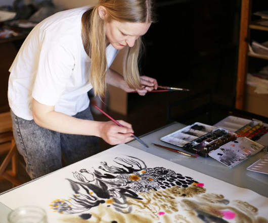
Her work on the illustration and lettering of book covers began with novels by Virginia Woolf, some of which were published in 2016 as a paperback series. Since then, Metsola has occasionally illustrated book covers published by Vintage/Penguin.
From neo-grotesques with a modern edge to culturally significant designs preserving endangered languages, these typefaces reflect the diversity and depth of contemporary typography. With low stroke contrast and two full sets of capitalsLatin and BlackletterPlace shines as a display face and a workhorse for complex typography.
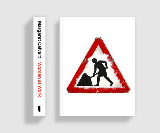
Her clear typography and cheerful pictograms have become an integral part of British daily life, and she's set international standards for directional signs throughout the world. To learn more about this exciting project, we chatted with Adrian Shaughnessy, the book's editor and graphic designer, writer, educator, and publisher.
Discover the best desktop publishing software in 2023. Desktop publishing software is used to create visual communications, such as brochures, business cards, greeting cards, posters, web pages for professional or personal printing online or on-screen. Affinity Publisher Affinity Publisher. Limited PDF editing options.
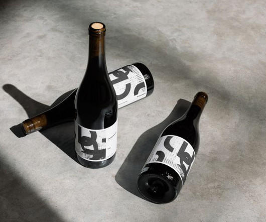
This side project by Fen Acey combines her love of food and drink packaging with collage and elegant typography to create beautiful and original artisan wine label designs. Typography played a crucial role in the creation process, bridging the handmade collage elements and the necessary textual information.
Typography is a funny thing because while it's largely based on fundamental, eternal principles, it nonetheless continues to evolve year after year. RST Thermal by Reset RST Thermal is a variable font that blends classical typography with modern design, focusing on balance and contrast. The easiest way to use the latest 2.0
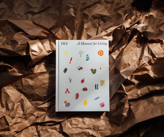
The Do Book Company is an independent publishing house in London that grew out of the Do Lectures, which has been gathering together the world's doers, disruptors and pioneers to share their stories since 2007. They've been translated into multiple languages and published in print, digital and audiobook formats.
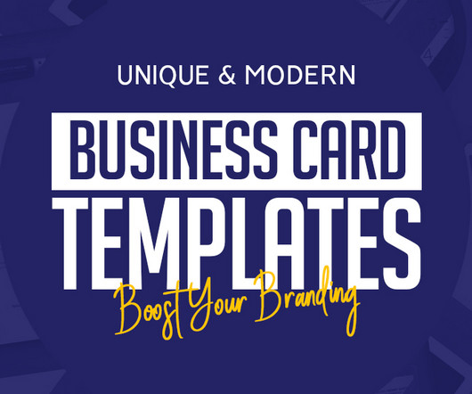
Don’t stop there—explore our full collection and dive into our library of thousands of unique business card templates published over the years. Bold TypographyTypography-centered business card templates have become increasingly popular for their ability to combine clarity with creativity.
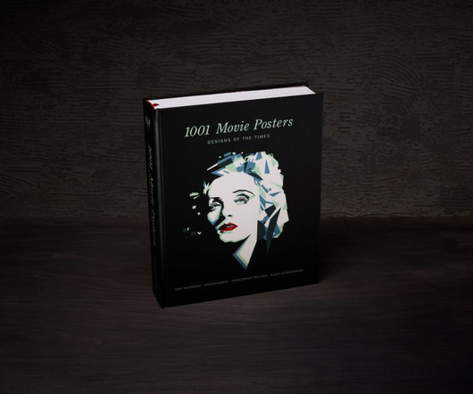
Images used here are copyrighted to Reel Art Press Bringing popular culture together with graphic design, photography, illustration and typography, movie posters enjoy huge popularity with creatives and fans alike, and this new book selects 1001 of the very best examples. It's available to order from the publisher's website.
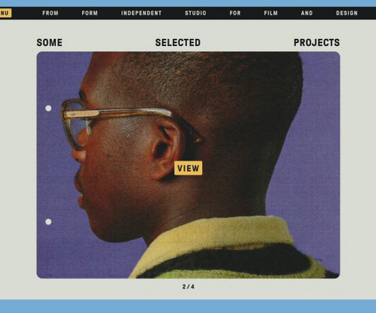
The new identity marks From Form’s tenth anniversary, and captures its “love of colour, film typography, and nostalgic aesthetics”, according to the studio. Its client list includes the likes of Ace & Tate, Skoda, Amsterdam Museum Night, and OFFF Festival.
Creating efficient, consistent, and flexible typography for digital platforms using modern design system principles. At the heart of this approach is typography , which is how we make text look and feel. When typography is well-designed, users can engage with content smoothly without distraction.
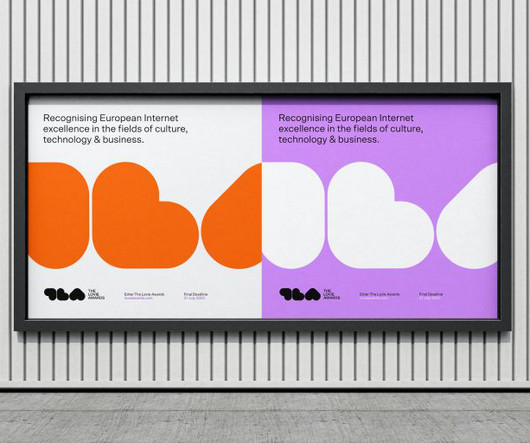
BfVA looked to Dutch design for inspiration, manifesting through bold typography, which comes to life in the smart abstracted forms of the wordmark and a flexible grid system that allows the winning work to take centre stage.
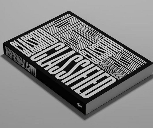
If you haven't heard of Standards Manual , the Brooklyn-based, independent publishing imprint founded by designers Jesse Reed and Hamish Smyth in 2014, it's about time you did. Now, they're returning to their publishing roots with their latest book, Classified: Local Ads from America's Small Towns. We ask if he has a favourite.
An amazing collection of family recipes with anecdotal stories, which was later referenced in a collection of essays put together by Daunt books called In The Kitchen, published in 2020." After some further Googling, I found out the book was self-published by the author herself, Archana, in Bangalore, India. Apparently not. "It
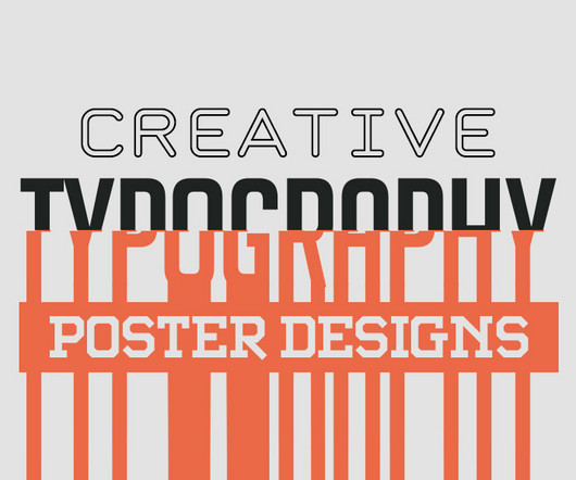
Typography can make or break a poster. Great poster typography is about more than picking a good-looking font. Well-spaced typography feels easier to read and more professional. When typography and imagery work together, the message becomes more cohesive and memorable. Start with your words.
When SiegeMag first appeared in 2017, it quietly disrupted the arts publishing world with a refreshing, inclusive ethos: "Artists Recommend Artists." Erratic typography, intentional spelling errors, and chaotic layouts turned the idea of an art magazine on its head.
Curated by Andrs Oliva, the exhibition positions letterpress as the unsung "building blocks" of modern London - both literally, in how type helped shape the city's publishing history, and metaphorically, in how design and print continue to define cultural identity.
Boasting dynamic typography and colours inspired by rave culture, the identity is a celebration of the UK's clubbing aesthetic. The dynamic and distinct typography, which contains seven alternates per character that align to a grid, appears to jump up and down to music while remaining readable to passers-by. He's not wrong.
An ambitious project by Peter Linck and editor Kresten Schultz Jørgensen, it reinvented the printed press with quality journalism, pleasing layouts and beautiful typography. Earlier this year, Playtype – an independent foundry based in Copenhagen – decided to resurrect Dagen's custom typeface, Publish Gothic.
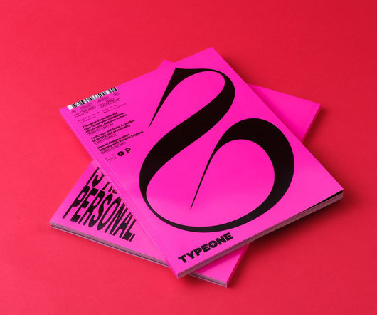
All photography by Yeshen Venema TYPEONE magazine isn't just a beautifully designed print publication; it's also full of key insights about the evolving interaction between typography and graphic design. Ultimately, typography doesn't exist in a vacuum but is just one element in a dynamic and ever-evolving design landscape.
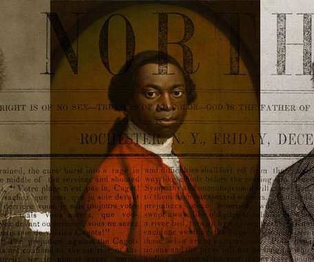
An introduction to early African American print culture; its authors, editors, journalists, printers and publishers in America. The post Black Print appeared first on I Love Typography. From protest pamphlets to the first Black newspapers and books.
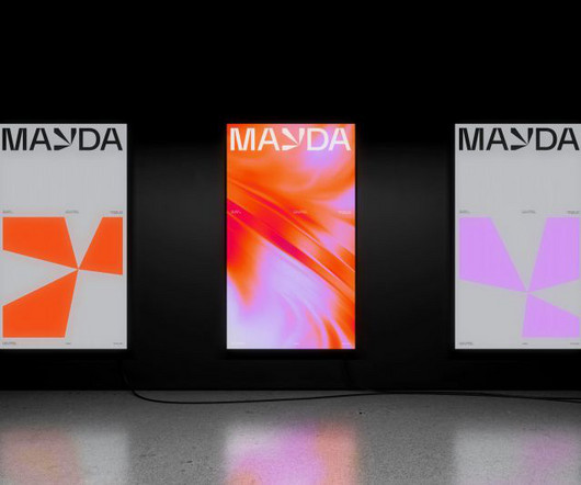
Mayda was shown as a crescent-shaped isle on several published maps between the 14th and 16th centuries. Typography and colour palette The typefaces used are Everett and Everett Mono from Weltkern. When is an island, not an island? Early maps positioned it west of Brittany and southwest of Ireland.
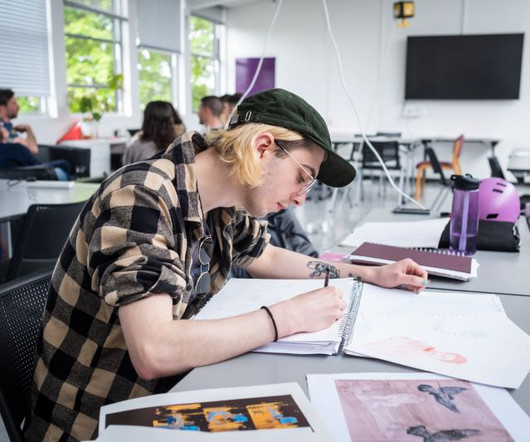
Best of all, this is a flexible degree that can be tailored to your interestsfor example, in app development, animation, visual identity and branding, illustration, photography, typography and publishing, or graphic design in general.
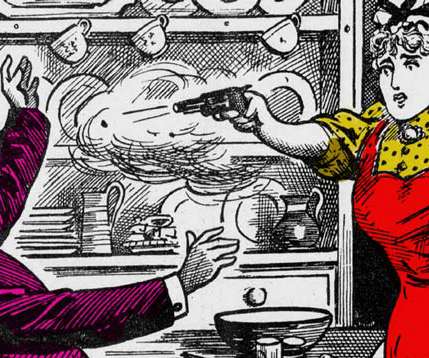
Woodcut, engraving, etching, and drypoint were techniques used by the likes of Albrecht Dürer, Hieronymus Bosch, and Raphael, while printmaking publishers like Hieronymus C**k, helped popularize the print and expand it into a burgeoning industry. The post Inventing Posters appeared first on I Love Typography.
If you think about the typography trends of recent years, one, in particular, stands out. These are all brilliant examples of a fascinating direction in graphic design, one forged by a collision of technology, typography and trends, creating new and exciting results today. The book started as a bit of a joke.
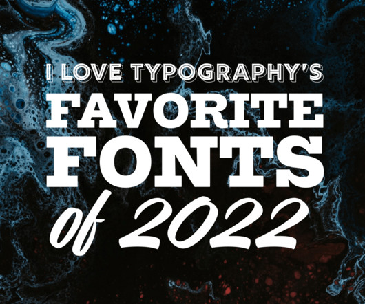
Join us as we look back at some of our favorite fonts published on ILT in 2022. The post ILT’s Favorite Fonts of 2022 appeared first on I Love Typography. Read the book, Typographic Firsts It’s that time of year again.
The Industrial Revolution mechanized printing and reduced costs, leading to explosive growth in publishing. The post Penny Dreadfuls & Murder Broadsides appeared first on I Love Typography. At the same time, an unprecedented increase in literacy produced millions of new readers and sparked a reading revolution.
And it feels like I published last year’s favorite fonts list about ten years ago! The post My Favorite Fonts of 2021 appeared first on I Love Typography. However, 2021 wasn’t a bad year for type design. In my determination to keep the list capped at ten, I’ve undoubtedly left out many releases that merit inclusion.
Logo Archive is a series of small books that are regularly published to give designers an overview of what’s going on in the industry regarding logo design and iconography.
Typography has always been a powerful tool in design, blending the art of arranging text with creativity to convey a message. With the advent of printing presses and later, digital technology, typography began to evolve rapidly. Timeless Appeal Unlike other design trends, typography is timeless.
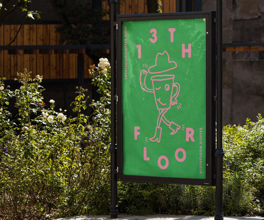
Kevin Summers of Process Play explains how they took 13th Floor Coffee Co to the next level with thoughtful use of typography and character design. As well as working closely with clients to help them discover and tell their unique stories, we also publish, exhibit and collaborate on various experimental projects."
Learning about Typography: The Typography Primer Book was actually first published waaaay back in the day, circa 2000, but the contents are still very relevant over a decade later, and includes Glossary of Typographic Terms. I’ve printed mine out, and actually had it spiral bounded and laminated. Serif & Sans Serif 3.
Maria Strick in the Netherlands and Marie Pavie, perhaps from France, are the first two women to have their calligraphy copybooks published in print. The post The Writing Mistress appeared first on I Love Typography. At the same time, women, known as writing mistresses, begin to teach handwriting and calligraphy to young women.
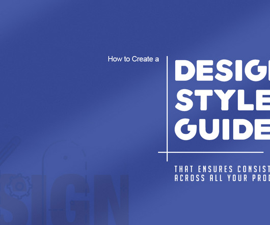
A good design style guide should include guidelines on logo usage, color palettes, typography rules, image styles, and quality standards, as well as user experience principles. It ensures that the look and feel of your products are consistent, helping to create a unique and recognizable visual language for customers.
A closer look at their subject matter and iconography reveals much about the motives of those who collaborated to publish them, sometimes making them as much propaganda as art. The post Prints & Propaganda appeared first on I Love Typography.
And if there's one obsession that designers feel truly passionate about, it's typography. The company's main goal is to value font creators and to better distribute the revenue share of the objects, books and fonts they produce and publish. The company publishes retail fonts developed by the two, their staff, and outside collaborators.
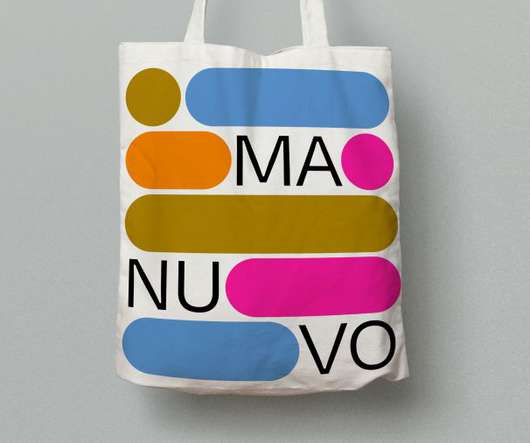
The resulting visual identity, which includes a logotype, logo animation, typography, colour pallet, graphic language and composition, is inspired by Manuvo's apps and programmes which create building blocks for the education of marginalised communities.
It's been 30 years since Neville Brody last published a monograph, and it's safe to say a hell of a lot's changed in that time – in his career, in the design industry, and in creativity more widely. The Graphic Language of Neville Brody, cover The Graphic Language of Neville Brody, cover Why did you decide to publish the new book now?
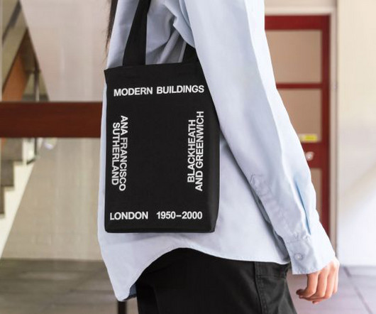
Now Studio Blackburn has launched a new book, published by Park Books, that delves into both the residential and community-focused buildings that flourished in this period. We took it on the understanding that we'd create a more substantial book and get it published by a world-renowned publishing house.
In the 21st century, typography teacher Hans-Christian Pulver pulled the designs from the archive and began to develop them digitally. FF DIN Slab is a revival of DIN 1451, a German typeface first published in 1931 and widely used in traffic, administrative and technical applications. Rumiko Sans comes in six weights.
Niggli Verlag (Publisher) $54.14 Learn More Latest Price on Amazon: Sale 81 Reviews Design Is a Job Audible Audiobook Mike Monteiro (Author) - Mike Monteiro (Narrator) English (Publication Language) 03/31/2014 (Publication Date) - A Book Apart (Publisher) $12.99 Those three are well-known as Typography, Gestalt, and Interface.
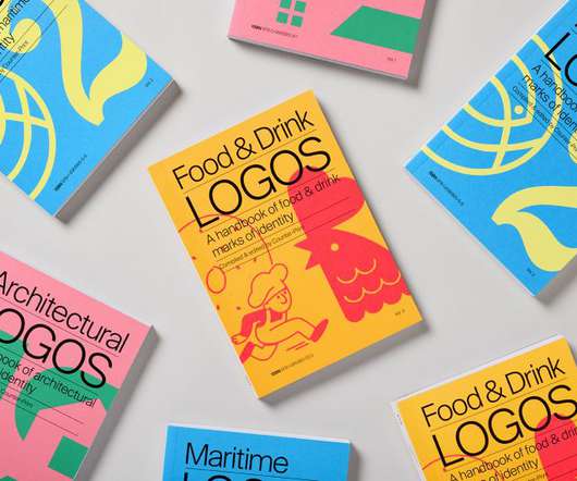
Food & Drink Logos is the third in a series from the publisher, following Architecture Logos and Maritime Logos. Whether that's done through the use of heraldry and laurels, by including the date in which the company was established or in the choice of typography, there is often a retro vibe. "I
POV Forward Thinking Review of the Year Editorial Team Jenny Brewer Olivia Hingley Ellis Tree Elizabeth Goodspeed Liz Gorny Extra nice Extra Search Account Social Chloe Gaillard imbues typography with historical easter eggs No matter how big or small, this designer makes brand design that is elegant and effective.
We organize all of the trending information in your field so you don't have to. Join 66,000+ users and stay up to date on the latest articles your peers are reading.
You know about us, now we want to get to know you!
Let's personalize your content
Let's get even more personalized
We recognize your account from another site in our network, please click 'Send Email' below to continue with verifying your account and setting a password.


Let's personalize your content