This site uses cookies to improve your experience. To help us insure we adhere to various privacy regulations, please select your country/region of residence. If you do not select a country, we will assume you are from the United States. Select your Cookie Settings or view our Privacy Policy and Terms of Use.
Cookie Settings
Cookies and similar technologies are used on this website for proper function of the website, for tracking performance analytics and for marketing purposes. We and some of our third-party providers may use cookie data for various purposes. Please review the cookie settings below and choose your preference.
Used for the proper function of the website
Used for monitoring website traffic and interactions
Cookie Settings
Cookies and similar technologies are used on this website for proper function of the website, for tracking performance analytics and for marketing purposes. We and some of our third-party providers may use cookie data for various purposes. Please review the cookie settings below and choose your preference.
Strictly Necessary: Used for the proper function of the website
Performance/Analytics: Used for monitoring website traffic and interactions
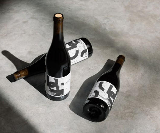
This side project by Fen Acey combines her love of food and drink packaging with collage and elegant typography to create beautiful and original artisan wine label designs. Typography played a crucial role in the creation process, bridging the handmade collage elements and the necessary textual information.
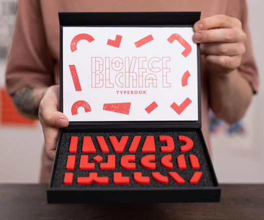
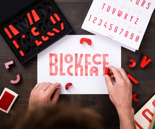
We spend so much time working in digital nowadays it's hard to remember that for hundreds of years, typography was a purely physical medium. BlockFace is a stamp kit designed to help you explore typography and more. Designed by graphic artist Will Mower, it's essentially a modular typographyprinting kit that's very easy to use.
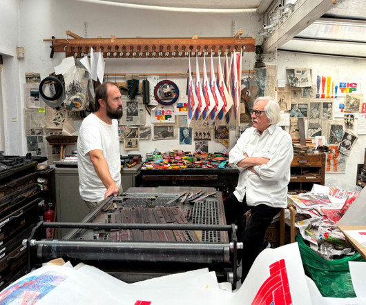
Alan Kitching, one of the most celebrated letterpress printers of our time, is bringing his work to Madrid for a new exhibition that explores heritage, craftsmanship, and the evolving role of print in a digital world. A legacy built in letterpress Few designers have made the impact that Kitching has on contemporary printmaking.
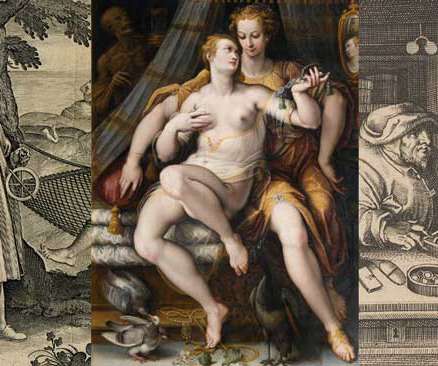
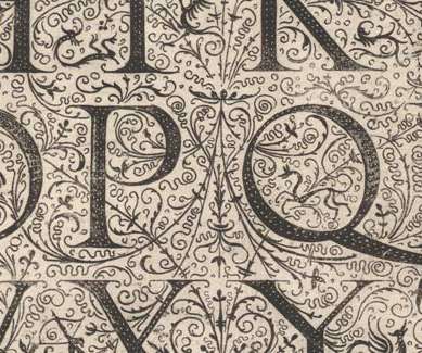
By the sixteenth century, printmaking — or art prints — had become a burgeoning industry. Millions were printed and many thousands have survived until the present day. Their significance goes well beyond their value as art prints or artifacts, revealing a great deal more than artists' talents and virtuosity.
The modern poster first appeared in France in the 19th century, but its antecedents can be found in Renaissance printmaking. The post Inventing Posters appeared first on I Love Typography.
And FT Scenik harnessed that feeling by taking its inspiration from the modernist typography of Margate, a coastal town in southeast England. It was inspired by eight-bit video games, the prints of Dutch graphic designer Karel Martens, and the cover of his book Printed Matter. FT Scenik Who doesn't love a day out at the seaside?
The Industrial Revolution mechanized printing and reduced costs, leading to explosive growth in publishing. The post Penny Dreadfuls & Murder Broadsides appeared first on I Love Typography. At the same time, an unprecedented increase in literacy produced millions of new readers and sparked a reading revolution.
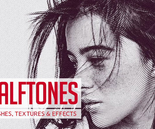
Originally developed for the printing press, halftoning is a technique used to simulate continuous tone imagery through the use of dots. Alternative Printmaker 11. Under-inked Print – Halftone Vector Text Effects 12. Poster Press – Screen-print Creator 16. Light Print Texture Illustrator Brushes 20.
Words Ellis Tree — Date 23 June 2025 Work Graphic Design Print Risograph Poster Politics Environmentalism Community When you grow up in West Cumbria, where “there’s more sheep than there are human beings”, and you’re into art, punk and anarchy, you have to quite actively create a different kind of cultural scene to countryside monotony.
Words Ellis Tree — Date 12 June 2025 Work Art Graphic Design Print Poster Exhibition Sport Community If you’re an Ipswich Town fan you’ll probably be more than familiar with the fan song Call Me Ted – an anthem that’s belted across the stands on match day weekends.
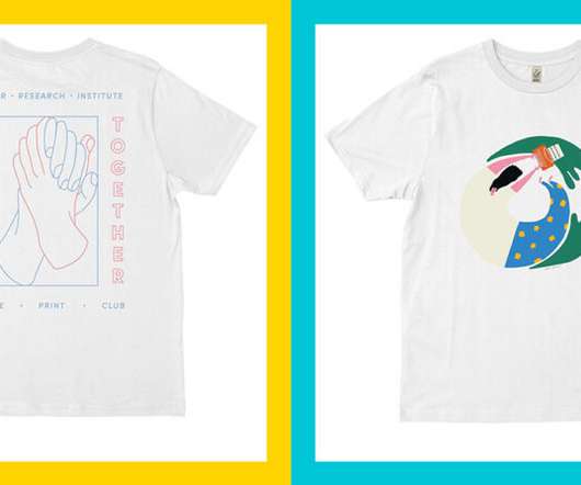
Future Print Club is a project created by Humana Studio with the intention of creating a “community that evokes the power of collaborative work to improve the world.” For the Future Print Club collaboration, she created a design for Girls Write Now. We’re so proud of our Shillington graduates around the world!
Across her research, writing and visual work she has a particular interest in printmaking, self-publishing and expanded approaches to photography. instagram.com/laurabeulens About the Author Ellis Tree — Ellis Tree (she/her) is a staff writer at It’s Nice That and a researcher on Insights.
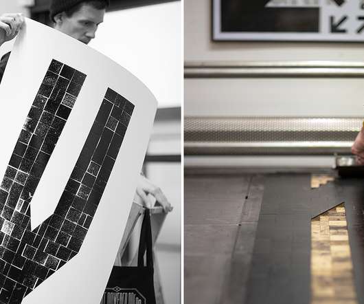
Using the Brico System for letterpress printing requires thinking of every possible combination from A to Z. Together, the trio created one monochromatic print of every letter, which span 1.5
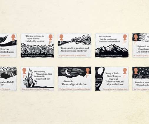
The project required a focus on typography from the start. Royal Mail’s micro-dot printing technique means that the paper’s “tactile” qualities are recreated accurately, Mitchell says. Having two lines from each poet created an interesting set of creative challenges, he adds. Starting from the words.
Given that so many typography blogs are run by type designers, it’s also refreshing to see one written, instead, by a designer who uses type in their day-to-day work. Eye Magazine Eye Magazine , the international review of graphic design, is a quarterly print magazine on graphic design and visual culture.
Words Ellis Tree — Date 1 July 2025 Work Illustration Publication Book Comic Print Sport Feminism History London-based illustrator and writer Anna Trench has always been in awe of how images and words can form a careful symphony to tell a story.
Jude is also in the process of working on some prints of the series, in the hopes of selling some of his work with proceeds from the project directed back to the people of Moree. Across her research, writing and visual work she has a particular interest in printmaking, self-publishing and expanded approaches to photography.
No matter the series, from the Little Black Classics and Penguin Moderns (with that gorgeous typography) to the exquisite clothbound hardbacks, they are all connected by simplicity and striking minimalism. The prints are priced at £85 each and are available for a limited time only. Today's Penguin designs have the same touch of magic.
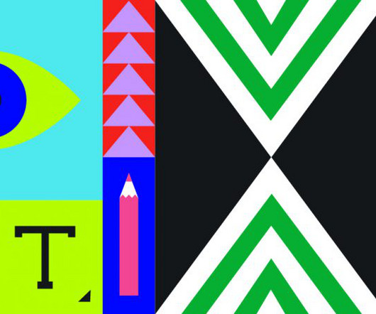
For hundreds of years, typography was an innately physical medium, beginning with ornate metal designs followed by mass-produced wood varieties that were cheaper and could be scaled up or down.
Founded in 2016 by Jacob Lindgreen and Paul Zdon, Platform is studio that focuses on visual identities, websites, book and other print projects. The pair’s work has an emphasis on typography which creates distinctive and attractive work—whether it’s something tangible or something digital. Ryan Duggan. Michael Corey.
Within all of the artwork, I don’t just stick to photography or drawing or typography, I’m the opposite of a purist. So most of the images mix photography and printmaking — all sorts of different techniques from monoprint to lithography to photographic contact printing. .
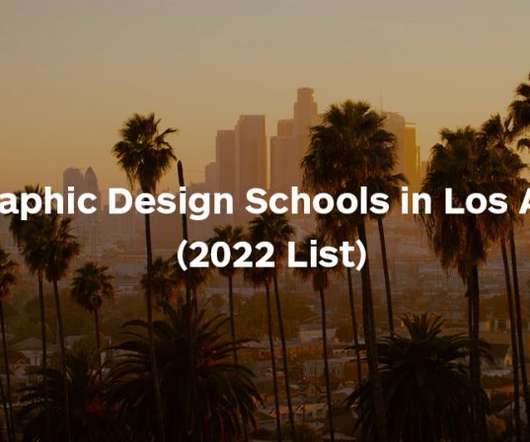
Otis Graphic Design students are offered study in UX/UI, typography and type design and other typical graphic design skills, whilst also learning printmaking and traditional letterpress skills. Also, Otis offers both a Communication Arts undergraduate degree with a major in Graphic Design and a Master of Fine Arts in Graphic Design.
Engraving is an old printmaking technique in which a design is incised into a metal plate using a cutting tool called burin. Even at the smallest font size, it remains well-defined with its extended tails and ball terminals that create a romantic look; making it perfect for printing on a wedding ring. Best Fonts for Leather Engraving.
I love colour, texture, nostalgic flourishes and imperfection, so I’m particularly drawn to things like old signage, off-beat typography, beautiful textured paper stock, 60s surf culture, Polaroid and 35mm photography, and handcrafts like weaving, embroidery and collage. A couple of years ago I discovered risograph printing and I am obsessed.
The identity perfectly reflects the restaurant’s alpine location—with a monochromatic colour palette reflecting a winter landscape and typography inspired by vintage Art Deco posters that promoted skiing in the area in the early 20th Century. Sofia Noceti is a freelance designer, illustrator, art director and printmaker.
Students on CCAD’s course will be able to use the college’s computer labs complete with the latest software, a print lab, photography student and more—so there’s no shortage of ways and places to create. Visual Communication students are also encouraged to produce printed materials such as posters, books and packaging.
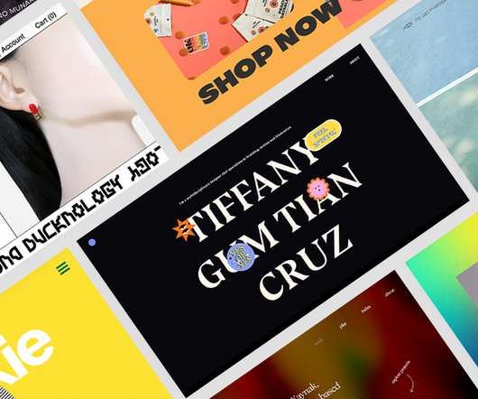
The website for her risograph printing studio Dopple Press has earned her the winning spot for The Wix Awards 2021 , on top of building a strong online presence for the small business. Diverse typography, check. Tiffany Cruz : Best use of typography. Best FAQ Page: In Print Art Book Fair. OK Drugs : Best homepage design.
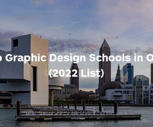
Whether your interests lean more toward print, web, motion graphics, user experience (UX) design, or another specialisation, these leading institutions offer unmatched learning environments to develop the graphic design expertise needed for career success.
His design work is heavily research and often plays with typography to create something abundant and detailed. On top of that, he also runs the account Empersant , a design and typography joke page. Freelance print and graphic designer Juliette van Rhyn studied on Shillington London’s part-time course. Renald Louissaint.
The Triad colour scheme is one of web and print design's most popular colour schemes. From photography to painting, to graphic design, to animation, to printmaking, to sculpture, there are many different ways to convey your message through images. The weight of your letters is just as important as their typography.
Specialising in comics, illustrations and posters, his art also has a distinctively low-fi and edgy aesthetic, thanks partly to his dynamic use of chunky typography. This childhood compulsion would take Connor to the Rhode Island School of Design, where he would study printmaking and illustration. I loved it."
German typographer, designer, teacher, and writer Jan Tschichold cited the first Bauhaus exhibition as directly leading him to forge a more experimental way of working with letterforms that was also simple and practical; and he went on to lay out his principles in seminal book Die Neue Typographie (The New Typography).
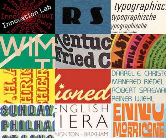
Here, we’re going to delve deep and dig out some of the most interesting vintage typography, all of which can inspire designers or even be used in your designs today. That’s right—the long held belief that Gutenberg invented the printing press isn’t true! ). Examples of Vintage Typography. Village & Orbit.
Juliette van Rhyn has designed printed textiles for fashion and interiors for the last decade and today works as a freelance print and graphic designer in London. Her gorgeous work takes the form of relief prints, created using the lengthy process of lino-cutting. Juliette van Rhyn. Jillian Adel. Carolyn Hawkins.
Lustig Cohen’s work was heavily inspired by architecture, and her inclination towards typography and abstraction can be seen in everything from her designs, to her paintings, to her mixed-media, sculpture, and printmaking works. Learn more * * * * * * * * *
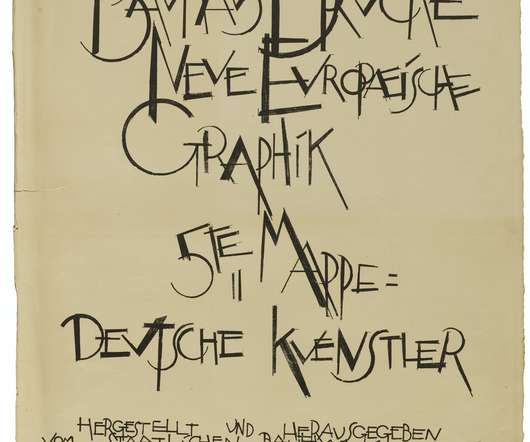
Stacks of posters from Oskar Leiner’s print shop. They all originated at a single print shop, the Buchdruckerei Oskar Leiner , and date from 1847 to 1876. Most of them are letterpress-printed, sometimes combined with lithography, and show an increasing diversity of type styles and sizes. Photo: Florian Hardwig.
You’re introduced to the latest in graphic design software, as well as traditional printing techniques such as risograph and screen printing. Typography is nothing if not a complex beast, tasking the designer to balance so many competing factors including hierarchy, order of reading, legibility and contrast, to name but a few.
You’re introduced to the latest in graphic design software, as well as traditional printing techniques such as risograph and screen printing. Graphic artist Anthony Burrill’s print, based on the simple but profound advice of ‘Work Hard & Be Nice to People’, resonated deeply with the creative community and beyond.
This mini 100-piece puzzle beautifully replicates Warhol's iconic Marilyn Monroe print, and there's one for his Campbell's Soup design too. It features a pink dial with multicoloured print and biosourced materials. The design combines matte black case elements with vibrant red and pink straps adorned with contrasting prints.
We organize all of the trending information in your field so you don't have to. Join 66,000+ users and stay up to date on the latest articles your peers are reading.
You know about us, now we want to get to know you!
Let's personalize your content
Let's get even more personalized
We recognize your account from another site in our network, please click 'Send Email' below to continue with verifying your account and setting a password.


Let's personalize your content