This site uses cookies to improve your experience. To help us insure we adhere to various privacy regulations, please select your country/region of residence. If you do not select a country, we will assume you are from the United States. Select your Cookie Settings or view our Privacy Policy and Terms of Use.
Cookie Settings
Cookies and similar technologies are used on this website for proper function of the website, for tracking performance analytics and for marketing purposes. We and some of our third-party providers may use cookie data for various purposes. Please review the cookie settings below and choose your preference.
Used for the proper function of the website
Used for monitoring website traffic and interactions
Cookie Settings
Cookies and similar technologies are used on this website for proper function of the website, for tracking performance analytics and for marketing purposes. We and some of our third-party providers may use cookie data for various purposes. Please review the cookie settings below and choose your preference.
Strictly Necessary: Used for the proper function of the website
Performance/Analytics: Used for monitoring website traffic and interactions
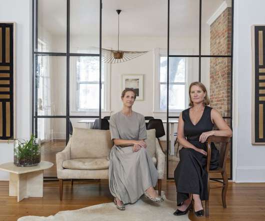
Courtney Rowson and Amy Pastre of SDCOPartners. Since launching SDCOPartners in 2009, founders Amy Pastre and Courtney Rowson have designed hundreds of brands worldwide – including names like LeCreuset and Soludos – but it's their work with industry-disrupting, women-owned businesses that drives their passion.
Its brand identity was creatively in charge of SDCOPartners. SDCOPartners’ designers came up with a concept that balances history and modernity, luxury and approachability for a consistent, flexible system that invites and intrigues. So, let this design post inspire you to plan your next brief vacation.
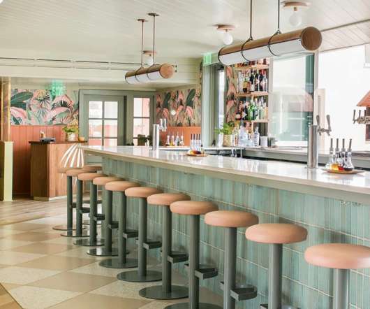
But not literally; we found a cafe and cocktail bar named Little Palm with a breezy aesthetic designed by SDCOPartners. SDCOPartners’ team was in charge of Little Palms’ brand identity, stationery, and signage design. Some days, we want to leave everything behind and start a new life under a palm tree.
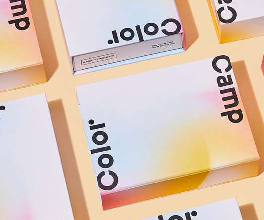
New branding project by SDCOPartners. Blending beauty, design, and technology with a laser focus on health, Color Camp inspires and empowers individual style and creative expression. Color Camp creates high-quality, customizable press-on gel nails, each set made to order by talented Los Angeles nail artists.
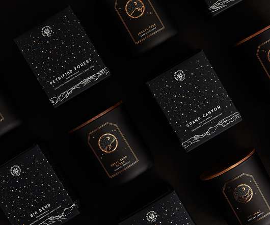
Inspired by the darkest places in the country, The Dark Sky collection celebrates America’s dark skies, bright stars and night sky conservation. The beautiful design was designed by SDCOPartners. The post Dark Sky appeared first on Mindsparkle Mag.
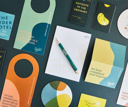
The Ryder Hotel identity was in charge of SDCOPartners , who created a delightful concept. SDCOPartners has wanted to take us on holidays since moment one. The brand design reflects the hotel’s laidback, fun-loving spirit and oasis-inspired interiors.
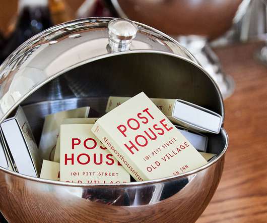
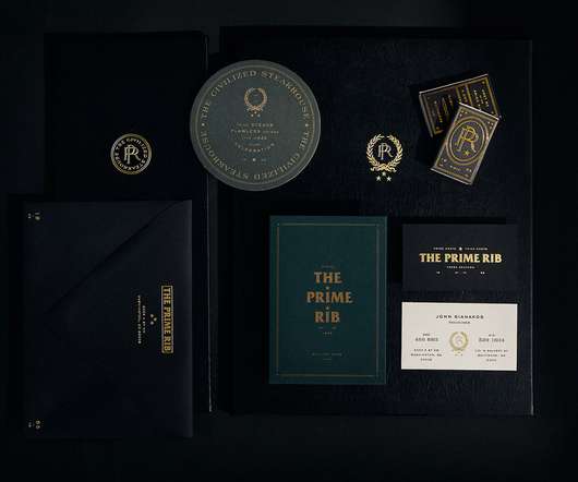
On this occasion, we’re presenting SDCOPartners branding design for The Prime Rib, a legendary, family-owned, 1940s-era Hollywood-inspired steakhouse. SDCOPartners team was creatively in charge of the brand’s identity, design, and story.
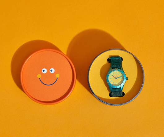
Designed to help kids learn to tell time and understand its many meanings, the brand inspires us all to explore our creativity and be true to who we are. Its fun visual identity was designed by SDCOPartners. A hand-illustrated Parchie is the brand’s mascot — an imaginary childhood friend brought to life.
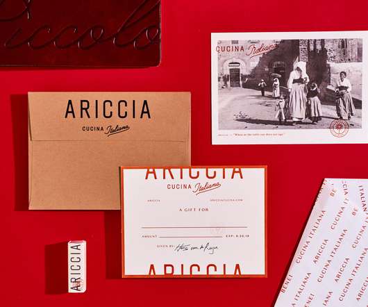
However, SDCOPartners managed to bring them back to life. A well-known fountain in the city of Ariccia was the main inspiration for the submarket icon. We’re showcasing a restaurant and the jazz lounge called Ariccia. Can you imagine listening to the background music from the streets before entering the place?
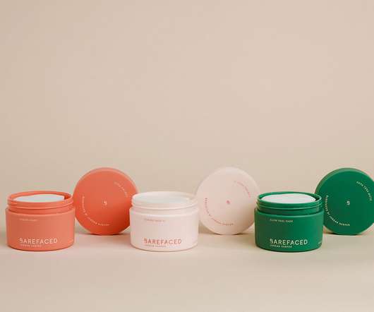
Developed by Jordan Harper, this brand’s identity design is from SDCOPartners. The line received inspiration from the passion for nurturing beautiful skin through high-quality solutions, both restoration and preventive. The studio’s designers had to create Bareface’s brand identity and packaging system.
I was never sure that ‘inspiration’ would strike before the deadline! I learnt that inspiration doesn’t happen accidentally. I drew inspiration from ornately designed bows of antique skeleton keys to design the logomark and I kept the logo font simple and approachable.
We organize all of the trending information in your field so you don't have to. Join 66,000+ users and stay up to date on the latest articles your peers are reading.
You know about us, now we want to get to know you!
Let's personalize your content
Let's get even more personalized
We recognize your account from another site in our network, please click 'Send Email' below to continue with verifying your account and setting a password.


Let's personalize your content