This site uses cookies to improve your experience. To help us insure we adhere to various privacy regulations, please select your country/region of residence. If you do not select a country, we will assume you are from the United States. Select your Cookie Settings or view our Privacy Policy and Terms of Use.
Cookie Settings
Cookies and similar technologies are used on this website for proper function of the website, for tracking performance analytics and for marketing purposes. We and some of our third-party providers may use cookie data for various purposes. Please review the cookie settings below and choose your preference.
Used for the proper function of the website
Used for monitoring website traffic and interactions
Cookie Settings
Cookies and similar technologies are used on this website for proper function of the website, for tracking performance analytics and for marketing purposes. We and some of our third-party providers may use cookie data for various purposes. Please review the cookie settings below and choose your preference.
Strictly Necessary: Used for the proper function of the website
Performance/Analytics: Used for monitoring website traffic and interactions
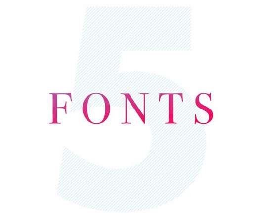
Haltung by Order Type Foundry Drawing inspiration from mid-century neo-grotesques such as Helvetica and Univers, Haltung reimagines the genre with added "air" in its letterforms. Whether used for editorial design or branding, this typeface offers a natural, authentic feel.
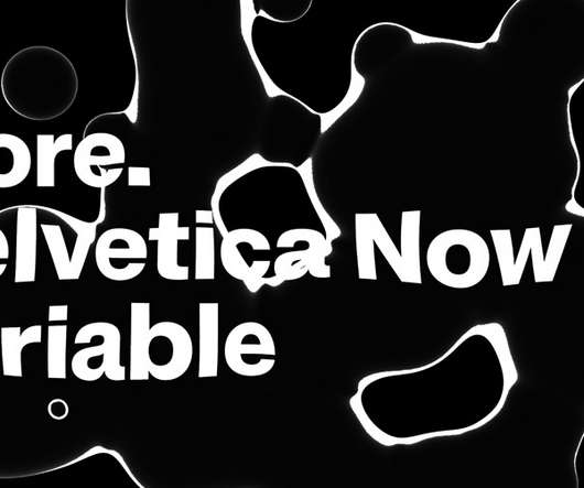
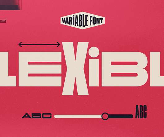
Monotype launched ‘Helvetica Now’ as Variable Font. So it’s no surprise that Monotype has finally launched Helvetica Now as a variable font. Helvetica Now is one of today’s most versatile fonts. Helvetica Now Variable Font from Monotype. Helvetica Now Variable Font from Monotype. Download on MyFonts.
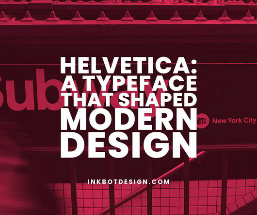
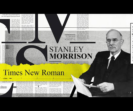
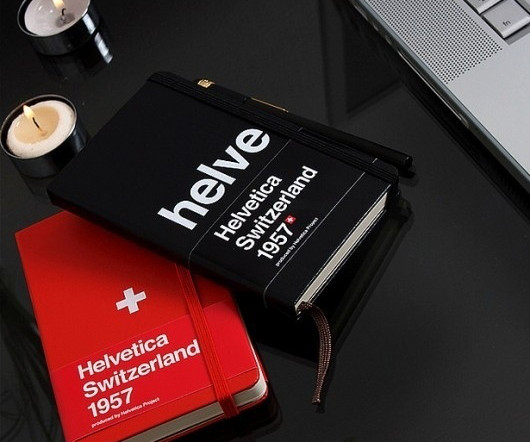
Helvetica: A Typeface That Shaped Modern Design With its clean lines and perfect proportions, Helvetica has become one of the world's most ubiquitous and influential typefaces. Helvetica, created in 1957 by Swiss designers Max Miedinger and Eduard Hoffmann, embodied the post-war's minimalist, rational design ethos.
Have you ever wondered why Helvetica is called Helvetica or what inspired the name Futura? Helvetica: Simplicity in a Name Helvetica is arguably the most recognized typeface in the world. Renaming it to Helvetica was a strategic move that embodied its clean, neutral style.
We were inspired by the heavy use of Helvetica / Akzidenz in the '90s club scene as we saw with clubs such as Cream, Haçienda and Fabric," he reveals. It is also possible to turn off the tiered effect within the font, using the stylistic set called 'Standard'.
Avoid overly fancy fonts for readability; stick to clean fonts like Arial, Helvetica, or Calibri. Customize to Fit Your Brand Change colors, fonts, and other style elements if needed, but keep them consistent.
Neue Helvetica World from Linotype. Think of a typeface as the overall design like the “Helvetica” family. Then, a font is a specific variation of that typeface, like “Helvetica Bold” or “Helvetica Italic.” But there’s a subtle difference.
It's almost a hybrid of Helvetica, Univers and Akzidenz Grotesk, so it naturally offers a minimalist, understated and elegant tone to the branding, hitting that sweet spot between professional and playful.
Helvetica Neue, meanwhile, was used as the primary typeface, along with Courier New as a supporting typeface. Helvetica Neue offers clean readability, while Courier New adds a classic typewriter feel, reminding readers of the human touch behind the work.
Two key typefaces were used in this system: Anton and Helvetica Now. Helvetica Now was used as a secondary typeface, "selected for its neutrality and legibility in smaller sizes, ensuring it complemented Anton without competing with it", says Galar.
Helvetica Font. And lastly, let’s talk about the brands’ most beloved font, Helvetica. Helvetica exudes simplicity and professionalism. If your brand intends to do the same, then Helvetica should be your ultimate pick! Helvetica Font Download. Quicksand Font Download.
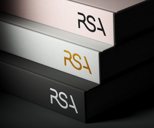
For the sake of clarity and coherence, the studio opted for Helvetica Now as the secondary font, which appears in a single size and weight throughout the system. The solution was a typographic framework that ties each of the four subsidiaries to the main RSA brand.
The new typographic system, meanwhile, uses Helvetica Now, an updated version of the modernist staple. All three elements communicate approachability, balanced but purposeful playfulness, and a level of design sophistication reminiscent of mid-century design craft.
It’s no secret that when it comes to typography, Helvetica stands as an emblem of modernist design, celebrated for its clean lines, readability, and versatility. However, even a stalwart like Helvetica can benefit from the nuanced harmony of a well-chosen typeface pairing. Download here 2. Download here 3. Download here 4.
For professional use, clean and versatile options like Helvetica or Times New Roman excel. However, checking licensing terms is essential for proper use and avoiding legal complications. Download Font Block Pie Font The best font depends on its purpose, balancing readability and style.
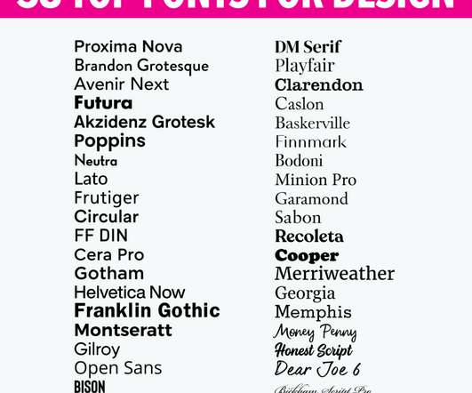
Helvetica® Now. Helvetica Now. Every single glyph of Helvetica has been redrawn and redesigned for this expansive new edition – which preserves the typeface’s Swiss mantra of clarity, simplicity and neutrality, while updating it for the demands of contemporary design and branding. Brandon Grotesque. Proxima Nova.
Fundamental typography terms Here are some basics to know: Typeface vs. font: A typeface is an overall design, like Helvetica. A font is a specific style within that typeface, such as Helvetica Bold or Helvetica Light. So, when you choose Helvetica, you’re picking a typeface.
His typeface designs are grounded in his own editorial needs, and one of them was for a distinctly modern and refined sans-serif residing between the formal rigidity of the neo-grotesques such as Helvetica and the more recent crop of humanist creations. Newsam addresses this need and injects a new personality into the International Style.
Helvetica Neue was selected for the signature typeface because serif fonts have been found to be harder for neurodiverse people to read. The recommendations led to several adjustments to the new guidelines, including: The addition of an off-white colour to use in digital applications, as white is the most energy-emitting colour.
Peasy by Delve Fonts Peasy by Delve Fonts Peasy by Delve Fonts Heltar by The Northern Block Created by Jonathan Hill of The Northern Block, Heltar is a neo-grotesque typeface that pays homage to Helvetica while carving out its own distinct identity.
Helvetica, for example, is a popular font known for its clean, modern look and excellent readability. Beaches of Normandy Tours, a tour agency focused on WWII historical tours, uses Helvetica in its blog articles to attract history enthusiasts, veterans, soldiers, and relatives. This makes it effective for engaging users.
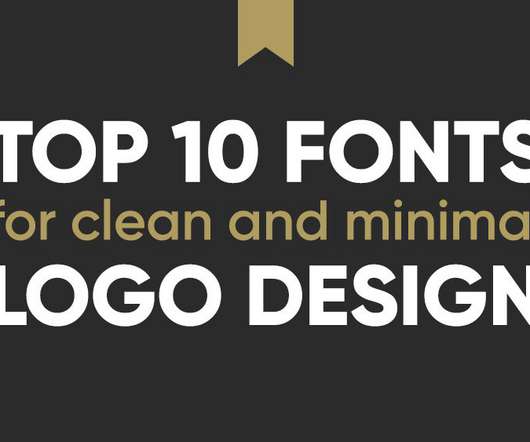
Top 10 Fonts of All Time 1 – Helvetica – The Epitome of Clean and Timeless Design Helvetica has become one of design's most iconic and influential fonts. This allowed Helvetica to be reproduced accurately at both small and large sizes. Helvetica swiftly became famous for its universal appeal and lack of personality.
Discover more of the best Women, Helvetica, Women's Fashion, Graphic Design, and Print inspiration on Designspiration Saved by Shelby White (@shelbywhite).
The serif typewriter-style font of Glaser's original has been swapped for a sans-serif that references the Helvetica signage of New York's subway system. The explanation for this is long-winded, but the intention seems to be to recognise how New Yorkers came together to support each other during the pandemic.
Helvetica was created in the late 1950’s by two Swiss designers looking to create a sans-serif typeface. To many readers this gives Helvetica and other san-serif fonts a cleaner, more modern look that is easier to read. It may also be the only font to boast its own Documentary, a 2007 film called, what else, Helvetica.
5 Phrases Of Massimo Vignelli is a gorgeous set of posters, entitled: Vignelli Forever, designed by Anthony Neil Dart set in Helvetica. Typeset in Helvetica, Designed by Anthony Neil Dart first published on Smithographics - Logo Designer | Copyright 2025
He’s one of the designers, if not the designer , who made Helvetica as popular and common as it is (or was). An example of how Massimo masterfully used Helvetica in different ways. Massimo Vignelli’s 5 fonts which he built his rich career on: Futura, Times New Roman, Helvetica, Bodoni, Century. Designers wanted more options.
A typeface is like the font family (e.g., “Helvetica”). The font is a specific style, size, and weight (“Helvetica Bold 12pt”). Sans-serif fonts are clean and simple (Arial or Helvetica). So, do you see the difference now? Which do you prefer?
While the West kept reinventing Helvetica, China somehow settled with printing almost everything in Univers. After exploring one of its… Continue reading on UX Collective »
Helvetica Now Variable Font. Helvetica Now Variable Font from Monotype. So it’s no surprise that Monotype has finally launched Helvetica Now as a variable font. The design of the Arsenica typeface draws inspiration from classic Italian poster designs. Download on MyFonts. Download on Fontspring. Download on MyFonts.
Helvetica Now Variable Font from Monotype. Helvetica Now Variable Font Helvetica Now Variable Font is a variable font that was created by Monotype. If you’re looking for a way to improve your typography, variable fonts are definitely worth considering. Five eye-catching variable fonts that add value to any design project.
The old logo was eh , with Helvetica in a circle and I know that that you are not supposed to critique Helvetica because it’s neutral and it works and… zzzzz. (And I don't mean that sarcastically, this actual looks like they had a useful, meaningful session.). And generic.
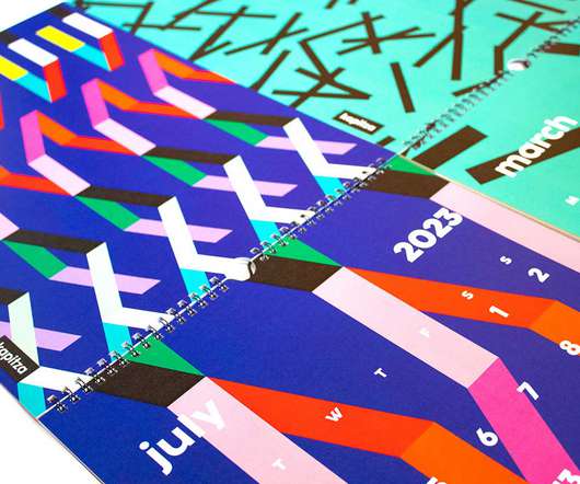
A minimalist wall calendar comes with six, double-sided calendar pages in Helvetica with a simple black bracket for hanging. Inspired by the nature of Tofino on Vancouver Island in Canada, this rectangular calendar features colorful buoys found hanging in a tree. 2023 KAL Wall Calendar (with bracket) by kalstore $42.
HelveticaHelvetica needs no introduction as one of the most ubiquitous fonts since its 1957 debut. Given Helvetica’s widespread familiarity, it smartly conveys universal concepts—as seen with brands like American Apparel, Panasonic, and Energizer promoting accessibility. Helvetica offers neutral clarity that works everywhere.
For example, many brands use Helvetica as their main font: BMW, American Airlines, Oral-B, The North Face, Toyota, Motorola, etc. But don’t let trends dictate the rules: sometimes, a serif font can be the right choice. But sometimes, even the most ordinary font can be what you need. You even can find such fonts on google docs!
Helvetica Neue Free After Effects Template (Free). Consider the Helvetica Neue animated font for your next project that needs a classic touch. The Paper is a perfect choice if you’re working on a video that requires a creative touch.
Discover more of the best Posters, Poster Design, Helvetica Posters, Good Graphics, and Graphic Design inspiration on Designspiration Saved by Ferdinand-Noel Bacani (@xariusound).
Aktiv Grotesk by Dalton Maag Aktiv Grotesk is a grotesque sans typeface described as a 'Helvetica killer' with some justification. The font has 14 weights (seven uprights and seven italics) and a slightly tighter kerning, including Cyrillic support.
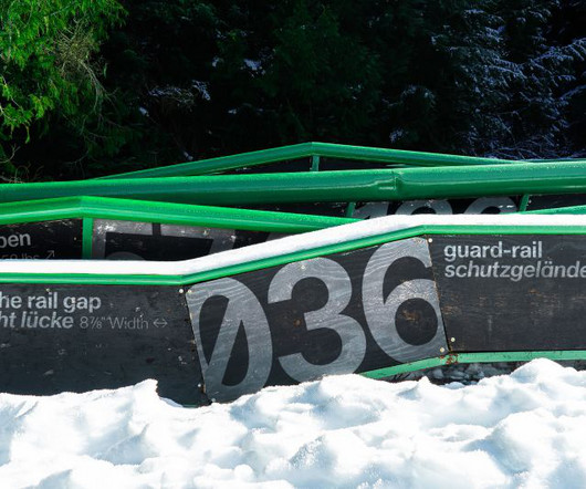
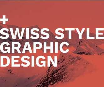
For some designers, the Swiss Style design is synonymous with Helvetica—which means "Swiss" in its original language. Its simple and neutral design influenced future Swiss typography in the 1950s, with typefaces like Helvetica, Folio, and Univers. . 14 Fonts Similar to Helvetica. Everything You Wanted to Know About Helvetica.
Helvetica Everywhere Let’s be honest. Helvetica is the potato of fonts—basic but always there when you need it. Love it or hate it, Helvetica has made its mark. So next time you find yourself reaching for Helvetica or adding a gradient, don’t sweat it. But when does it cross the line from timeless classic to lazy default?
How the Neo-grotesque genre – represented by the likes of Helvetica, AG Book, or Unica – might change if they retained the higher contrast found in early Gothics derived from Clarendon/Egyptiennes, where someone had simply lopped the serifs off."
We organize all of the trending information in your field so you don't have to. Join 66,000+ users and stay up to date on the latest articles your peers are reading.
You know about us, now we want to get to know you!
Let's personalize your content
Let's get even more personalized
We recognize your account from another site in our network, please click 'Send Email' below to continue with verifying your account and setting a password.


Let's personalize your content