Remove data-visuals
article thumbnail

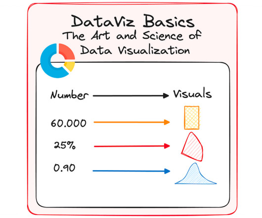
20 ideas for better data visualization

UX Collective

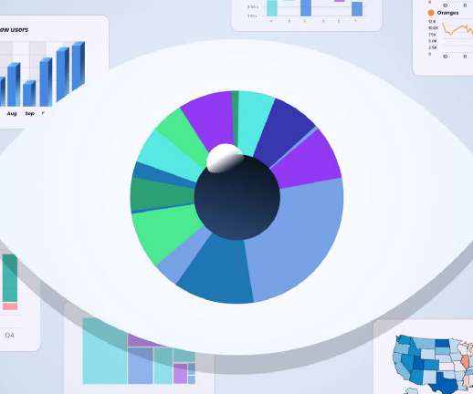
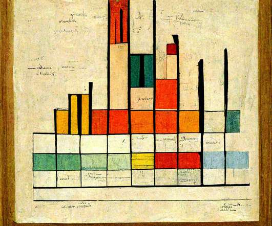
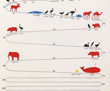
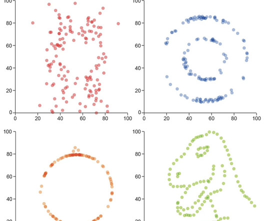
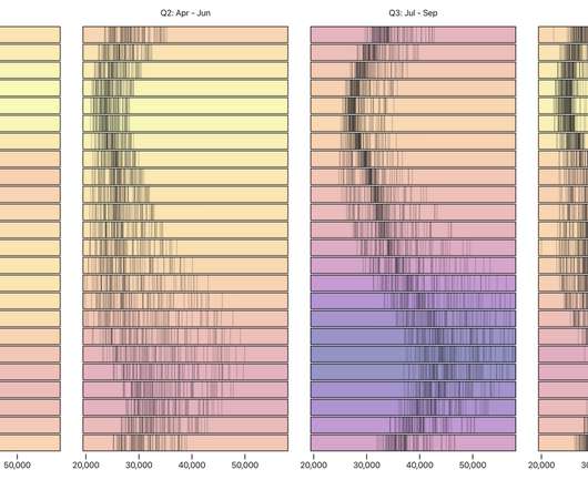
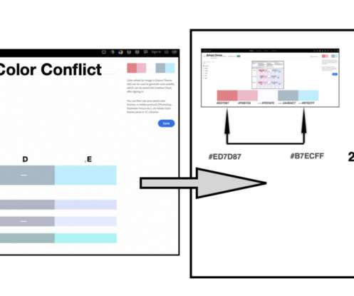
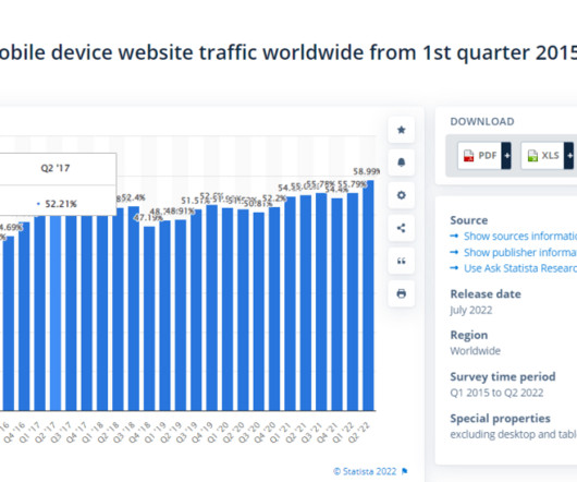
Applications we design are becoming increasingly data-driven. The need for quality data visualization is high as ever. Choose the right chart type Choosing the wrong chart type, or defaulting to the most common type of data visualization could confuse users or lead to data misinterpretation. a time series.

Color 145
article thumbnail

Online Course: Data Visualization Using Infographics to Transform Information into Art

We And The Color

Sonja Kuijpers is a renowned data illustrator and design teacher based in Eindhoven, Netherlands. In her online course, she will teach you how to effectively bring data to life with graphic shapes, colors, and creative layouts. Online Course: Data Visualization Using Infographics to Transform Information into Art.

Insiders

Sign Up for our Newsletter

This site is protected by reCAPTCHA and the Google Privacy Policy and Terms of Service apply.

Trending Sources

article thumbnail

Blooming bar charts: The growth of the data visualization industry

UX Collective

Exploring data visualization industry trends for 2022. Like a cultivated garden, the data visualization industry continues to blossom. According to Mordor Intelligence , data visualizations were valued at USD 2.99 billion in 2020 and are projected to reach USD 5.17 billion by 2026.

article thumbnail

How to visualize data from UX standardized questionnaires

UX Collective

However, I noticed that standardized questionnaires offer more opportunities for analysis and visualization than those commonly exploited by UXers. In this article, I propose to explore the opportunities of standardized questionnaire data analysis. Raw data Let’s start at the beginning, with the raw data.

Coding 90
article thumbnail

How to Use Visual Product Roadmaps for Better Planning and Results

Product managers (PMs) must gather and analyze product data, create product roadmaps for multiple stakeholders, identify roadblocks, and track a long list of milestones—all while staying on a tight schedule. Using a visual planning tool like MindManager® can make this process a whole lot easier.

article thumbnail

Categorizing an analogous color harmony for data visualization

UX Collective

There are instances in data visualization and graphic design where there is a need for a categorical color scheme with neighboring colors… Continue reading on UX Collective ».

Color 118
article thumbnail

Data visualization(-ish) in the style of famous artists

FlowingData

So of course someone entered “data visualization in the style of insert-anything-here” for a wide array of inspiration. DALL-E is an AI system from OpenAI that creates images from text. You can enter very random things and get very real-looking output. I’m partial to the bar chart made out of cake.

Artist 124
article thumbnail

Creative Insights: Data-Backed Trends to Help You Design Successful Content

Using Shutterstock.AI, our proprietary AI tool, we’ve crunched 700 billion industry data points to provide an in-depth look at what kind of design and marketing content engages audiences and drives results. Download this report to discover: The top visual themes and imagery that draw the most attention in the market.