This site uses cookies to improve your experience. To help us insure we adhere to various privacy regulations, please select your country/region of residence. If you do not select a country, we will assume you are from the United States. Select your Cookie Settings or view our Privacy Policy and Terms of Use.
Cookie Settings
Cookies and similar technologies are used on this website for proper function of the website, for tracking performance analytics and for marketing purposes. We and some of our third-party providers may use cookie data for various purposes. Please review the cookie settings below and choose your preference.
Used for the proper function of the website
Used for monitoring website traffic and interactions
Cookie Settings
Cookies and similar technologies are used on this website for proper function of the website, for tracking performance analytics and for marketing purposes. We and some of our third-party providers may use cookie data for various purposes. Please review the cookie settings below and choose your preference.
Strictly Necessary: Used for the proper function of the website
Performance/Analytics: Used for monitoring website traffic and interactions
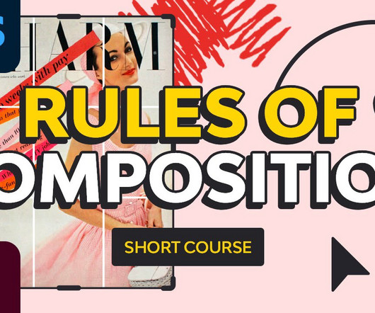
Do the interaction patterns feel consistent and predictable? Skeleton Layer There is where we finally enter layout, interface patterns, and interaction design at the screen and component level. Inconsistent interaction patterns across similar functions. Are we following established interaction patterns users expect?
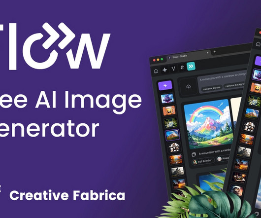
Unlike traditional AI tools that offer basic image generation, Flow introduces a new era of design possibilities, allowing users to generate not only stunning images but also transparent PNGs and intricate repeating patterns. Repeating Patterns: Creating seamless repeating patterns can be a challenging task, even for experienced designers.
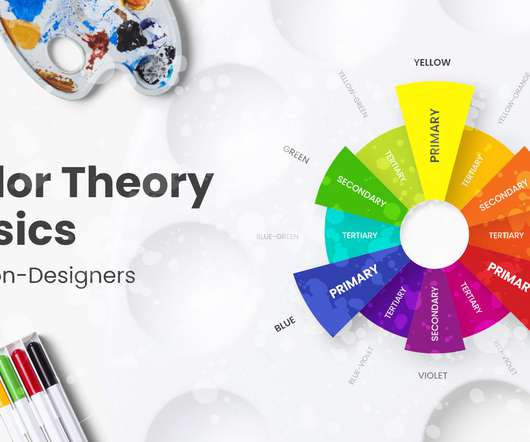
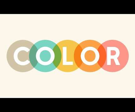
As a continuation of our inspirational examples and palette ideas for great color combinations, today we will have a look at the basics of colortheory and go beyond that. You can also review the colortheory article overview below and fast-travel to the specific sections you need. What are Colors?
A canny use of colortheory, typography finesse, and sharp layout strategies that foster understanding with ease. ColorTheory: Stirring up the Appetite Most food establishments utilize a specific set of colors in their branding. Play with arrangements, patterns, and spaces.
Colors are a powerful visual tool that can help us evoke certain emotions. In this course, you’ll learn all about the fundamentals of colortheory that can help you create your own color palette. What are color harmonies? What Is ColorTheory in Art? What are RGB and CMYK?
Procreate Pattern Brushes – $9. When patterns are used the right way, they are almost unnoticeable as they can add texture to give the image a grittier feel or shading to give the drawing depth. The Procreate Pattern Brushes kit provides you with 28 different pattern brushes to make using them look as seamless as can be.
Here are some basic theories that help designers and visual communicators organize information and create eye-catching logos, brand images, and overall great designs. ColorTheory. The now-iconic purple color scheme was also introduced, along with a new font and style. This is an example of colortheory at work.
Perfect for branding, logos, nursery rooms, or even baby announcements, the Dear Moon set comes with 90 different elements, 9 backgrounds, 9 cards, 14 seamless patterns and download information for the fonts that are used. Also included are fineliner patterns that can be used both with the other features and separately. Learn More.
In this article, you’ll learn everything from basic lingo to theory and examples of how websites are using grids. ColorTheory. The 5 Problems With Fundamental ColorTheory. Colortheory is one of the first tools we learn as designers. Creating Graphic Design and Illustration for Color Blind People.
Throw hue and tone into the mix, too, and you’re left with four, distinct color terms that everyone uses, yet not everyone understands. The mix-up among tint, shade, hue, and tone is understandable since they’re all related to colortheory and refer to similar concepts within design. Free Design Poster. Get the file.
This hand-sketched highly detailed set of 40+ mehndi henna elements and 12 colorful ethnic seamless patterns would be stunning for anti-stress color books, trendy posters, t-shirt prints, temporary flash tattoos, packagings, and a lot more. Download Now. Tattooesque Elements. Download Now. Yin Yang in Lotus.
They can have different directions such as vertical, horizontal, diagonal, curved, or move up and down across a page in a zigzag pattern. . Depending on the type or shade, you can use colors to emphasize elements or evoke certain feelings. Choosing the right colors is crucial when you’re trying to tell a story with your design.
Led by Michael Worthington, a member of the faculty at the California Institute of Arts, the course will teach you how to implement visual, rhythm, and pattern in design, techniques of image making and how to create your own series of images as well as how to use scale, direction, texture, weight, and space in your project.
color palettes. Color Palettes in Figma. Understanding gradients, palettes, colortheory and psychology are essential to creating pleasant visual designs. Color Palette provides you with a perfect color palette for your projects. Patterns In Your Figma Designs. Also, take a look at the other.
Canva Design School Canva Design School offers a range of online courses, tutorials, and resources for designers, including topics like branding, typography, and colortheory. It offers a range of features, including advanced typography, gradient and pattern fill, and shape-builder tools. Free Graphic Design Courses: 35.
It could be a couple of letters in a small text, following a different pattern than the rest of the letters to reveal a different message. Vibrant eye-candy color schemes. Pastel colors are still our favorite, but if you really want to make a bold statement and spread even more positivity, candy color schemes are a good choice. ??
These details might include repeating patterns, textures, logos, icons, and compositional techniques. It’ll cover everything you need from grid systems, typography, patterns, textures, and a dozen other helpful topics. But it’s not as easy as it may seems and nobody just picks up web design in a few weeks.
Origami Birds White Tights - Hand Printed, Great Design, Creative Patterns Luxury, covering tights made of microfiber and elastic fibers, 60DEN thick. The patterns on the tights are handmade in limited editions which guarantee their uniqueness. A collection of floral, animal, bird, and geometric patterns.
50 Totally Free Lessons in Graphic Design Theory. Color, Texture, and Imagery. It's important to understand the basics of colortheory and get a feel for how to work with colors. Color can make areas of a design pop off the page or recede into the background. Advanced ColorTheory: What Is Color Management?
So, for example, you could choose a Complementary color chord or an Analogous one. There are ten different chords you can choose from, and they're schemes based on traditional colortheory. You can also choose Shades when working with Color Chords, so you can get a variety of values of your chosen color.
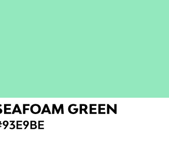
How to Use Seafoam Green Color As a trendy color of the season, seafoam green retains a soft characteristic while being eye-catching. You can definitely design stunning graphics using this color, from print design to branding, social media posts, logos, product design, and patterns. The grays act as neutrals. Take a look!
Our brains constantly try to find patterns and uncover more profound layers of understanding. Designing something encapsulating the entire company philosophy into a single graphic requires a deep understanding of visual arts and a business strategy, consumer behaviour patterns, etcetera, etcetera. Should I create my own logo design?
Leveraging the power of color in neuroaesthetics means using the insights we have about how the brain reacts to color to guide our design choices: Deepening our knowledge of color psychology and neuroaesthetics : The first step for any designer is to understand how color influences our emotions and behaviors.
The moods you can convey through combining green with other colors are limitless. So let’s start with Lucie Bajgart and her Khroma pattern. The abstract shapes look powerful and contrasting in good color combinations of dark green, blue, pink and orange. Khroma pattern by Lucie Bajgart. Pattern by Justin Vinalon.
When you look at a design in grayscale it forces you to only see tone but not actual colors. This way you can get an idea for why certain areas of an icon are colored darker than others. Unfortunately colortheory is a very detailed subject which can’t be learned in a day. Free Tutorials. Conclusion.
Tutorials Aside from informative articles, Smashing Magazine presents practical tutorials that walk readers through the process of applying distinct techniques, tools, or design patterns. These tutorials encompass a diverse array of subjects such as responsive design, typography, colortheory, and frontend development among others.
Repetition and Pattern Watch video lesson (2 mins) ↗ Repetition and patterns are aesthetically pleasing because they provide continuity. Marilyn Diptych by Andy Warhol In this photograph, repetition and pattern are seen on the wall that acts as a background for the four subjects. La Decalcomanie by René Magritte 3.9
It is not necessarily white and can be a repeated pattern or a colored background. ColorTheory. Colortheory is used to create a special mood of the design and evoke a certain emotion. It is used to fit designs in different screens, social media visuals, or prints. White (Negative) Space. Deliverables.
Data Visualization comes with the undeniable benefits of quickly recognizing patterns and interpret data. These charts allow you to see patterns through data visualization. Use Colors to Your Advantage. In every form of visualization, colors are your best friend and most powerful tool. Why Use it? Scatter Plot.
Octaevo – Using Shape Patterns. Blueventure – Utilizing ColorTheory. Not to mention our favorite function to automatically start the next episode or skip the intro. A great example for: Clean and simple navigation. Great visuals. Explanations written in a plain language. Visit Website. A great example for: 3D forms.
How to Create a Mid-Century Style Pattern in Adobe Illustrator The retro style is back and here to stay! We can feel its presence through handmade fonts, pastels, a limited color palette, and of course, simple shapes. Patterns What Is Pop Art? Back to the Seventies pack of patterns, brushes and textures for Adobe Illustrator.
An enormous bundle of over 240 widely colorful designs on different themes such as Interiors, landscapes, seasons, or even abstract patterns. 1000+ Seamless Pattern Designs Mega Bundle. 120 rooms of all shapes, sizes and colors. Everybody knows a little about colortheory and colors are important.
Color selection is a stage in a design process that requires both smart thinking and gut feeling. In today’s digital era, you can have as many colors and color combinations as you like. The human eye can see millions of…
For a design system – and any pattern, in general, is crucial to have a specific checklist of requirements, in order to be qualified as such. Whether you use them in the background, extract them from your images (with a color picker tool), or use font colors, every single nuance has its unique purpose. Color palettes.
You can then begin to create your own inspiration boards with color palettes that invoke different moods. You can also explore Adobe’s Color CC to further experiment with various color combinations. Palettes can be created from photos, prints, patterns or any other graphics that you find.
90s Graphic Design Trends: From Aesthetic Fonts to Grunge Patterns and Rave Flyers The 90s trends in graphic design were unique! Neon Color Palette Inspiration: Trending Palettes and Templates Discover 80s neon color palettes that go together and learn how to use a neon color palette! ColorTheory.
Its integration with design workflows helps ensure color choices meet WCAG requirements throughout the design process. Paletton Paletton offers a sophisticated color wheel-based approach to palette creation. Color Designer Color Designer combines palette generation with gradient creation and contrast checking.
Follow the principles of colortheory, proportions, and other features that make the result of graphic design successful when you create your icons. The collection includes multiple penguin designs, seamless patterns, cartoon Christmas elements, pre-made posters, and many more. They are aesthetic and attractive.
AI algorithms can now analyze user behavior, drawing insights from patterns, demographics, and preferences to help designers make data-backed decisions. This helps the viewer instantly recognize important updates, creating a more responsive and visually stimulating interface that adapts well to mobile usage patterns.
When introducing color, pattern, and texture at any scale, it’s important to consider how those elements might hold a deeper meaning and with whom there may be resonance. “I Soft colors, curved lines, blurred forms. Bold patterns, strong lines, statement colors.” Seeking inspiration, focus, boundaries?
The fundamentals of graphic design are about seeing (and understanding) how the qualities of visual material—shapes, images, colortheory , typography , and layout—work, and work together… and then being able to decide which qualities of each are relevant and engaging and useful for visualizing a particular idea or solving a certain problem.
In this tutorial, Marko Kožokar uses simple shapes and patterns to create a dispersion effect. Design a Floral Pattern for Fabric in Adobe Photoshop. Bring out your passion for pattern design with this tutorial. Lidija Paradinovic Nagulov walks you through the steps of creating a handmade floral pattern. Visit Tutorial.
The fundamentals of graphic design are about seeing (and understanding) how the qualities of visual material—shapes, images, colortheory , typography , and layout—work, and work together… and then being able to decide which qualities of each are relevant and engaging and useful for visualizing a particular idea or solving a certain problem.
Combining colors has always been a critical skill for graphic designers which requires years of learning and mastering. Aside from the basics of colortheory , however, a big part of finding the right color combinations is getting the right inspiration. Source: Tigers and Geometric Elements by Irina Skaska?
We organize all of the trending information in your field so you don't have to. Join 66,000+ users and stay up to date on the latest articles your peers are reading.
You know about us, now we want to get to know you!
Let's personalize your content
Let's get even more personalized
We recognize your account from another site in our network, please click 'Send Email' below to continue with verifying your account and setting a password.


Let's personalize your content