This site uses cookies to improve your experience. To help us insure we adhere to various privacy regulations, please select your country/region of residence. If you do not select a country, we will assume you are from the United States. Select your Cookie Settings or view our Privacy Policy and Terms of Use.
Cookie Settings
Cookies and similar technologies are used on this website for proper function of the website, for tracking performance analytics and for marketing purposes. We and some of our third-party providers may use cookie data for various purposes. Please review the cookie settings below and choose your preference.
Used for the proper function of the website
Used for monitoring website traffic and interactions
Cookie Settings
Cookies and similar technologies are used on this website for proper function of the website, for tracking performance analytics and for marketing purposes. We and some of our third-party providers may use cookie data for various purposes. Please review the cookie settings below and choose your preference.
Strictly Necessary: Used for the proper function of the website
Performance/Analytics: Used for monitoring website traffic and interactions
By reimagining classic elements like vintage typography or retro colorschemes with a contemporary, high-tech twist, they create visuals that feel both familiar and forward-thinking. This can include using old-school fonts and neon color palettes in ad visuals for a nostalgic, tech-forward look.
At its core, it strips away unnecessary elements to emphasize the essentials, often using clean lines, monochromatic colorschemes, and ample negative space. For example, websites can dynamically adjust their layouts, colorschemes, or imagery based on a user’s preferences, browsing history, or even current mood.
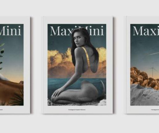
Adobe InDesign remains the industry standard for designing professional publications, including portfolios. With a few clicks, you can modify elements like colorschemes, typography, and images. Adjust the Typography and ColorScheme This template features a modern, clean typography system.
At the same time, the private areas of the apartment remain secluded, offering a retreat from the more public zones of the home. The apartment’s subdued colorscheme is punctuated by bold accent colors found in carefully selected pieces of furniture, art, and decor.
Each section—whether it focuses on the logo, colorscheme, typography, or application—has been thoughtfully designed to support a smooth, logical flow of information. Whether used for internal corporate communications or public-facing presentations, the template’s adaptability makes it suitable for various industries.
InDesign magazine templates are a game-changer for anyone looking to create polished, professional-looking publications without starting from scratch. In fact, they give you a creative starting point, which can inspire new ideas and help you maintain a cohesive look throughout your publication.
Newry-based design brand Orior continues to reshape public perception surrounding Ireland’s creative contributions – characterized by the predominance of studio craft, namely furniture – previously eclipsed by the country’s European neighbors.
One of the most underrated ways to understand your user’s needs is through public forums. While those have value, public forums are mercilessly blunt and honest (and provide insight into user behavior), and that is what you need. Additionally, it should follow a consistent colorscheme, shape, size, and placement.
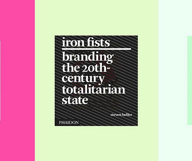
Iron Fists: Branding the 20th-Century totalitarian state by Steven Heller(2008) Iron Fists explores how totalitarian regimes weaponized graphic design to manipulate public opinion and consolidate power. From bold symbols to strict colorschemes , design was used to evoke loyalty and suppress dissent. PhaidonPress.
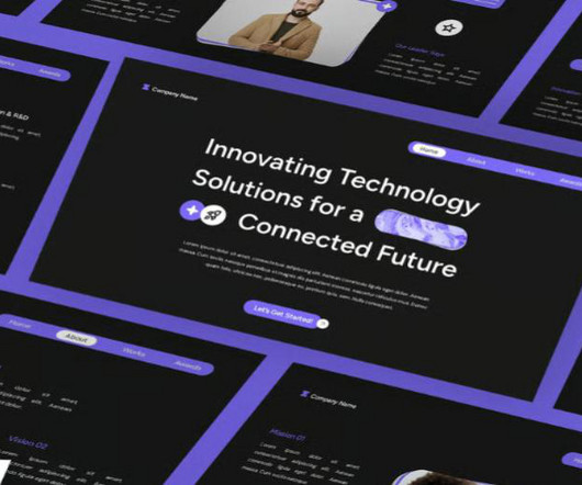
These templates come with pre-made layouts, design elements, and cohesive colorschemes that make it easy to impress your audience. Public Speaker Presentation Template Command attention with slides designed for TED-style talks, keynotes, or motivational speeches. Includes quote slides and audience engagement visuals.
This collaboration aimed to breathe new life into a brand that, while widely used, lacked strong public recognition. White Bear integrated this philosophy into every aspect of the rebrand, including logo design, colorschemes, packaging, digital assets, and marketing materials.
You can effortlessly integrate your own brand imagery, subtly tweak complementary colorschemes (though the chrome effect design is undoubtedly the star attraction!), While it’s initially showcased with a music or public event theme, its application extends far beyond these examples. All elements are fully customizable.
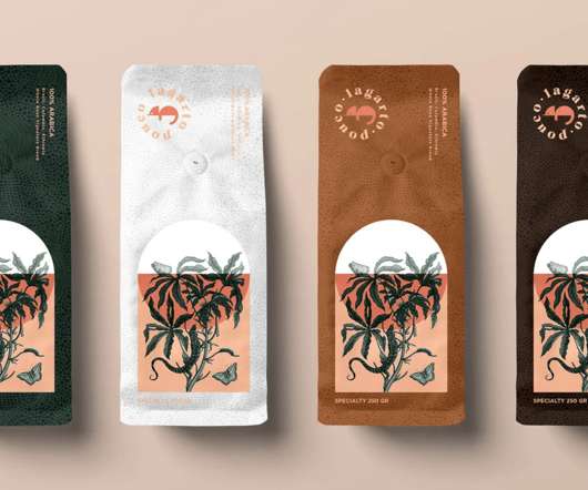
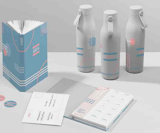
Gorgeous packages with a subtle colorscheme and delightful illustrations, excellent work by FiveStar Branding. This is what Outfit Branding and Public Marking Creative did together with this colorful visual identity. In this post, we take a look at a few packages that truly stand out in one way or another.
With these templates, you can create more than just an annual report; they make it simple to present your business, corporate identity, public relations, or financial company in a modern and clean design. These brochures are easy to customize and utilize free fonts. Here are some key reasons why brochures are essential in branding.
Different colors symbolize different things; like how black is usually associated with being sophisticated or mysterious, blue corresponds to cool or calming, green means growth, and red is sexy or exciting. Go for a monochromatic colorscheme if you want to work with varying shades and tints of the same color.
The first one has a clean, vintage-modern look with a warm color palette: The second one has a more retro feel with curved shapes, a muted colorscheme, and distressed textures: The third has a definite urban, architectural influence, with geometric shapes, straight lines, and sharp edges: Play around with one template to fit your different needs.
Use your brand story and color symbolism to determine your brand colors and evoke the emotions you’re aiming for with your design. Make sure you choose colors that complement each other and create a consistent look and feel for your colorscheme. Coca-Cola’s Iconic Red and White ColorScheme.
It has many colorschemes, which can be applied to any of your publications. You can also prepare your own colorschemes with it. If you don’t want to use the wizard, you can prepare customized publication with the help of the blank page that comes as soon as you log into the interface.
Additionally, you have the option of privately sharing your designs by email, links, or public websites. Enjoy changing the colorscheme, selecting more downloadable templates, etc. We appreciate Desygner ’s instant production of engaging social media content, brand identity kits, products, website templates, and business cards.
One of the elements in a brand kit, is a color palette , or colorscheme. If you choose to go with a pink logo, it’s important to also make sure it’s aligned to your brand color palette, or that you update your color palette to look good with a pink logo. Bubblegum, pink and red. Soft pink and burgundy.
Built-in vector editor, photo editor, motion graphics editor, layout and typography tools, and a large number of effect filters, design plugins, and design resources (Including 1M+ HD photos, illustrations, backgrounds, 20K+ icon graphics, and design elements and colorschemes). Importantly, it has almost no learning curve.
More specifically, it’s about managing how the public feels about your company. Corporate and/or visual identity refers specifically to using visual communication to shape your public perception. For instance, revising your company slogan or switching up your color palette are all corporate identity design choices. The problem?
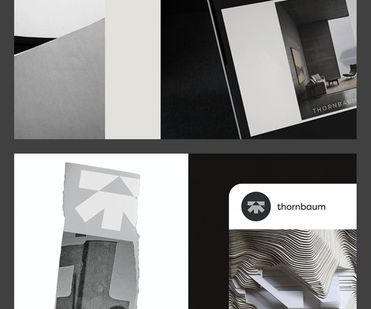
The chosen colorscheme and imagery evoke a sense of nostalgia, reminiscent of archival brutalist photographs, while maintaining a contemporary edge. This publication not only highlights their significant past projects but also serves as a source of inspiration, reflecting the founders' visionary approach to architecture.
Advertising in a magazine begins with picking the right publication for your target audience. If you’re not already reading a wide variety of industry publications, ask members of your team for recommendations or research where it’s best to advertise. The location of your poster determines the size and colorscheme.
As well, you can select a preferred colorscheme and adjust all the components as needed. It may help you draw people’s attention to your books, articles, and other publications. The most cutting-edge ones are social media sharing buttons, widget-ready sidebars, rich colorschemes, and unlimited customization possibilities.
The colorscheme is monotone. The austerity of the colorscheme and typography allow the intricate illustration to be the focus of the design. Please feel free to be in touch with any illuminating information, I'd love to update this publication with as much detail as possible. *I The type is simple.
The colorscheme is monotone. The austerity of the colorscheme and typography allow the intricate illustration to be the focus of the design. Please feel free to be in touch with any illuminating information, I'd love to update this publication with as much detail as possible. *I The type is simple.
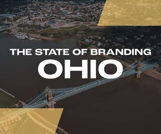
Whilst the images and colorscheme are soft, the sturdy border adds a contrasting stamp of authority and looks very strong. The Columbus flag is bursting with color, sporting a colorscheme of yellow, red, and white, with a blue circular emblem in the center. Key Cities in Ohio. So, let’s get started!
Colors: Companies can customize the colorschemes in these logo phases. They always have unprofessional vibes in their designs and logos and pure and worst color sense. Sometimes they come up with a fundamental and straightforward procedure for logo designing that never dares to grab the public attention at one go. .
Instead, the emphasis was on collaboration in the classroom, and giving the students a publication outlet. . They looked like twin embodiments of early 2000s emo kings, and provocatively contrasted the suburban backdrop of a California public school. The classroom dynamic was lowkey and democratic. On MySpace, it was a choice.
Author) English (Publication Language) 272 Pages – 05/11/2005 (Publication Date) – Basic Books (Publisher) −$6.10 $11.89 Norman writes, “Emotion is in everything we do… our emotional side supports rational thought and underlies our taste, aesthetics, and much of our social behaviour.”
Creative ads like that can be placed in both outdoor and indoor public spaces. . There’s a consistent colorscheme matching her brand and the Instagram page shows off her work in an exciting way as fans discover the full picture scrolling down. Use Gameplay to Take Your Advertising to the Next Level.
Besides, you will find them in printed publications, magazines, newspapers - the human eye most easily perceives them. By playing around with the colorscheme, you will achieve a stylish and trustworthy figure. E-pub License gives a right to embed this font in a limited number of e-books or other e-publications.
It boasts a narrow navigation bar with a customizable mega menu, a choice of carefully picked colorschemes and spectacular parallax-enhanced image blocks. Use one of the four premade colorschemes to make this template more suitable for your company’s branding identity. More info. Brewery Responsive Joomla Template.
The icons on the right integrate the brand color palette and complementary colors. Assert Your Brand Identity with a Unified Color Design. If you’re using photos in your ad design, ensure your colorscheme matches with the rest of your design for a unified look. Edit in Design Wizard.
Thanks to the infographic style and non-flashy colorscheme, it provides for easier comprehension of your personal and professional data. Helps to set up such options like branding, page layouts, menus, widgets, colors, elements of visibility and other. Limitless Color Options.
Her artworks are so incredibly detailed and diverse in subject matter and colorschemes.”. She has an online shop consisting of colorful greeting cards, enamel pins and stickers. Favorite accounts to follow: “I’ve been a long-time fan of @maruti_bitamin even before joining Instagram. Whitney Luu: A subtle nod to branding .
These hues are frequently utilized in publications with exciting plots or romance novels. Conversely, cold hues like blues and greens are often chosen for publications about self-help, wellness, or environmental issues since they are connected to peace, tranquility, and nature. The colorscheme might also convey the book’s genre.
Flash animation, the happiness of the graphic layout, perfect for the use I do, function such as menu bar and interaction with social media public make this WordPress theme for nonprofits better than free non-profit website templates that I've ever tried. Its well-balanced colorscheme perfectly fits the primary goal of this kind of services.
For artists who want to make their own NFTs , they can also submit work to DeviantArt and receive alerts if and when someone tries to mint it as an unauthorized NFT on a public blockchain. Big Cartel. Geared towards artists, makers and small brands, Big Cartel is a platform for creating and customizing stores for selling your art online.
User-friendly interfaces are essential for digital products that are meant to be used by the general public. Interaction Design Skills User-friendly interfaces are essential for digital products that are meant to be used by the general public. For instance, UI can handle traditional principles like colorschemes and typography.
This is mostly used for decorative purposes within branding or small pieces of type in certain publications. On the left, each logotype has been given a colorscheme that quite obviously doesn’t work, and on the right, a more appropriate one. A common mistake is not counting for gutters when designing for publications.
Color should be used liberally to ensure the facts are easy to absorb. Developing a colorscheme will make the blog easy on the eye and instantly recognizable. Color coding is always a clever way to differentiate information. Public domain images are free to use and there are no restrictions on where you can use them.
Building a StoryBrand by Donald Miller Donald Miller (Author) 235 Pages – 05/26/2023 (Publication Date) – Generic (Publisher) Buy on Amazon The Connection Between Storytelling and Brand Perception Storytelling has a notable influence on shaping how customers perceive and connect to a brand. Buy on Amazon C.
We organize all of the trending information in your field so you don't have to. Join 66,000+ users and stay up to date on the latest articles your peers are reading.
You know about us, now we want to get to know you!
Let's personalize your content
Let's get even more personalized
We recognize your account from another site in our network, please click 'Send Email' below to continue with verifying your account and setting a password.


Let's personalize your content